


For years I thought about what to put in an ad.
What I should have been thinking about first was how to divide the frame.
I learned this the annoying way: rebuilding AI-generated statics over and over, changing the subject, the lighting, the model's face - and the ads still looked off. The problem was never the subject. It was the layout underneath it.
This is my complete library of ad layouts: 10 compositions, when to use each one, when to avoid it, and the exact prompt keywords I paste into my image models to get them. The same reference I use to build statics for my own accounts every week.
Let's pull the frame apart.
What Are Ad Layout Compositions?
An ad layout composition is the structural division of the creative's frame - how the space is split into panels, grids, or zones before any subject, copy, or style is added. The layout determines where the eye enters, where it travels, and where the CTA lives. It's the architecture of the ad.
And here's why that definition matters more than it sounds:
A before/after ad with the wrong split feels wrong even when both images are perfect. A comparison grid with unequal cells loses the comparison logic it exists to create.
Layout errors can't be fixed downstream. Copy can be rewritten. Colors can be regraded. Structure is forever.
Side note
Why Layout-First Prompting Works
Here's the framework this whole article hangs on. I call it Layout-First Prompting:
Layout-First Prompting: describing the structural skeleton of the frame - splits, grids, panel weights - before describing the subject, style, or lighting. Because most image models weight early tokens more heavily, the layout instruction placed first controls the composition instead of fighting it.
Why does this matter so much for AI ads specifically?
Because composition is the first thing a trained eye clocks as “off” in AI images. Not the hands. Not the skin. The dead-centered subject with symmetrical negative space that no photographer would ever shoot.
Fix the layout first and something strange happens: every other decision starts landing in the right place automatically. The subject knows where to stand. The copy knows where to sit. The prompt basically writes itself.
(Also, layout-first is free. Unlike the fourth regeneration of a batch that “just doesn't look right.”)
The 10 Ad Layouts
Two families here: splits (the frame divided into zones) and grids (the frame divided into cells). Then two wildcards.
For each one: what it is, when to run it, when to skip it, and prompt keywords you can paste directly.
1. Hard Split - 50/50
The frame cut exactly in half by a vertical line. Two equal panels, two states, equal visual weight.
This is the workhorse of the before/after archetype and the most reliable layout in performance advertising, full stop.
- Use
- before/after comparisons, product A vs. product B, problem state vs. solution state
- Avoid
- one side of the story matters more than the other. A 50/50 assigns equal importance to both panels. If that's not true of your message, this layout is lying to your viewer.
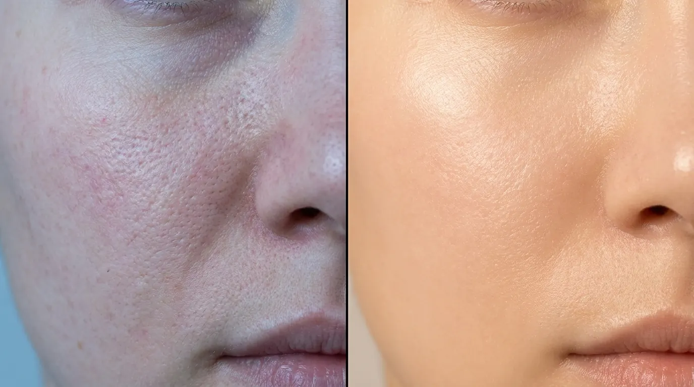
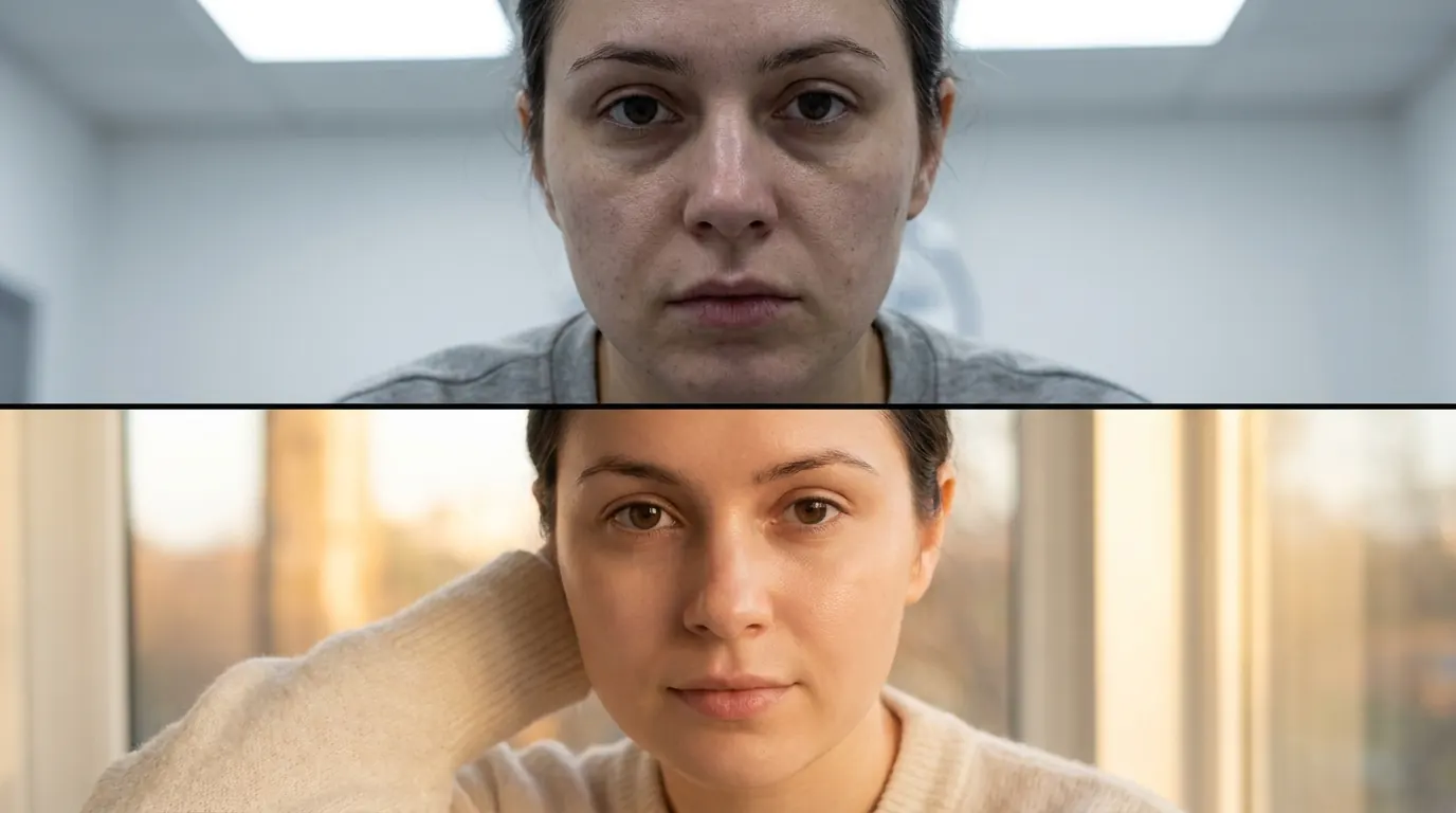
hard vertical split, two equal panels
frame divided exactly in half, left and right panels
sharp vertical dividing line between panels
split screen composition, 50/50 left right
hard edge split, no blending between panels
2. Uneven Split - 70/30
Same vertical divide, but one panel dominates. The big panel does the emotional work; the narrow panel does the product and copy work.
This is my default for lifestyle-plus-product statics. The 70 sells the feeling. The 30 closes.
- Use
- lifestyle scene + clean product shot, UGC frame + offer panel, story side + proof side
- Avoid
- both states genuinely deserve equal weight - that's a 50/50 job

asymmetric vertical split, 70/30 composition
dominant left panel, narrow right panel
uneven split screen, one panel dominant
70 percent lifestyle panel, 30 percent product panel
3. Diagonal Split
The divide runs at an angle. Instant energy and movement - the layout equivalent of turning the music up.
- Use
- fitness, performance products, dynamic before/afters, anything where “static” is the enemy
- Avoid
- the offer is calm, premium, or clinical. A diagonal split on a skincare serum reads like an energy drink.


diagonal split composition, angled divide
angled split screen, dynamic diagonal line
sharp diagonal split, two color zones
45 degree split, diagonal composition
4. Circular Reveal
A circle cut from the main image, showing different content inside - a zoom, a magnification, a peek at the other state.
The circle is a proof device. It says “look closer, we have nothing to hide.”
- Use
- skin texture zooms, ingredient close-ups, magnifying-glass effects, within-scene comparisons
- Avoid
- you have nothing worth magnifying. An empty circle is just a hole in your ad.
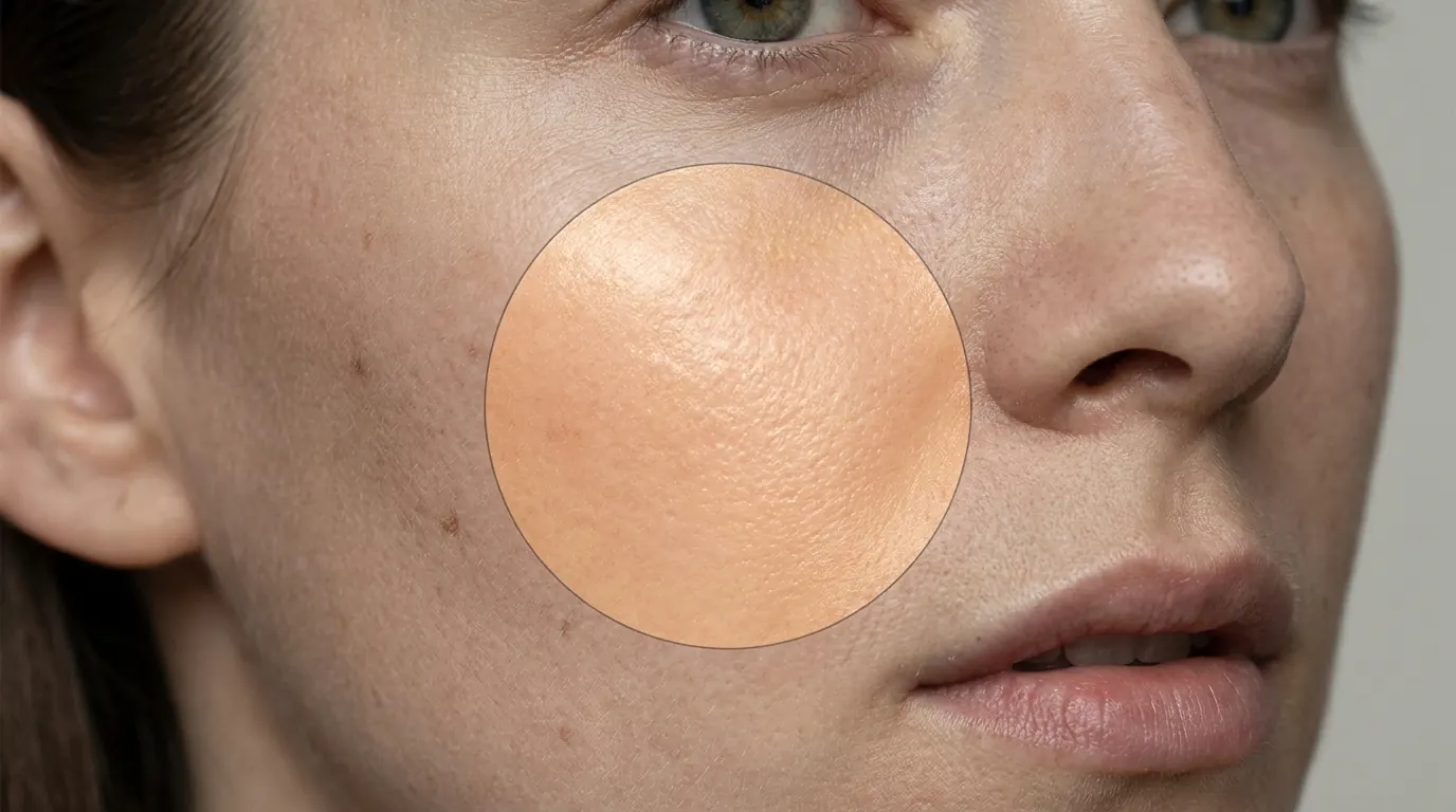
circular reveal, circle showing different content
round cutout revealing second image beneath
circular window in image, different scene inside
circular inset, zoomed detail within wider scene
5. 2x2 Grid
Four equal cells. Comparison logic in its purest form.
- Use
- four SKUs, four angles of one product, four steps of a routine
- Avoid
- you only have three good things to show. A grid with one filler cell is a three-panel ad wearing a disguise. Use the strip instead.

2x2 grid layout, four equal cells
four panel grid composition
quad split, four equal image panels
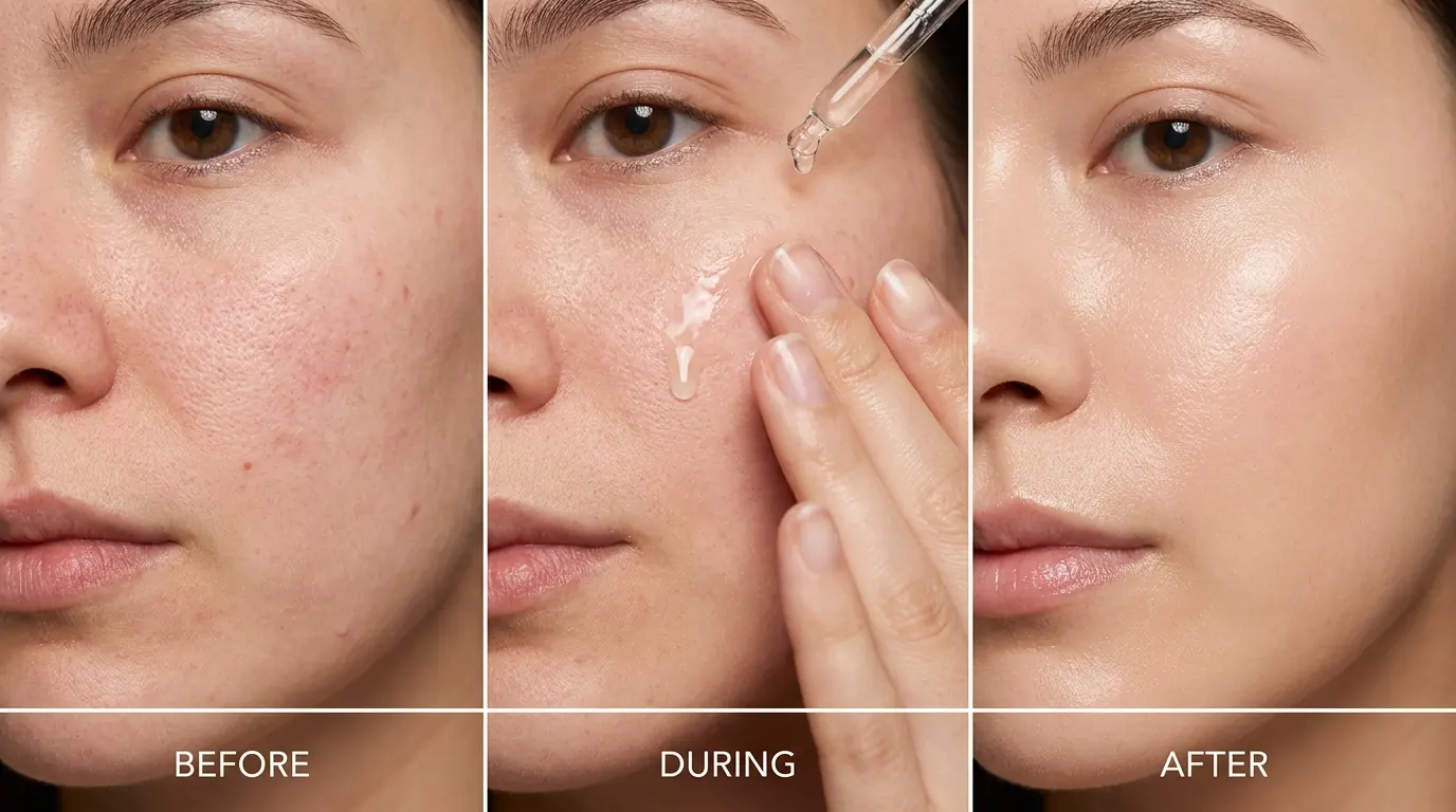
6. 3x1 Horizontal Strip
Three equal cells in a row. Reads left to right, which means it reads as time.
- Use
- three-step sequences, before/during/after, three variants
- Avoid
- your placement is vertical. On Stories, this layout shrinks to unreadable. Rotate it.
7. 1x3 Vertical Strip
The same triptych, stacked. Built for 9:16.
- Use
- morning/midday/evening routines, step sequences in Stories and Reels covers
- Avoid
- the sequence has no order. Vertical stacking implies “first, then, finally” whether you mean it or not.

3x1 horizontal strip, three equal panels in a row
triptych layout, three equal horizontal panels
1x3 vertical strip, three stacked equal panels
vertical triptych, three cells stacked
8. Hero + Detail Grid
One large dominant panel, two or three smaller detail panels supporting it. The hero makes the claim. The details are the receipts.
- Use
- lifestyle hero + product close-ups, main claim + proof panels
- Avoid
- you can't decide what the hero is. If everything is important, this becomes a 2x2 that lost a fight.

hero panel with two smaller detail panels
large hero image with detail insets
dominant hero shot with supporting smaller panels
9. Collage / Polaroid
Overlapping frames, slight rotations, that “pinned to a corkboard” energy. The organized-chaos layout.
- Use
- UGC-flavored statics, community proof, “customers sent us these” concepts
- Avoid
- you're premium. Chaos is a trust signal for authenticity, and a trust killer for luxury.

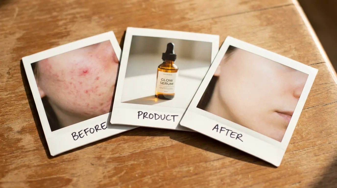
polaroid collage layout, overlapping photo frames
scattered photo collage, slight rotations
pinned photos composition, corkboard style
10. Full Bleed
One image, edge to edge, no divisions. The layout that pretends it isn't one.
The catch? Full bleed only works when the image is composed with deliberate negative space for your copy. Otherwise your text ends up fighting a busy background and losing.
- Use
- hero product shots, cinematic lifestyle, premium brand statics
- Avoid
- you need to show more than one state or step

full bleed composition, edge to edge image
single full frame image, no panels
negative space in upper third for text placement
Where the Text Goes (The Part Everyone Skips)
Here's the thing:
Every layout above comes with a built-in text zone. Ignore it and the layout stops working, no matter how good the images are.
The short version:
| Layout | Headline | CTA |
|---|---|---|
| Hard split 50/50 | Upper zone of ONE panel | Bottom of the same panel |
| Uneven 70/30 | Inside the narrow panel | Bottom of the narrow panel |
| Diagonal split | The calmer zone only | Same zone - never across the line |
| Circular reveal | Above the circle | Below the circle |
| 2x2 grid | Above the entire grid | Below the entire grid |
| Strips (3x1 / 1x3) | Above or below the strip | Opposite end from headline |
| Hero + detail | Inside the hero panel | Below the full composition |
| Collage / Polaroid | Outside the image area | Outside the image area |
| Full bleed | The designed negative space | Same - never fight the image |
Hard split 50/50
Headline
Upper zone of ONE panelCTA
Bottom of the same panelUneven 70/30
Headline
Inside the narrow panelCTA
Bottom of the narrow panelDiagonal split
Headline
The calmer zone onlyCTA
Same zone - never across the lineCircular reveal
Headline
Above the circleCTA
Below the circle2x2 grid
Headline
Above the entire gridCTA
Below the entire gridStrips (3x1 / 1x3)
Headline
Above or below the stripCTA
Opposite end from headlineHero + detail
Headline
Inside the hero panelCTA
Below the full compositionCollage / Polaroid
Headline
Outside the image areaCTA
Outside the image areaFull bleed
Headline
The designed negative spaceCTA
Same - never fight the image
One rule ties the whole table together: copy never crosses a divide. Not the vertical line, not the diagonal, not the circle's edge. The divide is doing structural work. Text laid across it breaks both.
Pro Tip
Stacking It: One Prompt, Full Layout Control
Let's put Layout-First Prompting to work in a single prompt. Structure first, then subject, then style:
Asymmetric vertical split composition dividing the frame 70 percent left
and 30 percent right with a clean hard vertical divide, left panel showing
a woman applying serum in soft morning window light with a natural
lifestyle feel, right panel containing a clean solid white background with
a hero product shot of the serum bottle centered vertically, left panel
dominant and lifestyle-forward, right panel clean and product-focused,
natural text zone in the upper area of the right white panel for headline
placement and a CTA zone at the bottom of the right panel, soft consistent
light direction across both panels, 50mm lens, premium beauty lifestyle
photography
The dominant panel does the emotional work. The narrow white panel does the product and copy work. The hard line between them makes the relationship instant.
And notice the order: eighteen words of layout before the woman even shows up. That's the whole trick.
Note
Conclusion: Structure First, Everything Else Second
If you take four things from this page, take these:
1. Decide the layout before anything else. The layout tells you how many images you need, where the subject goes, where the product goes, and where the text lives. Every other decision serves it.
2. Match the layout to the message weight. Equal states get 50/50. Dominant story gets 70/30. Sequence gets a strip. If the layout's logic contradicts your message, the viewer feels it even if they can't name it.
3. Put layout keywords first in the prompt. Early tokens win. Structure before subject, every time.
4. Copy never crosses a divide. The one-sentence fix for half the broken statics in any ad library.
Now the question back to you: which of the ten do you actually run? My bet is you're leaning on two of them and haven't touched the other eight. Pick one you've never tested and put it in your next batch - then come tell us how it performed in the community.
Free resource
Steal my ad concept & hook library
Every prompt, archetype, and hook I use in my own accounts. Updated weekly.
Join the free Skool community