


The first blurred ad I ever ran did everything by the book and still tanked.
I spent €260 hiding a product behind a clean Gaussian blur, slapped “You won't believe this” on top, and waited for the cheap clicks. They didn't come.
Not because blur doesn't work. Because I blurred the wrong thing. I hid the product when I should have hidden the payoff, and I made it look like a bad upload instead of a deliberate act of censorship.
This is a complete guide to curiosity gap ads. Specifically the static archetype I call Blurred Bait: blur, pixel, and censor the reveal to force a tap. I'll give you the four executions I run, the copy-paste prompts for each, and the exact reason most of them die at the ad level.
Let's pull it apart.
What Are Curiosity Gap Ads?
Blurred Bait: A static ad archetype that hides the payoff behind a blur, pixelation, or a censor icon so the viewer has to click to resolve it. It weaponizes the curiosity gap: the brain treats the withheld reward as an open loop and clicks to close it. The concealment is the creative, not a side effect of it.
That definition is the whole game. A curiosity gap ad doesn't sell the product. It sells the reveal.
Here's a live one:
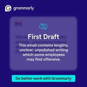
See what it withholds? Not the tool. The email you supposedly wrote. You want to read the thing that's apparently offensive. And the only way to see it is to click.
Note
Why Blurred Bait Works: The Visible Withhold
Most people think a curiosity gap ad works because it hides something. Wrong.
It works because it hides something on purpose, visibly.
The Visible Withhold: The blur has to read as a deliberate act of concealment, not a mistake. A soft blur looks like a low-quality upload - the brain scrolls past. A blur with a slashed-eye icon, a “Content Warning” label, or a censor bar reads as this was hidden from you, and that's the version that gets the tap.
That distinction is the entire archetype. Get it wrong and you've made a blurry ad. Get it right and you've made a locked door with a sign that says “do not open.”
Two mechanisms fire at once:
The curiosity gap. You show that information exists and that you're not showing it. The gap between “I know something's here” and “I can't see it” is the itch.
The Zeigarnik Effect. Our brains fixate on incomplete tasks. An unresolved reveal is an open loop, and open loops nag until you close them. The click is the close.
The kicker? You're not persuading anyone. You're just refusing to finish a sentence and letting their brain finish it for them.
How to Build a Blurred Bait Ad: 4 Executions
Four visual builds, ranked by how often they win in my accounts. Each one is a different way to make the withhold visible.
1. Frosted-Glass Overlay (the “your content is censored” build)
This is the one I reach for first, because it frames the hidden thing as the viewer's own problem.
A translucent frosted panel sits over blurred UI: an email, a chat, a doc. A censor icon and a warning label do the withholding. The button promises the fix. Use it when the payoff is diagnostic: something the viewer secretly worries is true about them.
Digital graphic on a solid dark purple background. In the center, a
translucent frosted-glass square overlay. Inside the overlay, a heavily
blurred image of an email interface with colorful text blocks. Above the
blur, a thin cyan "hidden eye" icon (an eye with a slash through it) and
bold white text reading "[FIRST DRAFT]". Below that, white paragraph text
reading "[This email contains writing some readers may find unclear]". At
the bottom, a bright cyan rectangular button with black text reading
"[Fix it →]". In the top-left corner, a white logo reading "[BRAND]".
Pro Tip
2. Hidden-Eye + Cursor (the “click here, specifically” build)
When the payoff is a product or format rather than a personal flaw, ambiguity does the heavy lifting, and an explicit cursor tells the eye exactly where to go.
A blurred product, a large slashed-eye icon dead-center, and a pixelated hand-cursor pointing at it. The copy names a benefit but hides the thing: “You can [do the desirable thing], with THIS.”
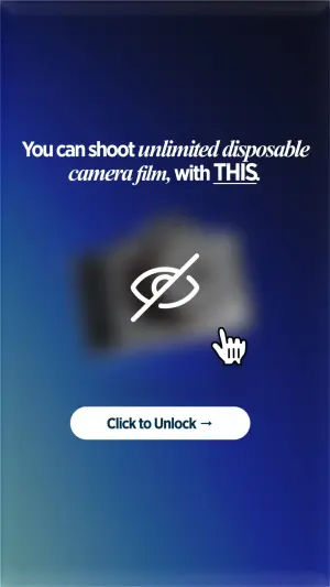
Digital graphic on a deep blue to light blue vertical gradient background.
In the center, a heavily blurred image of a [chunky rectangular product].
Overlaid on top of the blur, a large white "hidden eye" icon (eye with a
slash) and a white pixelated hand-cursor graphic pointing at the icon.
Above the blur, bold white serif text reading "[You can do X, with THIS]".
Below the blur, a white pill-shaped button reading "[Click to Unlock →]".
The word “THIS” is doing more work than any adjective could. It's a pointer to a thing you're not allowed to see yet.
Side note
3. Heavy Gaussian Blur + Content Warning (the “forbidden” build)
The cleanest version. A single blurred object, a “Content Warning” or “Sensitive” label, a solid button. No UI mimicry. Just a censored thing and a reason it's censored. Use it when the product is genuinely visual and the mystery is “what does it look like.”
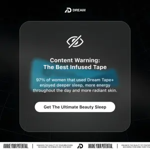
Digital graphic on a dark, sleek black background with a subtle futuristic
grid pattern. In the center, a dark grey rounded translucent UI overlay box.
Inside the box, a glowing, heavily blurred [bright product] object. Above the
blur, a white "hidden eye" icon. Below the icon, bold white text reading
"[Content Warning]" and smaller text reading "[why it's hidden]". At the
bottom of the box, a solid white pill button with black text reading
"[Reveal →]". At the top center, a white logo reading "[BRAND]".
Note
4. 8-Bit Pixelation (the pattern-interrupt build)
Same mechanism, retro skin. A product rendered as a blocky 8-bit sprite, a button floating dead-center as a physical barrier, oversized italic copy. The pixelation itself is the pattern interrupt - it reads as a game, not an ad.

Digital graphic on a vibrant solid [hot pink] background. In the center, a
heavily pixelated 8-bit style image of a [product covered in colorful
patterns]. Floating directly over the center of the product, a rounded
button in [light yellow] with red text reading "[CLICK HERE]". Above the
product, large italic text reading "[To unlock warmth]".
Pro Tip
The 4 Executions at a Glance
| Execution | Withhold signal | Best for | Test first against |
|---|---|---|---|
| Frosted-glass overlay | Censor icon + warning label | Diagnostic payoffs (your flaw) | Red error-tint version |
| Hidden-eye + cursor | Slashed eye + pixel cursor | Product / format reveals | Cursor vs. no cursor |
| Gaussian blur + warning | "Content Warning" + heavy blur | Visual products, taboo angle | Slight vs. heavy blur |
| 8-bit pixelation | Blocky sprite + center button | Pattern-interrupt scroll-stop | Pixel vs. smooth blur |
Frosted-glass overlay
Withhold signal
Censor icon + warning labelBest for
Diagnostic payoffs (your flaw)Test first against
Red error-tint versionHidden-eye + cursor
Withhold signal
Slashed eye + pixel cursorBest for
Product / format revealsTest first against
Cursor vs. no cursorGaussian blur + warning
Withhold signal
"Content Warning" + heavy blurBest for
Visual products, taboo angleTest first against
Slight vs. heavy blur8-bit pixelation
Withhold signal
Blocky sprite + center buttonBest for
Pattern-interrupt scroll-stopTest first against
Pixel vs. smooth blur
Where Blurred Bait Quietly Dies
The archetype has a failure mode that doesn't show up in CTR. It shows up two clicks later, in your CPA - and by then you've already scaled the loser.
I've eaten this one. Here's the pattern.
The bait-and-vitamin problem. I ran a heavy-blur “you have to see this” ad to a landing page that was just… a normal product page. CTR was fine. Everything downstream was garbage. The gap between the promise and the reveal was so wide the click felt punished, and Meta's algorithm reads punished clicks as fast as your CPA does.
The rule I run now:
- Use
- When your reveal is at least as interesting as the withhold implied.
- Avoid
- A soft blur with no censor signal (reads as low-quality, not hidden).
- Use
- When the payoff is diagnostic, taboo, or genuinely visual.
- Avoid
- Baiting a taboo you cannot deliver: trained-punished clicks kill accounts.
- Use
- The censor icon or warning label: make the withhold visible.
- Avoid
- It as your only archetype: curiosity fatigues fast in a warm audience.
That last one matters. Blurred Bait is a cold-traffic scroll-stopper. Show it to the same audience five times and the gap stops being a gap. They already know what's behind the blur. Rotate it against a Search Bar ad or a Notes App Screenshot ad so the same viewer meets a different mechanism.
Do Blurred Ads Actually Convert Better?
Sometimes, and only when the reveal pays off the gap. A curiosity gap ad reliably lifts CTR because it manufactures an open loop. But CTR is a vanity metric here. The archetype wins or loses on whether the post-click reveal is worth the tap. Cheap clicks into a weak reveal is the fastest way to teach your account to serve worse.
Is This the Same as Clickbait?
Mechanically, yes. Ethically, it depends on the reveal. Clickbait breaks the promise; a good Blurred Bait ad keeps it. The thing behind the blur really is worth seeing. The difference isn't the blur. It's whether you deliver.
Wrapping Up
The whole archetype comes down to one move: make the hiding visible.
A blur that looks accidental gets scrolled. A blur that reads as censored on purpose - that's the Visible Withhold, and that's what gets the tap.
Start with the frosted-glass overlay if your payoff is diagnostic, the hidden-eye + cursor if it's a product, and never bait a reveal you can't pay off.
This is one archetype in the static ad archetype library. It is the reference layer I pull from when I'm building a batch. If you want the rest, and the prompts that go with them:
Steal my ad concept & hook library - new breakdowns every week
Get instant access →Which withhold are you testing first - the censor bar, or the cursor?