


I used to think composition was a photographer's problem, not a media buyer's.
Then I started watching my own ads die in the feed before anyone got near the headline. Same product, same offer, same copy - but the ones that flopped had the subject parked dead-center like a passport photo, and the thumb kept moving.
That's when it clicked: composition isn't about making an ad pretty. It's about controlling where the customer's eye lands first and how long it stays there. And in a feed, you get about 0.3 seconds to win that.
These are the three composition rules I prompt to survive that window, plus the exact keywords for each.
Let's engineer the eye.
Why Composition Decides the First 0.3 Seconds
A scrolling thumb doesn't read. It scans. In a fraction of a second the eye either finds a place to land and a reason to stay - or it's gone.
The 0.3-Second Read: The window in which a scrolling viewer's eye locks onto your ad or moves on. It's decided almost entirely by composition - whether the eye has a clear place to land, a path to follow, and a reason to trust what it's seeing. Composition's entire job is winning that window before a single word is read.
So every composition choice is really one question: does this help the eye land, move, and stay?
Three rules cover it.
The 3 Composition Rules
| Rule | What it does | Use for |
|---|---|---|
| Rule of Thirds | Gives the eye a landing point + path | product shots, spokesperson, lifestyle |
| Foreground / Background | Pulls the viewer into the scene | aspirational lifestyle, beauty, food |
| Unstaged Framing | Buys trust through imperfection | UGC, testimonial, problem/solution |
Rule of Thirds
What it does
Gives the eye a landing point + pathUse for
product shots, spokesperson, lifestyleForeground / Background
What it does
Pulls the viewer into the sceneUse for
aspirational lifestyle, beauty, foodUnstaged Framing
What it does
Buys trust through imperfectionUse for
UGC, testimonial, problem/solution
1. Rule of Thirds (Off-Center = Direction)
Divide the frame into a 3×3 grid and place the product or face on an intersecting point - never dead center. Dead center feels like a passport photo. Off-center feels like a magazine editorial, and it gives the eye somewhere to travel.
Use for: product shots, spokesperson ads, lifestyle scenes. Avoid when: you intentionally want a clinical, symmetric before/after feel.
rule of thirds composition
subject placed on thirds grid
off-center framing, negative space on left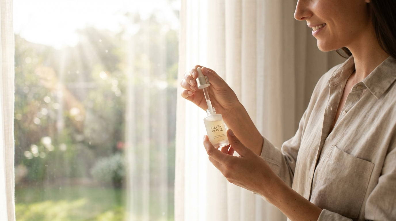
What you see: the subject sits on the right third. The left side breathes - empty light. The eye enters from the left and lands on the product, reading left-to-right the way eyes naturally move. That travel is the whole point: it gives the 0.3-Second Read a path to follow.
2. Foreground / Background Separation (Depth = Immersion)
Put something in the foreground and you create depth - the ad stops feeling like a flat catalog image and starts feeling like a scene you're inside. Even a blurred coffee cup edge or a leaf in the corner does it.
Use for: aspirational lifestyle, skincare and beauty, food and beverage. Avoid when: you need a clean, distraction-free product shot on white.
foreground bokeh element
shallow depth of field, layered composition
out-of-focus foreground framing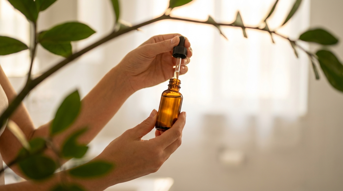
What you see: a blurred leaf edge frames one side. The product is sharp in the middle. The background melts to a soft wash. You feel like you're in the room, not looking at a render. This depends on the shallow depth of field from the focal length - foreground separation and an 85mm lens are the same move from two angles.
3. Unstaged Framing (Imperfection = Trust)
A slight tilt, cropped edges, a bit of motion blur on the periphery - these signal "real moment captured," not "hired photographer." It's the visual equivalent of a typo in a testimonial: the flaw is what makes it feel human.
Use for: UGC hooks, testimonial-style creative, problem/solution ads. Avoid when: you're running a luxury or premium brand where polish equals trust.
candid shot, slightly tilted frame
dynamic angle, handheld feel
motion blur edges, documentary style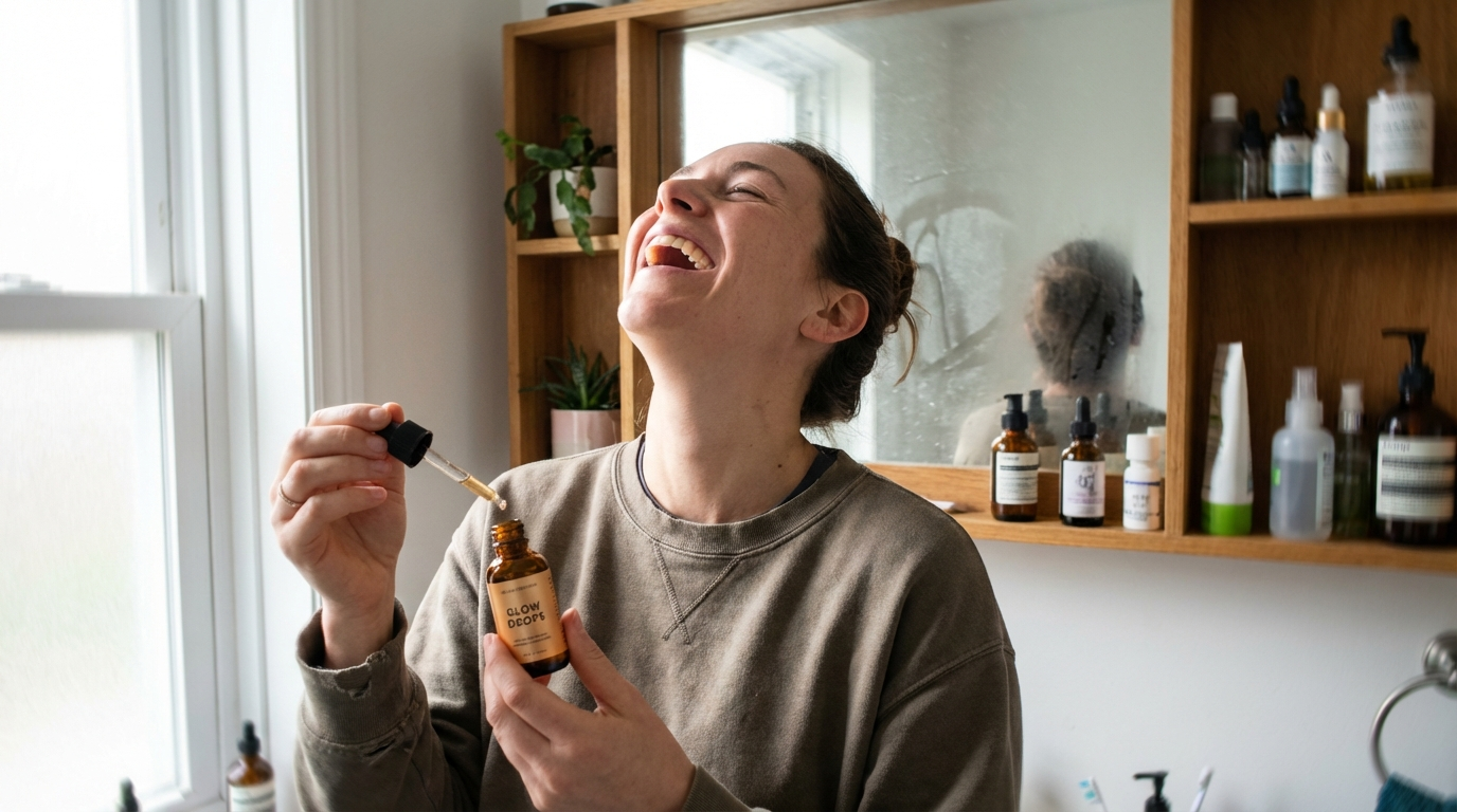
What you see: the frame isn't perfectly level. The shelf behind has a real person's clutter. The subject isn't posing. It reads like a friend filming a recommendation - exactly the energy that stops the scroll on TikTok and Reels. It's the composition-level version of the imperfection signals in realistic AI skin: the same trust-through-flaw principle, applied to the whole frame.
Note
The Full Composition Stack
These three combine into one line, dropped near the end of your prompt:
...rule of thirds composition, subject on the right third with negative space
left, out-of-focus foreground element for depth, slightly candid handheld
framing, natural window light, 35mm lens, unretouched lifestyle photography
Off-center to direct the eye. Foreground to pull it in. A touch of unstaged to hold it. That's the 0.3-Second Read, won on purpose.
Conclusion: Compose for the Thumb, Not the Gallery
Three to lock in:
1. Never dead-center. The passport-photo shot has no eye path. Put the subject on a third and let the empty space direct the read.
2. Add a foreground. One blurred element in the corner turns a flat catalog image into a room the viewer is standing in.
3. Let it be slightly wrong. A tiny tilt and real clutter buy more trust in UGC than any amount of polish. Imperfection is the tell that it's real.
The rule of thumb that anchors it: Off-center = Direction. Depth = Immersion. Imperfection = Trust.
So the move: take a dead-center product shot you're running and regenerate it on the right third with a blurred foreground element. Same product, same light. My bet is the recomposed version holds the scroll a beat longer - and that beat is the entire game.
Steal my ad concept & hook library
Every prompt, archetype, and hook I use in my own accounts. Updated weekly.
Join the free Skool community