


Here's what lived at the end of every prompt I wrote for a year.
8K, ultra HD, hyperrealistic, maximum detail, perfect, sharp.
I stacked every quality word I could think of, hit generate, and got back something that looked like a video-game cutscene. Skin like polished plastic. A background as crisp as the subject. Technically impressive, instantly fake.
Here's the part nobody tells you: those quality words are causing the problem.
More quality terms don't add resolution the way a better camera does. They signal a style category - and stack too many and you signal the wrong one entirely. You ask for a photograph and the model hands you a render.
This is the four-layer system I use to get high fidelity that still reads as shot on a camera. Exact prompt keywords for each layer, the words to delete on sight, and a baseline cheat sheet by shot type.
Let's fix the render look.
What Is the "AI Sharpness" Look?
There's a specific tell that over-specified quality prompts produce. Photographers have a name for it: the AI sharpness look.
Every surface renders at maximum detail at once. Skin has pores, and every pore has sub-pores. Fabric has weave, and every thread has fiber. The background is as sharp as the face.
It's immediately recognizable as generated - because real photographs don't work this way.
Here's the thing a real camera does that a render doesn't:
A real photograph has one zone of maximum sharpness. Everything else falls away from it, in both directions. The eyes are razor-sharp; the ears are already softening; the background is a wash.
Renders are sharp everywhere. That "everywhere" is the fake.
Why More Quality Words Make It Worse
The fix has a name. I call it Controlled Fidelity:
Controlled Fidelity: high resolution isn't sharpness everywhere - it's sharpness in the right place and natural quality everywhere else. You raise fidelity with a few precise terms, then deliberately pull the output back from the render edge, instead of stacking twenty quality words and hoping.
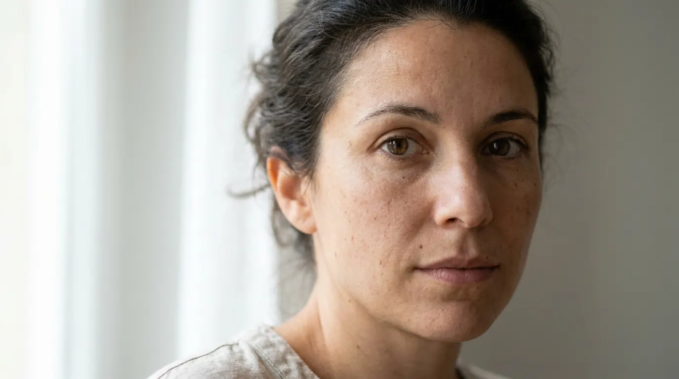
Why does stacking backfire?
Because a term like 8K or hyperrealistic isn't a dial that goes to eleven. It's a label that tells the model which pile of training images to imitate. Pile on ten labels and you drag the output straight into the CGI-and-concept-art pile - which is exactly where those words live online.
The photographers whose work actually looks real used fewer words, not more.
So the whole game is four layers, each doing one job. Get all four and stop.
The 4 Quality Layers
Resolution intent, focus control, surface detail, finish control. In that order.
Layer 1: Resolution Intent
The foundational signal that you want a high-fidelity image. It raises the general detail ceiling of the whole frame.
Pick one. Never stack more than two from this category - that's where the render look starts.
- Use
- setting the baseline quality level before you describe any specific detail
- Avoid
- stacking three or more resolution words. Each extra one pushes the output further into the CGI pile.
high resolution photography
8K photorealism
full-frame camera quality
medium format quality
professional camera output
What you see: noticeably more detail than a prompt with no resolution signal - specific marble veining, internal refraction in the glass, crisp label edges. The ceiling is raised. Nothing's overcooked yet.
Layer 2: Focus Control
This is the most important layer, because it's the single thing that separates a photograph from a render.
Photographs are sharp in one zone. Renders are sharp everywhere. Layer 2 tells the model where the sharpness lives - and, just as important, where it doesn't.
- Use
- directing sharpness toward the subject and letting everything else fall off
- Avoid
- naming two competing sharp zones. One named focus point per prompt, or you're back to sharp-everywhere.
razor-sharp focus on eyes
sharp focus on subject, soft background
crisp edge detail on product label
selective focus, natural background falloff
lens sharpness concentrated on subject
What you see: the eyes and the skin around them at maximum sharpness. Hair at the frame edges softer. Background a soft wash. The sharpness has a location - and that location is the strongest signal that this is a photo, not a render.
Layer 3: Surface Detail
The micro-level detail of specific surfaces - skin, fabric, product, environment.
The key word is specific. You name the surfaces that need detail instead of asking for detail on everything at once. Asking for everything is how you got the AI sharpness look in the first place.
- Use
- close-ups where surface fidelity is the product proof - skin texture, product material, fabric weave
- Avoid
- blanket terms like
micro-detail everywhere. Name the surfaces, not the whole frame.
true-to-life textures
micro skin detail, visible pores
fabric weave visible at close range
glass refraction detail
marble veining specific and natural
What you see: each surface obeys its own material logic - glass refracts like glass, marble has irregular stone veining, the label has the faint texture of printed paper. Detail that's material-specific, not uniformly cranked. That's the difference between true-to-life texture and just making everything shinier.
Layer 4: Finish Control
The layer everyone skips. Also the layer that prevents over-processing - so, the one that saves your ad.
Finish control pulls the output back from the render edge that Layers 1–3 push it toward. It's the counterweight.
- Use
- dragging the image out of "too perfect" and into "photographed"
- Avoid
- skipping it. Without Layer 4 the first three layers always drift back toward render.
clean but not overly polished
natural finish, not retouched
photographed quality, not rendered
natural imperfections preserved
slight natural variation in all surfaces
What you see: high detail, natural finish. Skin has pores, but the pores aren't individually hyper-rendered. Surfaces have texture that doesn't overwhelm the image. Layer 4 landed it in photographic territory.
The Words That Wreck It
Some quality terms reliably produce render-adjacent output. Delete them from any prompt where photographic realism is the goal.
| Term | What it actually does |
|---|---|
| hyperrealistic | Signals a polished render, not a photograph |
| perfect / flawless | Removes the natural imperfection that reads as real |
| maximum detail | Applies sharpness uniformly - the render look |
| 4K / 8K ultra HD (stacked) | Signal noise, over-sharpened output |
| highly detailed (alone) | Drags toward the concept-art category |
| crystal clear | Strips the natural softness of real photography |
| AI enhanced | Signals digital processing - the opposite of photographic |
| super resolution | Over-sharpens every surface at once |
| photorealistic render | The word render cancels the word photorealistic |
hyperrealistic
What it actually does
Signals a polished render, not a photographperfect / flawless
What it actually does
Removes the natural imperfection that reads as realmaximum detail
What it actually does
Applies sharpness uniformly - the render look4K / 8K ultra HD (stacked)
What it actually does
Signal noise, over-sharpened outputhighly detailed (alone)
What it actually does
Drags toward the concept-art categorycrystal clear
What it actually does
Strips the natural softness of real photographyAI enhanced
What it actually does
Signals digital processing - the opposite of photographicsuper resolution
What it actually does
Over-sharpens every surface at oncephotorealistic render
What it actually does
The word render cancels the word photorealistic
That last one is my favorite. People paste photorealistic render thinking they're doubling down on realism. They're handing the model a contradiction and letting it pick - and it picks render every time.
The Baseline by Shot Type
Different shots need different configurations. Here's the starting baseline I use, ready to adapt:
| Shot type | Baseline stack |
|---|---|
| Close-up skin / face | high resolution photography, razor-sharp focus on eyes, micro skin detail, true-to-life textures, clean but not overly polished |
| Product macro | 8K photorealism, sharp focus on label and surface, material-accurate rendering, clean but not overly polished, not a 3D render |
| Full-body lifestyle | high resolution photography, sharp focus on subject, natural background falloff, true-to-life textures on clothing and skin, real-world finish |
| Environmental / interior | high resolution photography, sharp focus on primary surface, natural detail falloff in background, editorial quality, photographed not rendered |
| Food & beverage | 8K photorealism, sharp focus on food surface and texture, micro-detail on primary surface, natural finish, clean but not overly polished |
Close-up skin / face
Baseline stack
high resolution photography, razor-sharp focus on eyes, micro skin detail, true-to-life textures, clean but not overly polishedProduct macro
Baseline stack
8K photorealism, sharp focus on label and surface, material-accurate rendering, clean but not overly polished, not a 3D renderFull-body lifestyle
Baseline stack
high resolution photography, sharp focus on subject, natural background falloff, true-to-life textures on clothing and skin, real-world finishEnvironmental / interior
Baseline stack
high resolution photography, sharp focus on primary surface, natural detail falloff in background, editorial quality, photographed not renderedFood & beverage
Baseline stack
8K photorealism, sharp focus on food surface and texture, micro-detail on primary surface, natural finish, clean but not overly polished
Screenshot that one. It's the whole lesson compressed.
Stacking It: The Full Baseline Prompt
Here's all four layers in a single controlled prompt, negatives included to hold the finish:
Ultra-realistic beauty photography of a woman in her early 30s, high
resolution photography, razor-sharp focus on eyes and upper cheekbones,
micro skin detail with visible pores and natural skin tone variation,
true-to-life textures on skin and hair, fabric weave visible on clothing
at close range, clean but not overly polished, natural finish not
retouched, natural imperfections preserved, slight natural variation
across all surfaces, soft morning window light from the left, 85mm lens,
shallow depth of field, no hyperrealistic, no perfect skin, no
over-smoothed surfaces, no 3D render
Read the order. Resolution intent → named focus point → specific surface detail → finish control → negatives. Four layers, each once. The negatives at the end fence off the over-processing the earlier terms could otherwise trigger.
Maximum fidelity in the right places. Natural quality everywhere else.
Pro Tip
ultra-realistic speaks a different dialect than candid photograph. If your baseline is dialed and the image still feels wrong, the mismatch is upstream, in the realism trigger. That's covered in the photorealism triggers guide.Note
Conclusion: Sharp in One Place, Natural Everywhere Else
Four things to take to your next batch:
1. More quality words make it worse. They're style labels, not a resolution dial. Ten of them signals "render," not "photograph."
2. Focus control is the whole ballgame. One named sharp zone, everything else falling off, is the single strongest photo signal you can send.
3. Never skip Layer 4. Finish control is the counterweight that pulls the image back from the render edge. It's the layer everyone forgets and the one that saves the ad.
4. Delete the wrecking words. hyperrealistic, perfect, flawless, maximum detail, stacked 8K - gone.
So here's the test: open your last AI ad's prompt and count the quality words. If it's more than four, you've found why it looks fake.
Cut it to four layers and run it again.
Steal my ad concept & hook library
Every prompt, archetype, and hook I use in my own accounts. Updated weekly.
Join the free Skool community