


For a long time I prompted light obsessively and never once thought about shadow.
And my images had this floaty, pasted-on quality I couldn't fix - subjects that looked cut out and dropped onto the background, products that seemed to hover a millimeter above the table. I kept adding more light to fix it. It never worked.
The fix was the opposite. I had to prompt the dark.
Shadow is the other half of every image, and AI only renders the light half by default - soft, non-committal grey shadows that commit to nothing and ground nothing. Once you prompt shadow with intent - where it falls, how hard, how dark, what color - your images stop looking like renders and start looking lit by a real source in the real world.
These are the eight shadow moves I use to ground an ad, grouped by the job they do, with the exact keywords.
Let's prompt the dark.
Why Shadow Is the Other Half of Every Ad
Light gets all the attention. Shadow does half the work and gets none.
The Other Half: Shadow is the deliberately-designed other half of every image - not a byproduct of light, but a separate tool with its own decisions. AI renders the light half and defaults the dark half to a soft grey mush, which is exactly why its subjects float, glow, and read as fake. Prompt the shadow with the same intent as the light and the image grounds.
This is the piece that closes the lighting system: outdoor light sets emotion, indoor light sets place, studio light sets status - and shadow makes all three physically real.
The 8 Shadow Moves at a Glance
| Move | What it does | Use for |
|---|---|---|
| Realistic cast shadow | Grounds subject in space | product & lifestyle |
| Contact shadow | Stops the “floating” look | any product on a surface |
| Deep / low-key | Drama, luxury, seriousness | premium, fragrance, men's |
| Soft falloff | Gentle, approachable | beauty, skincare, morning |
| Hard edge | Graphic, editorial | fashion, high-contrast |
| Patterned / shaped | Distinctive, decorative | editorial, luxury identity |
| No-glow fix | Kills the sticker halo | any dark-background shot |
| Color in shadow | Physical accuracy | outdoor, mixed-light interiors |
Realistic cast shadow
What it does
Grounds subject in spaceUse for
product & lifestyleContact shadow
What it does
Stops the “floating” lookUse for
any product on a surfaceDeep / low-key
What it does
Drama, luxury, seriousnessUse for
premium, fragrance, men'sSoft falloff
What it does
Gentle, approachableUse for
beauty, skincare, morningHard edge
What it does
Graphic, editorialUse for
fashion, high-contrastPatterned / shaped
What it does
Distinctive, decorativeUse for
editorial, luxury identityNo-glow fix
What it does
Kills the sticker haloUse for
any dark-background shotColor in shadow
What it does
Physical accuracyUse for
outdoor, mixed-light interiors
Shadows That Ground
The two that fix the float.
1. Realistic Cast Shadows
When an object casts a shadow onto a surface, it follows rules - the size and softness depend on how far the subject is from the surface and how large the light source is. AI frequently gets this wrong, casting shadows that don't match the light the rest of the image implies. A correct cast shadow is one of the fastest ways to make an image feel physically grounded.
Use for: any product resting on a surface, lifestyle shots where a body casts a shadow on floor or wall, any creative where physical credibility matters. Avoid when: the creative is intentionally graphic or abstract, where a realistic shadow would clash.
realistic cast shadow on surface below
hard cast shadow matching light direction
cast shadow angle matching key light position
ground shadow, physically accurate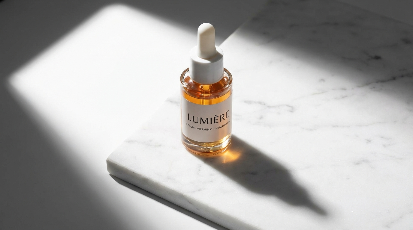
What you see: the shadow starts sharp and dark at the base and softens as it extends away. The angle matches the light - key from upper left, shadow falling lower right. It confirms the object is resting in real space.
2. Contact Shadows (Stop the Float)
The very dark, sharp shadow directly where an object touches a surface - the thin dark line under a bottle, the deep shadow where a hand meets a table. Without it, objects float. With it, gravity is confirmed.
Use for: any product on a surface, hand-holding shots, any creative where grounding matters. Avoid when: the composition intentionally floats the product as a graphic choice.
contact shadow where object meets surface
sharp dark shadow at base of product
deep contact shadow under bottle base
thin dark line where hand meets table
What you see: the darkest point in the whole image is the thin line where the base meets the surface. A tiny detail - but without it the object hovers; with it, you almost feel the weight pressing down. This is the positive-prompt cure for the floating-product problem you'd otherwise fence off with negative prompting.
Shadows That Shape
The four that set mood and design.
3. Deep Shadows & Low-Key Contrast
Shadows that get genuinely dark - not lifted, not filled, but near-black. The darkest zone approaches true black and the contrast runs high. The language of drama, luxury, and seriousness.
Use for: luxury and premium positioning, men's grooming, fragrance, evening lifestyle, any serious register. Avoid when: the product must be fully visible, or the creative is warm and approachable.
deep shadows, near black dark areas
high contrast, bright highlights and crushed dark shadows
shadow areas approaching true black
low-key deep shadows, inky recession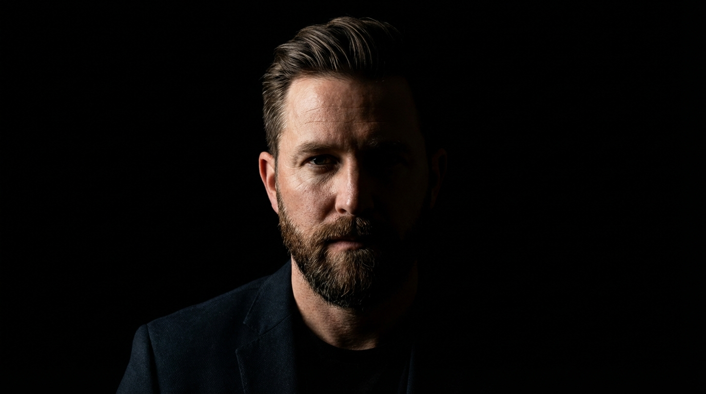
What you see: the shadow side is genuinely dark - not grey, crushed black. The transition from lit to shadow is quick and definite. This is the shadow half of the low-key setup in studio lighting.
4. Soft Shadow Falloff
The gradual fade from lit to shadow with no hard edge. It comes from large, close light sources - the softness itself tells the viewer the source was big and near. This gradient is what makes light feel organic and approachable.
Use for: beauty and skincare, morning-routine content, any subject that needs to feel approachable. Avoid when: the creative needs a sharp graphic edge.
soft shadow falloff, gradual transition
slow shadow gradient, large light source
gentle shadow edge, no hard lines
smooth transition from light to shadow
What you see: you can't find the exact line where light stops and shadow begins - there isn't one. The face fades bright-to-dark in a smooth continuous gradient. Present but never harsh.
5. Hard Shadow Edges
The opposite - a shadow with a sharp, clean edge, from small or distant sources: direct sun, a bare bulb. Graphic, architectural, high-contrast. The shadow becomes a design element.
Use for: editorial beauty, graphic product photography, high-fashion, summer outdoor, any shot where the shadow is part of the design. Avoid when: the creative needs softness or approachability.
hard shadow edge, sharp defined line
crisp shadow border, small light source
architectural shadow lines, sharp light
hard directional light, clean shadow geometry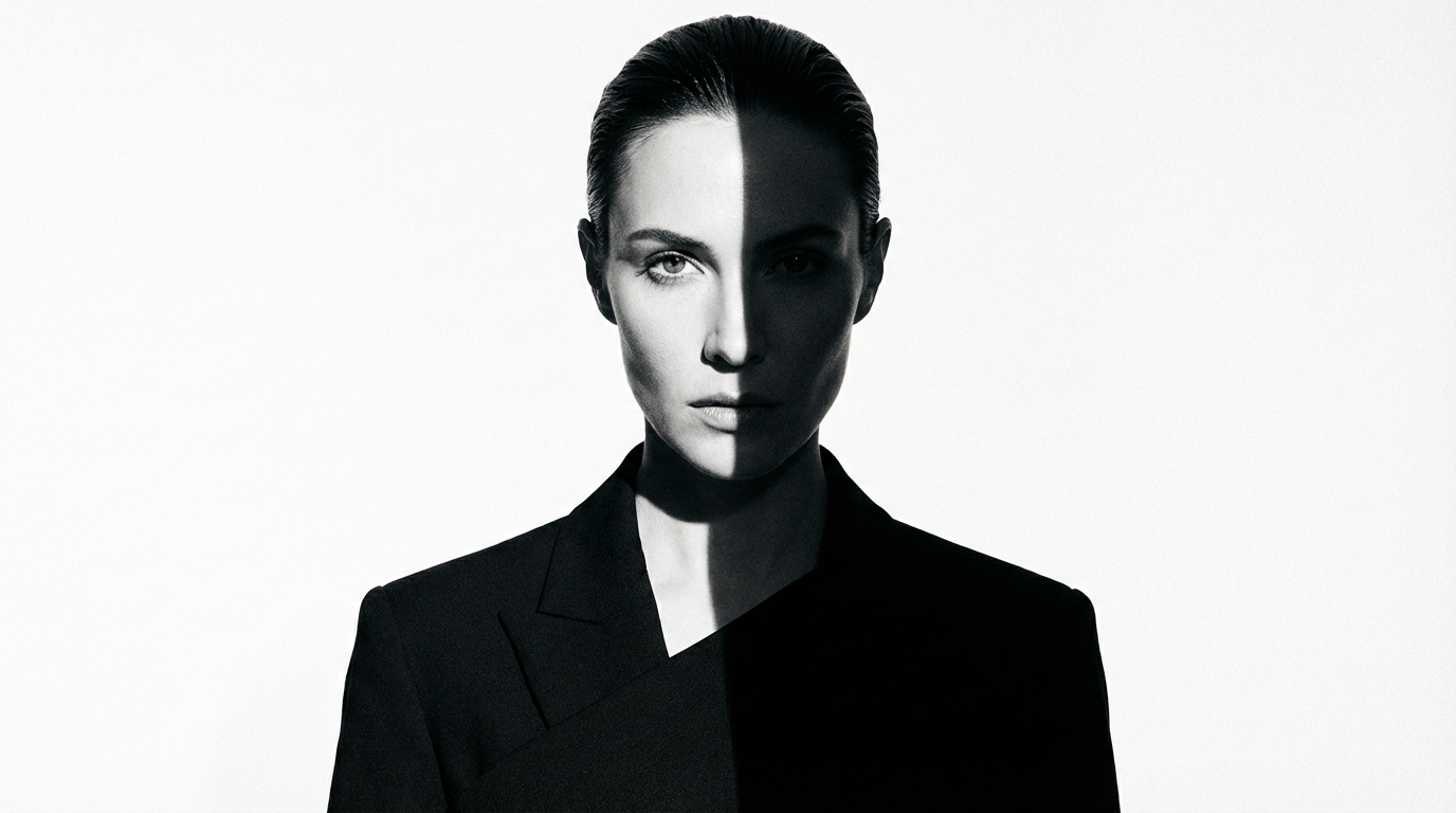
What you see: the line where light meets dark is clean enough to trace with a ruler. One half bright, one half dark, the border a graphic element. The shadow doesn't just describe the face - it divides it.
6. Patterned & Shaped Shadows
Shadows cast through something - window blinds, a plant, a cutout - throwing a pattern of light and dark across the subject. The shadow becomes texture and the light becomes design. One of the most distinctive editorial techniques there is.
Use for: luxury and premium aesthetics, editorial lifestyle, fashion-forward beauty with a strong identity. Avoid when: the pattern would obscure important product or face detail.
shadow pattern from window blinds on face
plant shadow pattern cast across subject
geometric shadow, shape through cutout
striped shadow from venetian blind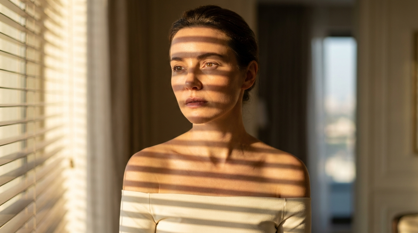
What you see: bands of light and shadow alternate across the face - a pattern the light source drew. The shadow is doing design work, not just describing form.
Shadows That Fix the AI Tells
The two that kill the dead giveaways.
7. Avoiding the Glow Effect
AI has a specific failure: on a dark background, it adds an unnatural ambient glow around the subject - a soft halo with no physical source. It makes the subject look like a sticker pasted onto the background. Prompting the glow out is one of the fastest realism fixes there is.
Use for: any low-key or dark-background creative where the subject needs to sit in real darkness. Avoid when: you genuinely want a glowing light source in frame - then describe where it comes from.
no ambient glow, hard light source only
subject lit by single source, no fill
dark background with no halo effect
no rim glow, only directional light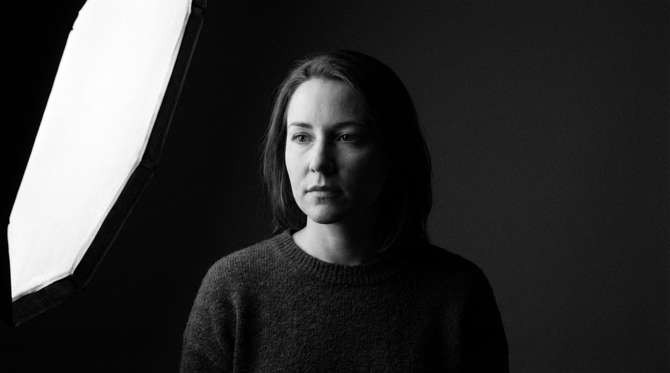
What you see: the shadow side simply becomes dark - it doesn't glow, and the subject doesn't peel off the background with a fake outline. Pair this with no ambient glow, no halo in your negative prompt list - the positive and negative work together.
8. Color in Shadows
Shadows are rarely neutral grey or black. They pick up the ambient environment - a blue sky makes outdoor shadows cool, a warm interior makes them amber, a forest makes them greenish. Prompting shadow color adds physical accuracy that instantly lifts realism.
Use for: outdoor lifestyle, mixed-light interiors, any creative where color accuracy matters and shadows are deep enough to see. Avoid when: the shot is high-key or the shadows are too shallow to carry color.
cool blue shadows, outdoor ambient
warm amber shadows, interior light
green ambient shadows, forest environment
shadow color complementary to key light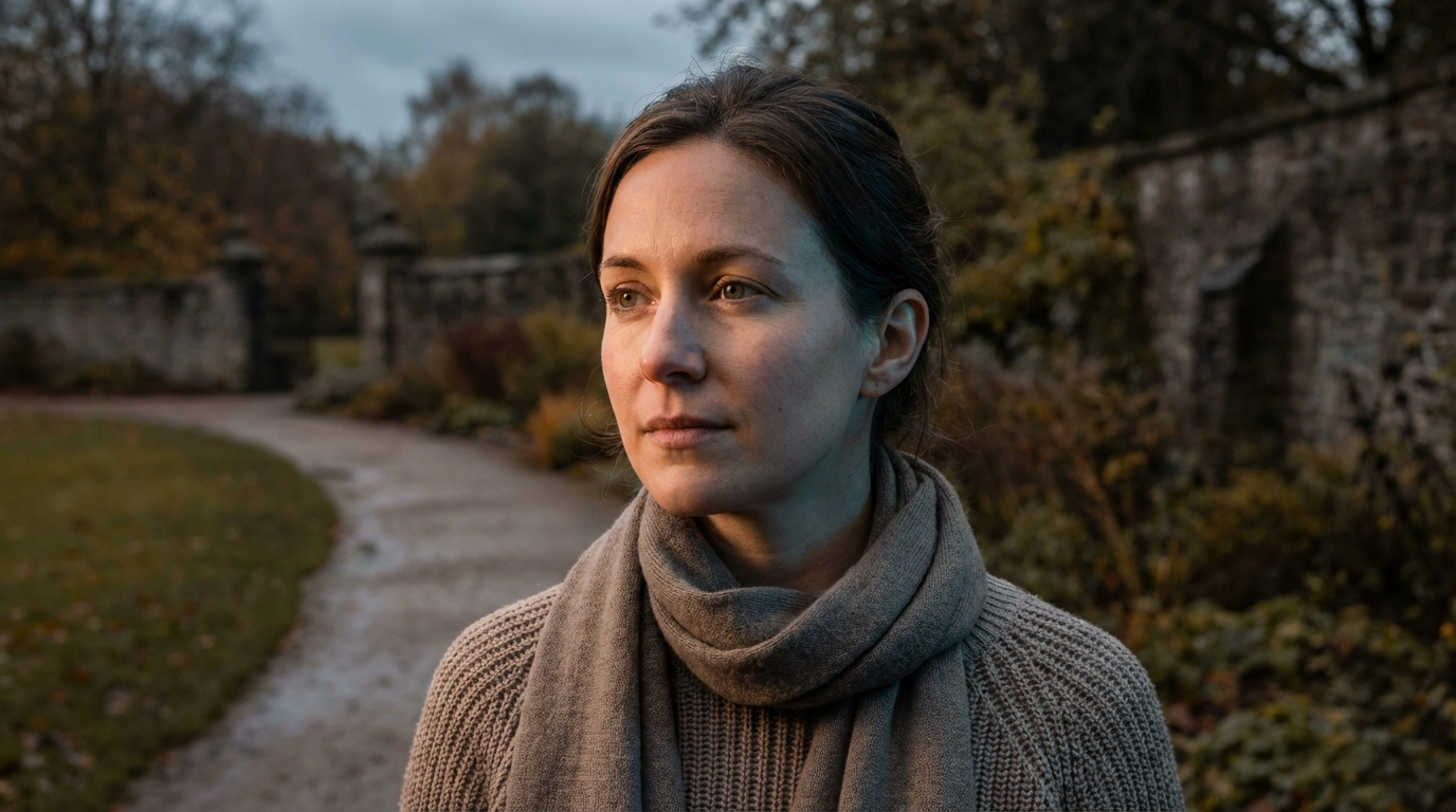
What you see: the lit side is warm daylight skin; the shadow side carries a faint cool-blue - the open sky reflecting into the dark. Two tones make it read physically accurate instead of flat. The shadow has color - the same environmental logic as natural lighting.
The Full Shadow Stack
Shadow is part of the Light slot in the prompt structure - every light term should have a matching shadow term:
Premium low-key editorial portrait of a woman in her early 30s, single hard
key light from upper right creating a sharp shadow that divides the face,
deep near-black shadow on the left, no ambient glow, cool blue shadow color,
sharp contact shadow beneath the product, 85mm lens, photorealistic editorial
photography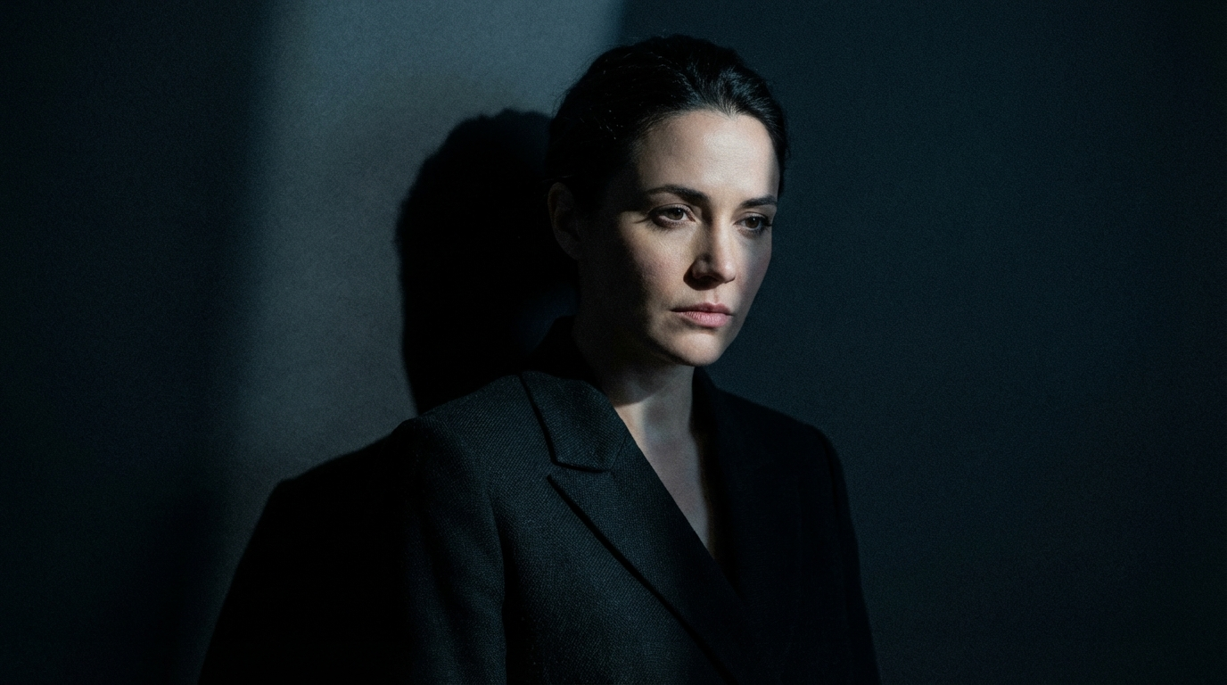
Hard edges, deep low-key contrast, a killed glow, a shadow color, and a contact shadow - every shadow in the frame with a reason to be exactly where it is.
Note
Conclusion: Prompt the Dark, Not Just the Light
Four to lock in:
1. Shadow is the other half - design it. AI defaults the dark to grey mush. Every light term deserves a matching shadow term.
2. Contact shadow stops the float. The single fastest fix for products that hover. One thin dark line and gravity returns.
3. Kill the glow. The ambient halo on dark backgrounds is the sticker tell. Prompt it out, positively and negatively.
4. Shadows have color. Cool outside, warm inside. Neutral-grey shadows are an AI signature - real shadows carry the room.
The rule of thumb that closes the module: think about where the darkness falls with the same intent as where the light lands. Control the shadow, and the light takes care of itself.
So the move: take a dark-background shot that looks pasted-on and regenerate it with sharp contact shadow, no ambient glow, deep near-black shadow. Same subject. My bet is it stops floating and finally sits in the frame - because you prompted the half of the image AI forgot.
Steal my ad concept & hook library
Every prompt, archetype, and hook I use in my own accounts. Updated weekly.
Join the free Skool community