


Color is the first thing that reaches the viewer, and for a long time I ignored it completely.
I'd get the subject, the light, and the scene right - then let the model output whatever default color it landed on. The images came out looking correct but emotionally flat. They said nothing before the eye reached the product.
Then it clicked: color is the fastest emotional lever in the whole image. Before anyone reads a single object in the frame, the palette has already told them how to feel. Warm says intimacy and nostalgia. Cool says clean and clinical. Muted says premium restraint. Saturated says energy and youth. The grade is the mood, applied to the whole frame at once.
And each palette is a specific, repeatable choice - not a vibe you hope the model finds.
These are the nine color grades I prompt to set the emotional temperature of an ad, with the exact keywords for each.
Let's grade for the feeling.
Why the Grade Is the Mood
A default AI color output is accurate but emotionally neutral - it shows the scene without deciding how the viewer should feel about it. That neutrality reads as flat.
The Palette Promise: The color grade sets the emotional temperature of an ad before the eye reads a single object. Every palette carries a fixed mood the viewer feels instantly - warm for intimacy, cool for clinical trust, muted for premium restraint, saturated for youthful energy. You're not correcting color; you're choosing a feeling and applying it to the whole frame at once.
It's the finishing-layer partner to the Grain Signature - grain sets the texture of the capture, color sets its emotion - and it takes its cues from the light you already chose in natural lighting.
The 9 Color Grades
At a glance:
| Grade | The mood it sets | Use for |
|---|---|---|
| Muted & desaturated | Premium restraint, calm | luxury, minimal, editorial |
| Earthy & warm natural | Organic, honest, grounded | natural beauty, wellness, food |
| Cool & neutral | Clean, clinical, modern | skincare, tech, medical |
| High-contrast punchy | Energy, bold, graphic | sport, Gen Z, high-impact |
| Low-contrast flat | Cinematic, soft, film | premium lifestyle, emotional |
| Warm golden | Nostalgia, intimacy, glow | lifestyle, food, comfort |
| Cool cinematic (teal-orange) | Dramatic, filmic, modern | tech, premium, film-still |
| Neon saturated | Nightlife, youth, bold | Gen Z, nightlife, editorial |
| Faded vintage | Analog nostalgia, retro | heritage, vintage, character |
Muted & desaturated
The mood it sets
Premium restraint, calmUse for
luxury, minimal, editorialEarthy & warm natural
The mood it sets
Organic, honest, groundedUse for
natural beauty, wellness, foodCool & neutral
The mood it sets
Clean, clinical, modernUse for
skincare, tech, medicalHigh-contrast punchy
The mood it sets
Energy, bold, graphicUse for
sport, Gen Z, high-impactLow-contrast flat
The mood it sets
Cinematic, soft, filmUse for
premium lifestyle, emotionalWarm golden
The mood it sets
Nostalgia, intimacy, glowUse for
lifestyle, food, comfortCool cinematic (teal-orange)
The mood it sets
Dramatic, filmic, modernUse for
tech, premium, film-stillNeon saturated
The mood it sets
Nightlife, youth, boldUse for
Gen Z, nightlife, editorialFaded vintage
The mood it sets
Analog nostalgia, retroUse for
heritage, vintage, character
Now the detail.
1. Muted & Desaturated Palette
Colors pulled back from full saturation - every color present but quieter, nothing shouting. Grey woven through the whole palette so nothing is fully vivid. This is the palette of premium restraint: expensive, controlled, adult. It's the grade luxury brands reach for because loudness reads as cheap.
- Use
- Luxury and premium positioning, minimal and editorial aesthetics, sophisticated adult brands, and any creative where restraint signals quality.
- Avoid
- The creative needs energy or youthful appeal - desaturation reads calm and premium, which can feel lifeless in a high-energy context.
muted color palette, desaturated tones
low saturation, restrained color grade
soft muted tones, premium desaturated look
quiet color palette, grey-influenced
desaturated editorial grade, calm and controlled
What you see: every color is present but softened - the greens are grey-green, the warm tones are muted, nothing is fully vivid. The image has a quiet, controlled, expensive quality. This is the grade that says premium without saying anything loud.
2. Earthy & Warm Natural Palette
Colors drawn from the natural world - terracotta, ochre, warm brown, olive green, sienna, deep rust. Warmth and groundedness without being tropical or golden. It's the palette of the organic, communicating an honest, unfiltered relationship to nature.
- Use
- Natural and organic beauty, artisan food and beverage, wellness brands, sustainable lifestyle, and any brand whose values are natural and honest.
- Avoid
- The creative needs cool cleanliness or high-tech precision - earthy warmth is the opposite of clinical and can feel dated in a sleek context.
earthy color palette, terracotta and ochre
warm natural tones, olive and brown
warm earth palette, organic natural color
muted earth tones, sienna and rust
natural warm palette, grounded and honest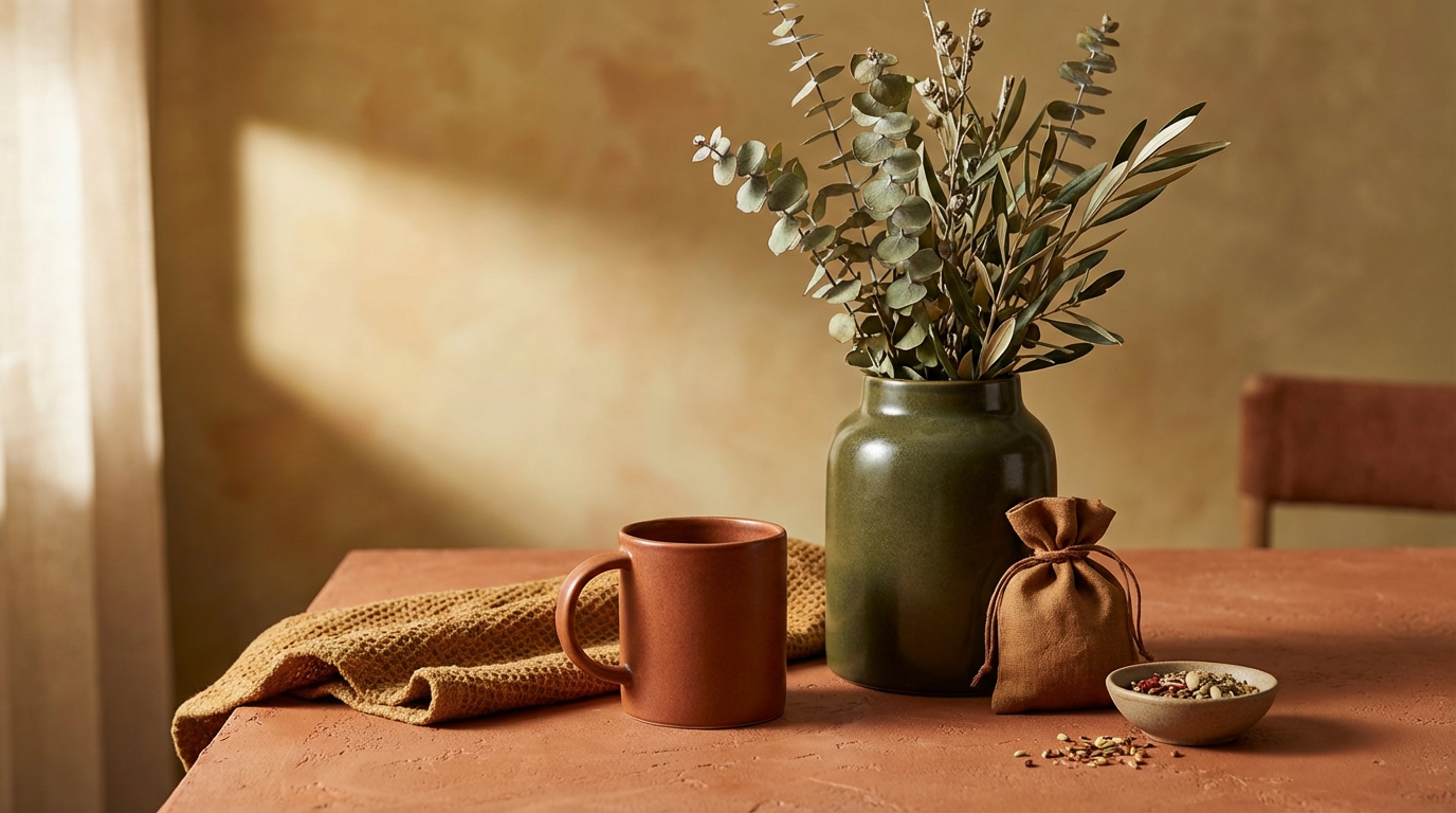
What you see: the color story is terracotta, olive, warm brown - the palette of the natural world, with no cool anywhere in the frame. The image feels grounded and honest. This is the grade for a brand built around the natural and the real.
3. Cool & Neutral Palette
Colors toward the blue and grey end of the spectrum - cool white, slate, ice-blue, soft grey, pale beige. Clean, clinical, considered. It signals precision, modernity, and control: the language of Scandinavian and Japanese minimalism, of tech, of dermatology, of anything that wants to communicate clarity and purity.
- Use
- Clinical skincare, tech and appliance brands, medical-adjacent products, and premium minimalist positioning.
- Avoid
- The brand is warm, organic, or approachable - cool neutrality is a mismatch for cosiness and comfort.
cool color palette, blue and grey tones
clean neutral palette, cool and clinical
soft cool tones, minimalist Scandinavian
cool grey palette, precise and modern
pale neutral palette, clinical clean grade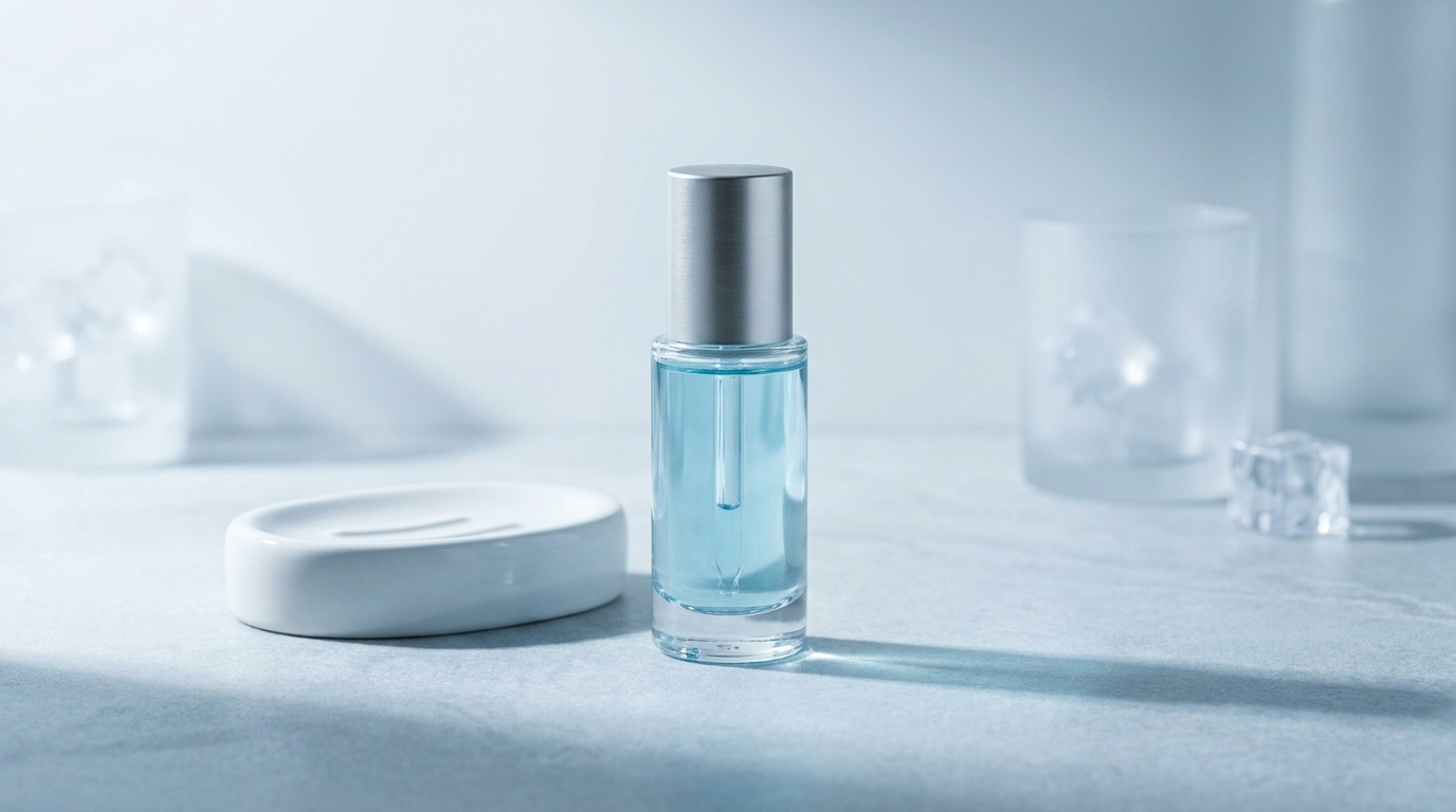
What you see: cool white and pale blue-grey across the frame, with cool-toned shadows and a white that reads cool rather than warm. The overall palette is clean, precise, and considered - the grade for a brand that wants to feel clinical and modern.
4. High-Contrast Punchy Grade
A tonal range stretched to its maximum - the brightest areas very bright, the darkest very dark, with little in between. High-contrast images are graphic and immediate. They demand attention because they reduce the frame to its essential elements.
- Use
- Sport and fitness, energy and high-impact brands, Gen Z creative, and bold graphic statements where immediate visual impact matters.
- Avoid
- The creative needs subtlety or a broad tonal range - high contrast strips tonal information and can feel aggressive in a soft context.
high contrast, punchy tonal range
deep shadows and bright highlights
strong contrast grade, graphic and bold
punchy contrast, saturated and immediate
graphic high contrast, strong tonal separation
What you see: highlights very bright, shadows very dark, and a hard punch between them with very little gradual transition. The image is reduced to bright shapes against dark. This is the grade for energy, sport, and immediate impact.
5. Low-Contrast Flat (Cinematic Film) Grade
A tonal range compressed toward the middle - highlights pulled down, the deepest blacks lifted to a soft grey. This is the look of film: controlled, deliberate, soft-shadowed, and read instantly as considered and expensive.
- Use
- Cinematic lifestyle content, editorial photography, introspective emotional register, and premium brands referencing the language of cinema.
- Avoid
- The creative needs punch and immediacy - a flat grade reads slow and can feel muddy without careful handling.
low contrast, cinematic flat grade
lifted shadows, soft blacks
film emulation grade, compressed tonal range
cinematic color grade, soft and filmic
faded blacks, low contrast film look
What you see: the darkest part of the image isn't black - it's a dark grey with detail still visible. The highlights are controlled rather than blown. The compressed range reads filmic and expensive, and it pairs directly with cinematic film grain.
6. Warm Golden Palette
A grade that pushes everything toward warmth - skin amber, shadows orange-brown, highlights gold, whites slightly warm. The color of golden hour, of nostalgia, of intimacy. It's the warmest and most emotional grade there is.
- Use
- Lifestyle content, food and beverage, comfort and wellness, and nostalgic or memory-driven messaging.
- Avoid
- The product needs color accuracy or a clinical register - a warm grade shifts every color toward amber and removes cool information.
warm golden color grade
amber and gold tones, warm shadows
golden hour color grade throughout
warm skin tones, amber shadows
warm nostalgic grade, gold and warmth
warm color grade, cozy and intimate
What you see: every color pushed toward warmth - amber skin, orange-brown shadows, the whole scene glowing. This is the color of memory and intimacy.
7. Cool Cinematic Grade (Teal & Orange)
Shadows pushed toward teal and blue while the highlights stay warm - the classic complementary grade of contemporary cinema. It's everywhere in film because it separates warm skin from a cool background and gives the image a produced quality.
- Use
- Cinematic lifestyle content, premium campaigns with a filmic aesthetic, and tech or modern brands chasing the high-production-value look.
- Avoid
- The creative needs natural color or a warm approachable register - teal-and-orange is a strong, recognizable move that can feel over-produced.
teal and orange color grade
cool teal shadows, warm skin tones
cinematic complementary grade
teal blue shadows, orange highlights
Hollywood color grade, teal and orange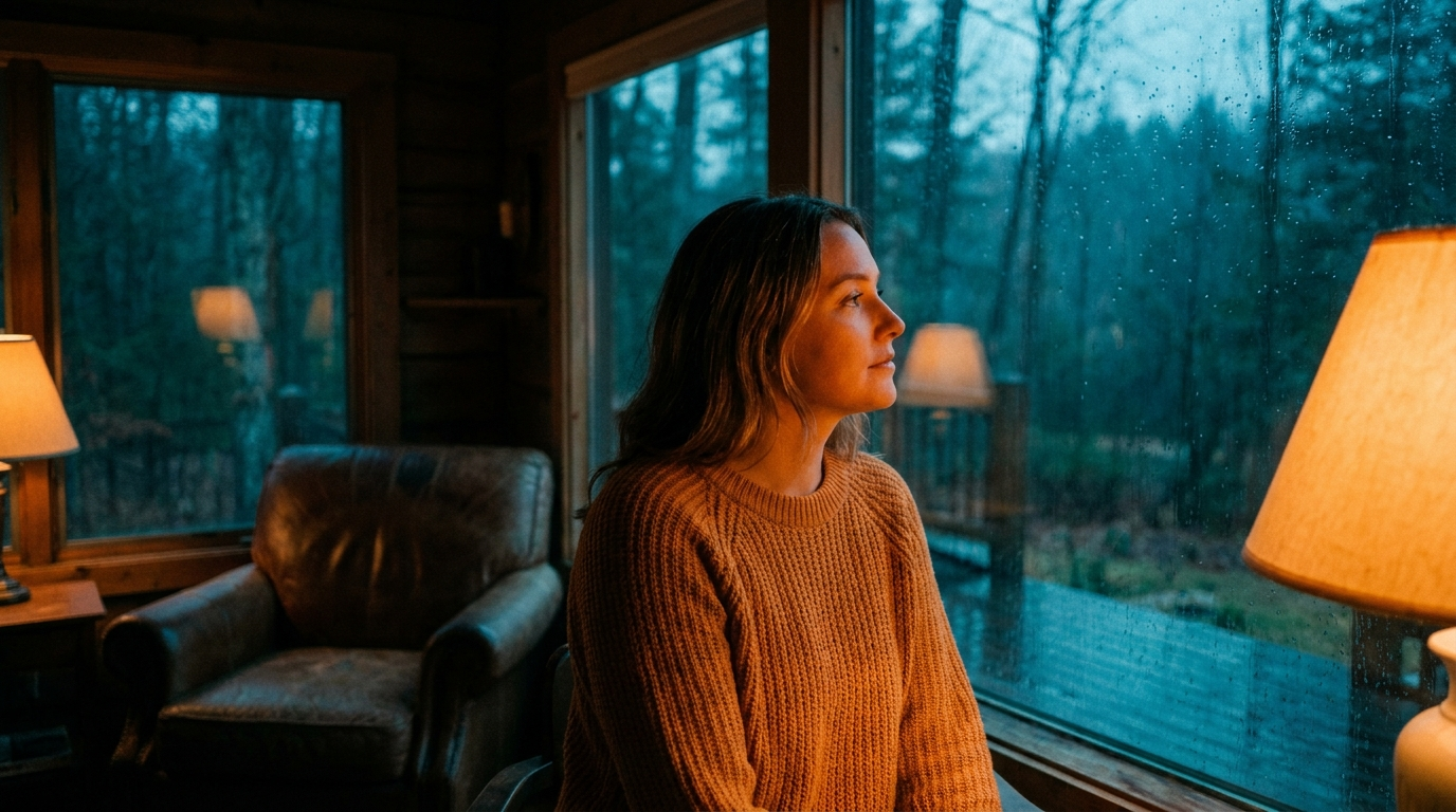
What you see: the shadows have gone teal-blue while the skin tones kept their warmth. That separation is what gives the frame its produced, high-production-value cinematic feel.
8. Neon & Saturated Palette
Colors pushed to maximum saturation and beyond - vivid pinks, electric blues, neon greens, deep purples. This palette isn't representing the natural world; it's an aesthetic statement of energy and youth. Nightlife, digital-native, bold and current.
- Use
- Youth-oriented brands, nightlife-adjacent products, bold-identity beauty, streetwear and fashion with a strong visual signature.
- Avoid
- The creative needs natural accuracy or premium restraint - neon saturation is loud and specifically youthful, the opposite of quiet luxury.
neon color palette, electric saturation
vivid pink and blue neon tones
saturated glow, bold and youthful
hyper-saturated palette, high energy
neon nightlife grade, electric and vivid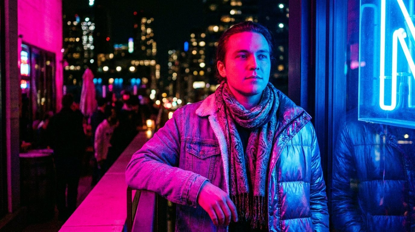
What you see: colors beyond natural - vivid, electric, glowing. Hot neon pink, electric blue. The palette isn't representing the world, it's making an energetic statement. The grade for youth, nightlife, and bold.
9. Faded Vintage Grade
The color story of a print that has aged - hues shifted from their original values over decades. Blues faded toward green-cyan, reds receded, contrast lost, the whole palette drifted warm and soft. The color of old photographs, and a signal of nostalgia and analog authenticity.
- Use
- Heritage and vintage positioning, nostalgic or memory-driven creative, and brands referencing a specific past era.
- Avoid
- The creative needs contemporary accuracy or clean modern color - faded vintage is specifically the look of age.
faded vintage color grade
aged print color, faded and warm
vintage color shift, cyan-faded blues
low contrast faded palette, nostalgic
faded film grade, aged and warm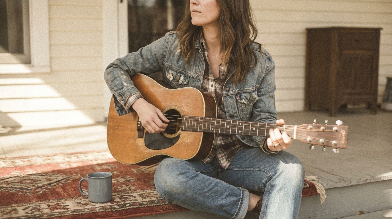
What you see: colors faded from their originals - blues shifted toward cyan-green, reds receded, contrast low, the whole palette drifted warm and soft. The grade of an old photograph, of memory.
The Special Case: Black & White
The complete removal of color information - an image reduced to its tonal relationships. Black and white is not a filter; it's a decision about what to remove and what to emphasize. It forces the viewer to read tone, form, and texture, and it carries seriousness and timelessness by association.
- Use
- Editorial and artistic creative, heritage and anniversary campaigns, and fashion with a strong visual identity where timelessness is the register.
- Avoid
- The product's color is part of its identity - monochrome removes it entirely.
black and white, monochrome grade
high contrast black and white
tonal black and white, form and texture
timeless monochrome, editorial B&W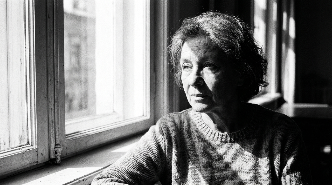
What you see: no color, only the relationship between light and dark. The eye reads form and texture instead of hue, and the frame carries a built-in seriousness. It pairs directly with black-and-white film grain.
The Full Color & Tone Stack
Color is the last decision in the prompt - after the image is built, you grade it:
Cinematic lifestyle portrait of a woman in her early 30s by a window, warm
golden interior light, natural skin texture, graded with a low-contrast
cinematic film look with lifted soft-grey shadows, a warm golden color story
in the highlights, muted desaturation in the mid-tones for a premium
restrained feel, subtle teal in the deepest shadows, 35mm film grain,
photographed film aesthetic, cinematic color grade
A warm golden story, lifted cinematic shadows, muted mid-tones, and a whisper of teal in the deep shadows - a considered grade layered over a fully built image. The result feels a specific emotional temperature instead of a neutral default.
Conclusion: Grade for the Feeling, Not the Accuracy
Four to lock in:
1. Color is the fastest emotional lever. Before the eye reads a single object, the palette has set the mood. Grade for the feeling you want, not the color that's technically accurate.
2. Every palette is a fixed mood. Muted for premium, warm for intimacy, cool for clinical, neon for youth, teal-orange for cinema. Pick by the emotion the brand needs to project.
3. Contrast is a mood too. High contrast reads energy and impact; low contrast reads filmic and calm. The tonal range is as much a decision as the hues.
4. Grade last, and grade with the light. Color is a finishing layer - apply it after the image is built, and let it extend the light you already chose rather than fight it.
The rule of thumb that anchors it: the default color output is accurate and emotionally silent. A graded image has decided how the viewer should feel before they read a thing. Color is the mood - grade for the feeling, not the accuracy.
So the move: take an emotionally flat image and regenerate it three times - once warm golden, once cool clinical, once muted desaturated. Same scene. My bet is they feel like ads for three different brands selling to three different people, because the grade was setting the mood all along.
Related: film grain, studio lighting, and the full AI ad prompt library.
Steal my ad concept & hook library
Every prompt, archetype, and hook I use in my own accounts. Updated weekly.
Join the free Skool community