


The cleanest images I made were the ones that looked the most fake.
That took me a while to accept, because I'd spent so long chasing sharpness and clarity - and the sharper and cleaner they got, the more they read as generated. Something was off and I couldn't name it.
The missing thing was grain.
Every image captured on real film has texture - the tiny physical record of a light-sensitive layer reacting to photons. AI has no grain by default. That perfect digital cleanliness is one of the most reliable "this was generated" signals there is, and adding the right grain is one of the fastest ways to reverse it.
And grain isn't one thing. Subtle 35mm reads different from high-contrast cinematic, from black-and-white, from faded expired stock. Each is a fingerprint of a specific camera and film.
These are the eight grain textures I prompt to make an image look captured instead of computed, with the exact keywords for each.
Let's add the grain.
Why Clean Is the Render Tell
A digital render is optically perfect - zero noise, zero texture, an unbroken smoothness no physical process produces. That smoothness is the tell.
The Grain Signature: Grain isn't noise to remove - it's a fingerprint. Every film stock and format carries a specific grain structure that tells the viewer exactly what captured the image: subtle 35mm, punchy cinematic, silvery black-and-white, faded expired stock. The absence of any grain at all is the single cleanest "digital render" tell there is. Add the right signature and the image reads as film.
It's the finishing-layer partner to the lens fingerprints and the direct cure for the clean-and-sharp problem in why AI ads look fake: the lens leaves optical fingerprints, the film leaves textural ones.
The 8 Grain Signatures
At a glance:
| Signature | The feeling it carries | Use for |
|---|---|---|
| Subtle 35mm | Real, understated, photographic | most lifestyle, general realism |
| Cinematic grain | High-contrast, film-still drama | premium lifestyle, emotional |
| Black & white | Timeless, serious, editorial | heritage, luxury, fashion |
| Kodachrome / vintage | Nostalgic, saturated, analog | retro, heritage, warm nostalgia |
| Expired / degraded | Decayed, imperfect, artful | vintage, artisan, character |
| Lomography / cross-process | Raw, unpredictable, indie | Gen Z, indie, editorial |
| Large format | Ultra-detailed with fine grain | luxury, premium print |
| Digital noise (high ISO) | Low-light, gritty, real | UGC, night, authentic |
Subtle 35mm
The feeling it carries
Real, understated, photographicUse for
most lifestyle, general realismCinematic grain
The feeling it carries
High-contrast, film-still dramaUse for
premium lifestyle, emotionalBlack & white
The feeling it carries
Timeless, serious, editorialUse for
heritage, luxury, fashionKodachrome / vintage
The feeling it carries
Nostalgic, saturated, analogUse for
retro, heritage, warm nostalgiaExpired / degraded
The feeling it carries
Decayed, imperfect, artfulUse for
vintage, artisan, characterLomography / cross-process
The feeling it carries
Raw, unpredictable, indieUse for
Gen Z, indie, editorialLarge format
The feeling it carries
Ultra-detailed with fine grainUse for
luxury, premium printDigital noise (high ISO)
The feeling it carries
Low-light, gritty, realUse for
UGC, night, authentic
Now the detail.
1. Subtle 35mm Film Grain
The fine, barely-there grain of a well-exposed 35mm frame - present in the shadows and mid-tones, almost invisible in the highlights, with a slightly organic irregularity that is different from digital noise. This is the grain of a well-shot, correctly exposed photograph, and it's the most universally useful of the eight.
- Use
- Lifestyle and beauty photography where a natural, authentic feel is needed, and any creative that should feel like a high-quality photograph rather than a render.
- Avoid
- The creative must be technically perfect and grain-free for clinical or product-accurate purposes - even subtle grain reduces perceived sharpness.
subtle 35mm film grain
fine grain texture, natural film look
slight film grain in shadow and midtone
gentle film grain, Kodak Portra look
35mm film photography, authentic photographed feel
What you see: the image is not quite smooth - in the shadow areas of the background and the darker zones of the clothing, a fine organic pattern of light and dark is visible. In the bright skin and window light it's barely present. The texture is irregular rather than uniform: it was captured, not computed.
2. Cinematic Grain (High-Contrast Film Look)
The stronger, more visible grain of a stock pushed in development, underexposed, or simply higher speed - 400 ISO and above. Coarser, more contrasty, and visible in the mid-tones as well as the shadows. It's the grain of French New Wave cinema, 1970s photography, and documentary work shot in available light.
- Use
- Editorial and fashion with a deliberate aesthetic edge, creative referencing cinema or documentary tradition, and heritage or counter-culture brand positioning.
- Avoid
- The creative needs clean commercial polish - cinematic grain pushes the image away from slickness.
cinematic film grain, high contrast
pushed film look, visible grain structure
ISO 800 film grain, coarse texture
cinematic grain, French New Wave style
high grain photography, documentary aesthetic
pushed process film, visible grain
1970s film grain aesthetic
What you see: the dark areas aren't a smooth darkness but a textured one, with the grain forming visible clusters. That grain carries into the mid-tones too. The whole frame has the slightly rough quality of a still pulled from a documentary film - not a flaw, a commitment.
3. Black & White Film Grain
Grain in a monochrome image has a different visual character to grain in color - without color information competing with it, the grain structure itself becomes more visible and more textural. It's the grain of photojournalism and the art-house tradition, and it carries seriousness by association.
- Use
- Editorial and artistic brand creative, heritage and anniversary campaigns, and fashion with a strong visual identity.
- Avoid
- The brand requires color accuracy or the product's color is part of its identity - monochrome removes all color information.
black and white film grain
monochrome grain, photojournalistic aesthetic
35mm film texture, monochrome grain
black and white photograph, visible grain
grainy B&W, documentary quality
silver gelatin grain, black and white texture
high contrast B&W with strong grain
What you see: no color, only tones. In the darkest zones the grain clusters into visible structures that add texture to the shadows; in the mid-greys it's even more visible than it would be in color, because nothing competes with it. The physical chemistry of film, made visible.
4. Kodachrome & Saturated Vintage Film
The specific color profile of Kodachrome-style stock - rich, slightly warm colors with a distinctive green-shadow quality, fine grain, and a sharpness with a character digital never quite replicated. The reds are very red, the blues are deep, and the palette has a warmth you recognize instantly.
- Use
- Lifestyle and travel content with a nostalgic register, summer and outdoor campaigns, and brands that want a warm, rich, analog palette.
- Avoid
- The creative needs accurate color or a contemporary minimal palette - Kodachrome overwrites neutral accuracy with its own color story.
Kodachrome film colors, rich saturated tones
vintage slide film look, warm rich colors
Kodachrome aesthetic, deep reds and blues
slide film sensitivity, saturated warm hues
Kodachrome 64 look, classic film
vintage film saturation, warm and fine
What you see: colors richer than a neutral digital capture - reds pulling toward orange, saturated deep blues, and a slight green cast in the shadows that is the chemical signature of the stock. The grain is fine and barely present. The whole frame has the warmth of a summer afternoon thirty years ago.
5. Expired & Degraded Film
Film stored past its use-by date - color shifts, channel separation, unexpected casts in different areas of the frame. Expired stock adds a layer of beautiful unpredictability: you know roughly what you'll get, never exactly. The degradation is organic in a way digital filters never manage, because filters are too regular.
- Use
- Fashion editorial with a strong aesthetic identity, vintage and heritage positioning, and youth-oriented brands where analog authenticity is a value.
- Avoid
- The product or brand requires predictable, accurate color - expired-film color error can read as a mistake in the wrong context.
expired film look, color shift
degraded film, unexpected color cast
expired 35mm, color separation
vintage expired film, pink or orange shift
film degradation, uneven color
expired slide film, cool or magenta cast
expired film grain, heavy texture and shift
What you see: skin tones pushed toward orange-magenta - the warm channel goes first. At high-contrast edges there's a faint color fringe between channels, and the grain is heavier than fresh stock. The error pattern is organic rather than algorithmic, which is exactly why it reads as real.
6. Lomography & Cross-Processed Film
The deliberately lo-fi aesthetic of plastic-lens cameras and film run through the wrong chemistry - heavy vignetting, light leaks, boosted saturation, unexpected color shifts. Photographic imperfection as an aesthetic decision, with high energy and the opposite of technical perfection.
- Use
- Youth-oriented brands, streetwear and underground fashion, music and culture-adjacent content, and any creative where lo-fi energy signals authenticity over polish.
- Avoid
- The creative needs clean commercial professionalism or luxury restraint - lomo charm is entirely context-dependent.
Lomography aesthetic, heavy vignette
cross-processed film, boosted saturation
lomo look, light leak and vignette
cross-process color shift, high saturation
plastic lens Lomography, lo-fi aesthetic
cross-processed slide film, unexpected colors
What you see: the corners are heavily darkened - not a subtle vignette but a strong dark intrusion from all four edges. A warm orange light leak washes one corner. Colors are punchy and shifted off natural. Every imperfection says a machine didn't fully control the outcome, and the result is more interesting to look at.
7. Large Format Film
The near-grainless, incredibly detailed look of 4x5 or 8x10 sheet film - grain so fine it's essentially invisible, with resolution that renders texture at a level smaller formats can't reach. Large format has a specific stillness and weight: everything in focus across a vast tonal range, every surface rendered with complete fidelity.
- Use
- Premium product photography, luxury brand campaigns, architecture and interiors, and any creative where the message is quality and detail.
- Avoid
- The creative needs the grain and energy of a smaller format - large format is detailed, still, and slightly formal.
large format film quality, extreme detail
large format 4x5, minimal grain texture
large format film, ultra-fine texture
8x10 sheet film, maximum resolution
large format tonal range, shadow detail
What you see: a stillness smaller formats rarely achieve - everything sharp, everything rendered, and a tonal range complete from the deepest shadow to the brightest highlight. There is no grain, only detail. Photography as technical achievement.
8. Digital Noise (High ISO Quality)
The texture of a digital sensor pushed to high ISO - not the organic irregularity of film grain but a more uniform, slightly colored noise that clusters in the shadows. This isn't the film look; it's the real digital low-light look, the noise of a photo genuinely taken in a dark room. Used well, it signals authenticity.
- Use
- UGC and low-light lifestyle content, night and evening creative, and anything that should feel like a real moment shot without controlled lighting.
- Avoid
- The creative needs daylight-bright, high-quality polish - high ISO noise reads as an error unless it's clearly deliberate.
high ISO digital noise, shadow texture
digital grain, high ISO quality
luminance noise in shadow areas
color noise in dark zones, digital camera
high ISO digital, low light texture
digital noise pattern, low light camera
ISO 6400 texture, real camera feel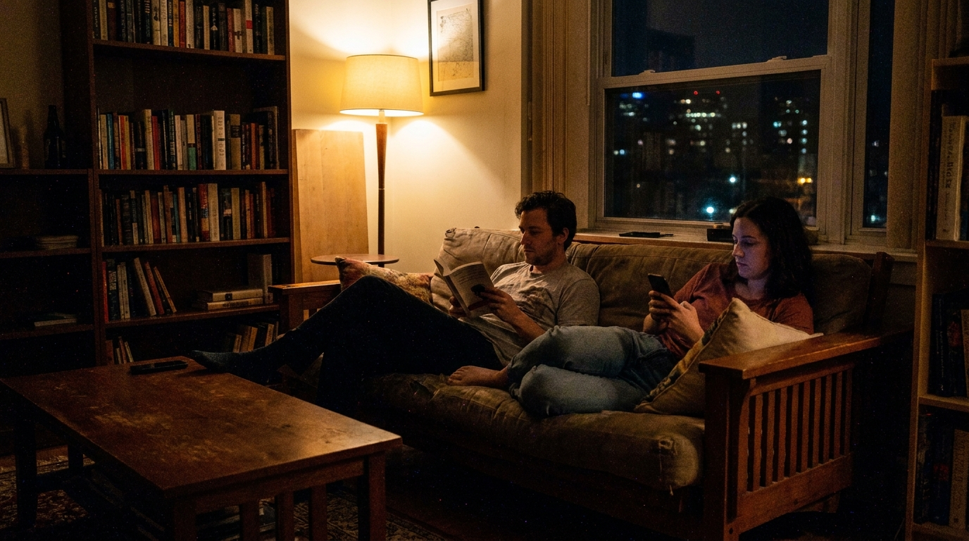
What you see: the dark areas aren't smoothly dark - they carry small variations in brightness and slight color shifts. The pattern is finer and more regular than film grain, and in the deepest shadows there's faint color noise. It's the honest texture of an image captured in a real moment in low light: no lights set up, no scene staged.
The Full Film Grain & Texture Stack
Grain is a finishing layer - it goes at the very end of the prompt, after the whole image is built:
Cinematic lifestyle portrait of a woman in her early 30s by a window, warm
golden interior light, natural skin texture, shot on 35mm film with subtle
organic film grain in the shadows and mid-tones, slightly warm Kodak Portra
color palette, gentle natural vignette at the frame edges, fine grain barely
present in the highlights, photographed film aesthetic not digital,
photorealistic 35mm film photography
Subtle organic grain, a warm film-influenced palette, a natural vignette - a film finish layered over an otherwise real image. The result reads as a well-shot photograph from a real camera, not a clean digital render.
Conclusion: Add the Fingerprint, Not the Noise
Four to lock in:
1. Clean is the render tell. Perfect digital smoothness is what marks an image as generated. Grain is the fastest cure - the fingerprint of a real capture.
2. Grain is a signature, not a slider. Subtle 35mm, cinematic, black-and-white, Kodachrome - each is a specific stock with a specific meaning. Pick the one that matches the register.
3. Match the grain to the brand. Subtle 35mm for general realism, cinematic for drama, large format for luxury, high ISO for authentic UGC. Grain is a positioning choice.
4. Grain goes last. It's a finishing layer over a fully built image - add it at the end of the prompt, after subject, light, and scene are resolved.
The rule of thumb that anchors it: the cleaner and sharper an AI image is, the faker it looks. Real capture leaves texture - grain in the shadows, a color story from the film, imperfection at the edges. Digital cleanliness is the tell; grain is the cure.
So the move: take your cleanest, sharpest "somehow fake" image and regenerate it with subtle 35mm film grain in the shadows and a warm Portra palette. Same image. My bet is it stops looking rendered and starts looking photographed - because you added the one thing every real camera leaves behind.
Related: camera effects, photorealism triggers, and the full AI ad prompt library.
Steal my ad concept & hook library
Every prompt, archetype, and hook I use in my own accounts. Updated weekly.
Join the free Skool community