


I once built the cleanest sticky-note ad you've ever seen.
Perfect yellow square. Crisp drop shadow. Tidy marker font, every line aligned to a grid. It looked like a button. It pulled 0.8% CTR.
So I did the opposite. I grabbed a real Post-it, scribbled on it, stuck it crooked to my monitor, and shot it with my actual desk lamp. Crumpled corner, uneven ink, a real shadow falling across my keyboard.
Same copy. 2.2% CTR.
The difference wasn't the words. It was whether the thing looked like a real object or a digital sticker.
This is a complete guide to handwritten ads, the Handwritten & Sticky Note archetype: a raw piece of paper, a messy Post-it, or a scrawled to-do list that stops the scroll precisely because everything around it is polished. I'll give you the build, three copy-paste prompts, and the one-second test that tells you if yours will work.
Here's the deal.
What Is a Handwritten Ad?
Handwritten ad: An ad that mimics a physical analog object - a sticky note, a lined notepad, a taped paper flyer - with real handwriting, to break up a feed of polished digital graphics. It works on analog pattern interruption: in a stream of high-def UI and studio product shots, a crumpled paper note reads as intimate and real, like a peek at someone's fridge reminder instead of a marketing campaign.
Every ad in the feed is trying to look good. This one wins by looking like nobody made it for the feed at all.
A real note isn't content. It's a personal artifact that happened to get photographed.
Here's a live one:
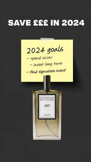
Note
Why It Works: The Shadow Test
Here's where most people ruin this archetype. They design a sticky note instead of photographing one.
A flat vector Post-it is just a Notes App Screenshot ad wearing a yellow costume. The whole power of analog is that it exists in the real world, and there's a one-second way to check whether yours does.
The Shadow Test: An analog-mimicry ad only works if it reads as a real, photographed object rather than a digital sticker. The tell is dimensionality. Real notes cast shadows, crinkle, curl at the corners, sit taped to surfaces, and let physical props rest on them. If your note is flat, clean, and perfectly aligned, it fails the test, and a failed analog ad is just a worse digital one.
That's what killed my grid-aligned version. It passed no shadow. It looked like UI.
Once it passes the Shadow Test, the archetype reads in three beats:
The paper medium. The stark yellow of a Post-it, or the familiar blue lines of notepad paper, catching the eye against the background.
The handwriting. Human, urgent, a little messy. This is the beat that separates analog from digital and pulls the reader in.
The checkmark or product. The eye lands on the physical product anchoring the note, or the item checked off the list. The brand becomes the completed goal, not a purchase.
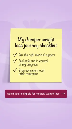
The kicker? The reader sees a relatable human goal (“spend wiser,” “meal plan for the week”) and the product shows up as the easy way to check that hard thing off their own mental to-do list. You're not selling. You're completing their list for them.
How to Build a Handwritten Ad
Four moves. The second one is where it lives or dies.
Step #1: Pick the analog object
Match the paper to the message. A Post-it reads as a quick personal reminder. Lined notepad reads as a considered to-do list. A taped paper flyer reads as guerrilla, street-level, word-of-mouth.
Each carries a different implied author. A fridge Post-it is you talking to yourself. A taped flyer is a stranger tipping you off.
Step #2: Pass the Shadow Test
This is the non-negotiable. Make it look photographed, not designed.
Real shadows. A curled or crumpled corner. Visible tape. A slightly off angle. Better yet, shoot it in a real environment - taped to a bathroom mirror, resting on a desk - instead of on a clean studio background. Every bit of physical imperfection buys trust.
Digital graphic on a solid dark charcoal background. At the top, bold white
text reads "[SAVE £££ IN 2024]". In the center, a square yellow sticky note
is attached to the background with a small piece of clear tape, casting a
soft real shadow. The note features black handwritten-style text. The header
reads "[2024 goals]", followed by a dashed list reading "[spend wiser]",
"[meal-plan for real]", and "[find my signature scent]". Below the sticky
note, place a sleek glass perfume bottle with a black cap and a white label
reading "[BRAND]".
Pro Tip
Step #3: Get the handwriting right
Two schools, and you should test them against each other.
Messy realistic cursive maximizes authenticity but can cost readability. A clean marker-style hand is instantly legible but drifts toward “designed.” Run absolute realism against quick readability and let the vertical decide. For a low-consideration impulse buy, legible wins. For an intimate, diary-style angle, messy wins.
Step #4: Anchor with a physical product or a checked box
Bring the product into the physical plane. Rest the actual product on the paper so it casts its own shadow, or check off the list item that the product represents.
Close-up top-down flat lay of a piece of lined notepad paper. At the top
center, a logo reads "[BRAND]". In the center of the paper, black
handwritten text reads "[TO-DO LIST]" with an underline. Below it is a list
with square checkboxes. The first box has a handwritten checkmark inside it,
with text reading "[Reorder supplements]". The next three boxes are empty,
with text reading "[Meal plan for the week]", "[Set up cold plunge]", and
"[Renew gym membership]". Resting directly on the paper in the top right
corner are two physical supplement capsules casting hard, dramatic sunlight
shadows.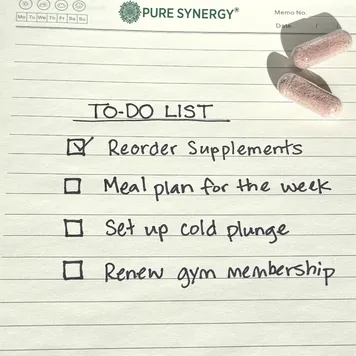
Side note
The guerrilla taped-flyer variant
When you want a “stranger tipped me off” feel instead of a personal note, shoot a printed flyer taped to a real surface.
Photography of a white 8.5x11 printed paper flyer taped to the outside of a
glass window pane with a single piece of white masking tape. The flyer
features bold black printed text. A large headline reads "[How is your real
calorie deficit calculated?]". Below it, three lines of text read
"[your stats, not a generic chart]". Below the text is a simple printed
table with four rows and three columns containing numbers and percentages.
At the bottom of the flyer, bold text reads "[Take the test >>]".
Reflections of trees are visible in the glass window.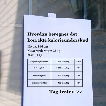
Pro Tip
The Handwritten Variant Map
| Variant | Implied author | Shadow Test priority | Test against |
|---|---|---|---|
| Post-it on a surface | You, to yourself | High (tape, shadow, angle) | Studio vs real environment |
| Notepad to-do + props | You, planning | High (props break the plane) | With props vs without |
| Guerrilla taped flyer | A stranger tipping you off | High (reflections, wear) | Raw flyer vs clean infographic |
| Digital vector sticky | Nobody (reads as UI) | Fails by default | Only as a control to beat |
Post-it on a surface
Implied author
You, to yourselfShadow Test priority
High (tape, shadow, angle)Test against
Studio vs real environmentNotepad to-do + props
Implied author
You, planningShadow Test priority
High (props break the plane)Test against
With props vs withoutGuerrilla taped flyer
Implied author
A stranger tipping you offShadow Test priority
High (reflections, wear)Test against
Raw flyer vs clean infographicDigital vector sticky
Implied author
Nobody (reads as UI)Shadow Test priority
Fails by defaultTest against
Only as a control to beat
Where Handwritten Ads Fail
Three ways, and the first is the one I paid for.
Flat vector, no shadow. My grid-aligned sticky note. If it doesn't pass the Shadow Test, you've built a digital note with worse readability. Photograph it or fake the photograph convincingly.
Handwriting too perfect. A flawless marker font on perfectly straight lines reads as a design choice, not a human hand. Some wobble, some uneven spacing, a line that runs slightly downhill. Imperfection is the proof.
Goals too generic. Test broad emotional goals (“feel safe and in control”) against specific tactical ones (“reorder supplements,” “meal plan Sunday”). Specific, checkable items usually build more trust, because a real to-do list has real tasks, not affirmations.
- Use
- Real shadows, crumpled corners, visible tape, off angles.
- Avoid
- Flat, grid-aligned vector sticky notes. They fail the Shadow Test.
- Use
- A real-world environment (mirror, desk, corkboard) over a studio background.
- Avoid
- Flawless marker fonts on perfectly straight lines.
- Use
- Slightly imperfect, human handwriting.
- Avoid
- Vague emotional goals where specific checkable tasks would land harder.
- Use
- A physical product resting on the paper to break the 2D plane.
- Avoid
- Treating this as Notes App with a yellow skin. The medium is the message.
Digital Sticky Note or a Photograph of a Real One?
Bias hard toward the photograph. Test a clean vector sticky note against a shot of a real, crinkled Post-it, and in most verticals the true analog object wins, because users respond to physical realism over digital approximations. The vector version is worth keeping only as the control your photographed version beats.
Messy Handwriting or Clean Marker?
Test both, and let consideration level decide. Clean marker is legible and fast, which suits impulse and low-consideration buys. Messy cursive is intimate and slow, which suits diary-style, personal-journey angles. The one constant: it has to look handwritten, never typed in a script font.
Wrapping Up
The whole archetype comes down to one test: does it look like a real object or a digital sticker?
Pick your paper, make it physically real - shadows, crinkles, tape, props - get the handwriting human, and let the product complete the list. Pass the Shadow Test and the analog interrupt does the rest.
The second your sticky note looks clean enough to be a button, you've lost it. Rough it up.
This is one spoke in the static ad archetype library. It's the analog twin of Notes App Screenshot ads: Notes App defeats ad-blindness by stripping design out, handwritten defeats it by adding physical reality in. Both fight the same enemy from opposite directions, and it pairs well with DM Thread fake text message ads in the same rotation.
Steal my ad concept & hook library - new breakdowns every week
Get instant access →Which analog object are you photographing first - the Post-it, or the taped flyer?