


The first fake text message ad I ran, I wrote both bubbles myself.
Both of them sounded like me. The grey one on the left, the blue one on the right, both written in tidy brand voice, both trying to sell. It pulled 0.6% CTR and I couldn't figure out why. The format was right. The offer was right.
Then it clicked: nobody eavesdrops on a brand.
I rewrote the incoming bubble as an actual person with an actual problem, typos and all, and left the product recommendation in the reply. Same offer. Same link. CTR went to 1.9%.
This is a complete guide to fake text message ads, the DM Thread archetype: an ad disguised as a private conversation so the viewer reads it as eavesdropping instead of a pitch. I'll give you the bubble structure, three copy-paste prompts, and the compliance line that gets these rejected.
Let me explain.
What Is a Fake Text Message Ad?
Fake text message ad: An ad that mimics a private chat interface - iMessage, WhatsApp, Instagram DMs - to present a product recommendation as a conversation between two people instead of a brand-to-buyer pitch. It works on voyeurism: people instinctively read other people's messages, so the sell lands with defenses down.
We're nosy by design. Show someone a private conversation and they'll read it before they decide whether they want to.
That instinct is the whole engine. The ad doesn't look like an ad. It looks like a screenshot a friend forwarded you.
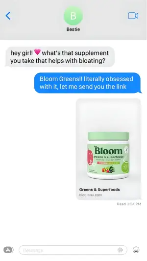
Here's the base version:
Note
Why It Works: The Overheard Sell
Every other ad format speaks to the viewer. This one lets the viewer listen in.
The Overheard Sell: The recommendation arrives as a private message between two other people, so the viewer processes it as eavesdropping on a real endorsement rather than receiving an ad. The brand never speaks. A friend does. Defenses stay down because the viewer thinks they're the observer, not the target.
The archetype runs on a two-bubble structure, and the roles are fixed:
The incoming message (grey, left) is the hook. This is the problem, the context, or the curiosity spike. “How did you get toned so fast?” “Wait WHAT stop.” “ok why is everyone talking about this.” It's the line the viewer has said or thought themselves.
The outgoing message (blue or green, right) is the solution. This is where the product shows up, usually with an image or a link preview. It reads as one friend helping another, not a CTA.
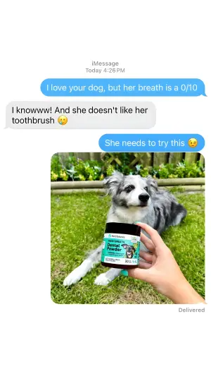
The eye lands on the grey bubble first. That's the recognition beat: “I've had this exact conversation.” Then it drops to the reply for the payoff.
The kicker? The incoming bubble is doing more work than the product bubble. Get the friend's problem to sound real and the sell writes itself. Make it sound like marketing and the whole illusion drops.
How to Build a Fake Text Message Ad
Three moves, then the variants.
Step #1: Write the incoming bubble like a real person, not a brand
This is where I lost that first 0.6% ad. Brand voice in the grey bubble kills it instantly.
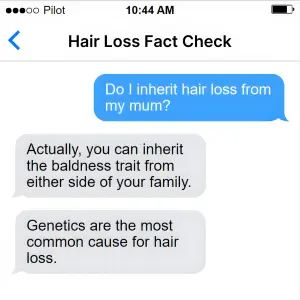
Real people text in fragments. Lowercase. No punctuation. “wait how” beats “I'm curious how you achieved that result.” The messier the incoming line, the more real the eavesdrop feels.
Match the opening to a thought your audience has already had. If they've never wondered the thing in the grey bubble, there's no recognition, and without recognition the whole archetype is just a screenshot.
Step #2: Deliver the product in the reply, then get out
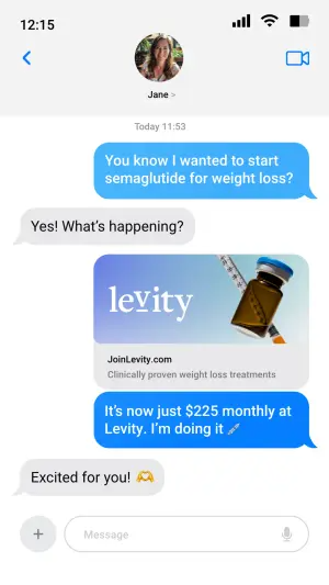
The blue bubble names the fix and stops. Optionally it carries a link preview or a photo. What it does not do is pitch.
“omg it's called [BRAND], link below” beats a three-line feature list. The friend wouldn't write a paragraph. Neither should the ad.
Digital graphic mimicking a smartphone screen in dark mode. The background
is solid black. In the center, a text message conversation. On the right, a
blue text bubble reads "[how are you always so calm at work lol]". Below
that on the left, a grey text bubble reads "[ok don't laugh but it's this
$14 thing]". Back on the right, two stacked blue text bubbles read
"[send it NOW]" and "[wait is that the one from tiktok]". At the bottom, a
standard dark mode iOS keyboard interface is visible.
Pro Tip
Step #3: Pick the platform, then decide 1-on-1 vs group
The interface is a targeting decision, not a design one.
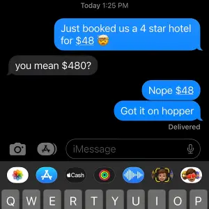
iMessage blue reads as US, iPhone, casual peer. WhatsApp green reads as international, group, family-and-friends. Instagram DMs read as creator-to-follower. Match the UI to where your audience actually lives.
Then choose the cast. A 1-on-1 thread is intimate and fast. A group chat manufactures consensus. Three people agreeing reads as a trend, not one opinion.
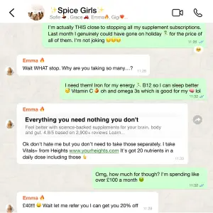
Digital graphic mimicking a WhatsApp group chat interface on a light
background. The header shows the group name "[the girls]" with small
profile icons. The conversation features alternating green and white text
bubbles. The first green bubble reads "[who found the vitamin thing]". A
white bubble replies "[MEEE why]". A green bubble responds "[i'm so tired
of swallowing 6 pills every morning]". A larger white bubble contains a
forwarded link preview with bold text "[BRAND - one scoop, all of it]" and
paragraph text "[the daily stack, minus the pill fatigue]", followed by the
sender's message "[it's all in one]". A green bubble replies "[ordering
now]". A final white bubble reads "[you're welcome in advance]".
Side note
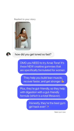
The story/DM reply variant
Swap the peer for a creator. The follower asks the question in a story reply and the creator answers in a stack of bubbles. Same mechanic, borrowed trust from a face the viewer already follows.
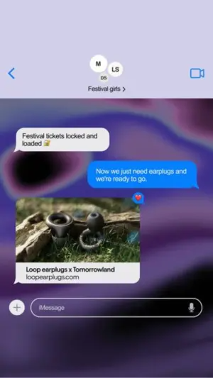
The overlay bubble on a photo
When the lifestyle image is the star, drop the full interface and float one bubble over the photo. It works for gifting and hinting angles, where the message is the nudge and the picture is the product.
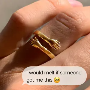
The review-bubble variant (bridge to social proof)
When you want volume of endorsement over a single conversation, drop the thread and float review bubbles over a product photo. It's the DM Thread crossed with a testimonial wall.

Photography of [a person using the product], on a solid [light pink]
background. Across the top, dark text reads "[headline]" with green review
stars and "[4.8 / 2,300 reviews]". Overlaid across the image are numerous
bright blue text message bubbles popping up randomly, containing
enthusiastic review quotes like "[i cannot go back]", "[why did no one tell
me]", and "[genuinely obsessed]".
Pro Tip
The DM Thread Variant Map
| Variant | Best for | The hook lives in | Watch out for |
|---|---|---|---|
| 1-on-1 iMessage/WhatsApp | Intimate peer recommendation | Grey incoming bubble | Sounding like a brand |
| Group chat | "Everyone's switching" consensus | The pile-on of replies | Clutter before payoff |
| Overlay bubble on photo | Gifting / hinting / lifestyle | One bubble over a real image | Weak, generic bubble copy |
| Review-bubble cluster | High-volume social proof | The floating quotes | Reads staged if overloaded |
| Story/DM reply | Creator-to-follower trust | The follower's question | Wrong platform UI for audience |
1-on-1 iMessage/WhatsApp
Best for
Intimate peer recommendationThe hook lives in
Grey incoming bubbleWatch out for
Sounding like a brandGroup chat
Best for
"Everyone's switching" consensusThe hook lives in
The pile-on of repliesWatch out for
Clutter before payoffOverlay bubble on photo
Best for
Gifting / hinting / lifestyleThe hook lives in
One bubble over a real imageWatch out for
Weak, generic bubble copyReview-bubble cluster
Best for
High-volume social proofThe hook lives in
The floating quotesWatch out for
Reads staged if overloadedStory/DM reply
Best for
Creator-to-follower trustThe hook lives in
The follower's questionWatch out for
Wrong platform UI for audience
Where Fake Text Message Ads Fail
Three ways I've watched these die.
Both bubbles in brand voice. The one I already confessed. If the grey bubble sounds written, the eavesdrop illusion collapses and you're left with a worse-looking regular ad.
Over-polished UI. A too-perfect mockup reads as designed, which reads as an ad. A slightly imperfect screenshot - a real timestamp, a typo, a read receipt - sells the realness. Native beats art-directed here, same principle behind fake-notification ads.
Claims you can't stand behind. This is the compliance one, and it matters more here than in most archetypes. A fake conversation makes it very easy to put a claim in a “friend's” mouth that the brand could never make directly. That's exactly what gets these flagged.
- Use
- Real, messy, human phrasing in the incoming bubble.
- Avoid
- Brand voice in either bubble, especially the incoming one.
- Use
- A platform UI that matches where your audience actually chats.
- Avoid
- Pristine, over-designed interfaces that read as art, not screenshots.
- Use
- The fixed structure: problem in grey, solution in blue or green.
- Avoid
- Putting a claim in a friend's mouth you couldn't run as a direct headline.
- Use
- A link preview or photo so the reply feels forwarded, not written.
- Avoid
- Using it as your only proof format - voyeurism fatigues fast.
Do Fake Text Message Ads Violate Meta Policy?
They can, and it's usually not the format that trips them. It's the claim. Meta and the FTC both care about ads that imply a personal endorsement or make health, financial, or results claims a brand can't substantiate. A conversation UI doesn't launder a claim you couldn't otherwise run. My rule: if a line in the thread would get rejected as a direct headline, it'll get rejected in a blue bubble too. Keep the claims runnable and the format is fine.
Note
iMessage or WhatsApp?
Depends on the audience, not your preference. iMessage blue signals US iPhone users and casual peer talk. WhatsApp green signals international, group-oriented, family-and-friends contexts. Test the one your audience opens most, then test dark mode against light. Dark mode often stops the scroll harder in a bright feed simply by contrast.
Wrapping Up
The whole archetype is one discipline: let a friend do the selling.
Write the incoming bubble like a real person with a real problem your audience recognizes, deliver the product in the reply, and never let brand voice leak into the thread. That's the Overheard Sell, and it's why a screenshot of a conversation beats a headline you wrote to be persuasive.
Get the grey bubble right and the ad practically runs itself. Get it wrong and you've made a regular ad wearing a costume.
This is one spoke in the static ad archetype library. If you liked how the DM Thread hides the sell in a conversation, the Calendar Mockup pain point ads archetype hides it in an interface, and Blurred Bait hides the reveal entirely.
Steal my ad concept & hook library - new breakdowns every week
Get instant access →Whose conversation are you letting your buyer overhear first?