


The best-performing static I ran last year was a screenshot of an Apple Note.
No design. Yellow header, a bold headline, three checkmarks, a product photo dropped in the corner. It looked like I threw it together on my phone in a coffee line. It pulled 2.4% CTR and I couldn't leave it alone.
So I “fixed” it. Rebuilt it in Figma: real font, a proper studio product shot, a soft gradient behind the note. Cleaner in every way.
It dropped to 0.9%.
I had polished the trust right out of it. That's the whole lesson of this archetype, and it has a name.
This is a complete guide to notes app ads, the Notes App Screenshot archetype: an ad disguised as a private note so it slips past the “this is an ad” filter. I'll give you the build, three copy-paste prompts, and the exact reason making it nicer makes it worse.
Here's the deal.
What Is a Notes App Ad?
Notes app ad: An ad that mimics the iOS Notes interface - yellow header, plain white background, a bold headline, a checklist - to present a product recommendation as someone's private note instead of a designed ad. Notes is where people keep grocery lists and brain dumps, so a Notes screenshot in-feed reads as personal and unpolished, which is exactly why it bypasses ad-blindness.
Notes is the least glamorous app on the phone. That's the point.
Nobody makes marketing in Notes. So when a Note shows up in a feed full of designed ads, the brain files it as real before it files it as ad.
Here's the base version:
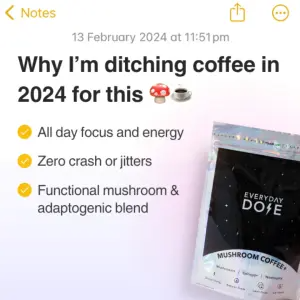
Note
Why It Works: The Polish Penalty
Most formats reward better production. This one punishes it.
The Polish Penalty: In native-mimicry formats, trust moves inversely to production value. Every visible design decision - a perfect font, a studio product shot, a gradient - signals “someone made this to sell me something” and subtracts believability. The Notes app wins because there's almost nothing left to polish. It's the archetype where the penalty is steepest.
That's what killed my Figma remake. Every upgrade I added was a fresh signal that a marketer had touched it.
The archetype reads in a fixed hierarchy:
The UI header. The yellow back arrow (“< Notes”, “< All iCloud”) and the stark white background. This is the native signal. The eye clocks the environment as “personal note” in a fraction of a second, before reading anything.
The bold headline. The largest text, framing a secret or a list. “Why I'm ditching [villain]”, “Reasons you'll LOVE [brand]”, “How I became a morning person”. It promises a personal revelation, not an offer.
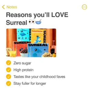
The checklist. Yellow checkmarks, three or four items. The brain loves a list and scans it happily, digesting the value props without feeling sold to. These are benefits written as private notes-to-self, not ad copy.
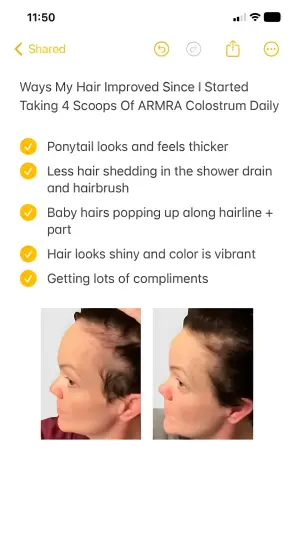
The kicker? The moment the reader hits the bullets and thinks “this note is about my exact problem,” the product photo stops being a pitch and becomes the logical conclusion of the list.
How to Build a Notes App Ad
Four moves. Resist the urge to improve any of them.
Step #1: Nail the native header
The yellow header is non-negotiable. It's the single fastest trust signal in the format.
Include the back arrow, a plausible timestamp, and the plain white background. The more it matches a real iOS Note, the faster the brain skips the “is this an ad?” check. This is the same native-beats-designed logic behind DM Thread fake text message ads.
Step #2: Write the headline as a secret, not an offer
The headline frames a personal revelation. It should sound like the first line of a note you'd write to yourself.
“Why I'm ditching coffee for this” beats “Try our mushroom coffee.” One is a diary entry. The other is a banner. Test the “ditching [villain]” angle against a pure benefit hook like “My 2024 energy stack.” The villain framing usually pulls harder because it implies a story.
Step #3: Build the checklist like notes-to-self
Three or four checkmarks. Benefits phrased the way a real person jots them, not the way a brand lists features.
“no more 3pm crash” beats “supports sustained energy.” Lowercase, clipped, honest. The checklist is where the Polish Penalty bites quietly: over-formatted, perfectly parallel bullets read as copywriting.
Digital graphic mimicking an iOS Notes app interface on a white background.
At the top, the standard yellow header reads "[Notes]" and shows a date
timestamp. Below, a large, bold black headline reads "[Why I'm ditching
coffee in 2024 for this]". Under the headline is a list of three items,
each starting with a yellow checkmark emoji followed by the text
"[no 3pm crash]", "[actual focus, not jitters]", "[mushroom + adaptogen
blend]". In the bottom right corner, overlay a product photo of a metallic
silver pouch of "[Mushroom Coffee]" with the brand name "[BRAND]".
Pro Tip
Step #4: Integrate the product without breaking the illusion
Two ways to bring in the product: overlay a photo, or type the brand as a text hyperlink inside the note.
The overlaid photo is punchier. The text link is more native. Test both, and test photo placement above the bullets versus below, because reading the benefits first often warms the reader before they see the product.
Digital graphic mimicking an iOS Notes app interface. The background has a
subtle light grey grid pattern like graphing paper. The standard iOS header
UI is at the top. Below, a bold black headline reads "[How I became a
morning person when I was burned out]", with the words "[morning person]"
highlighted in bright yellow marker. Below the headline are several
paragraphs of normal text "[the honest version, no supplements-bro
energy]", with one full sentence also highlighted in yellow marker. In the
bottom right corner, place a logo of a small cartoon bird face and the text
"[BRAND]".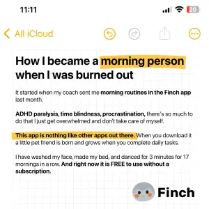
Side note
The floating-note variant (when you want a lifestyle photo too)
Sometimes you want the product in a real setting and the native note. Float a small Notes snippet over a lifestyle photo.
Top-down lifestyle photography of a glass filled with a green smoothie and a
metal straw, next to a cardboard tube of "[BRAND]" superfood powder and
fresh peaches. Overlaid in the center is a white, rounded UI box mimicking
an iOS Notes snippet. Inside the box, the header reads "[Notes]", the
headline reads "[my actual morning, not the aesthetic one]", below is a
green checkmark emoji next to "[less bloat by day 4]", then text "[one scoop,
that's it]" and bold text "[FROM DAY ONE]". At the bottom of the main image,
overlay a green review graphic reading "[4.7 stars, 3,100 reviews]".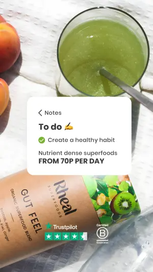
The Notes App Variant Map
| Variant | Best for | Polish Penalty risk | Test against |
|---|---|---|---|
| Full-screen checklist note | Clean benefit list, cold traffic | Low (purest native) | Photo above vs below bullets |
| Highlighter journal entry | Story-led, "how I fixed X" angles | Low | Highlighter vs bold/italic |
| Floating note over photo | Lifestyle + native in one | Medium | Floating note vs full-screen |
| Half-note / half-studio hybrid | Product hero + native top | High (breaks the illusion) | Hybrid vs 100% Notes mockup |
Full-screen checklist note
Best for
Clean benefit list, cold trafficPolish Penalty risk
Low (purest native)Test against
Photo above vs below bulletsHighlighter journal entry
Best for
Story-led, "how I fixed X" anglesPolish Penalty risk
LowTest against
Highlighter vs bold/italicFloating note over photo
Best for
Lifestyle + native in onePolish Penalty risk
MediumTest against
Floating note vs full-screenHalf-note / half-studio hybrid
Best for
Product hero + native topPolish Penalty risk
High (breaks the illusion)Test against
Hybrid vs 100% Notes mockup
Where Notes App Ads Fail
Three ways, and the first is the one I've paid for.
Over-polishing. My Figma remake. Every design upgrade is a trust downgrade in this format. If your instinct says “let me make this look more professional,” that instinct is wrong here.
The hybrid that breaks the illusion. The half-Notes, half-studio-background build is tempting because the product looks great. But the polished half exposes the native half as staged. Test it against a 100% full-screen Notes mockup with the product photo just pasted inside the white note. The fully-native version usually holds trust better.
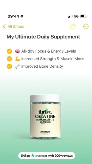
Benefits that read as copy. Perfectly parallel, marketer-grammar bullets (“Supports energy. Enhances focus. Promotes calm.”) snap the reader out of it instantly. Write the list like a tired person jotting reasons, not a brand writing a landing page.
- Use
- The exact native header: yellow arrow, timestamp, white background.
- Avoid
- Custom fonts, gradients, or studio product shots.
- Use
- A headline that reads as a personal secret or revelation.
- Avoid
- The half-native, half-designed hybrid unless you've tested it holds.
- Use
- Clipped, lowercase, human benefit phrasing in the checklist.
- Avoid
- Marketer-grammar bullets. Parallel and polished reads as an ad.
- Use
- One or two expressive emojis, max, to aid scanning.
- Avoid
- “Improving” a winner. Better production is worse performance here.
Should the Product Photo Go Inside the Note?
Test it, but bias toward inside. A product photo pasted within the white note keeps the whole thing reading as one native artifact. A photo overlaid on top, or a separate polished product panel, reintroduces the Polish Penalty. When in doubt, keep everything inside the note and let the format stay boring.
Do Emojis Help or Clutter?
A couple help. The yellow checkmark is load-bearing. It's what makes the list scannable and native at once. Secondary emojis can speed scanning, but every extra one nudges the note toward “designed.” Isolate them in a test: with and without. Usually two beats six.
Wrapping Up
The whole archetype is one counterintuitive discipline: stop making it look good.
Nail the native header, write the headline like a private revelation, keep the benefits human, and drop the product in without dressing it up. That's the Polish Penalty working for you instead of against you.
The moment you feel proud of how clean it looks, you've probably broken it. The winning Notes ad should look like it took ninety seconds, because that's the version people trust.
This is one spoke in the static ad archetype library. It pairs naturally with DM Thread fake text message ads - both live or die on looking unmade - while Calendar Mockup pain point ads uses a familiar interface to do the opposite job, and the Blurred Bait archetype hides the payoff entirely.
Steal my ad concept & hook library - new breakdowns every week
Get instant access →What's the first winner you'll resist the urge to clean up?