


For years my pain point ads just said the pain.
I'd run “Drowning in email?” over a stock photo of a stressed guy at a laptop and watch it die at 0.7% CTR. The line was true. The photo was fine. It still got scrolled.
Then I watched a fake calendar beat my best headline.
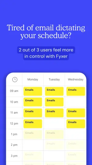
No stressed guy. No clever copy. Just a screenshot of a clogged week, every morning slot jammed with yellow blocks, and the viewer went “that's my Tuesday” before reading a word.
This is a complete guide to pain point ads that work like that one did. Specifically the archetype I call the Calendar Mockup: you don't describe the problem, you render it inside an interface your audience already lives in. I'll give you the build, the copy-paste prompt, and the exact place these ads collapse.
Here's the deal.
What Is a Pain Point Ad?
Pain point ad: An ad that targets a specific frustration your audience already feels and makes it the center of the creative. The strongest version doesn't state the pain in copy. It shows it - rendering an invisible feeling (overwhelm, falling behind, wasted time) as a concrete, recognizable visual so the viewer self-identifies in under a second.
Most pain point ads stop at the copy. A headline names the frustration, a stock image nods at it, done.
The Calendar Mockup does something harder. It draws the pain.
Here's the one that made me rebuild how I do this:
Note
Why the Calendar Mockup Works: The Pain Mirror
Here's what separates this from a normal pain point ad.
It isn't talking to the viewer. It's reflecting the viewer.
The Pain Mirror: An ad that renders an invisible feeling as a concrete state inside an interface your audience uses every day, so they recognize their own life before they read a single word. It works as a mirror, not a message. The brand barely appears until recognition has already landed.
The Calendar Mockup runs the Pain Mirror in three beats, in this exact order:
1. The Overwhelm. The eye hits the cluster of yellow blocks first. It reads “no free time” pre-verbally, before the headline even registers. Visual pain lands faster than written pain.
2. The Empathy Play. Now the headline does its job: “Tired of email dictating your schedule?” It's not a claim. It's a mind-read. The viewer already felt the overwhelm; the line just names it back to them.
3. The Lifeline. Only now does the brand show up, with the fix and a proof point: “2 out of 3 users feel more in control.” Solution plus social proof, delivered after the pain is already throbbing.
The kicker? Sequence is everything. Show the block first, name it second, solve it third. Flip that order and you've got a normal ad about a product nobody asked to hear about yet.
How to Build a Pain Mirror Ad
Four steps. The order matters as much as the parts.
Step #1: Pick a pain your audience feels but can't picture
Not every frustration has a visual. “I want more revenue” doesn't. “My calendar has no white space” does.
The Pain Mirror needs a pain that maps to a state: full, empty, red, late, unread, overdrawn. If you can't picture the pain as a screen, this archetype isn't the one. Reach for a different archetype in the library instead.
Step #2: Choose the interface they already live in
The power comes from familiarity. The viewer has to recognize the UI instantly as one they open daily.
Calendar for time pain. Inbox for volume pain. A banking app for money pain. A notifications stack for attention pain. Match the interface to the frustration and half the work is done.
Pro Tip
Step #3: Overload the interface visually
This is where most people undercook it. One or two blocks isn't overwhelm. It's a normal Tuesday.
Jam the morning solid. Leave the afternoon faintly filled so the eye reads “and it keeps going.” The visual has to communicate too much before a word is read.
Digital graphic design. The top half is a solid royal blue background
containing a large white serif headline reading "[Tired of email dictating
your schedule?]" and a smaller dark blue rounded pill banner containing
white text reading "[2 out of 3 users feel more in control with BRAND]".
The bottom half features a clean, white digital calendar UI mockup showing
columns for days and rows for times. The morning time slots are completely
filled with bright yellow event blocks, each containing the dark text
"[Emails]". The afternoon slots show faintly visible, washed-out yellow
blocks.
Swap the noun in the blocks to fit your vertical: “Meetings,” “Follow-ups,” “Admin,” “Unread.” The block label is the pain, repeated until it's a wall.
Step #4: Land the empathy headline, then the lifeline
Headline mirrors the feeling. Subhead delivers the fix plus a proof number. That's it.
Keep the headline a question or a statement of their frustration, never a feature. “Tired of email dictating your schedule?” beats “AI email management for professionals” every time, because one is a mirror and the other is a brochure.
The 3 Beats at a Glance
| Beat | What it does | Where it sits | Fails when |
|---|---|---|---|
| The Overwhelm | Reads "no free time" pre-verbally | The visual (jammed blocks) | Interface looks half-empty |
| The Empathy Play | Mind-reads the exact frustration | The headline | Headline sells a feature |
| The Lifeline | Fix + social proof | The subhead | Solution shows up before pain lands |
The Overwhelm
What it does
Reads "no free time" pre-verballyWhere it sits
The visual (jammed blocks)Fails when
Interface looks half-emptyThe Empathy Play
What it does
Mind-reads the exact frustrationWhere it sits
The headlineFails when
Headline sells a featureThe Lifeline
What it does
Fix + social proofWhere it sits
The subheadFails when
Solution shows up before pain lands
Where Pain Point Ads Fail
Two failure modes, and I've shipped both.
Agitation with no lifeline. Early on I ran a Pain Mirror so heavy on the problem that it never offered a way out. Great CTR, a cost per lead 71% over my account average downstream. Turns out you can make someone feel the pain so hard they close the tab to escape it. The lifeline isn't optional. It's the release valve.
Picking a pain with no picture. I tried this archetype for a vertical where the frustration was abstract (“you're leaving money on the table”). There was no interface to jam, no state to render, so I forced a fake dashboard that meant nothing. It read as decoration. The mirror only works when the reflection is instantly legible.
- Use
- When the pain maps to a visible state: full, late, unread, overdrawn.
- Avoid
- Abstract pains with no visual state to render.
- Use
- An interface your audience opens daily, mocked close to the real thing.
- Avoid
- A clean, half-empty interface: undercooked overwhelm reads as normal.
- Use
- The sequence - overwhelm, empathy, lifeline - with a real proof number.
- Avoid
- Agitating without offering the fix in the same frame.
Should You Show the “After” State Too?
Test it. The default Calendar Mockup is purely problem-focused: it shows the chaos and lets the copy imply the fix. But a split-screen version, chaotic “before” calendar next to a clean, color-coded “after,” sometimes converts better because it demonstrates the outcome instead of only agitating.
My honest read: problem-only wins on cold traffic where you need the scroll-stop, and before/after wins on warmer audiences who already feel the pain and want proof the fix is real. Run both.
Does Block Color Change Performance?
It can. Bright yellow reads as “busy.” Red reads as “alarm.” Grey reads as “dread.” The right color depends on the emotion you want the overwhelm to trigger for your specific demographic, so it's worth a dedicated color test before you scale the winner. Same visual, different feeling.
Wrapping Up
The whole archetype is one move: stop describing the pain and draw it.
Pick a frustration with a visual state, render it in an interface your audience already lives in, and let recognition happen before the reading does. That's the Pain Mirror, and it's why a fake calendar can beat a headline you spent an hour on.
Run the sequence in order. Overwhelm, empathy, lifeline. And never agitate without handing over the release valve.
This is one spoke in the static ad archetype library. If you liked how the Calendar Mockup hides its sell, the Blurred Bait archetype hides the reveal entirely.
Steal my ad concept & hook library - new breakdowns every week
Get instant access →Which pain are you rendering first, and in which interface?