


The scroll is muscle memory now. People blow past ads without seeing them - that's banner blindness, and it's the wall every creative hits.
But there's one thing a thumb still stops for: a system notification. An AirDrop request, a calendar reminder, a text message popping up on the lock screen. Years of phone use have trained us to halt and read the second a native UI element appears - because it might be personal, might be urgent, might be for us.
The AirDrop Transfer archetype weaponizes exactly that reflex. It mimics a native system alert so precisely that the brain processes it as a personal notification first and an advertisement second - and in that split-second gap, it's already read your message. It completely bypasses banner blindness by not looking like an ad at all.
This is the first archetype in the UI Mimicry & Native group of the Static Ad Library. I'll break down why it works, six real notification-style ads with the exact prompts to build your own, and how to test it.
Let's fake the alert.
What Is an AirDrop / Notification Ad?
An AirDrop (or notification) ad is a creative built to look like a native phone or computer UI element - an AirDrop request, an iOS notification banner, a calendar reminder, a lock-screen alert - usually overlaid on a real, relatable background. The message lives inside the fake notification. It sells by disguise: it doesn't look like marketing, so the reflex to ignore marketing never fires.
Most ads announce themselves. This one impersonates your phone.
Why It Works: The System Alert Reflex
This archetype runs entirely on conditioned response and pattern interruption. And the trigger has a name.
The System Alert Reflex: Years of smartphone and computer use have trained the brain to instantly stop and read any native UI element - an AirDrop request, a calendar reminder, a text message. By mimicking one, the ad bypasses banner blindness, because the brain processes it as a personal alert before it registers as an advertisement. You're not asking for attention; you're triggering a reflex that grants it automatically.
Here's the visual hierarchy that makes it land, in order:
1. The Pop-Up. The stark, bright white UI box dead in the center creates massive contrast against the darker, textured background. The eye cannot ignore it.
2. The Command. The text inside the notification (“Take Your Lion's Mane”) acts as a direct, imperative call to action.
3. The Contextual Background. The eye then processes the setting - the laptop, the open book, the dropper bottle - which anchors the digital reminder in a relatable, physical lifestyle moment (needing focus while working).
And the “Aha” moment is the beat where the user reads the text and realizes it's not their calendar reminding them of a meeting - it's a clever ad reminding them of a problem they probably feel right now (needing focus or energy at their desk).
Note
6 AirDrop / Notification Ads (Broken Down)
Here's the pattern across six - the fake UI, the message, and the relatable context in each:
| Ad | The Native Element | The Context |
|---|---|---|
| Supplement dropper | Desktop calendar reminder | Working at a wooden desk |
| Hair-loss shampoo | AirDrop request | In the shower |
| Skincare trial set | Desktop system alert | Product on yellow rocks |
| Calorie-tracking app | AirDrop, split-food image | Blurred phone home screen |
| No-makeup makeup | AirDrop request | Soft pink abstract |
| Liver detox | Lock-screen notification | Aerial pool wallpaper |
Supplement dropper
The Native Element
Desktop calendar reminderThe Context
Working at a wooden deskHair-loss shampoo
The Native Element
AirDrop requestThe Context
In the showerSkincare trial set
The Native Element
Desktop system alertThe Context
Product on yellow rocksCalorie-tracking app
The Native Element
AirDrop, split-food imageThe Context
Blurred phone home screenNo-makeup makeup
The Native Element
AirDrop requestThe Context
Soft pink abstractLiver detox
The Native Element
Lock-screen notificationThe Context
Aerial pool wallpaper
Now the teardowns - each with the exact recreate prompt. Swap the XXXXX placeholders for your own copy.
1. The Desk Calendar Reminder (Supplement)
A top-down desk scene with a calendar reminder popped over it. The context (laptop, notebook, dropper bottle) says “you're working and need focus” - and the fake reminder delivers the product as the fix, right at the moment of need.
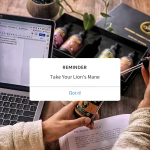
Top-down lifestyle photography of a wooden desk workspace. A person's hands
are holding a dark glass supplement dropper bottle over an open notebook. A
laptop, a small potted plant, and an open black presentation box containing
several other dropper bottles are visible in the background. In the dead center
of the image, overlay a crisp, white digital UI pop-up graphic that mimics a
desktop calendar reminder. Inside the pop-up, write small text at the top
reading "XXXXX", a larger main headline in the middle reading "XXXXX", and a
blue clickable text button at the bottom reading "XXXXX".
Test: the UI platform - this desktop calendar reminder vs. an iOS text-message bubble vs. an actual AirDrop transfer request (people react differently to different native alerts). And background chaos: an organized aesthetic desk vs. a busy one.
2. The Shower AirDrop (Hair Loss)
An AirDrop request over a man showering - the exact moment hair-loss anxiety hits. The blurred, real setting sells the disguise; the AirDrop framing makes it feel like a message someone's trying to send you.
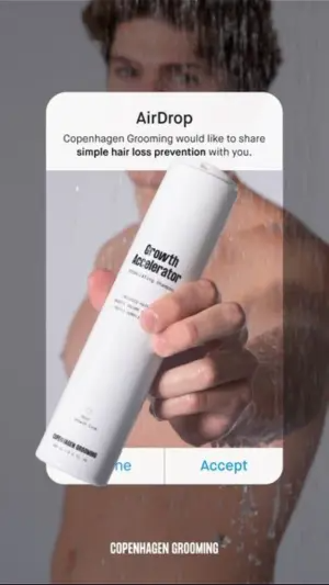
Vertical photography of a man taking a shower, holding a white cylindrical
shampoo bottle out towards the camera. The man and shower background are
slightly blurred. In the dead center, overlay a crisp white iOS AirDrop
notification box. Inside the box, the title reads "XXXXX" and the subtext reads
"XXXXX". Below the text is an image of the white bottle with black text reading
"XXXXX". At the bottom of the box, two clickable blue text buttons read "XXXXX"
and "XXXXX". Add small text at the very bottom of the image reading "XXXXX".
Test: background context - the shower vs. a man looking into a bathroom mirror (the classic hair-loss realization moment). And UI type: “AirDrop” framing vs. an incoming “FaceTime” call UI, to see which creates a stronger pattern interrupt.
3. The Yellow System Alert (Skincare Trial)
A vivid product shot with a desktop system alert overlaid, carrying the offer and a strikethrough price. The “NOT DECLINE / ACCEPT” buttons add cheeky humor that boosts the disguise.

Product photography of dark grey skincare bottles and tubes resting on textured
bright yellow rocks against a solid yellow background. Overlay a large white
digital UI pop-up box mimicking a desktop system alert. Inside the box, bold
black text at the top reads "XXXXX", followed by subtext "XXXXX" and a
crossed-out price "XXXXX" next to a discounted red price "XXXXX". At the bottom
of the box, two clickable text buttons read "XXXXX" and "XXXXX". Add small white
text at the very bottom of the image reading "XXXXX".
Test: button psychology - a cheeky “NOT DECLINE” button vs. a standard “DECLINE,” to see if the double-negative humor lifts CTR. And price presentation: strikethrough ($95 → $5) vs. a percentage (“94% OFF”).
4. The Food-Split AirDrop (Calorie App)
An AirDrop over a blurred phone home screen, with a split-image inside (messy food vs. clean food). The notification contains the before/after, so the disguise and the sell happen in the same frame.
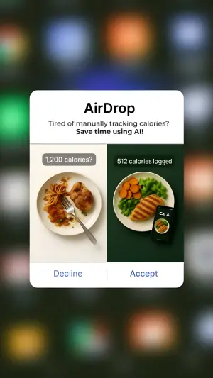
Vertical digital graphic with a heavily blurred smartphone app home screen grid
as the background. In the center, overlay a crisp white iOS AirDrop notification
box. Inside the box, bold top text reads "XXXXX" and subtext reads "XXXXX".
Below the text, include a split-screen image: the left side shows a messy plate
of food with a grey label reading "XXXXX", and the right side shows a healthy
plate of chicken and vegetables next to a smartphone with a dark green label
reading "XXXXX". At the bottom of the box, two text buttons read "XXXXX" and
"XXXXX".
Test: the split image (“Messy Food vs. Clean Food” inside the notification vs. a straightforward app screenshot). And the background: the blurred app grid vs. a blurred restaurant table, grounding it in a real calorie-tracking moment.
5. The Pink AirDrop (No-Makeup Makeup)
A soft, on-brand pink background with an AirDrop request and an inset flat-lay of the product. The casual “wants to send you” tone makes it feel like a friend sharing a find, not a brand selling.
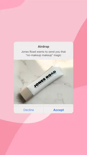
Digital graphic with a soft pink abstract wavy background. In the center,
overlay a crisp white iOS AirDrop notification box. Inside the box, top text
reads "XXXXX" and subtext reads "XXXXX". Below the text is an inset image of a
white cosmetic tube with bold black text reading "XXXXX" lying flat on a white
marble surface with hard sunlight shadows. At the bottom of the box, two text
buttons read "XXXXX" and "XXXXX".
Test: the product visual - the inset flat-lay tube vs. a close-up of a model's glowing “no-makeup” face, to see if the result sells better than the tool. And copy tone: casual “wants to send you…” vs. an urgent “You forgot your…” cart-abandonment hook.
6. The Lock-Screen Reminder (Liver Detox)
A full lock-screen mockup - time, aspirational wallpaper, and a notification banner carrying the message. This is the most complete disguise: it's not a floating box, it's an entire believable phone screen.
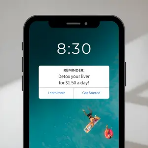
Digital mockup of a black smartphone displaying a lock screen interface. The
lock screen wallpaper is a top-down aerial photo of people floating on bright
floaties in clear turquoise water. Large white text at the top displays the
time "XXXXX". In the center of the screen, overlay a white iOS notification
banner. Inside the banner, top bold text reads "XXXXX" and main text reads
"XXXXX". At the bottom of the banner, two text buttons read "XXXXX" and
"XXXXX". The background behind the phone is a plain, light grey surface with
soft natural shadows.
Test: notification timing - a morning time (8:30 AM, recovery vibe) vs. late-night (11:30 PM, when users feel guilty about drinking). And lock-screen wallpaper: a calming aspirational ocean vs. a relatable “toxic” image (blurry cocktails or junk food) to heighten problem-awareness.
How to Build Your Own AirDrop / Notification Ad
The recipe:
1. Pick the native element. AirDrop request, calendar reminder, iOS notification banner, lock screen, FaceTime call. Each triggers the reflex differently - match it to your audience's device habits.
2. Get it forensically accurate. The exact box shape, the real Decline/Accept buttons, the correct system fonts. Almost-right kills the disguise. Quote every word exactly with the AI text in images rules.
3. Write the message as a command. The notification text is an imperative - “Take Your Lion's Mane,” “Detox Your Liver.” Direct, personal, present-tense.
4. Anchor it in a real moment. A shower, a desk, a phone home screen - the context makes the alert feel like it belongs to a real life. The background does the grounding work of making the disguise believable.
How to Test an AirDrop / Notification Ad
Two levers move performance most:
The UI type. This is the biggest one. AirDrop vs. calendar reminder vs. text bubble vs. FaceTime vs. lock-screen banner - each native element triggers a different intensity of the reflex, and different audiences react to different alerts. Test the platform itself, not just the copy.
The context timing. When the fake notification appears to arrive changes everything. A morning reminder, a late-night guilt-timed alert, a shower moment, a working-at-the-desk moment - match the notification to the exact instant the viewer feels the problem.
Conclusion: Impersonate the Phone, Not the Ad
Four to lock in:
1. A notification hijacks a reflex ads can't reach. Banner blindness ignores ads; the System Alert Reflex stops for a native UI element automatically. That's the entire edge.
2. Forensic accuracy is non-negotiable. The disguise only works if the UI is pixel-perfect. Almost-right triggers suspicion, not the reflex.
3. Write the message as a personal command. Imperative, present-tense, direct - the way a real alert talks to you, not the way an ad does.
4. Anchor it in the moment of need. The context and timing make the fake alert feel real - and place the product exactly where the problem lives.
The Rule of Thumb for the archetype: people scroll past ads but stop for their phone. Mimic a native alert precisely enough and the brain reads your message before it realizes it's an ad - the one reflex banner blindness can't override.
So the move: take a message that keeps getting scrolled past and rebuild it as a pixel-accurate AirDrop request or lock-screen notification, dropped onto a real moment where the viewer feels the problem. My bet is it stops the thumb - because it stopped looking like an ad.
Related reading: the product grid archetype and CTA buttons in AI ads.
Get instant access
Steal my ad concept & hook library, new breakdowns every week.
Join the free community