


People don't buy on savings.
They buy because they want the thing. Then they go hunting for a number that lets them feel smart about it. The receipt ad's only job is to hand them that number before they have to go looking.
My first receipt ad didn't understand that. I listed the prices, clean and honest, and let the reader add them up themselves. It died at 0.9% CTR.
I'd made them do the math.
The next version crossed out the retail price, did the subtraction for them, and circled the answer in green marker. Same product, same prices. 2.5% CTR.
This is a complete guide to receipt ads - the Receipt / Document archetype: an ad built to look like a store receipt, a tax form, or an official document, so it hijacks the reflex that makes you scrutinize paper instead of scrolling past it. I'll give you the build, three copy-paste prompts, and the reason the circled number matters more than the product.
Here's the deal.
What Is a Receipt Ad?
Receipt ad: An ad that mimics an official financial or administrative document - a store receipt, an itemized comparison, a W-2, a blueprint - to wrap a marketing claim in the authority of hard data. It hacks the administrative lizard brain: we're conditioned to stop and carefully read receipts and forms to check totals and catch errors, so the format pulls the viewer into reading line by line instead of scrolling.
Every other native format works on emotion. This one works on the opposite instinct: the cold, careful reading you give a document that might have an error in it.
And the eye trusts the shape of a document before it verifies a word inside it.
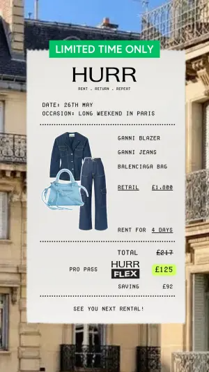
Here's a live one:
Note
Why It Works: The Math Alibi
Here's the mechanism nobody names.
The Math Alibi: People decide with emotion and justify with logic, so the receipt format hands an already-interested buyer the exact numbers they need to rationalize the decision. The circled total isn't information. It's permission. You're not convincing them to want it - they already do. You're giving them the math to feel smart about it.
That's why my first version failed. I gave them accurate prices but made them assemble the justification themselves. The winning version pre-built the alibi and circled it.
The archetype reads in three beats:
The format. Stark background, dotted lines, columns, official typography. This is the authority trigger. It signals “document, not ad” before any number is read.
The bottom line. The single most emphasized data point: the circled total, the struck-through retail, the neon-highlighted savings. The eye lands here first. This is the alibi.
The itemized proof. The line items the reader travels back to, to verify the total is real. This is what makes the alibi hold up under the scrutiny the format invited.
The kicker? The same play works without numbers. Swap arithmetic for authority - a W-2, a blueprint - and the official document becomes the alibi instead of the math. “This form is relevant to you” borrows the same lizard-brain scrutiny that a receipt does.
How to Build a Receipt Ad
Four moves. The second one is the whole ad.
Step #1: Nail the document format
The format is the authority. Get the details right: monospace or typewriter type, dotted separator lines, aligned price columns, a plausible header. A receipt that looks designed loses the aura of officialdom - the same native discipline behind Notes App Screenshot ads.
Texture helps. A slightly crumpled paper, an off-white scan, a faint print misalignment. The imperfections that say “this is a real printout, not a graphic.”
Step #2: Do the math for them and circle the answer
This is where I lost the first one. Never make the reader calculate the value. Pre-build the comparison and emphasize the payoff number so hard the eye can't miss it.
Cross out the retail price. Show the difference. Circle or highlight the final total. One number, maximally emphasized, is worth more than a perfect ledger the reader has to work through.
Digital graphic mimicking a printed store receipt on textured off-white
paper. At the top, a bright green rectangular badge reads "[LIMITED TIME
ONLY]" and a logo reads "[BRAND]". Below, typewriter-style text reads
"[order details]". In the center, a collage of three product items with an
itemized text list beside them reading "[item - £X]". Below the list, a
comparison reads "[RETAIL £1,800]" crossed out next to "[YOUR PRICE]". At
the bottom, a dotted line separates the total section, with a neon green
highlighted price reading "[£125]" and text reading "[you keep the
difference]".
Pro Tip
Step #3: Make the itemized proof scannable, not exhaustive
The line items exist so the reader can verify the total is honest. But a wall of twenty items defeats the purpose. Three to six recognizable line items is enough to make the math feel real without making it work.
When you're comparing against a competitor, the itemization is your weapon. Test naming the competitor directly against a generic label.
Digital graphic mimicking a crumpled piece of white paper. A bold black
header reads "[WHOLE FOODS:]". Below is an itemized list of grocery items
with prices in red text reading "[item - $X/LB]". A horizontal black line
separates the list from a summary. Black text "[WHOLE FOODS COST]" sits next
to red text "[$XX]", and below it black text "[BRAND COST]" next to green
text "[$XX]". Below that, bold black text reads "[ALL OF THE ABOVE.
DELIVERED.]". At the bottom, text reading "[TOTAL: $169/MONTH]" is surrounded
by a hand-drawn black marker circle. A logo at the bottom left reads
"[BRAND]".
Side note
Step #4: For non-savings verticals, swap math for authority
No price comparison? Use the document's authority directly. A tax form for a class-action or compensation angle. A blueprint for a technical B2B pitch. The official format carries the alibi even when there's no arithmetic.
Close-up, slightly angled macro photography of an official US W-2 Wage and
Tax Statement form. A strong, vibrant green color gradient overlay is
applied for a stylized look. In the bottom left corner, large, bold, stacked
text reads "[RECEIVED MARKETING EMAILS FROM]" in white and "[BRAND?]" in
bright green.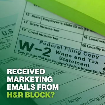

Pro Tip
The Receipt / Document Variant Map
| Variant | The alibi is | Best for | Test against |
|---|---|---|---|
| Savings receipt | Struck-through retail vs total | DTC, rental, high-ticket | Highlight color: green/red/yellow |
| Competitor comparison | Line-item price gap | Subscription, grocery, SaaS | Named vs generic competitor |
| Tax form / official doc | Institutional authority | Class-action, lead-gen | Question vs statement hook |
| Blueprint / schematic | Technical credibility | B2B, engineering | Human-hands vs clean flat-lay |
Savings receipt
The alibi is
Struck-through retail vs totalBest for
DTC, rental, high-ticketTest against
Highlight color: green/red/yellowCompetitor comparison
The alibi is
Line-item price gapBest for
Subscription, grocery, SaaSTest against
Named vs generic competitorTax form / official doc
The alibi is
Institutional authorityBest for
Class-action, lead-genTest against
Question vs statement hookBlueprint / schematic
The alibi is
Technical credibilityBest for
B2B, engineeringTest against
Human-hands vs clean flat-lay
Where Receipt Ads Fail
Four ways, and the first is the one I already confessed.
Making them do the math. Accurate but un-circled. If the reader has to assemble the value themselves, most won't. Do the subtraction and emphasize the answer.
Too many line items. A receipt with twenty rows reads as work, and work gets scrolled. Keep the itemization to a scannable few that make the total believable.
A format that looks designed. A too-clean, perfectly-kerned “receipt” reads as a graphic, and the authority evaporates. It has to look printed, scanned, slightly imperfect - the Notes App Screenshot discipline applied to documents.
Savings too big to believe. “£1,800 → £12” trips the skepticism reflex the format was supposed to disarm. The number has to be striking and plausible. An unbelievable total reads as a scam, not a deal.
- Use
- Authentic document details: monospace type, dotted lines, aligned columns.
- Avoid
- Making the reader calculate the value themselves.
- Use
- One maximally-emphasized number - circled, highlighted, or struck-through.
- Avoid
- Over-designed formats that lose the aura of officialdom.
- Use
- A scannable few line items, not an exhaustive ledger.
- Avoid
- Savings so large they read as a scam.
- Use
- A named competitor over a generic one when comparing.
- Avoid
- Burying the alibi. The payoff number is the ad; everything else supports it.
Should You Name the Competitor?
Usually yes. Test a direct call-out (“Whole Foods”) against a generic label (“the premium grocery store”). The named version tends to lower acquisition cost, because a specific competitor gives the reader a real price anchor and makes the comparison feel concrete rather than rhetorical. The risk is trademark and platform-policy friction, so keep the claim factual and the numbers defensible.
What Highlight Color for the Total?
Test three. Neon green codes as “money saved” and usually wins in a pure savings context. Red codes as “urgent” and can win when the angle is a deadline or a warning. Yellow codes as “important” and reads as a neutral highlighter. Whatever you pick, only one number gets the emphasis. Highlight everything and you've highlighted nothing.
Wrapping Up
The whole archetype is one idea: the receipt isn't information, it's permission.
Build the format authentic, do the math so the reader doesn't have to, and circle the one number that lets them feel smart about a decision they've already made emotionally. That's the Math Alibi, and it's why a struck-through price outsells a paragraph of benefits.
When there's no math to show, borrow the authority instead - a form, a blueprint, anything that reads as documented truth. The format was always the proof.
This is one spoke in the static ad archetype library. It's the logic-brain counterweight to the emotional native formats, and it pairs with the Blurred Bait archetype - one withholds the answer, the other hands it over in full.
Steal my ad concept & hook library - new breakdowns every week
Get instant access →What's the one number you'll circle - and have you done the math so your buyer doesn't have to?