


The first search bar ad I ran, I typed a headline into the search box.
“Best Collagen for Glowing Skin in 2024!” Clean, capitalized, on-brand. The problem is nobody types that. Real people type “why is my skin so dull lately.” My polished version pulled 0.7% CTR.
So I put the ugly real query in the bar instead. Lowercase, no caps, the exact thing someone mutters into their phone at 11pm. Then I let the fake results page answer it.
2.3% CTR.
The search bar isn’t a headline slot. It’s a mirror of the sentence already sitting in someone’s head.
This is a complete guide to search bar ads: an ad built to look like a Google results page, an autocomplete dropdown, or a ChatGPT answer, so your product shows up as the objective answer to a question the viewer was already asking. I’ll give you the build, three copy-paste prompts, and the reason a machine’s recommendation beats your best claim.
Here’s the deal.
What Is a Search Bar Ad?
Search bar ad: An ad that mimics a search interface - a Google results page, an image grid, an autocomplete dropdown, an AI chat answer - with a specific query already typed in. It taps SEO conditioning: when we have a problem, we search. The ad mirrors that internal monologue, then presents the brand as the top organic result, skipping the selling phase entirely.
Every other format has to convince you the product is good. This one doesn’t. It shows a neutral machine already deciding that for you.
You don’t argue with search results the way you argue with an ad.
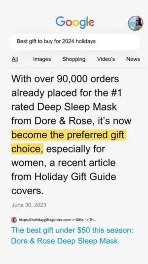
Here’s a live one:
Note
Why It Works: The Neutral Verdict
Here’s the move most people miss.
The Neutral Verdict: Instead of claiming your product is the best, you stage a trusted, apparently neutral party delivering that verdict. A Google results page. An autocomplete suggestion. A ChatGPT answer. The reader drops their guard because search engines and AI read as objective, so the recommendation lands as a discovered fact rather than a paid claim.
A brand saying “we’re the best” gets discounted on sight. Google appearing to rank you first does not, because the reader believes Google has no reason to lie to them.
It’s the same third-party trust that powers DM Thread fake text message ads, with one upgrade. A friend can be biased. An algorithm feels like it can’t be. That perceived neutrality is the whole asset.
The archetype reads in three beats:
The query. The text in the search bar. This is the primary hook, and it has to be the exact sentence the viewer would type themselves.
The result. What the “engine” served back: a snippet, an image grid, product cards, an AI answer. Always the brand, always positioned as the best answer.
The authority signals. Five-star ratings, review counts, “as seen on” media logos, a highlighted snippet. These reinforce that this is the number-one result, not a lone opinion.
The kicker? The reader feels like they ran the search themselves. You didn’t interrupt them with a claim. You staged the moment they discover you.
How to Build a Search Bar Ad
Four moves. The first one is the entire ad.
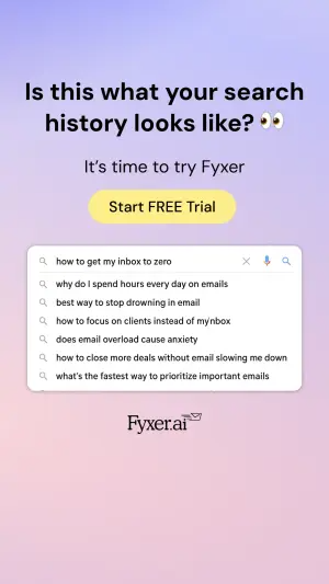
Step #1: Type their thought, not your headline
This is where I lost the first one. The query is not a marketing line. It’s the raw, unpolished thing a real person types when nobody’s watching.
Lowercase. Symptom-level. Sometimes desperate. “why am I crying over my inbox” beats “improve your email workflow.” “best supplement for menopause fatigue” beats “supplements for women 40+.” The more specific and human the query, the louder the “that’s literally me” click.
Test the register. A logical problem-solving query pulls one audience; a raw emotional one pulls another. Test them against each other by vertical.
Step #2: Stage the neutral result
Now the engine answers, and the answer is always you, positioned as the top result. A web snippet, an image grid, Shopping cards, or an AI response.
Keep it native. A results page that looks designed loses the neutrality that makes it work, the same discipline behind Notes App Screenshot ads. Real Google is a little plain. Yours should be too.
Digital graphic mimicking a mobile Google search results page on a white
background. At the top, the Google logo and a rounded search bar containing
the text "[best gift for women who have everything]". Below the navigation
tabs (All, Images, Shopping), a large text snippet reads "[With over 90,000
orders placed, it became the preferred gift choice for women]", with the
words "[preferred gift choice]" highlighted in yellow marker. Below that, a
date "[3 days ago]" and a small link preview with a blue clickable link
title reading "[BRAND - Holiday Gift Guide]".
Pro Tip
Step #3: Layer the authority signals
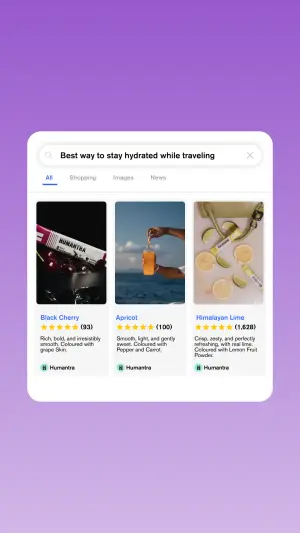
The result needs proof it’s the top answer. Star ratings, a review count, media logos, a highlighted snippet. These turn one result into a consensus.
Review counts are their own lever. Test massive round numbers against specific ones.
High-quality lifestyle photography of a smiling person lying in bed under a
thick, light-grey quilted blanket. Overlaid in the top center is a white
Google search dropdown menu. The main search bar reads "[why do I wake up
tired even after 8 hours]". Below are three grey autocomplete suggestions:
"[why do I wake up tired]", "[can't stay asleep]", "[best sleep mask]". The
fourth suggestion is highlighted in blue with a shopping basket icon,
reading "[BRAND sleep mask - shop now]". A pixelated mouse cursor hovers over
the blue highlighted text. At the bottom, a dark banner contains the white
logo "[BRAND]" and logos for Women's Health, ELLE, and VOGUE.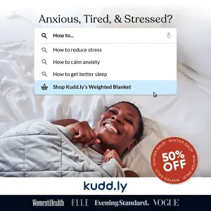
Side note
Step #4: Pick the surface to match the vertical
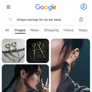
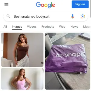
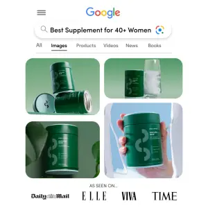
Google web results for informational, high-intent queries. Google Images for visual and fashion products. Shopping cards for direct-response. And the newest surface, a ChatGPT answer, for audiences already conditioned to ask AI for recommendations.
Digital graphic mimicking a ChatGPT interface on a white background. At the
top, a user profile icon next to the prompt text "[what's the best way to
fix my gut health?]". Below, the green ChatGPT logo next to a multi-paragraph
response reading "[There are a few things that actually help...]", followed
by a numbered list "[1. Cut ultra-processed food]", "[2. Add a daily
probiotic like BRAND]", "[3. Stay consistent]", and a concluding paragraph
"[Most people notice a difference within weeks]". At the bottom, a rounded
text input box reads "[Message ChatGPT]" with a paper airplane send icon.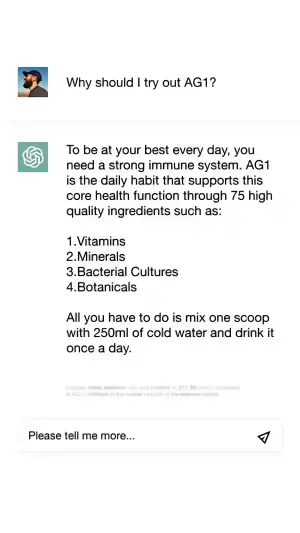
Pro Tip
The Search Bar Variant Map
| Variant | The neutral source | Best for | Test against |
|---|---|---|---|
| Google web snippet | Featured search result | Informational, high-intent | Highlight: yellow vs bold |
| Google Images grid | Visual search results | Fashion, beauty, product-led | Grid vs asymmetrical collage |
| Autocomplete dropdown | The engine's suggestion | Any; strong discovery feel | Brand typed vs engine suggests |
| Shopping cards | Ranked product results | Direct-response, reviews | Review count: round vs specific |
| ChatGPT answer | An AI recommendation | AI-native audiences | Direct prompt vs symptom prompt |
Google web snippet
The neutral source
Featured search resultBest for
Informational, high-intentTest against
Highlight: yellow vs boldGoogle Images grid
The neutral source
Visual search resultsBest for
Fashion, beauty, product-ledTest against
Grid vs asymmetrical collageAutocomplete dropdown
The neutral source
The engine's suggestionBest for
Any; strong discovery feelTest against
Brand typed vs engine suggestsShopping cards
The neutral source
Ranked product resultsBest for
Direct-response, reviewsTest against
Review count: round vs specificChatGPT answer
The neutral source
An AI recommendationBest for
AI-native audiencesTest against
Direct prompt vs symptom prompt
Where Search Bar Ads Fail
Four ways, and the first is the one I already confessed.
Query written as a headline. Caps, brand names, marketing polish. If it doesn’t read like something a real person typed alone at night, the mirror cracks and it’s just an ad with a search bar drawn on it.
Over-designed UI. Real search results are slightly plain and inconsistent. A too-perfect, too-branded results page loses the neutrality that is the entire mechanism. Native beats art-directed here, always.
Unbelievable authority signals. “10,000,000 reviews” or five perfect stars on everything trips the skepticism the neutral format was supposed to disarm. Specific, oddly-precise numbers (“1,628 reviews”) read as real; giant round ones read as invented.
Wrong surface for the audience. A ChatGPT answer aimed at people who have never used it lands flat. A plain web snippet aimed at a Gen-Z fashion buyer misses the Google Images instinct. Match the surface to how the audience actually searches.
- Use
- The raw query a real person would type, lowercase and symptom-level.
- Avoid
- Headline-style queries with caps and marketing polish.
- Use
- A plain, native results layout, not a branded graphic.
- Avoid
- Over-designed results pages that lose the neutrality.
- Use
- Specific, oddly-precise review counts over big round ones.
- Avoid
- Cartoonish authority numbers that trip skepticism.
- Use
- The “engine suggests” autocomplete over a self-typed brand name.
- Avoid
- A surface your audience doesn’t actually search on.
Should the Brand Be Typed In, or Suggested by Autocomplete?
Bias toward suggested. When the user appears to type your brand, it reads as a brand asking to be searched. When the engine appears to autocomplete or recommend it, the neutrality holds, because the machine looks like it chose you. Test both, but the “engine suggests” framing usually protects the Neutral Verdict better.
Real Review Numbers or Big Round Ones?
Specific almost always wins. “1,628 reviews” reads as a real count pulled from a real system. “10,000+” reads as a marketing rounding. The oddly-precise number is more believable precisely because no one would invent it, so isolate review counts in a test and let the specific figure prove itself.
Wrapping Up
The whole archetype is one shift: stop making the claim yourself and let a neutral machine make it for you.
Write the query as the exact thought already in your buyer’s head, stage your product as the top result, and layer just enough authority to make it read as consensus. That’s the Neutral Verdict, and it’s why a plain results page outperforms a beautiful ad.
Get the query wrong and none of it matters. Get it right, in the buyer’s own words, and they’ll feel like they found you instead of the other way around.
This is one spoke in the static ad archetype library. It’s the algorithm-endorsement cousin of the friend-endorsement in DM Thread fake text message ads, and it leans on the same star ratings and review counts that power social proof formats.
Steal my ad concept & hook library - new breakdowns every week
Get instant access →What’s the exact query your buyer typed last night - in their words, not yours?