


Most of my early AI ads were unusable for one reason: the text was nonsense.
I'd prompt an ad with a headline and get back a beautiful image with a garbled mess where the words should be - "SPME SKIM SIMPFIED" in a nice font, perfectly kerned. The image was great. The copy was illegible. And an ad you can't read is not an ad.
Then I learned the two things that fix it. First, you have to quote the exact text you want, word for word, in the prompt - the moment you describe it loosely ("a headline about skin"), the model invents its own spelling. Second, text isn't a caption you tack on and hope for. It's a design layer you build in stages: quote it, style it, place it, contrast it. Each stage moves the ad from "text appears" toward "text is designed."
This is the exact process I use to get readable, well-designed text into an AI ad, with the copy-paste prompts for each stage.
Let's make the words legible.
Why AI Writes Gibberish by Default
The model isn't spelling - it's rendering the shape of text it has seen. Left to invent, it produces letter-forms that look right and read wrong. The fix is to stop letting it invent.
The Text Layer: Text in an AI ad is a design layer you build, not a caption you hope for. You quote the exact words, style the type, place it deliberately, and contrast it against the image. The escalation from "text appears" to "text is designed" is what separates a gibberish render from a finished ad - and it starts with one rule: quote the text exactly, or the model invents it.
Anything you don't want the model to write, you fence off with the negative prompt layer - no gibberish text, no fake lettering - and everything you do want, you quote.
The 5 Stages of the Text Layer
At a glance:
| Stage | What it controls | The core move |
|---|---|---|
| Quote it | Whether it's legible at all | exact words in quotes |
| Style it | The type's personality | name the font style |
| Place it | Where it sits | name the position |
| Contrast it | Whether it's readable | name the contrast |
| Size & hierarchy | What's read first | name the size relationships |
Quote it
What it controls
Whether it's legible at allThe core move
exact words in quotesStyle it
What it controls
The type's personalityThe core move
name the font stylePlace it
What it controls
Where it sitsThe core move
name the positionContrast it
What it controls
Whether it's readableThe core move
name the contrastSize & hierarchy
What it controls
What's read firstThe core move
name the size relationships
Now the detail.
Stage 1: Quote the Text Exactly
The single most important rule. Put the exact words you want rendered inside quotation marks in the prompt. This tells the model the specific letters - the moment you describe text loosely, the model invents its own gibberish.
- Use
- Every prompt that includes any text element whatsoever - headlines, CTAs, logos, labels, packaging.
- Avoid
- The design deliberately calls for no legible text, or blurred background signage that shouldn't read - then you don't quote, you blur.
the text "Your skin. Simplified." on the banner
headline reads "Your Skin. Simplified." in a bold clean font
the words "SHOP NOW" on the button
logo that reads "AURUM" on the label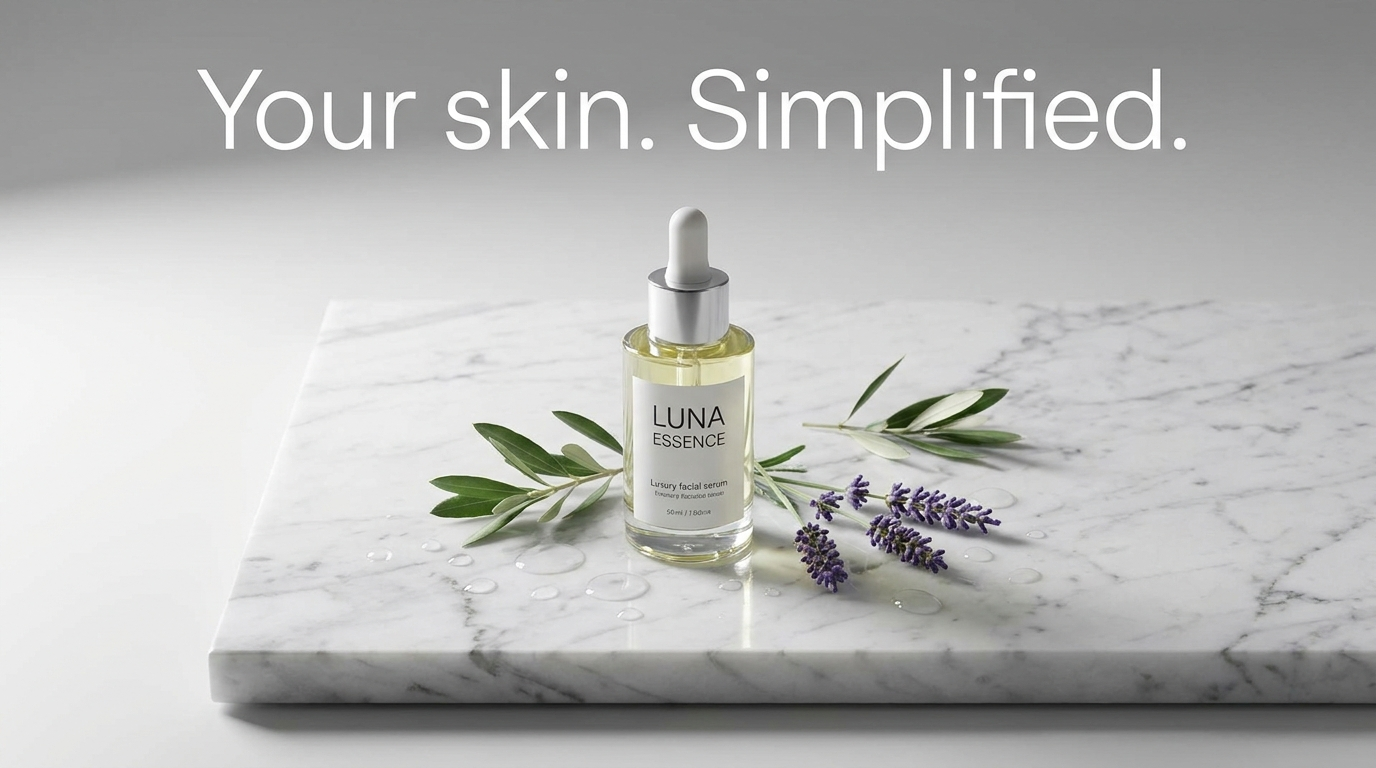

What you see: the headline reads exactly as quoted - no gibberish, no substituted characters. The quotation marks told the model the specific letters to render rather than inventing its own. That's the difference between a legible ad and a nice-looking, unusable one.
Stage 2: Style the Type
Once the words render, you control the type's personality - because the font carries as much meaning as the words. A thin serif reads luxury; a bold sans reads confidence; a handwritten script reads warmth. Name the style the brand's register demands.
- Use
- Any text where the typographic style is part of the brand message - which is nearly all of it.
- Avoid
- The model can render it in a generic sans and the style isn't a signal - save the specificity for elsewhere.
clean modern sans-serif typography
bold condensed sans-serif headline
elegant thin serif, luxury typography
handwritten script font, warm and personal
heavy geometric sans-serif, confident and bold
all-caps headline, wide letter spacing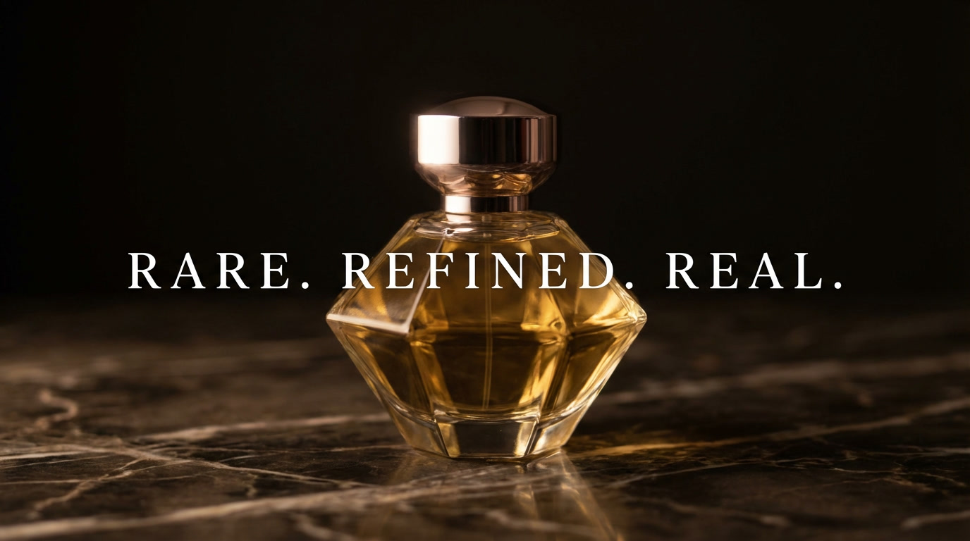

What you see: the headline reads and carries a personality - the spaced thin serif says luxury and restraint, where a bold condensed sans would have said confidence and results. The typeface is doing message work, not just legibility work.
Stage 3: Place the Text
Where the text sits is a composition decision - it should occupy the negative space the image left for it, never crossing the subject or fighting the focal point. This is where the text layer meets photo composition: the empty zone in the frame is where the text belongs.
- Use
- Any ad with both an image and a text element - the placement decides whether the layout reads clean or cluttered.
- Avoid
- The text is the entire creative (a pure-type ad) - then placement is the whole layout, handled differently.
headline placed in the upper third
text in the clean negative space on the left
CTA button centered at the bottom
headline in the top-left, product on the right
text occupying the empty upper area of the frame
What you see: the headline occupies the upper third, sitting in the clean negative space the composition left for it. The product sits below in its own zone. Nothing overlaps, nothing competes, and the ad reads in a clean top-to-bottom order.
Stage 4: Contrast the Text
Text is only legible if it separates from what's behind it. Dark text on a light zone, light text on a dark zone, or a subtle shadow or panel behind the text to lift it off a busy area. It's a legibility decision and a design one at once.
- Use
- Any text over an image where the background varies in brightness - which is most real ads.
- Avoid
- The text sits over a clean flat zone with obvious contrast already - no extra treatment needed.
white text on dark background zone
dark text on light background area
text with subtle drop shadow for legibility
text over a semi-transparent panel for contrast
high contrast text, clearly readable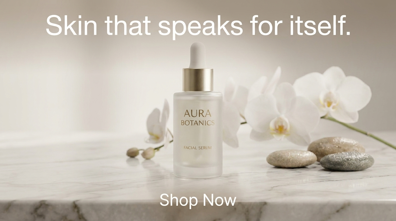
What you see: the text sits over a slightly darker part of the background - just enough that the white type reads cleanly against it. The contrast is legible without being harsh, and the text separates from the image completely. Legibility and design solved in one move.
Stage 5: Size & Hierarchy
When the ad has multiple text elements - a headline, a subhead, a CTA - their relative size tells the eye what to read first. The headline is largest, the subhead smaller and supporting, the CTA small but visually distinct. Hierarchy is how a multi-element ad reads in the right order.
- Use
- Any ad with more than one text element - headline plus CTA, or headline plus subhead plus button.
- Avoid
- The ad has a single text element - then hierarchy isn't a factor.
large headline, small supporting subhead
oversized headline, minimal CTA below
headline dominant, subhead and CTA smaller
small distinct CTA button, large headline above
clear type hierarchy, headline to subhead to CTA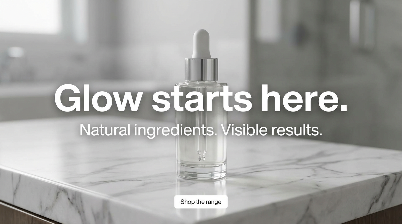
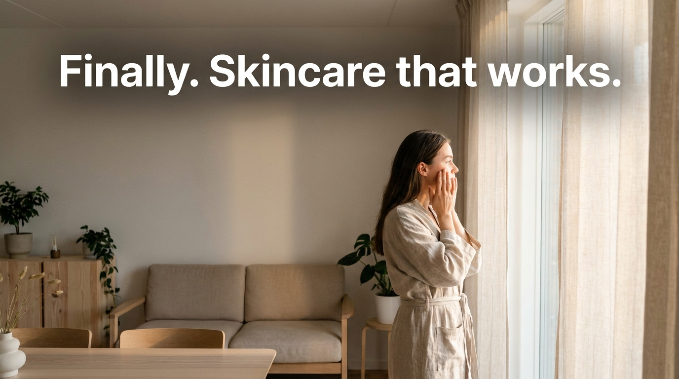
What you see: three text elements at clearly different sizes - the headline dominates, the subhead supports, the CTA is small but distinct. The size relationships tell the eye the exact order to read them, so the ad reads as a sequence rather than a competing wall of type.
Visual Comparison: The Same Ad at Five Levels of Text Prompting
Watching the escalation is the fastest way to internalise it. Same base idea - a skincare product on a light surface - with the text prompt built up stage by stage.
Level 1 - text described loosely: a beautiful image where the model invents its own copy. Nothing was quoted, so the words are whatever the model felt like writing.

Level 2 - text quoted exactly:
Level 3 - quoted + styled + placed:
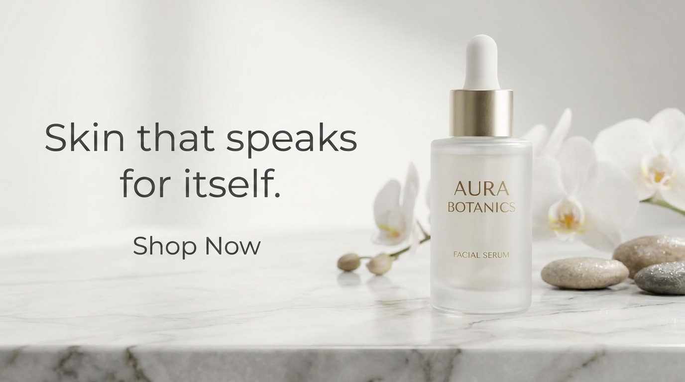
Level 4 - quoted + styled + placed + contrasted:
Level 5 - full text layer with hierarchy:
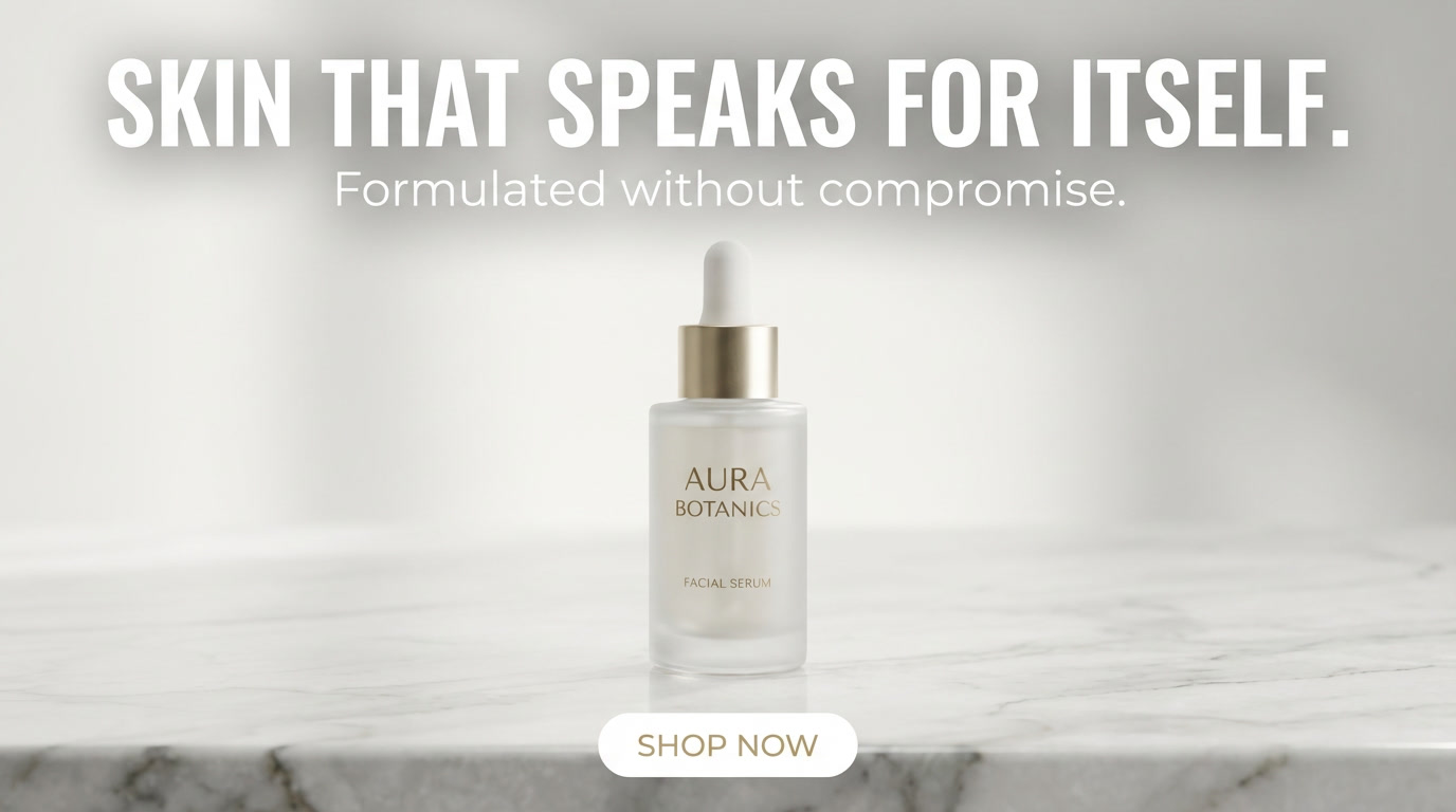
Same base image, transformed entirely by how the text was prompted.
The Full Readable Text Stack
The text layer goes near the end of the prompt, after the image and composition are set:
Clean skincare product ad, a serum bottle on a soft white surface with
natural window light and a few dried botanicals, clean negative space in the
upper left of the frame, the headline "Your skin. Simplified." in an elegant
thin serif font placed in the upper-left negative space in dark charcoal
text with clear contrast against the light background, a small "SHOP NOW"
button in the lower area in a clean sans-serif, clear type hierarchy with the
headline dominant, photorealistic product photography, professional ad design
Quoted text, a styled font, a deliberate placement, solved contrast, and a size hierarchy - the full text layer built in one prompt. The result is a legible, designed ad, not a nice image with nonsense written on it.
Conclusion: Build the Text, Don't Hope for It
Four to lock in:
1. Quote it or lose it. The single rule that fixes gibberish: put the exact words in quotation marks. Describe text loosely and the model invents its own spelling.
2. Text is a design layer, not a caption. Style it, place it, contrast it, size it. Each stage moves the ad from "text appears" to "text is designed."
3. Placement is composition. Text belongs in the negative space the image left for it - never crossing the subject or fighting the focal point.
4. Contrast is legibility. Dark on light, light on dark, or a subtle panel behind. If the text doesn't separate from the background, none of the other stages matter.
The rule of thumb that opens the module: the model renders the shape of text, not the meaning of it - so it invents gibberish unless you quote the exact words. Quote the text, style it, place it, contrast it. Text is a layer you build, not a caption you hope the model spells right.
So the move: take an ad where the text came out as gibberish and regenerate it with the exact headline in quotation marks, a named font style, and a placement in the clean negative space. Same image. My bet is the words finally render legibly - because you stopped hoping and started quoting.
Related: negative prompting, ad layout compositions, and the full AI ad prompt library.
Steal my ad concept & hook library
Every prompt, archetype, and hook I use in my own accounts. Updated weekly.
Join the free Skool community