


Handwriting is one of the fastest trust signals there is in an ad - and one of the easiest to get wrong.
A sticky note, a torn-paper reminder, a handwritten label on a jar: these formats read as "a real person did this," which is exactly why they convert in UGC. But my early attempts came out looking like a handwriting font - every letter identical, perfectly even, mechanically consistent. Perfectly consistent handwriting isn't handwriting at all. It's the tell.
Here's what I learned: handwriting reads as human because it's uneven. The stroke weight varies as the pen presses harder and lighter. The baseline wanders slightly off level. The same letter looks a little different each time it appears. Those imperfections are the entire signal - and they layer onto a specific paper format that carries its own texture and history.
These are the six handwritten formats I prompt to look like a real hand wrote them, with the exact keywords for each.
Let's make it human.
Why Perfect Handwriting Is the Tell
A handwriting font is uniform by design - and uniformity is precisely what a real hand never produces. The model defaults to that uniform version unless you tell it to break.
Imperfect Ink: Handwriting reads as human because it's uneven - the stroke weight varies with pen pressure, the baseline wanders off level, and the same letter looks slightly different each time. Those specific imperfections are the proof a person wrote it. Perfect, uniform, evenly-spaced "handwriting" reads as a font. You prompt the imperfection on purpose, layered onto a paper format with its own texture and history.
It's the text-layer cousin of the Earned Wear principle - the ink carries the human, the paper carries the wear - and both draw on grounding elements: the small imperfect details are what prove reality.
The 6 Handwritten Formats
At a glance:
| Format | The signal it sends | Use for |
|---|---|---|
| Sticky note | A personal reminder, informal | UGC, personal, testimonial |
| Torn notebook paper | Casual, in-the-moment | Relatable, everyday, notes |
| Handwritten annotation | Genuine belief, markup | Product proof, ingredient call-outs |
| Round sticker / label | Handmade, small-batch, craft | Artisan, food, natural |
| Washi tape + writing | Aesthetic, scrapbook, warm | Lifestyle, memory, feminine |
| Kraft paper label | Sustainable, unbleached, honest | Eco, organic, artisan |
Sticky note
The signal it sends
A personal reminder, informalUse for
UGC, personal, testimonialTorn notebook paper
The signal it sends
Casual, in-the-momentUse for
Relatable, everyday, notesHandwritten annotation
The signal it sends
Genuine belief, markupUse for
Product proof, ingredient call-outsRound sticker / label
The signal it sends
Handmade, small-batch, craftUse for
Artisan, food, naturalWashi tape + writing
The signal it sends
Aesthetic, scrapbook, warmUse for
Lifestyle, memory, feminineKraft paper label
The signal it sends
Sustainable, unbleached, honestUse for
Eco, organic, artisan
Now the detail.
1. Sticky Note
A yellow Post-it - the most powerful single handwriting format in advertising, because everyone has written one and received one. Ballpoint or marker ink, a slightly curled corner, the light adhesive shadow on the surface beneath, and a yellow that is never perfectly uniform.
- Use
- Personal callouts, 'I found this' testimonial feel, annotation on before/after ads, urgency messaging, pricing callouts in a human voice.
- Avoid
- The brand is luxury or clinical - a sticky note signals casual and personal, which conflicts with premium restraint.
yellow Post-it sticky note with handwritten message
slightly curled corner on sticky note
real shadow cast by sticky note on surface
sticky note paper texture, slightly fibrous
handwritten ink on sticky note, ballpoint pen quality
sticky note at a slight angle, not perfectly straight
ink color slightly uneven on sticky note
sticky note with uneven baseline handwriting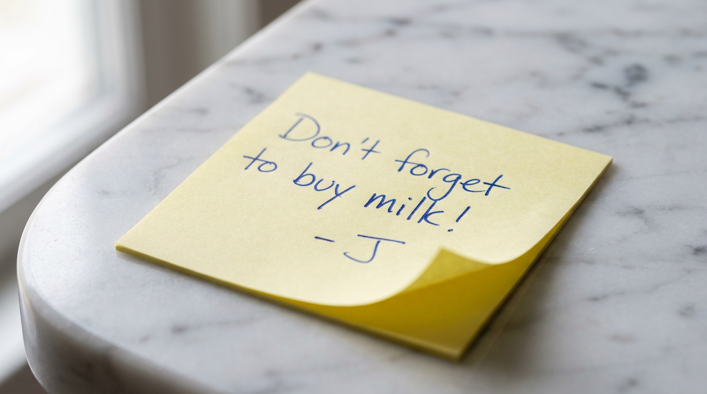
What you see: the note isn't perfectly straight, the corner has begun to curl, and the shadow beneath confirms the paper has thickness. The handwriting has an uneven baseline and varying stroke weight - a pen, not a font.
2. Torn Notebook Paper
A page torn from a notebook - the irregular, slightly fibrous torn edge is the whole signal. A clean straight edge reads as a graphic; a genuine tear has raised fibers and an unpredictable line, and the ink interacts with the paper grain.
- Use
- Casual handwritten messages, testimonial quotes rendered as a personal note, 'real person found this' hooks, before/after annotations.
- Avoid
- The creative is premium or the context is luxury - torn paper is casual by nature.
torn notebook paper, irregular fibrous torn edge
lined notebook paper, faint blue lines visible
plain white paper, slightly off-white surface
handwritten note on torn paper, ink bleeding into fibers
torn edge catching light, slightly raised paper fibers
paper grain visible under handwriting
creased paper, one fold line visible
torn paper resting at slight angle, natural shadow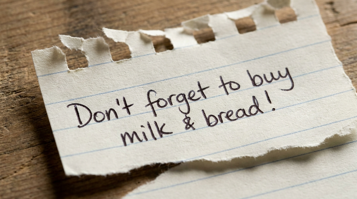
What you see: the tear is irregular with visible fibers, the blue rules sit pale beneath the ink, and the baseline drifts across the lines. Real note, not a pasted graphic.
3. Handwritten Annotations & Markup
Circles, arrows, underlines and crosses drawn straight onto a product image - the visual language of someone who got excited and grabbed a pen. It's the most effective attention-directing device in direct response, because it mimics genuine behaviour.
- Use
- Circling a key ingredient, arrows pointing at before/after detail, underlining a price, crossing out an old price, a star beside a claim.
- Avoid
- The markup would obscure important product detail - annotation should direct attention, not block it.
hand-drawn circle in red ink around text or product
imperfect hand-drawn circle, not perfectly round
arrow hand-drawn in ballpoint pointing to element
handwritten underline, slightly wavy
cross-out line through text, handwritten
red marker circle with slight ink variation
annotation in margin, handwritten note beside element
What you see: the circle isn't round and doesn't close, the arrow tapers at the point, and the line weight varies where the pen pressed harder. A hand drew this fast.
4. Round Stickers & Handwritten Labels
A circular sticker with handwritten text on a jar or package. The sticker surface is slightly shinier than what it's stuck to, it may bubble or lift at one edge, and the ink sits on the sticker material rather than soaking in.
- Use
- Pricing callouts, 'NEW' or 'SALE' labels, handwritten product descriptions, hand-applied trust signals like '100% Natural'.
- Avoid
- The context is premium and a hand-applied sticker would undermine the production-quality signal.
round white sticker with handwritten text
circular sticker, slight sheen on sticker surface
sticker edge slightly lifting at one side
handwritten text on sticker, black marker quality
sticker applied at very slight angle
kraft paper round sticker, artisan label
price sticker handwritten, natural ink on sticker surface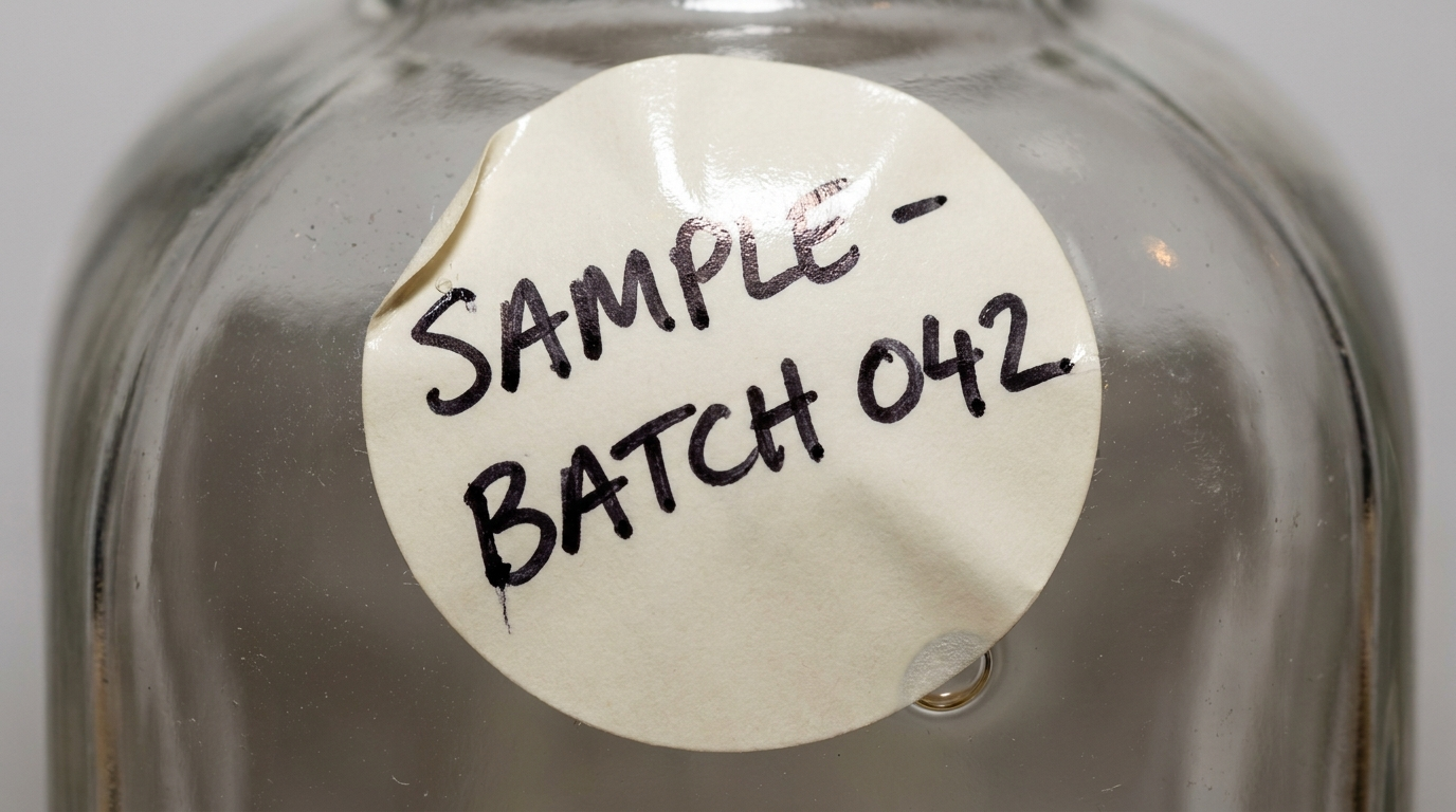
What you see: the sticker isn't perfectly centred or flat, and the marker strokes thicken and thin. The sticker surface catches light differently than the glass beneath it.
5. Washi Tape & Written Notes
A strip of washi tape - semi-transparent, matte, with torn rather than cut ends - used as a label surface or to stick a note down. You can just see the surface below through it, and the edges are never perfectly straight.
- Use
- Artisan and natural brand aesthetics, sticking a handwritten note into a scene, label replacement on mockups, decorative annotation in a flat lay.
- Avoid
- The brand has no connection to craft, artisan or natural positioning - washi tape is a specific aesthetic signal.
washi tape strip, semi-transparent matte surface
washi tape with slightly irregular torn ends
handwritten text on washi tape, ink over tape texture
washi tape holding down paper at corner
washi tape edge slightly translucent
surface texture through washi tape, matte finish
washi tape strip at slight angle, hand-applied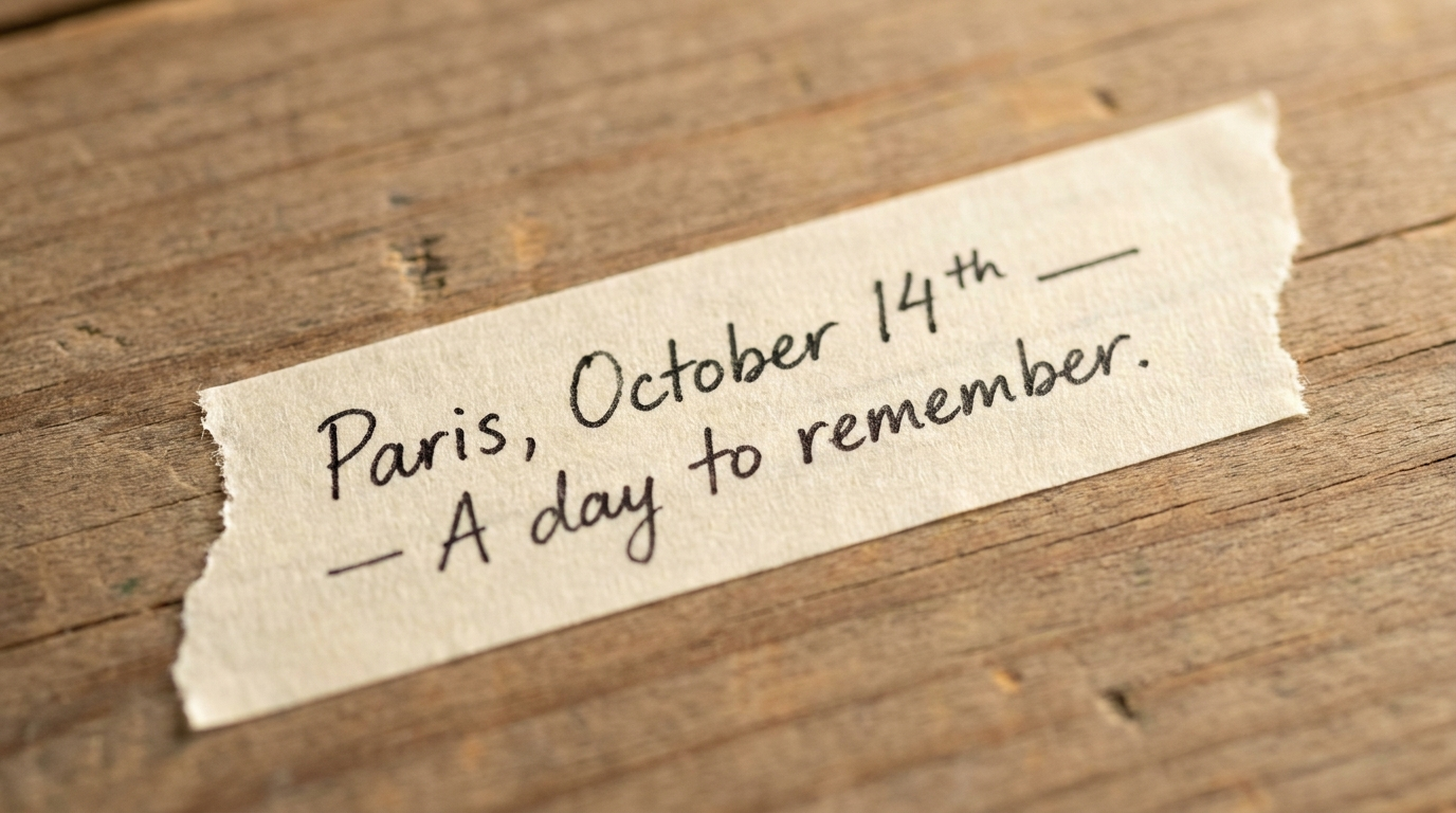
What you see: the ends are torn rather than cut, the grain reads faintly through the tape, and the ink sits on the matte surface. Assembled by a person.
6. Kraft Paper Labels
Brown kraft as a label surface - the warm tone of unbleached paper, a rough fibrous texture, and ink that absorbs slightly instead of sitting crisp on top. Kraft handwriting reads rustic where white-label handwriting reads clean.
- Use
- Natural beauty, organic food and beverage, artisan and small-batch positioning, sustainable brands - anywhere the language should read handmade.
- Avoid
- The brand is high-tech or premium-slick - kraft is warm and rustic, a mismatch for a clean modern register.
brown kraft paper label, natural warm tone
kraft paper label with handwritten text
rough kraft paper surface texture
handwritten ink on kraft paper, absorbed and rustic
kraft paper slight color variation
pen ink darker on kraft paper, more absorbed
What you see: the ink soaks slightly into the fiber so the strokes are less crisp, and the kraft reads rough and warm. It looks like a small producer who cares about detail.
The Full Handwritten Realism Stack
Layer the ink imperfection and the paper history together:
Top-down flat lay, a torn piece of lined notebook paper on a marble surface,
an irregular fibrous torn edge along one side with visible paper grain, the
handwritten message "Don't forget the meeting at 4 PM - J" in black ballpoint
with visible stroke-weight variation and a slightly wandering baseline, a
faint fold line across the paper, a soft shadow where the paper lifts at one
corner, warm natural window light, 50mm lens, photorealistic lifestyle
photography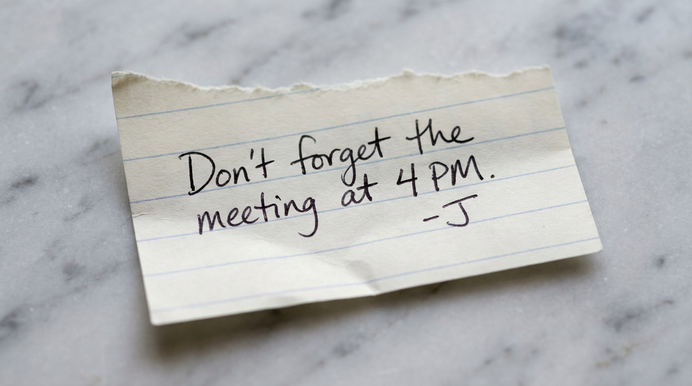
Imperfect ink (varying weight, wandering baseline), a real paper format (torn edge, visible grain, a fold), and the physical proof (shadow, lift) - the full handwritten layer built in one prompt. It reads as something a real person wrote and left there.
Conclusion: Break the Handwriting on Purpose
Four to lock in:
1. Perfect handwriting is a font. Uniform, evenly-spaced, identical letters read as generated. Imperfect Ink is what reads as human.
2. The ink and the paper are two jobs. The ink carries the human; the paper carries the format and its wear. Prompt both.
3. Physical proof grounds it. A curled corner, an adhesive shadow, a slight angle, a fold - these confirm the paper is a real object.
4. Match the format to the brand. Sticky notes for personal UGC, kraft labels for artisan and organic, washi tape for warm lifestyle.
The rule of thumb that anchors it: the model renders the shape of handwriting, not the hand. Real handwriting is never perfectly spaced, never perfectly level, and never consistent in stroke weight. Break all three deliberately, layer them onto a paper format with its own texture and history, and it reads as a person.
So the move: take an ad where the handwriting came out looking like a font and regenerate it as a yellow Post-it with the exact words, an uneven baseline, varying stroke weight, a curled corner and a soft shadow. Same message - it stops looking generated and starts looking like a note someone left on your desk.
Related: AI text in images, realistic AI textures, and the full AI ad prompt library.
Steal my ad concept & hook library
Every prompt, archetype, and hook I use in my own accounts. Updated weekly.
Join the free Skool community