


Metal was the material I got wrong the most.
A gold ring, a chrome bottle cap, a piece of jewelry - these are the exact products where a fake metallic surface kills the whole ad. And mine kept coming out looking like painted plastic: a flat gold-colored surface with a single dead highlight, no depth, no life.
Then I understood the thing that changed everything: metal has no color of its own. It's pure reflection. A gold ring looks gold because it's reflecting warm light back at you. A chrome cap looks like chrome because it's mirroring the room around it. When you prompt the metal and forget the reflection, you get painted plastic. When you describe what the metal is reflecting, you get metal.
And each metal reflects differently - gold warm, chrome mirror-sharp, brushed soft and directional, oxidized dull and matte.
These are the eight metal types I prompt by their reflective behavior, with the exact keywords for each.
Let's make it reflect.
Why Metal Is a Mirror, Not a Color
A rendered metal object is a colored surface with a highlight painted on. A real one is a mirror bending the whole room into itself.
The Reflection Rule: Metal has no color of its own - it's pure reflection, so a metallic surface is only ever as convincing as what you tell it to reflect. Gold reflects warm light, chrome mirrors the environment, brushed metal smears the reflection into a directional band. Describe the reflection, not just the metal, and the surface stops being painted plastic and starts being metal.
It's the reflective extreme of the material wear logic - and it leans hard on studio lighting, because a mirror is only as good as the light and environment it has to reflect.
The 8 Metal Types
At a glance:
| Metal | How it reflects | Use for |
|---|---|---|
| Gold (warm) | Warm, soft, rich highlights | luxury beauty, jewelry, premium |
| Silver / white gold | Cool, neutral, bright | modern luxury, tech, watches |
| Rose gold | Warm-pink, soft balance | feminine luxury, beauty, jewelry |
| Chrome / mirror | Sharp, full environment | tech, automotive, editorial |
| Brushed gold | Soft directional warm band | premium packaging, accessories |
| Oxidized / antique | Dull, matte, tarnished | heritage, vintage, artisan |
| Gold foil / packaging | Bright reflective accents | premium packaging, foil print |
| Jewelry gemstones | Metal + stone interaction | fine jewelry, engagement |
Gold (warm)
How it reflects
Warm, soft, rich highlightsUse for
luxury beauty, jewelry, premiumSilver / white gold
How it reflects
Cool, neutral, brightUse for
modern luxury, tech, watchesRose gold
How it reflects
Warm-pink, soft balanceUse for
feminine luxury, beauty, jewelryChrome / mirror
How it reflects
Sharp, full environmentUse for
tech, automotive, editorialBrushed gold
How it reflects
Soft directional warm bandUse for
premium packaging, accessoriesOxidized / antique
How it reflects
Dull, matte, tarnishedUse for
heritage, vintage, artisanGold foil / packaging
How it reflects
Bright reflective accentsUse for
premium packaging, foil printJewelry gemstones
How it reflects
Metal + stone interactionUse for
fine jewelry, engagement
Now the detail.
1. Gold (Warm Metal Logic)
Gold reflects a warm, slightly desaturated version of its environment - it doesn't just reflect light, it tints everything it reflects with its own yellow warmth. What makes gold look expensive is the extreme contrast between its brightest highlight and its deepest shadow, with almost no mid-tone in between.
- Use
- Luxury beauty and jewelry, premium products with gold packaging, any creative where gold is a material signal of premium positioning.
- Avoid
- The product is a cooler metal - gold logic applied to non-gold produces the wrong color temperature and the wrong reflective quality.
polished gold, warm metal reflection
gold ring, bright specular highlight
gold surface, high contrast bright and dark
warm gold reflection, yellow-amber tint
polished gold, mirror-like surface
gold sheen, deep shadow high contrast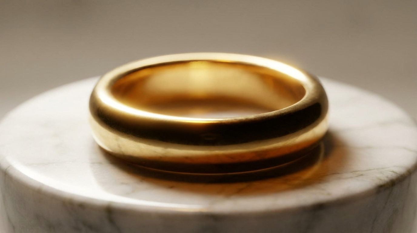
What you see: the highlight on the ring is a single bright zone - almost white at its center with a warm gold edge. It transitions straight into shadow with barely any falloff, and the shadow side picks up the warm color of the marble as a reflection. Extreme contrast, warm tint, and an almost complete absence of middle tones: that's gold.
2. Silver & White Gold (Cool Metal Logic)
Silver reflects its environment with a cool, neutral tone - it doesn't add warmth the way gold does, it simply mirrors the world around it with high fidelity. Highlights are pure white, shadows are cool blue-grey, and the overall contrast is lower than gold because no warm color is pushing it.
- Use
- Silver jewelry, white gold, platinum, and any premium product with a silver or chrome finish.
- Avoid
- The material is warm-toned gold or rose gold - cool metal logic on warm metal gives the wrong color temperature.
sterling silver, cool neutral reflection
silver ring, pure white highlight
cool grey shadow on silver surface
silver chain, high fidelity environment reflection
white gold, neutral cool metal
platinum surface, blue-grey shadow tone
What you see: each link catches the light at a slightly different angle - some bright white, some mid-grey, some nearly dark depending on orientation. The highlights carry no warmth and the shadow zones are cool blue-grey. Honest, reflective, neutral metal.
3. Rose Gold (Warm-Cool Balance)
Rose gold sits between the warmth of yellow gold and the coolness of silver - a pink-amber tone with a specific delicate quality. The highlight is warm and slightly pink; the shadow is a muted rose-brown rather than the deep warm shadow of yellow gold, and the contrast is softer than either neighbor.
- Use
- Premium beauty packaging, fashion jewelry, and brands with a soft, feminine luxury aesthetic.
- Avoid
- The product needs the strong warm signal of yellow gold or the cool precision of silver.
rose gold surface, pink-amber reflection
rose gold jewelry, warm pink highlight
rose gold packaging, soft warm metal
rose-copper tone metal, delicate reflection
blush gold surface, muted warm tone
rose gold highlight, warm shadow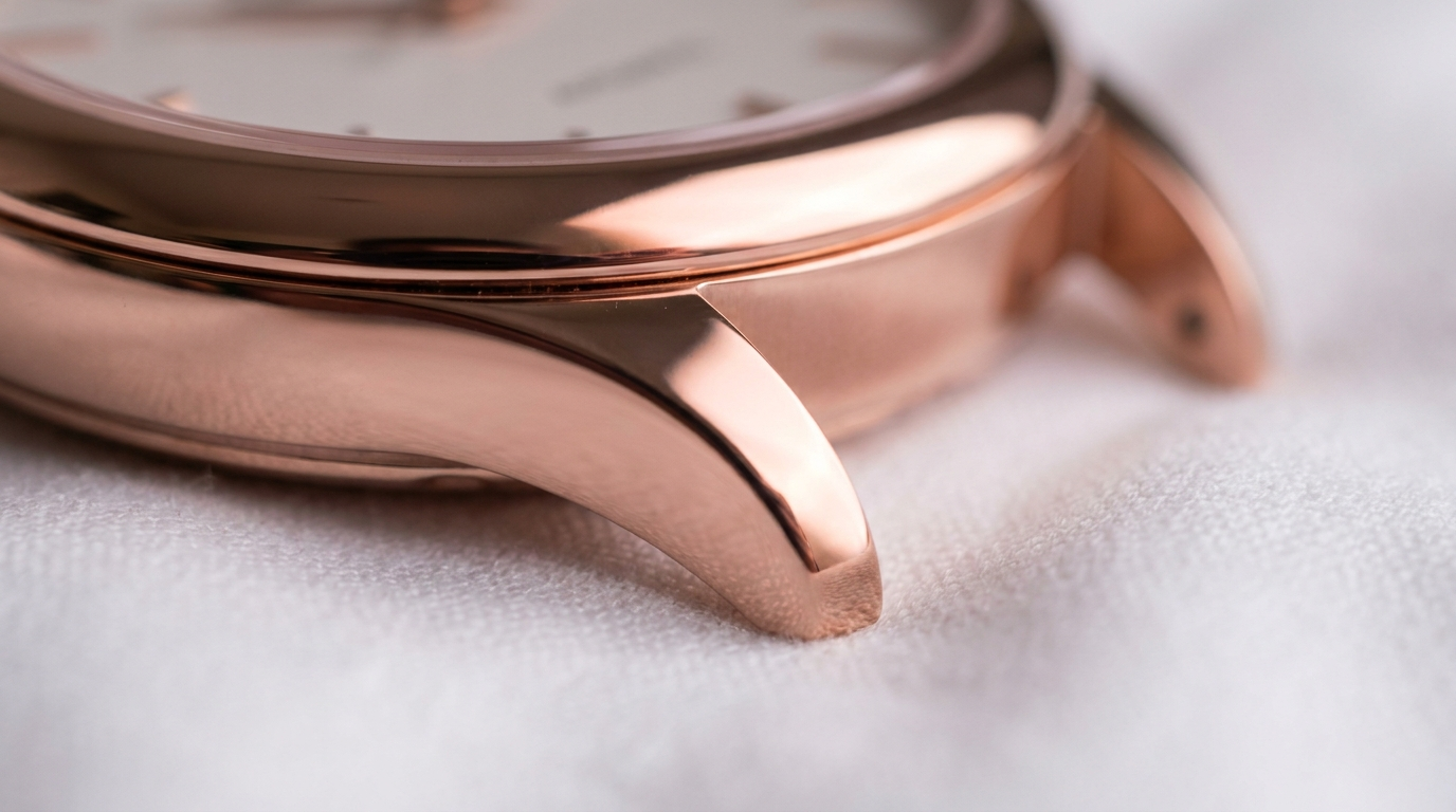
What you see: the highlight is pink-warm rather than yellow-warm, and the shadow zone is a muted rose-brown - warmer than silver, softer than gold. There's a wider mid-tone range before the surface goes dark. Rose gold has a gentleness the other metals don't.
4. Chrome & Mirror-Finish Metal
A surface polished to a mirror finish reflects its environment with such high fidelity that it essentially disappears and shows only what's around it. Chrome has no inherent color - it's made entirely of reflections, with a very bright specular point and the environment wrapped and distorted across the curve.
- Use
- Tech and appliance product photography, premium kitchen and bathroom fixtures, automotive-adjacent lifestyle, editorial product work.
- Avoid
- The environment hasn't been considered - chrome mirrors the mess around it, and a poorly composed scene reads as confusion, not premium.
chrome surface, mirror-finish reflection
polished steel, environment reflected
chrome object, distorted environment reflection
mirror-finish metal, no inherent color
chrome highlight, white specular
polished chrome, curved surface reflection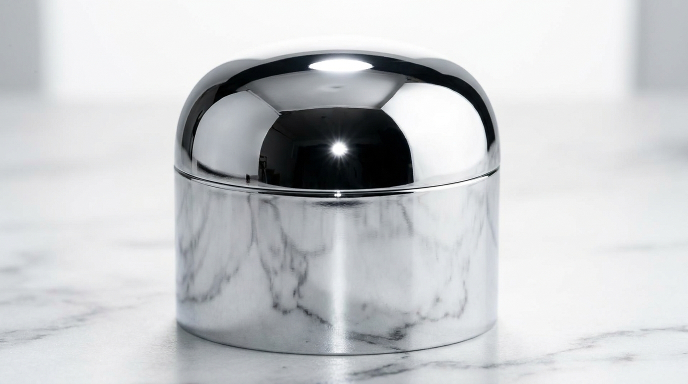
What you see: the cap is entirely composed of what it reflects. The ceiling reads as a bright zone on the top of the curve, the marble as a veined band across the bottom, plus a single hard specular point. Control the room and you control the chrome.
5. Brushed Gold (Matte Warm Metal)
Gold brushed rather than polished - the same warm-yellow color, but a directional texture that scatters light instead of concentrating it into one bright specular. The highlight drags along the brush direction into a warm band, and the shadow zones sit lighter.
- Use
- Contemporary luxury packaging, modern jewelry with an anti-bling aesthetic, premium tech accessories.
- Avoid
- The brief calls for the maximum impact of high-gloss polished gold - brushed gold is quieter and more restrained.
brushed gold surface, sheen texture
matte gold finish, directional highlight
brushed gold packaging, soft warm sheen
satin gold finish, low external reflection
brushed yellow gold, texture streaks
soft gold sheen, brushed directional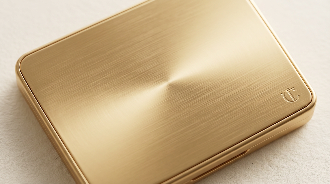
What you see: instead of one bright point, a soft band running along the brushing. Where polished gold has a single hot zone, the brushed surface spreads into a broader lit area - warm gold, but quieter and more considered.
6. Oxidized & Antique Metal
Metal that has reacted with its environment over time - the dark brown-black of oxidized silver, the green patina of aged copper and bronze, the warm brown of antique gold. Oxidation lowers highlight brightness, adds color to the shadows, and varies unevenly across the surface.
- Use
- Heritage and antique jewelry, artisan accessories, vintage brand positioning where age is part of the object's value.
- Avoid
- The product is new and the brightness of fresh metal is the appeal - patina signals history, not newness.
oxidized silver, dark brown-black patina
antique gold, aged warm-brown tone
bronze patina, green oxidation
aged copper, verdigris surface
antique metal, uneven oxidation pattern
darkened silver, oxidation in recessed areas
What you see: the oxidation has pooled in the recessed areas - the valleys of the pattern go near-black - while the raised edges are rubbed bright by handling. That uneven map of dark recess and polished relief is what makes antique metal read as old rather than dirty.
7. Gold Foil & Metallic Packaging
Foil-stamped gold on a box, a metallic label on a bottle, a foil-wrapped product. Foil is thinner than solid metal and behaves differently: very high brightness in the specular zone, plus small extra highlights along every crease and embossed edge.
- Use
- Luxury packaging photography, premium beauty and fragrance, any creative where the packaging itself is the luxury signal.
- Avoid
- The product uses solid metal - foil and solid metal have distinct reflective physics.
gold foil stamping on packaging
metallic foil label, bright highlight accents
foil-stamped gold, thin foil surface
foil wrapping, creased highlights
metallic packaging, bright reflective accents
embossed foil, texture and reflection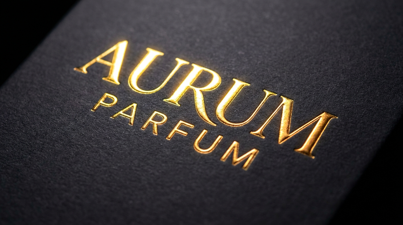
What you see: the foil is brightest where it transitions from the flat face to the embossed relief, with secondary highlights along the letterform edges. The dark matte board behind it makes the foil read even brighter than it would on a light surface.
8. Jewelry Gemstones & Metal-Stone Interaction
Metal set with stones is two reflective systems at once - the faceted, multi-point sparkle of the stone alongside the broad warm specular of the shank, plus the small shadows the setting casts onto the stone.
- Use
- Fine jewelry, engagement and wedding-ring photography, any creative where a gemstone is set in metal.
- Avoid
- The jewelry is metal-only or the stone isn't a primary visual element - gemstone prompting adds complexity you don't need.
diamond in gold setting, stone and metal contrast
gemstone catching light, faceted sparkle
prong setting casting shadow on stone
brilliant cut diamond, point light specular
sapphire in silver setting, deep color and metal
emerald cut stone, sharp facet reflection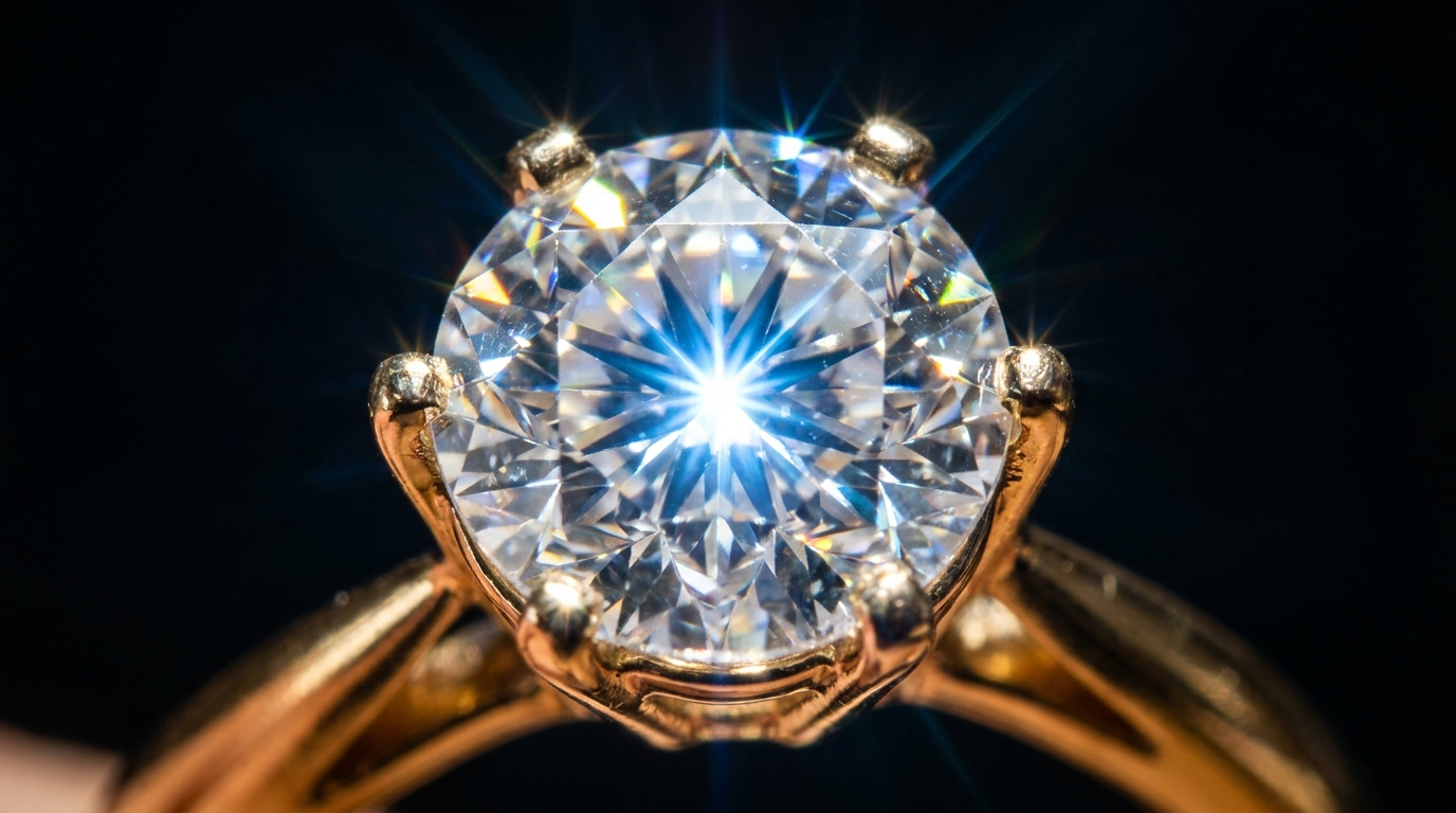
What you see: the diamond throws multiple sharp points of light from its facets while the gold shank holds one broad warm specular. The prongs cast small shadows across the stone - that detail is what confirms the stone is really set in the metal rather than pasted on top.
The Full Metallic Logic Stack
Combine metals when a frame holds several, each reflecting its own way:
Close-up luxury lifestyle flat lay, a 14k yellow gold chain necklace resting
on a dark brushed steel surface, a warm polished gold pendant with a bright
specular highlight on the outer curve and a warm shadow beneath, a small
diamond in a gold prong setting throwing sharp faceted sparkle, cool white
highlights along the silver chain links beside it, a single soft window
reflected across all the metal, dark neutral background, 85mm macro lens,
premium jewelry photography
Polished gold (warm, high-contrast), brushed steel (soft directional), silver (cool, mirror-neutral) and a faceted diamond - four reflective behaviors in one frame, each described by what it reflects, not just what metal it is.
Conclusion: Describe the Reflection, Not the Metal
Four to lock in:
1. Metal has no color - it reflects one. Prompt the reflection and you get metal; prompt the color and you get painted plastic. That's The Reflection Rule.
2. Each metal reflects its own way. Gold warm and high-contrast, silver cool and neutral, chrome mirror-sharp, brushed soft and directional.
3. A mirror needs a room. Chrome and polished metal reflect the environment, so a considered scene and controlled light matter as much as the metal.
4. Contrast is the luxury. The jump from bright highlight to deep shadow - with almost no mid-tone - is what makes gold read expensive. Flatten it and you flatten the value.
The rule of thumb that anchors it: metal is a mirror. Describe what it reflects - the warm light, the dark room, the bright window - not just the metal. A gold surface is only as convincing as the reflection you gave it.
So the move: take a flat, painted-plastic gold product and regenerate it with a bright warm specular, a deep dark shadow with almost no mid-tone, and a soft window reflected across the surface. Same object. My bet is it stops looking like colored plastic and starts looking like actual gold.
Related: material wear, camera effects, and the full AI ad prompt library.
Steal my ad concept & hook library
Every prompt, archetype, and hook I use in my own accounts. Updated weekly.
Join the free Skool community