


For years I wrote ads that sold the product.
Clinically proven this, 30% more that, four out of five dermatologists agree. Reasonable, benefit-led, and completely invisible in the feed. People scrolled past every one of them.
Then I ran an ad that didn't sell the product at all. It just attacked the thing my customer already hated - the overpriced, chemical-soaked stuff they'd been putting up with - and pointed at our product as the way out. It crushed everything I'd run before it.
That's the Brand Manifesto. It doesn't lead with what the product does. It leads with what the customer is against, names the enemy out loud, and turns the product into the escape hatch. It stops the scroll because it validates a frustration the viewer already had but hadn't seen anyone say.
This is the first archetype in the Static Ad Library. I'll break down why it works, seven real manifesto ads with the exact prompts to build your own, and how to test it.
Let's pick a fight.
What Is a Brand Manifesto Ad?
A Brand Manifesto ad is a creative that leads with a stance instead of a benefit - either aggressively against an “enemy” (overpriced products, complicated routines, an industry norm) or in favor of a shared identity (busy moms, people who refuse to settle). The product appears as the antidote to the enemy or the badge of the identity. It sells belonging before it sells features.
Most ads answer “what does this do?” A manifesto ad answers “what do you stand against?”
Why It Works: The Named Enemy
The manifesto runs on identity and shared frustration. And the engine underneath it has a name.
The Named Enemy: You name the thing your customer already hates - the overpriced perfume, the complicated diet, the shame of hiding hair loss - and by attacking it you become their ally. You're not describing a feature; you're validating a frustration the viewer already had, and the product becomes the escape from it. That's why it stops the scroll and makes them feel seen.
The positive version is the same move inverted: instead of naming an enemy, you champion an identity (“Not all heroes wear capes - sometimes we call them Mom”). Either way, you take a stance, and the viewer who already agrees feels seen.
Note
Here's the visual hierarchy that makes it land, in order:
1. The Stance (the problem). The eye hits the boldest, most provocative element first - the crossed-out red text, the “X” over the old way, the chaotic calendar. This is the enemy, made visual.
2. The Product (the hero). The eye moves to the product, cleanly presented as the direct antidote to the problem.
3. The Payoff. The headline or CTA that seals the new reality - “Smell iconic,” “we make it simple.”
And the “Aha” moment is the contrast itself - the instant the brain registers the jump from the complicated, negative “before” to the clean, simple “after” the brand provides. That contrast is the ad.
7 Brand Manifesto Ads (Broken Down)
Here's the pattern across seven real ones - spot the enemy, the antidote, and the payoff in each:
| Ad | The Named Enemy (or identity) | The Payoff |
|---|---|---|
| Perfume | Overpriced, chemical, short-lived scent | “Smell iconic. All day.” |
| Asana | Low-impact busywork | “Unlock your team's highest-impact work” |
| Low-FODMAP meals | “A low-FODMAP diet is hard” | “We make it simple” |
| Bolt | Slow rides / cravings | “Faster than you give in to another one” |
| Leggings | Leggings that don't shape | The Sir Mix-a-Lot hook |
| Mom supplement | The chaotic, overloaded schedule | “Not all heroes wear capes” |
| Fēlix (hair) | Clippers, hats, hiding it | “Learn to love your hair again” |
Perfume
The Named Enemy (or identity)
Overpriced, chemical, short-lived scentThe Payoff
“Smell iconic. All day.”Asana
The Named Enemy (or identity)
Low-impact busyworkThe Payoff
“Unlock your team's highest-impact work”Low-FODMAP meals
The Named Enemy (or identity)
“A low-FODMAP diet is hard”The Payoff
“We make it simple”Bolt
The Named Enemy (or identity)
Slow rides / cravingsThe Payoff
“Faster than you give in to another one”Leggings
The Named Enemy (or identity)
Leggings that don't shapeThe Payoff
The Sir Mix-a-Lot hookMom supplement
The Named Enemy (or identity)
The chaotic, overloaded scheduleThe Payoff
“Not all heroes wear capes”Fēlix (hair)
The Named Enemy (or identity)
Clippers, hats, hiding itThe Payoff
“Learn to love your hair again”
Now the teardowns - each with the exact recreate prompt. Swap the XXXXX placeholders for your own copy.
1. The Perfume Manifesto (“Smell iconic. All day.”)
Three minimalist bottles, and above them a stack of crossed-out red text listing everything wrong with normal perfume. The enemy is listed and struck through; the product stands clean beneath it. Pure before/after contrast in a single frame.
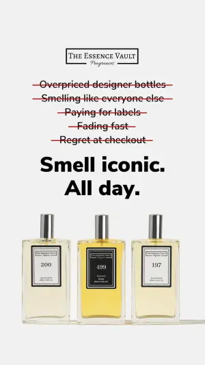
Product photography of three elegant, minimalist glass perfume bottles filled
with light yellow liquid, standing side-by-side on a seamless off-white
background. The bottles have solid black square labels with white borders,
containing the text "XXXXX". Above the bottles, display five rows of dark text
with bright red strikethrough lines through them, reading "XXXXX". Below the
product, write a large, bold black headline that says "XXXXX". At the very top
center, place a rectangular logo box that says "XXXXX". Soft, even studio
lighting.
Test: the enemy - swap the crossed-out pain points (price vs. chemical ingredients vs. poor longevity) to find which frustration converts hardest.
2. The Software Manifesto (Asana-style)
Two award badges up top borrowing authority, a clean framed layout, and a headline that reframes the enemy as low-impact busywork. The stance is aspirational rather than aggressive - championing “real work” over noise.
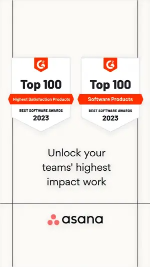
Minimalist digital graphic design, vertical format. The top half features two
identical shield-shaped award badges side-by-side. The badges are white with
bright red accents and banners, containing the bold text "XXXXX". The
background is clean white with thin subtle vertical black framing lines on the
left and right edges. In the lower center, write a clean modern headline that
says "XXXXX". At the very bottom center, place a large black logo box that
says "XXXXX".
Test: the badges - G2/software awards vs. customer star ratings vs. press logos (“As seen in Forbes”). And the headline: a hard metric (“Save 10 hours a week”) vs. the aspirational framing.
3. The Meal Manifesto (“A low-FODMAP diet is hard. We make it simple.”)
A flat-lay meal, with a two-color headline that states the enemy (“...is hard”) and the payoff (“we make it simple”) in one breath. The food is the proof the hard thing just got easy.
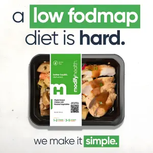
Top-down flat lay photography of a healthy prepared meal - sliced chicken
breast, roasted potatoes and carrots - in a black rectangular container with a
wide green-and-white cardboard sleeve around the center reading "XXXXX". Above
the meal, a massive bold headline where the first half is dark blue and the
second half is bright green, reading "XXXXX". Below the meal, a secondary line
of text reading "XXXXX".
Test: the food visual (chicken vs. a vibrant vegetarian dish for appetite appeal), and the top text as a question (“Struggling with XXXXX?”) vs. the definitive statement. That flat-lay is the top-down angle in action.
4. The App Manifesto (Bolt, “Faster than you give in to another one”)
A stylized GPS-map phone screen and an aggressive competitor callout as the headline. The enemy is the slow ride (and the craving you'd cave to waiting for it). The clean vector map is the antidote.
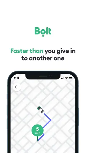
Minimalist vector illustration of a mobile phone screen displaying a
simplified, stylized GPS map interface in light gray and white. On the map, a
simple 3D top-down car icon drives along a blue-and-purple gradient route line
toward a green circular destination pin that says "XXXXX". Above the phone, on
a solid white background, place a green logo reading "XXXXX" and a bold,
two-tone green-and-black headline reading "XXXXX".
Test: the stylized vector map vs. a literal app screenshot, and the aggressive competitor hook vs. a pure benefit claim (“Under 5 minutes. Guaranteed.”).
5. The Fitness Manifesto (the Sir Mix-a-Lot leggings hook)
A behind shot of shaping leggings with a cheeky, instantly-recognizable hook as the banner, plus feature callout lines pointing to the product. The stance here is attitude - the humor is the tribe signal.

High-quality fitness photography. Close-up shot from behind of a woman wearing
fitted, ribbed olive-green athletic leggings. The model's hands adjust the
waistband at the lower back. Gym lighting with a subtle neon glow in the
blurred background. Place a large solid green banner at the top with bold white
text reading "XXXXX", with white pointing lines connecting to different parts
of the leggings, accompanied by small text reading "XXXXX". At the bottom
right, add a small white button graphic reading "XXXXX".
Test: technical fabric callouts (“squat proof,” “seamless”) vs. aesthetic callouts (“booty contouring”), and the cheeky hook vs. a straight performance hook.
6. The Identity Manifesto (“Not all heroes wear capes - sometimes we call them Mom”)
A chaotic, overloaded calendar as the visual enemy, with the product overlapping it as relief. This is the positive-identity version - it champions the busy mom rather than attacking a competitor. The chaos is the empathy.
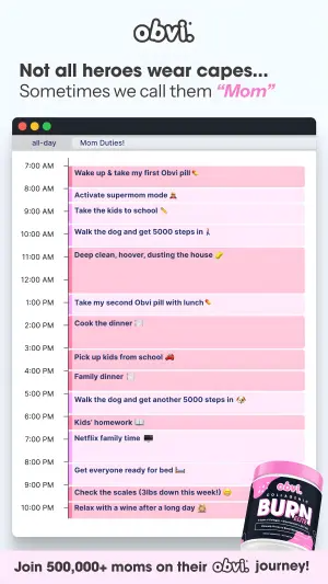
Digital mock-up of a desktop calendar interface on a clean light background.
The calendar is filled top to bottom with colorful horizontal time blocks in
pink, gray, and purple containing the text "XXXXX" and small emojis. In the
bottom-right corner, overlapping the calendar, place a 3D render of a bright
pink supplement tub with the label text "XXXXX". Leave space at the top for a
logo and bold headline reading "XXXXX", and space at the bottom for a banner
reading "XXXXX".
Test: a hyper-chaotic stressful calendar vs. a balanced aesthetic one (which mirrors the persona's real state), and desktop calendar UI vs. an iPhone planner UI.
7. The Comparison Manifesto (Fēlix, “Learn to love your hair again”)
A three-panel triptych: two “losing” options with red X's (clippers, a hat) and the product as the green-checkmark winner. The enemy is how men currently cope with hair loss; the product is the dignified third option.
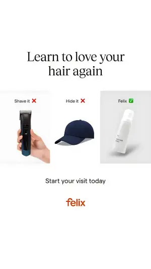
Minimalist product comparison graphic. A horizontal triptych on a clean white
background. Left panel: a hand holding a black electric hair clipper below the
text "XXXXX" with a red X emoji. Middle panel: a plain dark-blue baseball cap
below the text "XXXXX" with a red X emoji. Right panel: a black cosmetic tube
on a subtle gray pedestal, with the text "XXXXX" and a green checkmark emoji
above it. Across the top, a large elegant serif headline reading "XXXXX". At
the bottom center, a logo reading "XXXXX".
Test: the “losing” alternatives (swap the clippers for messy generic foam or a comb-over), and the winning panel's background (subtle gray vs. a bold brand color that pulls the eye to the solution).
How to Build Your Own Brand Manifesto Ad
The recipe is the same every time:
1. Name the enemy. What does your customer already hate about the category? The price, the complexity, the shame, the wasted time. Make it specific and make it visual - crossed-out text, a red X, a chaotic screen.
2. Position the product as the antidote. Clean, simple, calm - the visual opposite of the enemy. The contrast between the two is the entire ad.
3. Land the payoff. One line that names the new reality: “we make it simple,” “smell iconic,” “love your hair again.”
4. Order the hierarchy. Enemy first (boldest), product second (hero), payoff third (seal). The eye should travel problem → solution → new reality.
Because manifesto ads are text-heavy, the words have to render cleanly - quote every headline exactly using the AI text in images rules, keep it legible over the image with the text-over-image treatments, and build any button with the CTA button patterns.
How to Test a Manifesto Ad
Two levers move manifesto performance most:
The enemy. This is the biggest one. The same product with a different named enemy is a completely different ad. Test price-anger vs. complexity-fatigue vs. shame vs. wasted time - the frustration you pick decides who feels seen.
The contrast. Test how hard you push the before/after - a dark, chaotic, aggressive enemy visual vs. a calm, restrained one. Sometimes clinical simplicity outperforms drama; sometimes the opposite. Let the split test tell you.
Conclusion: Sell the Side, Not the Feature
Four to lock in:
1. Lead with the enemy, not the benefit. A manifesto ad answers “what do you stand against?” not “what does this do?” The stance stops the scroll where a feature list never could.
2. Name the enemy specifically. Vague enemies don't convert. The overpriced perfume, the complicated diet, the shame - the more specific the frustration, the more the viewer feels seen.
3. Make the contrast the hero. The Aha moment is the jump from complicated-before to simple-after. Build the whole frame around that one visual contrast.
4. Test the enemy first. It's the highest-leverage variable in the format. Same product, different enemy, completely different result.
The Rule of Thumb for the archetype: a benefit tells the customer what you do. A named enemy tells them you're on their side against something they already resent - and people buy from the brand that fights their fight.
So the move: take a benefit-led ad that's underperforming and rebuild it as a manifesto - name the enemy your customer already hates, show your product as the clean antidote, and land the payoff. My bet is it outperforms the benefit version, because it stopped selling features and started validating a frustration.
Get instant access
Steal my ad concept & hook library, new breakdowns every week.
Join the free community