
A button in a static ad is a lie - and it has to be a convincing one.
It can't actually do anything. Nobody can tap it and have something happen. And yet the whole job of a CTA button is to look tappable - to trigger the reflex every scroller has learned from a decade of interfaces: solid shape, an obvious label, a hint of depth, "this is a button, press it."
For a long time my CTAs failed this. I'd get a flat, washed-out rectangle with fuzzy text that read as decoration, not action. Nobody's thumb twitched at it.
Then I learned the specific visual cues that make a static button read as clickable, and the trust badges that sit around it doing the persuasion work. Each one is a small piece of interface language, borrowed from real UI and rendered into a still image.
These are the eight CTA and badge elements I prompt to make an ad look clickable, with the exact keywords for each.
Let's fake the click.
Why a Static Button Has to Look Clickable
A real button works because it responds to a tap. A static button can't respond to anything - so it has to borrow every visual cue of a working one and none of the function.
The Click Illusion: A button in a static ad has no function, so it has to look clickable through purely visual cues - a solid contrasting fill, soft depth or a shadow, a rounded shape, and a clear action label. Those cues trigger the learned "this is a button, tap it" reflex a decade of interfaces installed in the viewer. The button can't work, so it has to look like it works.
It runs on the quoted-text rule from AI text in images - the button label must be quoted exactly - and the contrast logic from color grading, because a button only reads as a button when it separates hard from everything around it.
The 8 CTA & Badge Elements
At a glance:
| Element | What it does | The core cue |
|---|---|---|
| Solid rectangle CTA | The primary action | solid fill + label |
| Rounded / pill CTA | Softer, modern action | rounded corners |
| Ghost / outline button | Secondary, subtle action | outline, no fill |
| Price / offer badge | The deal, at a glance | circular badge, bold number |
| Trust badge | Credibility, proof | seal shape, claim text |
| Countdown / urgency | Act now pressure | timer, "ends soon" |
| Product callout frame | Names the hero | boxed label on product |
| Arrow / directional | Points the eye to the CTA | hand-drawn or graphic arrow |
Solid rectangle CTA
What it does
The primary actionThe core cue
solid fill + labelRounded / pill CTA
What it does
Softer, modern actionThe core cue
rounded cornersGhost / outline button
What it does
Secondary, subtle actionThe core cue
outline, no fillPrice / offer badge
What it does
The deal, at a glanceThe core cue
circular badge, bold numberTrust badge
What it does
Credibility, proofThe core cue
seal shape, claim textCountdown / urgency
What it does
Act now pressureThe core cue
timer, "ends soon"Product callout frame
What it does
Names the heroThe core cue
boxed label on productArrow / directional
What it does
Points the eye to the CTAThe core cue
hand-drawn or graphic arrow
Now the detail.
1. Solid Rectangle CTA
The most common button format: a solid rectangle with real contrast against its surroundings, a short action phrase inside, and enough padding between the text and the button edge. The solid fill is what makes it read as tappable - the flat, washed-out version reads as decoration.
- Use
- Any primary CTA, mobile-first creatives where the button needs to feel like a real interface element, direct-response ads.
- Avoid
- The brand is luxury or minimal and a hard-edged block feels crude - a ghost or outline button suits that register.
solid rectangle CTA button, high contrast fill
"SHOP NOW" button, bold sans-serif label
solid button with clear padding around text
button reads "SHOP NOW", contrasting fill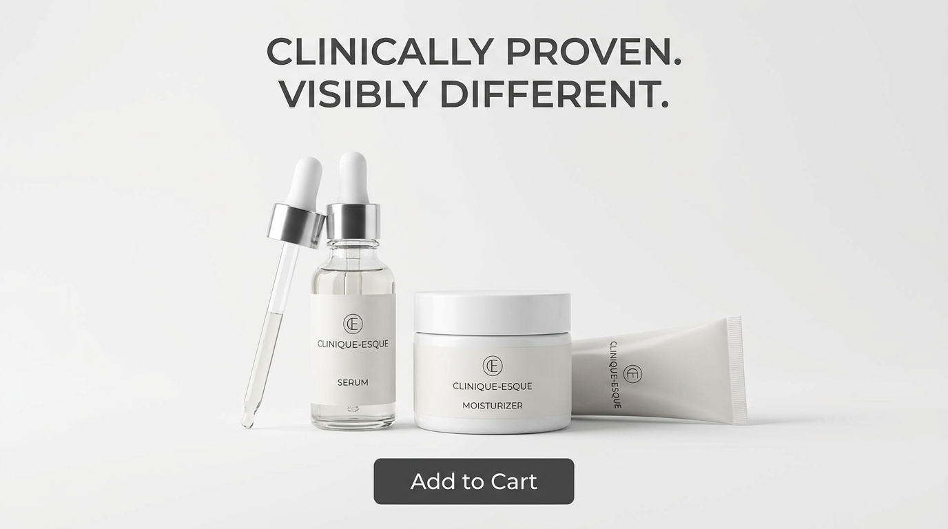
What you see: a solid block of contrasting color with the label centered and clear padding around it. It has the exact visual language of a real interface button, so the thumb recognizes it instantly.
2. Rounded / Pill-Shaped CTA
The same solid button with rounded corners or fully rounded pill ends - softer, more modern, more premium than the hard rectangle. It's the button shape of most modern app interfaces, which is exactly why it reads as clickable.
- Use
- E-commerce and lifestyle brands, premium and beauty positioning, modern app-adjacent aesthetics.
- Avoid
- The brand is aggressive or high-urgency - a hard rectangle reads as more direct and immediate.
rounded CTA button, pill shape
button with rounded corners, "Add to Cart"
pill-shaped button, modern soft edges
rounded button, contrasting fill, clean label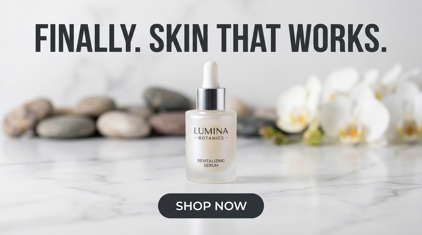
What you see: fully rounded ends with the label centered inside. Friendly, contemporary and premium - softer than a rectangle but still unmistakably a button.
3. Ghost / Outline Button
A button with no fill - just a thin outline around the label, text in the same color as the border. Subtler than a solid button, it reads as a secondary action or a premium, restrained aesthetic. It trades some obviousness for elegance.
- Use
- Luxury and premium brands, secondary CTAs alongside a primary solid one, minimal and editorial ad aesthetics.
- Avoid
- The CTA needs maximum immediacy - a ghost button is quiet and can be missed in a fast scroll.
ghost button, thin outline no fill
outline CTA button, "Learn More"
minimal outline button, elegant and restrained
thin-bordered button, text matching outline color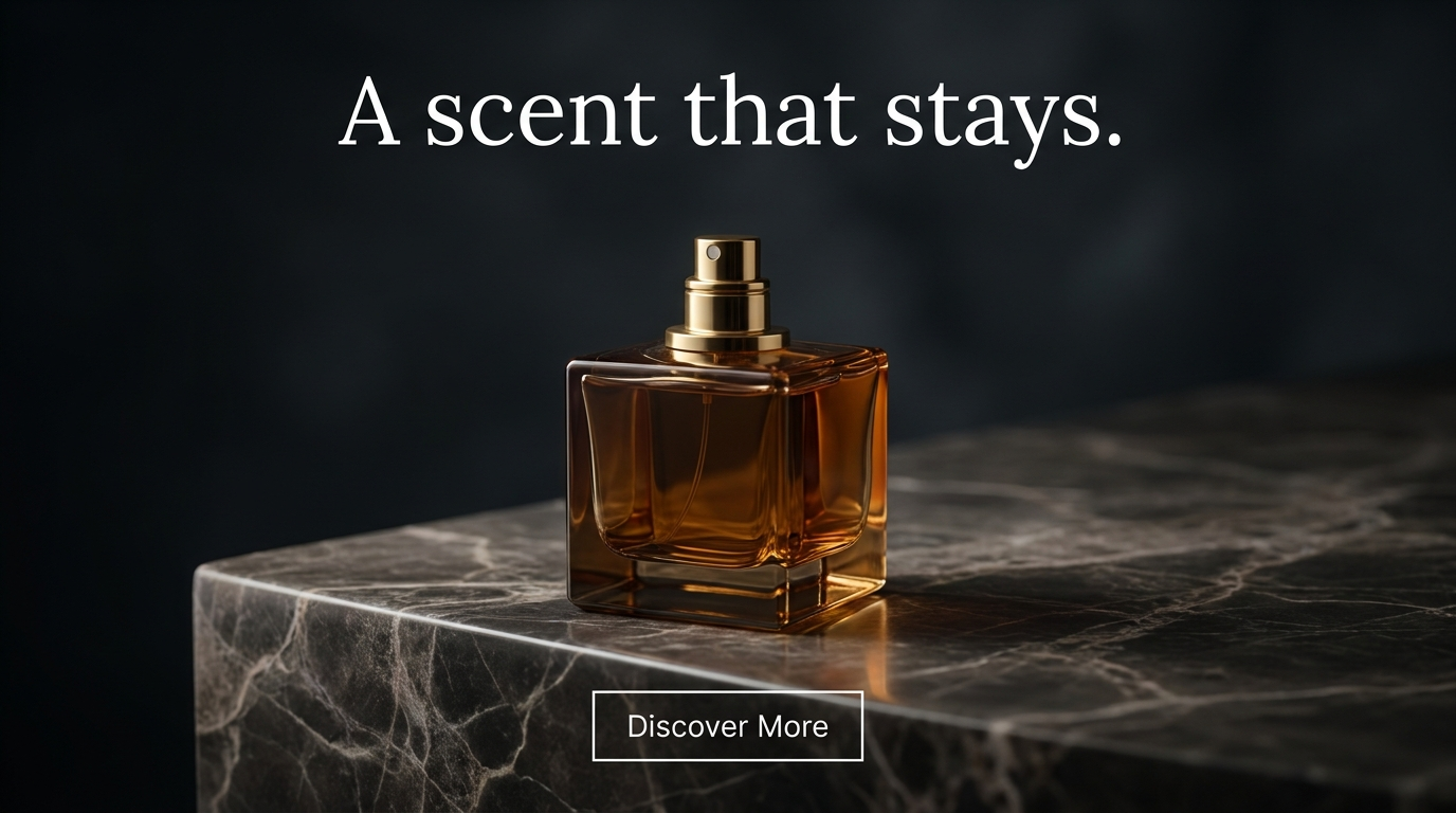
What you see: the button is defined only by a thin outline with the label inside in the same color. It reads as a button, but a quiet one. A scent that stays, not a shout.
4. Price & Offer Badge
A circular or starburst badge that presents the offer at a glance - a discount percentage, a price, a "SALE" flag. Bold numbers, contrasting fill, a shape that reads as a promotional sticker. Its job is to make the deal legible in a fraction of a second.
- Use
- Discount and sale messaging, price-led direct response, promotional callouts where the offer is the hook.
- Avoid
- The brand is premium and a loud discount badge undermines positioning - luxury rarely shouts a percentage.
circular price badge, bold contrast
starburst badge, "30% OFF" bold number
promotional badge, bright contrasting fill
discount badge, large clear percentage
sale badge, circular starburst shape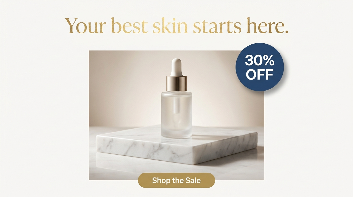
What you see: a bright circular badge with the percentage filling it, slapped onto the ad like a promotional sticker. The number is the biggest thing in the frame after the headline.
5. Trust Badges & Social Proof
A small graphic seal that signals credibility - "Clinically Proven," "Dermatologist Tested," a five-star rating, a certification mark. These read as proof because they mimic the visual language of real certifications and review systems. The badge borrows the authority of the format.
- Use
- Claim-heavy categories, skincare and supplements where testing matters, review-and-rating social proof, guarantees.
- Avoid
- The claim can't be substantiated - a trust badge implies verification, and an unsupported one is a legal and credibility risk.
trust badge, "Clinically Proven" seal
five-star rating graphic, review social proof
certification seal, "Dermatologist Tested"
small circular trust badge with claim text
verified badge, credible seal shape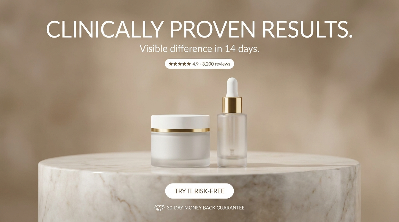
What you see: a star rating pill and a guarantee mark framing the button. They read as verification because they borrow the exact format of real review systems - and the authority of the format transfers to the claim.
6. Countdown & Urgency Elements
Time-based elements that create scarcity - a countdown timer, a "24 HOURS ONLY" flag, a "limited stock" indicator. They borrow the visual language of real urgency mechanisms and push the viewer to act now. The urgency element is the pressure applied to the click.
- Use
- Limited-time offers, flash sales, launches with genuine scarcity, any creative where urgency drives the action.
- Avoid
- The urgency is manufactured and obvious, or the brand is premium - false urgency erodes trust.
countdown timer graphic, "23:59:47"
"24 HOURS ONLY" urgency flag
"Limited stock" badge, scarcity signal
urgency banner, bold contrasting strip
"ends soon" tag, countdown style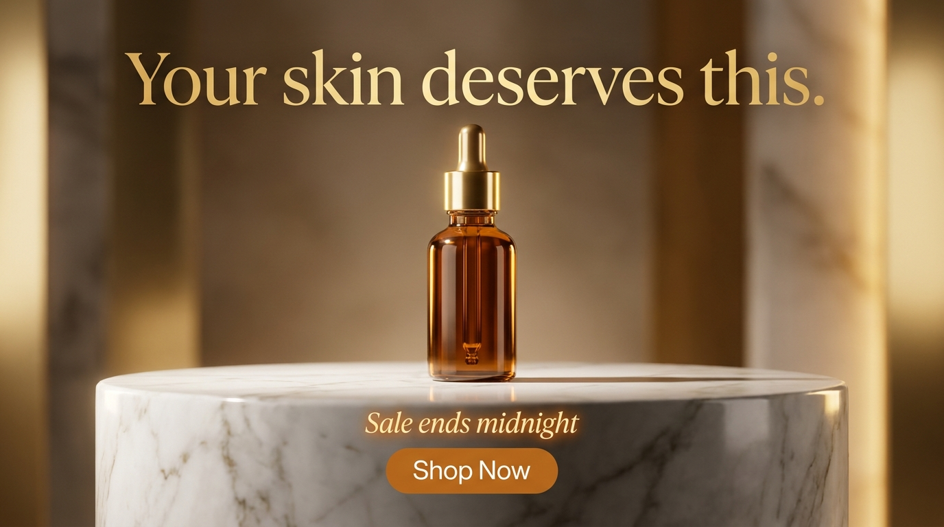
What you see: a timer showing hours, minutes and seconds, or a bold "24 HOURS ONLY" flag sitting next to the CTA. It borrows the exact format of a real urgency mechanism, and the button is right there to act on.
7. Product Callout Frame
A boxed or bracketed label placed on the product itself that names the hero ingredient or key feature - "New Formula," "With Vitamin C," "2% Retinol." It reads as a callout because it uses the visual language of a spec highlight, with a box or a leader line separating it from the image behind.
- Use
- Ingredient callouts, feature highlights, hero-product labeling, creatives where a specific feature is the selling point.
- Avoid
- The callout would clutter the product or obscure key detail - it should highlight, not bury.
product callout box, "2% Retinol"
feature label pointing to product
boxed ingredient callout, "New Formula"
callout frame with bracket, feature highlight
product feature label, clean boxed text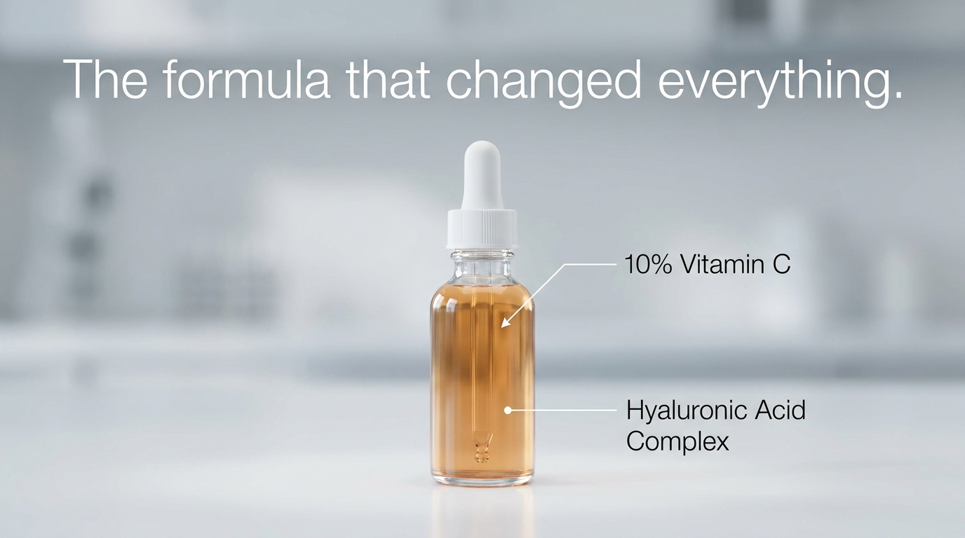
What you see: clean labels connected to the bottle by thin leader lines. It reads as a feature callout because it uses the exact language of a spec highlight - the ingredient named and tied to the product.
8. Arrow & Directional Elements
Graphic or hand-drawn arrows that point the eye directly at the CTA or the key element. An arrow is the most direct attention-directing tool there is - it removes all ambiguity about where to look next. Clean and graphic for a modern brand, hand-drawn for a human register.
- Use
- Directing the eye to the CTA, pointing at a key product or offer, guiding the reading order of a busy ad.
- Avoid
- The composition already leads cleanly to the button - an unnecessary arrow just adds clutter.
curved arrow pointing to CTA button
hand-drawn arrow, ballpoint ink quality
clean graphic arrow directing the eye
subtle arrow from headline down to button
directional arrow, high contrast against background
What you see: an arrow - clean graphic or hand-drawn - points from the headline or product toward the button. This is the eye-path logic from photo composition, made explicit.
Visual Comparison: The Same CTA at Four Design Levels
Same base creative - a skincare product ad with a "Shop Now" CTA - with the button built up level by level.
Level 1 - CTA text only, no container
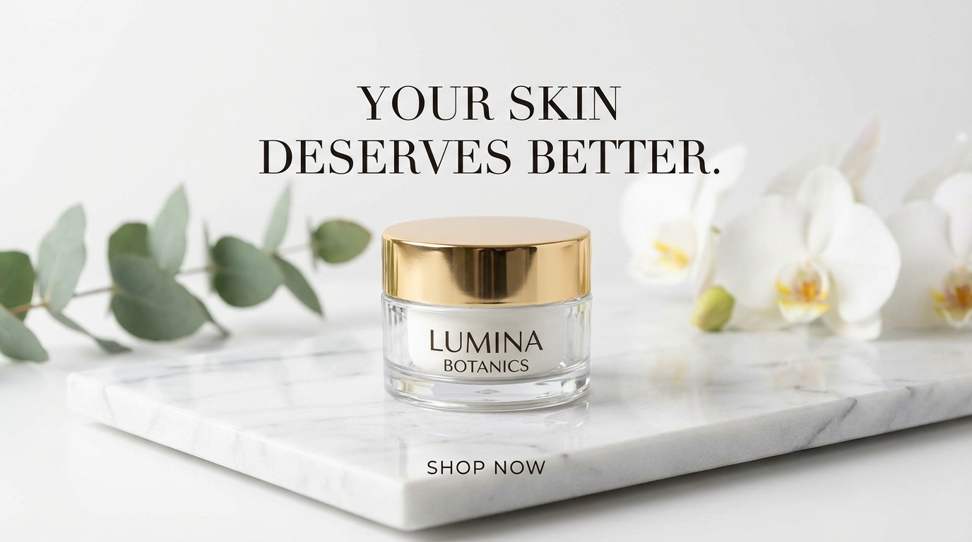
The words are there but they float - no container, so it reads as a caption, not an action.
Level 2 - solid button, no styling detail
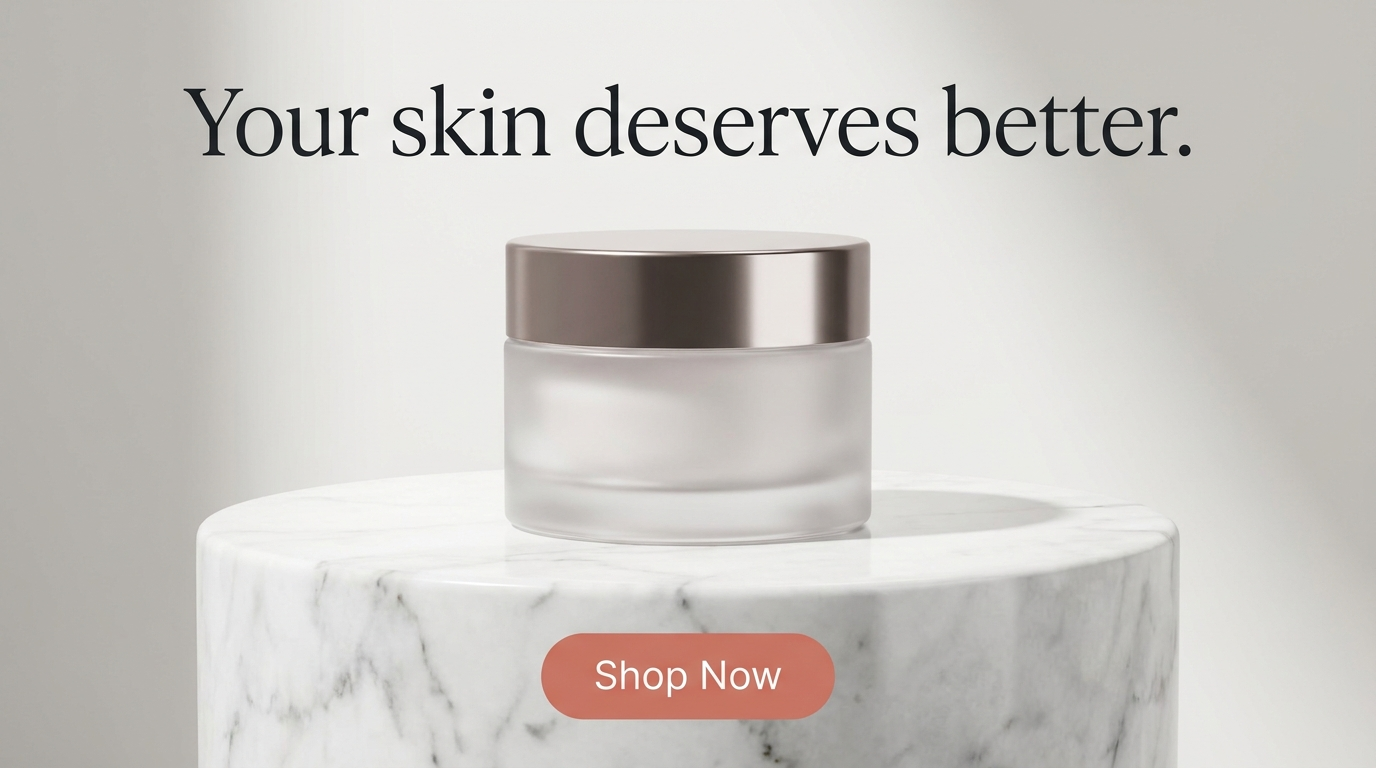
It's a button now - a solid fill gives it a container. But it's flat and generic, and the fill sits too close to the background tone to snap forward.
Level 3 - button + contrast + placement
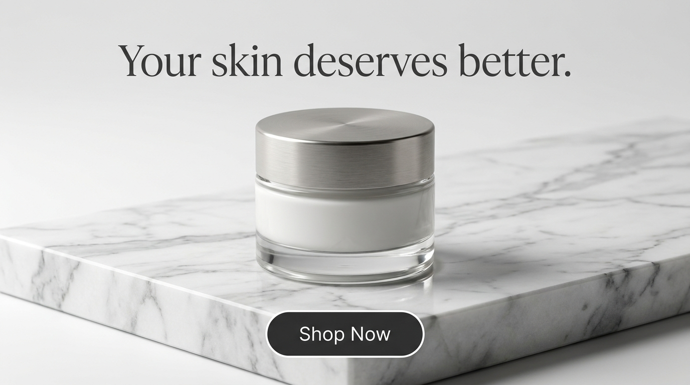
Contrasting fill, deliberate placement in the clean lower zone, a soft edge separating it from the marble. Same words - it now reads as something to tap.
Level 4 - full CTA with depth and supporting elements
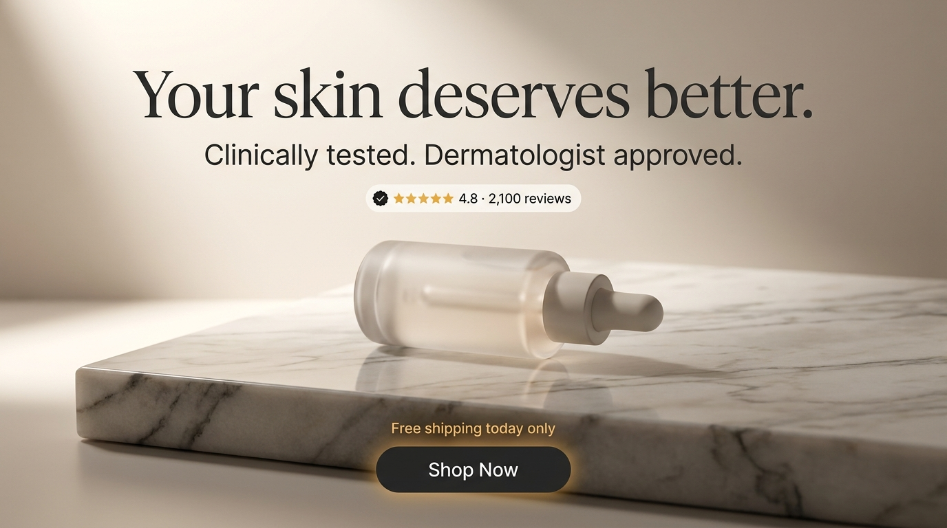
Soft depth on the button, the eye led into it, a trust badge doing the persuasion. This is a finished, clickable-looking CTA - the same words, transformed by how they were built.
The Full CTA & Badge Stack
The CTA layer goes at the very end of the prompt, after the image and copy are set:
Clean skincare product ad, serum bottle on a soft neutral surface, headline
"The formula that changed everything." in the upper area, a solid rounded
"SHOP NOW" button in a bright contrasting color with soft depth and a subtle
shadow placed in the clean lower-center zone, a small "CLINICALLY PROVEN"
trust badge to the left of the button, a "30% OFF" starburst badge in the top
corner, a subtle curved arrow directing the eye from the headline to the
button, clear type hierarchy, photorealistic product photography,
professional ad design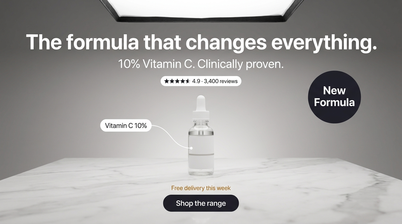
A rounded high-contrast button with depth, a trust badge for credibility, an offer badge for the deal, and a callout naming the hero ingredient - the full CTA layer in one prompt. It reads as a finished, clickable ad, not an image with floating text.
Conclusion: Make It Look Like It Works
Four to lock in:
1. A button has to look tappable. It can't function, so it borrows every visual cue of a working one - solid contrasting fill, soft depth, a clear label. Flat washed-out text reads as decoration.
2. Badges borrow authority. Trust seals, star ratings and offer starbursts read as credible because they mimic the format of real certifications and promotions. The format carries the persuasion.
3. The arrow forces the eye path. When the composition doesn't lead cleanly to the CTA, an arrow removes all ambiguity about where to look and tap next.
4. Quote every label, contrast every element. The button text, the badge claim, the offer number - all quoted exactly, all separated hard from the background.
The Rule of Thumb: the CTA button in a static ad has no function, so it has to look like it works. Give it a solid contrasting fill, soft depth, a rounded shape and a quoted label - the visual language a decade of interfaces taught the viewer to tap.
So the move: take an ad where the CTA is bare floating text and regenerate it as a solid rounded button in a contrasting color, with soft depth and a small arrow pointing to it. Same words. My bet is it stops reading as a caption and starts reading as something to tap - because you built the illusion of the click.
Related: AI text in images, handwritten text in AI images, and the full AI ad prompt library.
Steal my ad concept & hook library
Every prompt, archetype, and hook I use in my own accounts. Updated weekly.
Join the free Skool community