


For a long time I ran product ads that showed one hero item, beautifully lit.
One bottle, one shade, one perfect shot. Reasonable. And they converted fine - until I tested an ad that showed the whole range at once: every color, lined up in a clean grid. It beat the single-hero shot, and when I dug into why, the answer was almost embarrassing.
The single shot asked the viewer to like my pick. The grid let them find their pick.
That's the Product Grid. It shows multiple colors, styles, or a full bundle in one frame, and it works because the viewer's eye inevitably lands on the exact variant they like best - turning a passive scroller into an active chooser before they've even clicked. It signals “there's definitely something here for you,” and it bypasses the friction of making someone visit the site just to see the options.
This is the third archetype in the Static Ad Library, after the brand manifesto and the founder ad. I'll break down why it works, then hand you 18 real product-grid ads - grouped by sub-format - each with the exact prompt to build your own, plus how to test them.
Let's show the whole range.
What Is a Product Grid Ad?
A Product Grid ad displays multiple variants of a product - colors, styles, sizes, or a bundle - arranged together in one frame: a grid, a gradient lineup, a scattered flat-lay, or a collage. The range itself is the hook. Instead of selling one item, it sells choice.
Most ads show you a product. A grid shows you a collection, and dares you to find your favorite.
Why It Works: The Abundance Pull
This archetype runs on the psychology of abundance and choice. And the mechanism has a name.
The Abundance Pull: Showing the whole range at once makes the viewer's eye lock onto the one variant they personally want - the shade, the color, the style that feels like theirs. That micro-selection converts a passive viewer into an active chooser, because they've mentally picked “their one” before they click. The volume signals “there's something here for me,” and the collector's mindset does the rest.
Here's the visual hierarchy that makes it land, in order:
1. The Pattern / Volume. The eye is caught first by the sheer quantity, the symmetry of the grid, or a pleasing color gradient. This is what stops the scroll.
2. The Hook / Headline. The text that gives it context - a big discount, a specific fit, a bold claim.
3. The Micro-Selection. The eye lands on the specific color or variant the viewer likes best, shifting them from watching to choosing.
And the “Aha” moment is the instant they spot their preferred shade - or clock the sheer value of the bundle - and realize the brand caters to their exact taste without them having to hunt for it.
Note
The 7 Sub-Formats at a Glance
The 18 examples below sort into seven distinct layouts. Here's the map before the detail:
| Sub-format | The pull it creates | Best for |
|---|---|---|
| Clean color grid | “Find your color” | apparel, basics, accessories |
| Gradient lineup | Satisfying visual order | beauty, makeup shades |
| On-model panels | See it worn, in every color | apparel where fit matters |
| Lifestyle abundance | Range + a real-world context | home, cleaning, food |
| Bundle / collector box | “Look how much you get” | premium, sets, gifting |
| Collage | Range + a human wearing it | jewelry, swimwear, fashion |
| UI / spec mockup | Range sorted by a feature | tech, function-led products |
Clean color grid
The pull it creates
“Find your color”Best for
apparel, basics, accessoriesGradient lineup
The pull it creates
Satisfying visual orderBest for
beauty, makeup shadesOn-model panels
The pull it creates
See it worn, in every colorBest for
apparel where fit mattersLifestyle abundance
The pull it creates
Range + a real-world contextBest for
home, cleaning, foodBundle / collector box
The pull it creates
“Look how much you get”Best for
premium, sets, giftingCollage
The pull it creates
Range + a human wearing itBest for
jewelry, swimwear, fashionUI / spec mockup
The pull it creates
Range sorted by a featureBest for
tech, function-led products
Now all 18 - swap the XXXXX placeholders for your own copy.
Clean Color Grids
The purest form: one product in every color on a plain background, nothing distracting from the single decision - which one is mine?
1. The Floating T-Shirt Grid
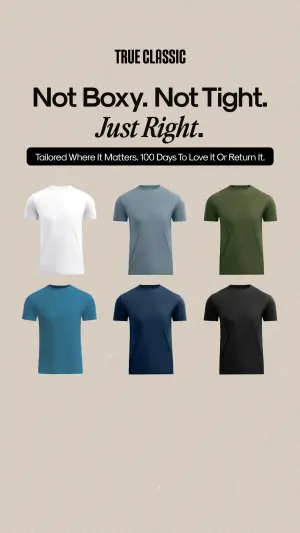
Digital graphic showing a neat, perfectly aligned grid of six blank t-shirts
in different solid colors (white, light blue, olive, dark blue, navy, black)
appearing to float against a plain light beige background. Above the shirts,
place bold black text reading "XXXXX". Below the text, add a black rounded
banner with white text reading "XXXXX". At the very top center, place a logo
reading "XXXXX".
Test: grid size - 6 shirts vs. just 3, to find where abundance tips into choice paralysis.
2. The Silk Pillowcase “Magic Stripe”
A clever single-product variation: one pillowcase split into vertical color stripes to show every option on one item. Abundance without the clutter of a full grid.
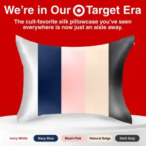
Digital product mockup of a single silk pillowcase resting on a white display
podium against a vibrant red background. The pillowcase itself is divided
magically into five vertical color stripes (white, navy, pink, beige, dark
grey) to show color options on one product. Above the pillow, write large
white and black text reading "XXXXX" and a subheadline reading "XXXXX". Below
the podium, place small pill-shaped color swatch labels reading "XXXXX".
Test: the “magic” multi-striped single pillowcase vs. a literal stack of five different colored pillows folded on top of each other.
Gradient Lineups
Variants arranged so the colors flow - the gradient itself is the scroll-stopper, and the eye lands on a favorite along the way.
3. The Blush Shade Gradient
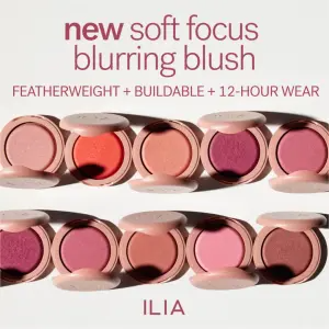
Top-down product photography of ten small, round makeup blush compacts
arranged in two horizontal rows of five. The compacts are open, revealing a
gradient of shades from light pink to deep berry. Clean white background with
hard shadows. Above the compacts, write elegant text reading "XXXXX". Below
the text, add a smaller line reading "XXXXX". At the bottom center, place a
logo reading "XXXXX".
Test: product state - all compacts open (powder texture as hero) vs. all closed (sleek packaging as hero). This is the top-down angle from the camera angles work.
4. The Pastel Deodorant Row (Review Angle)
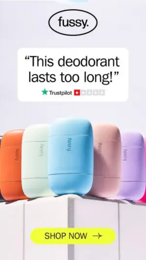
Product photography of five pill-shaped, matte deodorant containers in pastel
colors (orange, mint, blue, pink, purple) standing in a row on a white
geometric ledge against a light purple background. Above the products, place a
white text box containing a quote reading "XXXXX" and a review star graphic
reading "XXXXX". At the very top, add a logo reading "XXXXX". At the bottom,
place a bright yellow rounded button reading "XXXXX".
Test: copy angle - the customer review quote vs. a purely functional headline (e.g., “24-Hour Odor Protection”).
5. The Vibrant Deodorant Row (Freshness Angle)
The same lineup with a completely different texture strategy - water droplets sell “fresh and clean” where the matte version sells “sleek.”
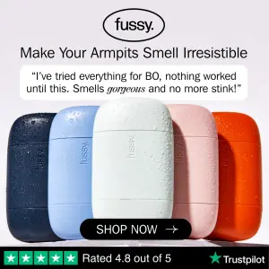
Product photography of five pill-shaped deodorant containers in vibrant colors
(navy, light blue, white, pink, orange) standing side-by-side. The containers
are covered in fresh, realistic water droplets. Above the products, place a
text box reading "XXXXX" and a headline above it reading "XXXXX". At the top,
add a logo reading "XXXXX". At the bottom, place a black button reading "XXXXX"
and a green review banner reading "XXXXX".
Test: visual texture - this wet, droplet aesthetic vs. the dry matte version above, to see which drives a stronger feeling of cleanliness. The droplets lean on the water & liquid freshness cue.
On-Model Panels
The same item worn in each color - answers “what does it look like on a person?” while still showing the range.
6. The V-Neck Panel Trio
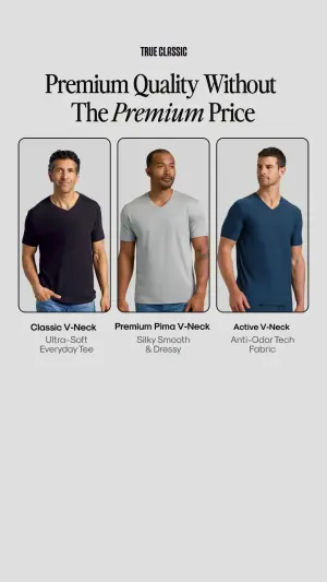
Digital graphic featuring three vertical rectangular panels side-by-side. Each
panel contains a different male model wearing a solid-colored V-neck t-shirt
(black, grey, navy) against a plain gray background. Below each panel is dark
text reading "XXXXX" and lighter subtext reading "XXXXX". At the top, write a
bold serif headline reading "XXXXX" and a top center logo reading "XXXXX". The
overall background is light grey.
Test: human vs. ghost mannequin - on-model photos vs. flat-lay or ghost-mannequin versions, to see if faces enhance the apparel or distract. Faces need the founder-ad level of realism to hold up.
7. The Colored-Contacts Before/After
Range shown as transformations - each variant paired with the result it produces. The grid is the proof.
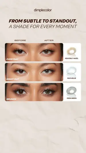
A vertical digital graphic split into three horizontal panels. Each panel
shows a close-up crop of a person's eyes, demonstrating a "Before" and "After"
effect of wearing colored contact lenses. Next to each pair of eyes is a 3D
render of the specific contact lens and a text label reading "XXXXX". Above
the panels, write an elegant headline reading "XXXXX" and a logo at the top
reading "XXXXX". The background is a subtle, textured off-white paper.
Test: cropping (extreme eye close-ups vs. the full face), and naming (occasion-based like “Night Out” vs. literal like “Deep Blue”).
8. The Earplug Personality Grid
Range mapped to identity - a grid of different people, each with their variant, so the viewer picks the one that's “them.”
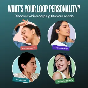
Digital graphic on a dark teal gradient background. In the center, a 2x2 grid
of four circular portrait photos featuring different smiling people wearing
small earplugs. Beneath each circular photo, place a colorful tilted text
label reading "XXXXX". At the very top, write a large, bold white headline
reading "XXXXX" and a smaller subheadline reading "XXXXX".
Test: the grid subject (people vs. the earplug models up close), and the hook (identity-driven “What's your personality?” vs. problem-driven “What are you trying to block out?”).
Lifestyle Abundance Shots
The range dropped into a real environment - abundance plus context that a floating grid can't give.
9. The Cleaning-Supply Basket
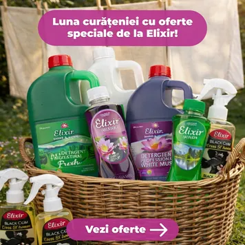
Outdoor bright product photography of a woven wicker basket filled to the brim
with various brightly colored bottles and sprayers of liquid cleaning
supplies. The basket sits on green grass with a softly blurred background of
white sheets hanging on a clothesline. At the top center, place a large
magenta text bubble reading "XXXXX". At the bottom center, place a magenta
button with an arrow reading "XXXXX".
Test: framing - this lifestyle basket vs. a clean studio lineup of the same bottles.
10. The Scattered Athletic-Wear Flat-Lay
Range as a pleasing scatter framing the edges - energy and abundance over rigid order.
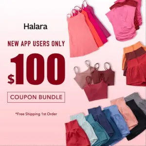
Flat lay photography of various colorful athletic wear, including folded tank
tops, shorts, and skirts, arranged in a visually pleasing, scattered pattern
framing the edges of the image on a soft pink gradient background. On the left
side, write large, bold dark red text reading "XXXXX" and "XXXXX". Include a
logo at the top reading "XXXXX".
Test: layout style - this dynamic scattered flat-lay vs. a perfectly aligned grid of the same clothing.
11. The Silk Sleepwear Set (Props)
A full set styled as a lived-in flat-lay, with props adding warmth and lifestyle context.
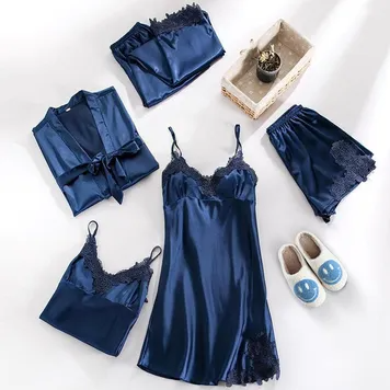
Top-down flat lay photography of a complete navy blue silk sleepwear set,
including a robe, camisole, slip dress, and shorts, arranged elegantly on a
clean white surface. Next to the clothing, include a pair of white fuzzy
slippers with blue smiley faces on them and a small woven basket containing a
tiny plant. Bright, natural lighting with soft shadows.
Test: arrangement (aesthetic scatter vs. rigid folded grid), and props (with slippers/basket vs. pure product focus).
12. The Smart-Luggage in Context
A single hero product placed in its real moment of use - abundance here is contextual (the world around it) rather than color variants.
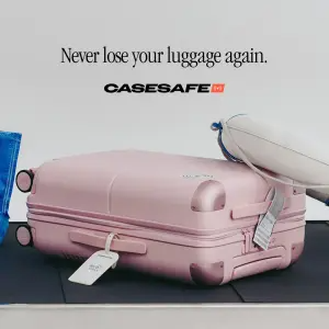
Product photography of a light pink hardshell suitcase laying flat on a black
rubber airport baggage carousel. A white smart-tracking tag is attached to the
side handle. A portion of another bag and a travel pillow are visible in the
background. Above the suitcase, on a light gray background, write an elegant
serif headline reading "XXXXX" and place a logo reading "XXXXX".
Test: the setting (baggage carousel vs. hotel lobby vs. car trunk), and focus (wide luggage shot vs. macro close-up of just the smart tag).
Bundle / Collector Boxes
The full set in a case - triggers the collector's mindset directly. The pull is “look how much you get.”
13. The Watch Collector's Box
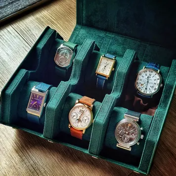
High-angle, close-up photography of an open luxury dark green velvet watch
collector's box containing six different elegant wristwatches strapped around
small velvet cushions. The box is resting on a textured wooden table surface.
Rich, moody lighting.
Test: abundance vs. scarcity - a fully loaded box vs. a box with one empty slot, to trigger a subtle “missing piece” feeling.
Collages
An asymmetrical mix of a hero shot (often on a model) plus smaller product crops - range and a human wearing it.
14. The Gold-Nameplate Jewelry Collage
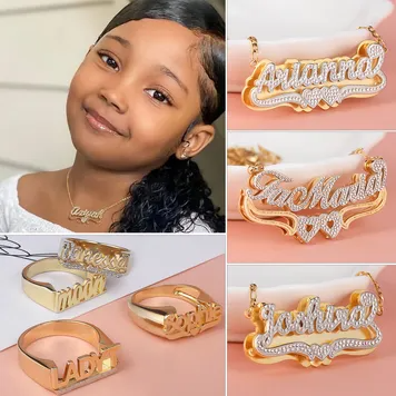
An asymmetrical photo collage. The large left panel shows a smiling model
wearing a delicate gold nameplate necklace. The right side is divided into
three smaller horizontal panels, each showing a high-quality close-up of a
custom gold and diamond nameplate necklace resting on a white display surface.
The bottom left features a small panel showing three custom gold name rings.
Test: the human element (collage with a model vs. macro-only grid), and backgrounds (pastel/white vs. dark velvet, to make the gold pop).
15. The Swimsuit Lifestyle Collage
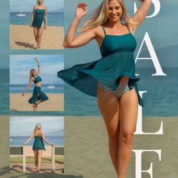
An asymmetrical fashion photo collage. The large right panel features a
full-length shot of a smiling blonde woman walking on a sandy beach wearing a
teal two-piece swimsuit with a flowing skirt. The left side features a
vertical stack of three smaller photos of the same woman in different poses on
the beach. Overlaid across the right side of the image is massive, slightly
transparent white text reading "XXXXX".
Test: text intrusiveness (the big semi-transparent “SALE” overlay vs. a clean separate banner), and pose variation (front/side/back of the suit vs. different lifestyle poses).
UI / Spec Mockups
The range sorted by a feature, presented as an interface - abundance becomes a functional decision.
16. The Free-Software Laptop Duo
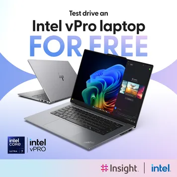
Digital graphic featuring two sleek silver laptops on a light purple and white
abstract background. The foreground laptop is open, displaying a colorful
digital interface. The background laptop is closed and angled to show its thin
profile. At the top, write small black text "XXXXX" and massive, bold blue
text "XXXXX". In the bottom left corner, place two square logos reading
"XXXXX". In the bottom right corner, place two brand logos reading "XXXXX".
Test: the hook (“FOR FREE” vs. a benefit like “Speed Up Your Workflow”), and product state (both laptops open vs. this open/closed combo).
17. The Earplug Split-Screen
Problem on top, range on the bottom - pairs the “when you need it” context with the “which one” choice.
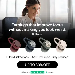
Split composition digital graphic. The top half is a photograph of a woman
working focused on a laptop in a bright room, slightly darkened with a black
overlay containing bold white text reading "XXXXX" and a logo reading "XXXXX".
The bottom half is a solid white background featuring a row of four
loop-shaped earplugs in different colors (burgundy, navy, gray, beige). Below
the earplugs, write a line of text reading "XXXXX", a black button reading
"XXXXX", and a green review graphic reading "XXXXX".
Test: background context (office/laptop vs. a noisy subway commute), and button copy (discount “UP TO 30% OFF” vs. action “Find Your Fit”).
18. The Earplug Slider Interface
Range presented as app-style toggles sorted by decibel reduction - the abundance pull turned into a spec decision.
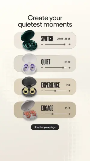
Digital graphic mimicking a mobile app interface on a warm off-white
background. The design features a vertical stack of four pill-shaped toggle
sliders. Each slider contains a small open case of earplugs on the left, bold
text reading "XXXXX" in the middle, and a volume slider graphic indicating
decibel reduction on the right. At the top, write a clean elegant headline
reading "XXXXX". At the bottom, place a dark button reading "XXXXX".
Test: sorting order (low-to-high reduction vs. reverse), and UI metaphor (volume sliders vs. a star-rating or battery-life visual).
The Test Levers That Move Product Grids
Across all 18, the same handful of variables move performance most:
Grid size. More options vs. fewer - the single most important test. Find your choice-paralysis ceiling.
Layout style. Rigid aligned grid vs. dynamic scattered flat-lay. Order signals control; scatter signals abundance.
Product state. Open vs. closed, wet vs. dry, worn vs. flat. Each reveals a different hero quality.
Framing. Studio lineup vs. lifestyle context. Clean vs. real.
The hook. Discount (“UP TO 30% OFF”) vs. benefit (“Find Your Fit”) vs. identity (“What's your personality?”).
How to Build Your Own Product Grid Ad
The recipe:
1. Choose the range that creates a choice. Colors, styles, or a bundle - whatever gives the viewer a “which one is mine?” decision.
2. Pick the layout for the pull. Clean grid for “find your color,” gradient for visual satisfaction, collage or on-model for “see it worn,” box for “look how much you get,” UI mockup for “which fits my need.”
3. Add the context hook. The discount, the fit claim, the identity question - the headline that frames why the range matters.
4. Stop before paralysis. Enough variants to signal abundance, few enough that the viewer can still pick one.
Conclusion: Let Them Find Their One
Four to lock in:
1. A grid lets the viewer pick, not you. One hero shot asks them to like your choice; the range lets them find theirs. The micro-selection is what converts.
2. Volume is the scroll-stopper. The pattern, symmetry, or gradient stops the thumb before the headline is even read. The abundance is the hook.
3. Match the layout to the pull. Grid for color, gradient for satisfaction, box for value, collage for “on the body,” UI for “which fits.” The format is the strategy.
4. Watch the paralysis ceiling. More isn't always better. Test grid size - there's a point where abundance stops pulling and starts overwhelming.
The Rule of Thumb for the archetype: one product asks the viewer to want what you chose. A grid lets them find what they already wanted - and people commit faster to a choice that feels like their own.
So the move: take a single-hero product ad and rebuild it as a grid of every color or a full bundle. Same product line. My bet is it lifts click-through - because you stopped selling one thing and started letting the viewer choose their one.
Get instant access
Steal my ad concept & hook library, new breakdowns every week.
Join the free community