


The best-performing ad I ever ran was the one that looked the least like an ad.
No product hero shot, no slick graphic, no headline doing backflips. Just the founder standing in front of the camera, looking into the lens, telling you why he made the thing. It felt like a genuine update from a person - and it beat every polished creative in the account.
That's the Founder (Team) archetype. It puts a real human face at the center of the frame, because a face is the fastest trust signal there is. Consumers are exhausted by faceless, polished corporate brands, and the moment a founder or a team steps into frame, the ad stops feeling like a company selling to you and starts feeling like a person telling you something.
This is the second archetype in the Static Ad Library, after the brand manifesto. I'll break down why it works, five real founder and team ads with the exact prompts to build your own, and how to test it.
Let's put a face on it.
What Is a Founder (Team) Ad?
A Founder or Team ad places a real, identifiable human - the founder, the team, the person who actually makes or delivers the product - at the center of the creative. The person is the hero, not the product. It sells through authenticity: the implication that there's a real human behind this brand who cares whether it's good.
Most ads hide the company behind a logo. This one shows the people.
Why It Works: The Face Tax
Humans are biologically wired to look at faces first, and to read them for trustworthiness and emotion before anything else in a frame. This archetype pays that tax on purpose.
The Face Tax: A real human face is the price of entry for trust. A faceless, polished ad reads as “a company selling to me”; a founder or team member looking into the lens reads as “a person telling me something.” The face humanizes the brand and stops the scroll because it feels like a genuine update from a human, not a hard sell from a corporation. Pay the tax - put a real face in the frame - and you buy credibility no graphic can.
There's a second effect stacked on top: the halo. When a believable, likable person fronts the brand, the viewer transfers their feeling about the person onto the product. Trust the face, trust the thing.
Here's the visual hierarchy that makes it work, in order:
1. The Face / Eyes. The eye goes here first - humans look at faces before anything else, reading for trustworthiness and emotion.
2. The Context / Product. The eye drops to what the person is holding or interacting with, or the environment they're in (a warehouse, a kitchen, a lab).
3. The Quote / Text. Finally, the viewer reads the text to understand the story - the problem the founder set out to solve.
And the “Aha” moment is the pivot from personal struggle to product solution: the realization that this wasn't built in a boardroom to maximize margins, but born out of a genuine frustration the viewer probably shares.
Note
5 Founder & Team Ads (Broken Down)
Here's the pattern across five - the face, the context, and the story in each:
| Ad | The Human | The Context / Story |
|---|---|---|
| Service pair | Two smiling uniformed workers | Local, trustworthy, “on the job” |
| Expert explainer | A man pointing to his temple | “You're saying it's all in my head?” |
| Founder + product | A man presenting a watch case | Curated luxury, personally chosen |
| Dad + guitar | A relaxed dad playing at home | Lived-in, warm, family real |
| Team truck photo | A big team in matching shirts | Community, scale, real crew |
Service pair
The Human
Two smiling uniformed workersThe Context / Story
Local, trustworthy, “on the job”Expert explainer
The Human
A man pointing to his templeThe Context / Story
“You're saying it's all in my head?”Founder + product
The Human
A man presenting a watch caseThe Context / Story
Curated luxury, personally chosenDad + guitar
The Human
A relaxed dad playing at homeThe Context / Story
Lived-in, warm, family realTeam truck photo
The Human
A big team in matching shirtsThe Context / Story
Community, scale, real crew
Now the teardowns - each with the exact recreate prompt. Swap the XXXXX placeholders for your own copy.
1. The Service Pair (Two Uniformed Workers)
Two smiling workers in matching uniforms, standing in front of a branded work van. The uniforms and the van signal legitimate local business; the two smiling faces signal real people who'll show up. Trust before a single word is read.

Photography of two smiling male service workers wearing white button-down
uniform shirts and khaki pants, standing side-by-side with their hands in
their pockets. Behind them is a white commercial work van with a large logo
and text that says "XXXXX" along with a large graphic of an ant. The
background is a sunny, slightly blurred outdoor setting with green trees.
Test: the background - a generic nature backdrop vs. an actual residential home, to see if “on the job” context increases local trust. And prop vs. no prop: empty-handed vs. holding their core equipment (e.g., a sprayer).
2. The Expert Explainer (Pointing to the Temple)
A single approachable person against a bold solid color, pointing to his temple with a headline that voices the customer's exact suspicion (“You're saying it's all in my head?”). The face carries empathy; the pose visualizes the frustration.

Studio portrait of a smiling young man in a gray long-sleeve shirt pointing
his index finger directly to his temple. The background is a solid, vibrant
red. At the top center, place a small logo and white text reading "XXXXX".
Below that, add larger white text reading "XXXXX". Below that, add italicized
tan text reading "XXXXX".
Test: the background color - urgent vibrant red vs. a calming, authoritative clinical blue. And the expression - smiling and approachable vs. serious and empathetic.
3. The Founder + Product (Presenting the Case)
A founder in a suit standing behind a luxury display, proudly presenting an open case of the product. The person lends the product his personal endorsement; the setting lends it retail-boutique credibility. “I chose these myself.”
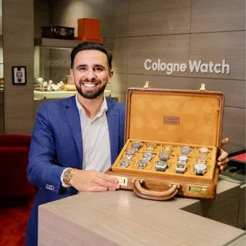
High-quality indoor photography of a smiling man in a blue suit jacket and
crisp white shirt, standing behind a luxury display counter. He is proudly
presenting an open, elegant wooden briefcase lined with tan suede, filled with
numerous luxury wristwatches. The background is a well-lit, high-end retail
boutique with wood-paneled walls, a wall sign reading "XXXXX", and illuminated
glass display cases.
Test: product focus - the full briefcase (abundance) vs. holding up one detailed hero watch. And attire - the formal suit vs. high-end casual (a fitted black turtleneck), to match the target buyer's self-image.
4. The Dad + Guitar (At Home)
A warm, candid, lived-in scene: a dad sitting cross-legged on the floor playing guitar with kids around him. No polish, no pose - the messiness is the message. This is authenticity as the entire creative.
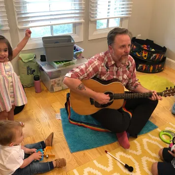
Candid, warm, brightly lit photography of a man sitting cross-legged on a
wooden floor in a home playroom, playing an acoustic guitar. He is wearing a
plaid shirt. Several young children are sitting and standing around him,
looking engaged and happy. The room feels lived-in and authentic, featuring
toy bins, a yellow patterned rug, and windows with white blinds in the
background.
Test: the camera angle - this wide room shot vs. a tight close-up on the founder's face and the guitar. And action vs. still: a mid-strum, mouth-open-singing action shot vs. a posed shot looking into the lens. This is where the caught-moment expression work matters most.
5. The Team Truck Photo (The Whole Crew)
A big group of adults and kids in matching shirts posing in front of a branded truck. Scale and community are the signal - this isn't one guy, it's a whole real crew that shows up. The more faces, the more “real company.”

Outdoor daylight group photo of a large team of adults and children smiling
and posing together in front of a large commercial truck. The truck features a
bright pink cylindrical tank with black text reading "XXXXX". On top of the
truck tank sits a large inflatable Santa Claus in a sleigh. Many people in the
group are wearing matching bright pink t-shirts and red Santa hats.
Test: uniformity - casual matching t-shirts vs. the crew in full high-visibility professional work gear. And seasonality: this holiday version (inflatables and hats) vs. an evergreen version, to measure the exact lift of holiday-specific creative.
How to Build Your Own Founder Ad
The recipe:
1. Put a real face at the center. The founder, the team, the person who makes it. Eyes toward the lens. This is the whole archetype - everything else supports the face.
2. Add the context. What they're holding, where they're standing - the warehouse, the kitchen, the truck. The environment proves the story is real.
3. Voice the founder's frustration. The text carries the “why I made this” story - the personal problem that became the product. That's the Aha.
4. Keep it un-produced. Natural photos or candid-looking AI. The moment it reads as a glossy studio campaign, the authenticity - and the trust - evaporate.
The face itself has to hold up under scrutiny, so the realism of the person matters more here than in any other archetype - natural skin from the realistic AI skin work and a genuine, un-posed expression from the facial expressions work are what make the face read as a real human rather than a stock model. And where there's text, quote it exactly with the AI text in images rules.
How to Test a Founder Ad
Two levers move founder performance most:
The face and expression. This is the biggest one. The same message on a smiling, warm face converts differently than on a serious, authoritative one. Test approachable vs. expert, one face vs. a whole team - the emotional read of the person is doing the persuasion.
The production level. Test polished vs. genuinely candid. Counterintuitively, the rougher, more real-looking version often wins here, because polish signals “corporate” and this archetype is trying to signal the opposite. Let the split test tell you how rough to go.
Conclusion: Show the People, Not the Logo
Four to lock in:
1. A face is the fastest trust signal there is. People read faces before anything else. Put a real one in the frame and you buy credibility no graphic can - that's the Face Tax, and it's worth paying.
2. The person carries the halo. Trust the face, trust the product. A believable, likable human fronting the brand transfers their credibility onto the thing being sold.
3. Un-produced beats polished. This is the one archetype where cranking the realism stack backfires. It should look like a genuine photo of a real person, not a studio campaign.
4. Voice the founder's frustration. The story that converts is “I had this problem, so I made this” - not “our company is proud to present.” Personal beats corporate every time.
The Rule of Thumb for the archetype: a logo tells the customer a company exists. A face tells them a person is behind it who cares whether it's good - and people trust people, not companies.
So the move: take a polished, faceless creative that's plateaued and rebuild it as a founder ad - a real face, the context that proves the story, and the founder's frustration in the copy. My bet is it outperforms the polished version.
Get instant access
Steal my ad concept & hook library, new breakdowns every week.
Join the free community