


The highest CTR I've ever pulled came from a lie.
It was a fake “Missed Call” notification. Green phone icon, a brand name where a contact should be, the little red badge. It pulled 3.1% CTR, my best ever, and I was thrilled for about four days.
Then the feedback turned. Hide-rate 4x my account average. CPM climbing every morning. I killed it inside a week.
I'd borrowed urgency I had no way to repay. The reflex I triggered didn't convert. It curdled.
This is a complete guide to fake notification ads - the Push Notification archetype: a static ad built to look like an iOS banner, lock-screen alert, or system pop-up, so it hijacks the reflex you've been conditioned to obey. I'll give you the build, three copy-paste prompts, and the exact line where this format tips from clever into hated.
Let me explain.
What Is a Fake Notification Ad?
Fake notification ad: An ad that mimics a system alert - an iOS banner, a lock-screen notification stack, or an app pop-up - to make an ad look like a high-priority message you need to check. It hacks the Pavlovian response to digital alerts: we're conditioned to stop and look the instant a notification appears, so the format borrows that reflex before the brain registers it's an ad.
You don't decide to look at a notification. You just look. That involuntary check is the entire mechanism.
The ad occupies the mental slot your brain reserves for “someone needs me right now.”
Here's a clean one:
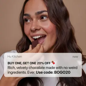
Note
Why It Works: Borrowed Urgency
Every element of this archetype is borrowed. The format isn't yours. The urgency isn't yours. You're renting the priority of a real alert.
Borrowed Urgency: The notification format loans your ad the priority of a genuine system alert, so it gets read before it gets judged. But urgency you borrow has to be repaid with relevance. Repay it with a real offer or a genuinely useful message and the reflex converts. Repay it with nothing, or with a bait-and-switch, and the reflex turns to resentment.
That's the whole game, and it's the line I crossed with the missed call. A fake missed call is maximum borrowed urgency with nothing to repay it. At that point you've stopped borrowing and started stealing.
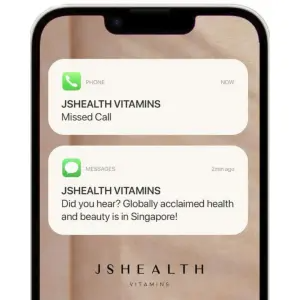
The archetype reads in three beats:
The banner. The stark white, pill-shaped UI element floating over the background. This is the reflex trigger. It commands the eye first, on contrast alone.
The sender. The app icon or contact name at the top. This sets context and trust: is this a friend, a brand, a calendar? The sender identity decides how the message lands before a word of the offer is read.
The hook. The bold text inside, carrying the actual offer, discount, or curiosity spike. This is where you repay the urgency you borrowed.
The kicker? The reader's relief-then-interest happens in one micro-second: “oh, I'm not missing a call, I'm being handed a deal.” Get that swap to feel like a pleasant surprise instead of a trick, and the format prints.
How to Build a Fake Notification Ad
Four moves, and the third is the one that keeps you out of the resentment zone.
Step #1: Build the banner to read as native
The white banner is the trigger, so it has to look like the real thing. Correct corner radius, correct shadow, correct type weight. A banner that looks designed loses the reflex, because the brain only auto-obeys alerts that look like alerts.
Step #2: Choose the sender identity deliberately
Who the notification is “from” changes everything. A brand name reads as a promo. A friend's name reads as social proof. A “Bestie” reads as FOMO. An “Order Update” reads as urgency about something you supposedly already did.
Match the sender to the emotion you want. Test a friend-persona (“Bestie”) against a transactional one (“Your cart is about to expire”) and watch how differently the same offer lands.
High-quality lifestyle photography of [a smiling person reacting to the
product]. The background is a solid, warm [tan] color. Overlaid on the
bottom half of the image is a crisp white iOS banner notification. At the
top left of the banner, small text reads "[Hu Kitchen]". In the banner body,
bold black text reads "[BUY ONE, GET ONE 20% OFF]", followed by regular
paragraph text reading "[Rich chocolate, no weird ingredients. Ever.]" and
bold text reading "[Use code: BOGO20]".
Pro Tip
Step #3: Repay the urgency in the hook
This is the discipline. The bold text has to justify the interruption. A real discount, a genuinely relevant tip, an exclusive that feels exclusive.
The stronger the urgency you borrowed, the better the payoff has to be. A gentle banner can carry a soft offer. A red-badge, adrenaline-spiking alert that pays off with a weak 10%-off will breed more anger than clicks.
Minimalist product photography on a solid pastel [yellow] background. Two
hands reach toward each other from opposite sides of the frame; one hand
offers a small, dark cylindrical device to the other empty, open hand. In
the top center, overlay a white iOS system alert pop-up box. Inside the box,
a bold header reads "[Reminder]" and subtext reads "[It's time to ditch your
bad habits]". At the bottom of the box, two clickable text buttons read
"[I'm ready to quit]" in blue and "[I like my bad habits]" in red. At the
bottom center of the image, place a logo reading "[BRAND]".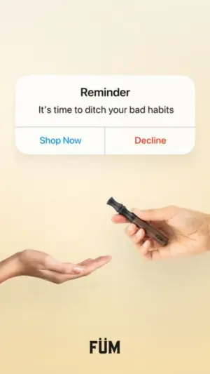
Side note
Step #4: Pick the notification type to match the intensity
Single banner, lock-screen stack, system pop-up with buttons, or a lock-screen with a loaded time stamp. Each carries a different urgency level.
Digital graphic mimicking a smartphone lock screen on a smooth [pink]
gradient background. At the top, large white text displays the date
"[Friday, November 17]" and massive bold text displays the time "[11:11]".
Below the time, a stack of three white iOS message notification bubbles from
a contact named "[Bestie]". The top bubble contains the text "[OMG did
you see they FINALLY restocked]". The middle bubble contains "[the code
still works btw]". The bottom bubble contains "[go go go]".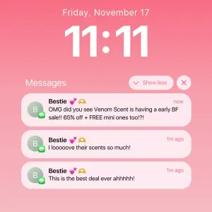
Pro Tip
The Notification Variant Map
| Variant | Urgency level | Backlash risk | Test against |
|---|---|---|---|
| Banner over lifestyle shot | Low | Low | App banner vs calendar event |
| Lock-screen message stack | Medium | Low–medium | Bestie vs Order Update sender |
| System pop-up with buttons | Medium | Low | UI buttons vs emotional-consequence |
| Fake “Missed Call” | Very high | High (deception) | Only if you can repay it |
Banner over lifestyle shot
Urgency level
LowBacklash risk
LowTest against
App banner vs calendar eventLock-screen message stack
Urgency level
MediumBacklash risk
Low–mediumTest against
Bestie vs Order Update senderSystem pop-up with buttons
Urgency level
MediumBacklash risk
LowTest against
UI buttons vs emotional-consequenceFake “Missed Call”
Urgency level
Very highBacklash risk
High (deception)Test against
Only if you can repay it
Where Fake Notification Ads Fail
Three ways, and the first cost me a whole ad account's goodwill for a week.
Borrowing you can't repay. The fake missed call. It steals maximum urgency and repays with a bait-and-switch, so the reflex converts to anger. High CTR, high hide-rate, rising CPMs. The metric that looks best is the one hiding the damage.
Payoff too weak for the urgency. A red-badge, heart-rate-spiking alert that delivers “10% off sitewide” feels like a con. Match the payoff to the intensity or dial the intensity down.
Banner that looks designed. If the notification looks like a graphic instead of a real alert, the reflex never fires and you're left with a busy ad. Native rendering is the price of entry, same as every UI-mimicry format.
- Use
- A pixel-accurate native banner: correct radius, shadow, type weight.
- Avoid
- Fake missed calls and fake “emergency” alerts. That's stealing, and it bills you back in CPM.
- Use
- A sender identity chosen for the exact emotion you want.
- Avoid
- High-adrenaline alerts paired with weak offers.
- Use
- A payoff strong enough to justify the urgency you borrowed.
- Avoid
- Designed-looking banners that break the native illusion.
- Use
- Emotional-consequence buttons where an identity choice fits.
- Avoid
- Running it constantly. Borrowed Urgency fatigues once the audience learns your alerts aren't real.
Is a Fake Missed-Call Notification Too Aggressive?
Usually, yes. It's the highest-CTR, highest-regret variant in the archetype. It works because a missed call is maximum urgency, and it backfires for the same reason: the let-down is proportional to the alarm. It spikes hide-rate and negative feedback, which Meta prices straight into your CPM. If you run it at all, run it where the payoff genuinely rivals the alarm, and watch your feedback metrics daily, not your CTR.
What Time Stamp Should the Lock Screen Show?
Not a neutral one. “11:11” catches the eye through the make-a-wish superstition. An odd, specific time like “2:14 AM” reads as a friend texting late because they couldn't wait. Both outperform a forgettable mid-afternoon time, because the timestamp itself becomes a tiny story. Test the two against each other by vertical.
Wrapping Up
The whole archetype is one rule: urgency you borrow has to be repaid with relevance.
Build the banner native, choose the sender for the emotion, and make the payoff worth the interruption you forced. Do that and Borrowed Urgency converts. Skip the repayment and you've trained an audience to resent your alerts.
The fake missed call will always tempt you with the best CTR in the account. It'll also be the one you kill first. Borrow, don't steal.
This is one spoke in the static ad archetype library. It's the alert-shaped cousin of DM Thread fake text message ads: the DM Thread opens the whole conversation, while the notification is the banner that pulls you toward one. Different reflex, same native discipline - the same one that carries the Blurred Bait archetype.
Steal my ad concept & hook library - new breakdowns every week
Get instant access →What's the payoff behind your notification - and is it worth the reflex you're about to hijack?