


My first fake Instagram post had everything except people.
Perfect post card. Clean product photo. Right fonts, right spacing, verified checkmark. It looked exactly like a real IG post, and it pulled 0.8% CTR.

Then I added the part I’d skipped: a reaction count, one named commenter with a review that sounded like a real person wrote it, a couple of replies underneath. Same product, same photo.
2.4% CTR.
The platform shell was never the ad. The crowd inside it was. An empty shell is just an ad wearing a costume.
This is a complete guide to social media mockup ads: an ad wrapped in a familiar platform UI - an Instagram Story, an X thread, a Slack channel, a Facebook comment section - so it reads as a post you’re eavesdropping on instead of a pitch you’re being shown. I’ll give you the build, three copy-paste prompts, and the one thing that separates a scroll-stopper from a costume.
Here’s the deal.
What Is a Social Media Mockup Ad?
Social media mockup ad: An ad that recreates a real platform’s interface (Instagram, X, Facebook, Slack) and drops the product inside it as a post, comment or thread. It runs on two forces at once: native platform conditioning, which slips past banner blindness because your brain reads the UI as content, and social proof, because the likes, comments and replies show other people already sold on it.
We spend hours a day inside these interfaces. Our defenses go up for ads and down for posts. This archetype pays the ad in through the post door.
It doesn’t feel like being sold to. It feels like scrolling.
Here’s a live one:
Note
Why It Works: The Populated Shell
Here’s the mistake I made, and the one most people make.
The Populated Shell: A social mockup only persuades when the UI is populated with believable social signals - a reaction count, a named commenter, a reply thread, a poll with votes. The familiar platform frame gets you past banner blindness. The visible crowd inside it does the selling. Strip the crowd out and you’re left with an ad in a costume.
That’s why my empty version failed. The shell was flawless and completely unpopulated. No one was in the room, so there was no one to agree with.
This is the crowd version of a pattern you already know. In DM Thread fake text message ads a single friend does the endorsing. In Search Bar ads a neutral algorithm does it. Here, a visible crowd does it. Three different endorsers, same principle: someone other than the brand vouches.
The archetype reads in three beats:
The native frame. The instantly-recognized platform: the IG Q&A sticker, the Slack sidebar, the Facebook reaction icons. This drops the viewer’s guard before anything else registers.
The social validation. The community signals: who’s asking, how many likes, the commenter’s profile photo, the reply count. This is the populated part, and it’s the persuasion.
The embedded solution. The product, the answer, the link - digested last and framed as a demanded solution rather than a cold pitch.
The kicker? People don’t evaluate a full room. They join it. Show enough visible agreement and the viewer skips “is this good?” and lands on “everyone’s already in.”
How to Build a Social Media Mockup Ad
Four moves. The second one is the whole archetype.
Step #1: Pick the platform your buyer actually lives in
The UI is a targeting decision. Instagram for beauty, wellness, lifestyle. X for reactive, scarcity-driven, opinionated products. Facebook for older demographics and comment-driven proof. Slack or Teams for B2B.
Match the platform to where the audience already scrolls, and the native frame does its job automatically.
Digital graphic mimicking an Instagram Story. A close-up sunlit photo of a
woman with thick, shiny hair holding a supplement bottle labeled "[BRAND]"
up to her face. Overlaid at the top is a white Instagram Q&A sticker reading
"[Ask me anything]" and the bold question "[what's your secret? your hair
looks insane]". Below are three white, rounded text-background boxes reading
"[ok so I get this a lot lol]", "[started BRAND 3 months ago]", and
"[that's genuinely the only change]".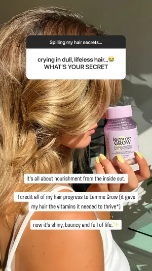
Pro Tip
Step #2: Populate the shell
This is the step I skipped and the reason the archetype works. Fill the UI with credible social proof. A reaction count. A named commenter with a specific, human-sounding review. A reply or two. A poll with visible votes.
The signals have to look real. Believable, oddly-specific numbers beat big round ones, the same way they do in the social proof formats you’ll build separately.
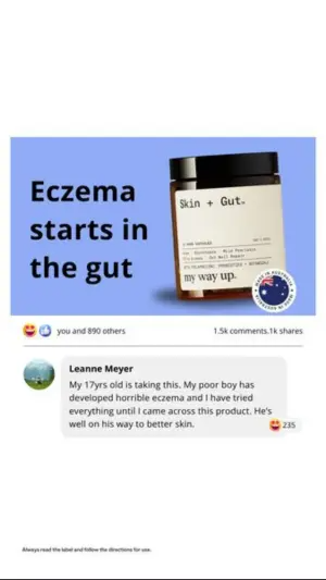
Digital graphic mimicking a Facebook feed post on a white background. The
top is an image with a light blue background featuring bold dark text
"[Eczema starts in the gut]" next to a brown supplement jar with a white
label reading "[BRAND]". Below the image is the standard Facebook reaction
bar reading "[890 others]". Below that is a highlighted comment featuring a
profile photo and name "[Sarah M.]" next to a grey bubble with a
multi-sentence emotional review reading "[bought this for my 17-year-old son
after everything else failed, three weeks in and I actually teared up]",
ending with a like count.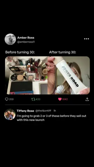
Side note
Step #3: Choose the instigator
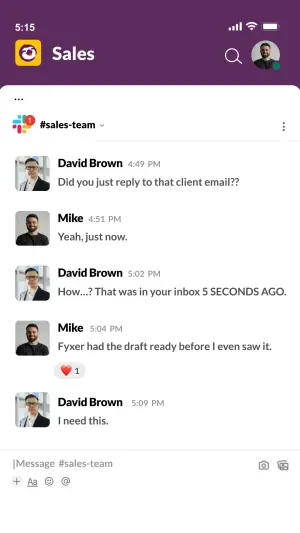
Who starts the conversation reframes the whole proof. A coworker asking a coworker reads as peer validation. A boss asking an employee (“how did you finish this so fast?”) reads as status. A client or a competitor asking reads as external credibility.
Digital graphic mimicking a mobile Slack app interface. A dark purple header
reads "[#marketing]" with a profile icon. Below is a message thread showing
alternating profile photos and messages between two users named "[Dana]" and
"[Marcus]". The bubbles read "[wait how did you turn that report around
overnight]", "[lol BRAND did most of it]", "[send me the link right now]",
and "[already in your DMs]", ending with a grey bubble containing a red heart
reaction emoji and the number 1.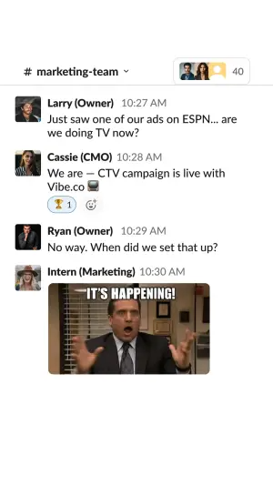
Pro Tip
Step #4: Embed the solution last
The product comes after the social validation, never before. The link, the image, the brand name lands once the crowd has already made it feel wanted. Lead with the proof, close with the product.

The Social Mockup Variant Map
| Variant | The populated signal | Best for | Test against |
|---|---|---|---|
| Instagram Story Q&A | Question sticker + replies | Beauty, wellness, creator | Polished vs raw background |
| X / Twitter thread | Likes, retweets, reply tweet | Reactive, scarcity products | Light vs dark mode |
| Facebook comment | Reaction count + top comment | Older demos, emotional buys | Persona: parent vs first-person |
| Slack / Teams thread | Coworker replies + reactions | B2B, SaaS, productivity | Humor vs data; peer vs boss |
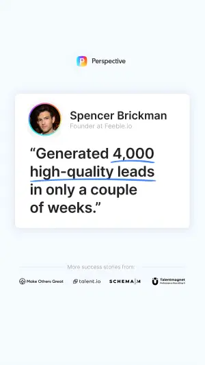
| Testimonial card | Named title + logos | B2B credibility | Volume vs efficiency metric |
| Instagram poll | Visible vote split | Engagement, comparison | Engagement-bait vs buying-intent |
Instagram Story Q&A
The populated signal
Question sticker + repliesBest for
Beauty, wellness, creatorTest against
Polished vs raw backgroundX / Twitter thread
The populated signal
Likes, retweets, reply tweetBest for
Reactive, scarcity productsTest against
Light vs dark modeFacebook comment
The populated signal
Reaction count + top commentBest for
Older demos, emotional buysTest against
Persona: parent vs first-personSlack / Teams thread
The populated signal
Coworker replies + reactionsBest for
B2B, SaaS, productivityTest against
Humor vs data; peer vs bossTestimonial card
The populated signal
Named title + logosBest for
B2B credibilityTest against
Volume vs efficiency metricInstagram poll
The populated signal
Visible vote splitBest for
Engagement, comparisonTest against
Engagement-bait vs buying-intent
Where Social Media Mockup Ads Fail
Four ways, and the first is the one I already confessed.
The empty shell. A pristine, unpopulated platform mockup. No reaction count, no comment, no reply. It’s the single most common failure, and it turns the whole archetype back into a regular ad in a fancy frame. Populate it or skip it.
Over-designed UI. Real platforms are slightly plain and imperfect. A too-branded, too-clean recreation loses the native conditioning that gets you past banner blindness. Native beats art-directed, same discipline as Notes App Screenshot ads.
Cartoonish engagement numbers. “2.3M likes” on a comment reads as invented and trips the skepticism the format was meant to disarm. Specific, plausible counts (“1,247”) read as real.
Wrong platform for the buyer. A Slack mockup aimed at retirees, or a Facebook comment aimed at Gen Z, breaks instantly. The native frame only works if the audience actually lives on that platform.
- Use
- A platform your buyer genuinely scrolls every day.
- Avoid
- The empty shell - an unpopulated mockup is an ad in a costume.
- Use
- Real social signals: reaction counts, named commenters, reply threads.
- Avoid
- Over-designed, too-branded interfaces that lose the native feel.
- Use
- Specific, plausible engagement numbers over big round ones.
- Avoid
- Cartoonish like or comment counts that read as fake.
- Use
- An instigator persona chosen to reframe the proof: peer, boss, parent, client.
- Avoid
- A platform your audience doesn’t actually use.
Does the Verification Checkmark Help?
Often, yes. The blue check reads as “this account is real and notable,” which lends the mocked post borrowed credibility. Isolate it in a test - run the exact post with and without the badge - because on some audiences the checkmark lifts CTR meaningfully and on others it reads as an influencer trying to sell, which cuts trust. It’s a cheap variable to test and worth isolating.
How Many Likes Should the Fake Post Show?
Enough to signal a crowd, not so many it reads as staged. A comment with 1,247 reactions feels real; the same comment with two million does not. Believable and specific beats impressive and round every time, because the whole point of the populated shell is that it looks like it happened, not like it was manufactured.
Wrapping Up
The whole archetype is one rule: don’t just build the platform, fill it with people.
Pick the UI your buyer lives in, populate it with believable social proof, choose whose voice carries the endorsement, and let the product land last. That’s the Populated Shell, and it’s why a mocked post with a crowd beats a flawless one without.
Build the empty version and you’ve made a prettier banner ad. Populate it and you’ve made something a scroller mistakes for their own feed.
This is one spoke in the static ad archetype library. It completes the endorsement trio: a friend vouches in DM Thread, an algorithm vouches in Search Bar ads, and a whole crowd vouches here.
Steal my ad concept & hook library - new breakdowns every week
Get instant access →Which platform does your buyer scroll first thing in the morning, and who’s in the room when they get there?