


Most ads ask the viewer to watch. This one asks them to choose.
For a long time I thought engagement was about the hook - the headline, the visual, the pattern break. Then I ran an ad that was basically a stack of buttons - “Speak Spanish / Speak French / Speak German” - and watched people interact with it like a quiz. They weren’t looking at an ad anymore. They were making a selection.
That’s the Button Select archetype. It presents the offer as a set of clickable buttons, and the moment a viewer mentally taps one, they’ve stopped being an audience and become a participant. The choice feels like a low-commitment, high-reward action - and the brain is drawn to any UI that promises a tailored outcome.
This is the first archetype in the Pattern Interrupts group of the static ad archetype library. I’ll break down why it works, three real button-select ads with the exact prompts to build your own, and how to test it.
Let’s make them tap.
What Is a Button Select Ad?
Button select ad: An ad that presents the offer as an interactive-looking choice - a vertical stack of buttons, a split “this or that” toggle, a mini quiz. Each button is a low-commitment decision the viewer makes in their head. It sells by gamification: instead of consuming a message, the viewer plays a tiny interaction, and that participation is the conversion event.
Most ads are a broadcast. This one is a quiz.
Note
Why It Works: The Fake Tap
This archetype hacks the psychology of choice and gamification. The mechanism has a name.
The Fake Tap: Presenting the offer as a set of clickable buttons transforms a passive viewing experience into an interactive quiz. It lowers the cognitive barrier to entry, because tapping a button feels like a low-commitment, high-reward action. The brain is instinctively drawn to UI that promises a tailored outcome - so it engages with the choice instead of ignoring the ad. The mental tap is the moment of conversion.
Here’s the visual hierarchy that makes it land, in order:
1. The Prompt. The eye starts at the headline or question at the top, which frames the choices.
2. The Buttons. The eye moves straight to the stack of buttons or the split-choice UI. The stark contrast of white shapes against the background makes them the undeniable focal point.
3. The Context / Reward. The background image or surrounding elements - a mascot, the product, PR logos - provide trust and context for the choice being made.
And the “aha” moment is the exact second the viewer mentally taps the button that applies to them - shifting their mindset from “I am looking at an ad” to “I am telling this brand what I want.”
3 Button Select Ads (Broken Down)
Here’s the pattern across three - the prompt, the buttons, and the reward in each:
| Ad | The choice offered | The reward framing |
|---|---|---|
| Duolingo | Which language to speak | A tailored learning path |
| Lash brand | Which feature matters | “What makes us different?” |
| Watch brand | Round vs. square | A style-match verdict |
Duolingo
The choice offered
Which language to speakThe reward framing
A tailored learning pathLash brand
The choice offered
Which feature mattersThe reward framing
“What makes us different?”Watch brand
The choice offered
Round vs. squareThe reward framing
A style-match verdict
Now the teardowns - each with the exact recreate prompt. Swap the XXXXX placeholders for your own copy.
1. The Language Stack (Duolingo)
A vertical stack of flag-badged buttons, each a language, with the mascot below for trust and personality. The viewer picks “their” language - and has mentally started the course before clicking.
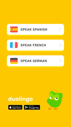
Digital graphic on a bright, solid yellow background. In the center, a vertical
stack of three white, rounded pill-shaped buttons with subtle drop shadows. The
top button features a Spanish flag icon and text "XXXXX". The middle button
features a French flag icon and text "XXXXX". The bottom button features a
German flag icon and text "XXXXX". In the bottom left corner, place a white text
logo reading "XXXXX" above two app store download badges. In the bottom right
corner, place a 3D cartoon green owl character with its arms crossed.
Pro Tip
2. The Feature Buttons (Lash Brand)
A close-up beauty shot with a headline question and a stack of feature buttons. Each button is a benefit the viewer “selects” as the one that matters to them - and the PR logos underneath borrow credibility.
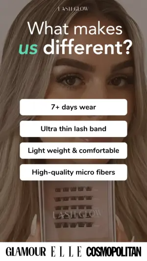
Vertical digital graphic. The background is a close-up, softly lit photograph
of a person's face, focusing on their eyes and long eyelashes. They are holding
a small cosmetic box in the lower frame. Overlaid at the top is a large text
headline reading "XXXXX", with the second word highlighted in mint green. In
the center, a vertical stack of four white, rounded rectangular buttons
containing the black text: "XXXXX", "XXXXX", "XXXXX", and "XXXXX". At the
bottom, a white banner contains black media logos for "XXXXX", "XXXXX", and
"XXXXX".
Pro Tip
3. The Split Choice (Watch Brand)
A split-screen “this or that” - two product variants, each with its own tappable half. The viewer picks a side and gets a style verdict. The binary choice is even lower-commitment than a stack.
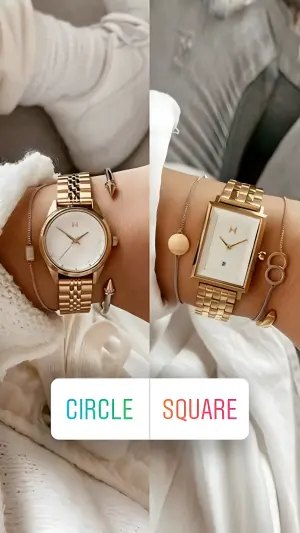
Digital graphic featuring a split-screen vertical layout. The left side shows a
close-up of a wrist wearing a round gold analog watch with layered bracelets.
The right side shows a close-up of a wrist wearing a rectangular gold analog
watch with layered bracelets. Overlaid across the bottom center is a white
rectangular UI button split into two halves. The left half contains the text
"XXXXX" in teal, and the right half contains the text "XXXXX" in a warm
orange-to-pink gradient.
Pro Tip
How to Build Your Own Button Select Ad
The recipe:
1. Frame the choice with a prompt. A headline or question at the top that makes the buttons make sense - “Which language?”, “What matters to you?”, “This or that?”
2. Make the buttons the focal point. Stark white (or high-contrast) shapes against the background, so the eye can’t miss them. Build them with the CTA button cues so they read as genuinely tappable.
3. Keep each choice low-commitment. A language, a feature, a side. The tap has to feel free and easy - that’s what lowers the barrier.
4. Anchor with trust. A mascot, PR logos, the product itself - context that rewards the choice and makes it feel safe. Quote every button label exactly with the AI text rules.
How to Test a Button Select Ad
Two levers move performance most:
The choice itself. This is the biggest one. What you ask the viewer to choose between changes everything - languages by popularity vs. profitability, features vs. objections, round vs. square. The options are the ad.
The button UI. How the choice is presented - a vertical stack vs. a split toggle, one conjoined button vs. two separate floating ones. The format changes how interactive it feels, and how many people mentally tap.
- Use
- Buttons as the undeniable focal point of the frame.
- Avoid
- Low-contrast buttons that blend into the photo behind them.
- Use
- Choices that feel free: a language, a feature, a side.
- Avoid
- Choices that imply commitment, cost or a form to fill in.
- Use
- A prompt or question that frames why the buttons exist.
- Avoid
- A naked button stack with no headline to give it meaning.
- Use
- Trust anchors: mascot, product, press logos under the choice.
- Avoid
- Six or more options - the tap stalls when the quiz gets long.
Conclusion: Turn the Ad Into a Quiz
Four to lock in:
1. Participation beats attention. A viewer who mentally taps a button has already engaged. The Fake Tap converts a passive scroller into a participant before they click.
2. The buttons must be the focal point. Stark, high-contrast, obviously tappable. If the buttons don’t pull the eye, the interaction never starts.
3. Keep each choice free. Low-commitment, high-reward. A language, a feature, a side - the tap has to feel like no risk and a tailored payoff.
4. Test the choice before the design. The options you offer are the highest-leverage variable. Popularity vs. profitability, feature vs. objection - the choice is the ad.
The rule of thumb for the archetype: a broadcast asks the viewer to watch; a quiz asks them to choose. The moment they mentally tap a button, they’ve stopped being an audience and started telling you what they want - and a participant converts far better than a spectator.
So the move: take a passive ad that lists your benefits and rebuild it as a button stack that asks the viewer to pick the one that matters to them. Same benefits. My bet is it lifts engagement - because you turned watching into choosing.
This is one spoke in the static ad archetype library. If you want the UI-borrowing cousins, see AirDrop ads and Product Grid ads.
Steal my ad concept & hook library - new breakdowns every week
Get instant access →What’s the one choice your buyer is already making in their head before they buy - and could you put it on a button?