


I spent years making my ads look better. Then I made one look worse on purpose, and it outperformed all of them.
It was an MS Paint pie chart. “Should I arrange my funeral before I die?” - a big purple slice (“Yes, get started”) and a tiny orange one (“Yes but in orange”). Objectively ugly. Zero production value. And it stopped the scroll cold, because it looked nothing like an ad.
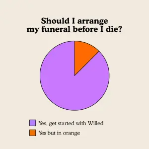
That’s the Funny & Ugly archetype. We’re so bombarded by hyper-polished, perfectly lit brand imagery that our brains tune it out automatically. When an ad is intentionally ugly, pixelated, or built around a ridiculous meme, it shatters that expectation - and the brain processes it as native, organic internet culture (a shitpost from a friend) rather than corporate marketing. It builds instant rapport, because it signals the brand doesn’t take itself too seriously.
This is the second archetype in the Pattern Interrupts group of the static ad archetype library. I’ll break down why it works, eight real funny-and-ugly ads with the exact prompts to build your own, and how to test it.
Let’s make it worse.
What Is a Funny & Ugly Ad?
Funny & ugly ad: An ad that deliberately abandons production polish in favor of humor, memes, and an “anti-ad” aesthetic - MS Paint interfaces, low-quality selfies, chaotic Facebook-post backgrounds, absurd pie charts, pop-culture memes. It sells by disguise and rapport: it doesn’t look like marketing, so the brain doesn’t tune it out, and the humor makes the brand feel human. The joke is the hook; the real pain point underneath is the sell.
Most ads try to look expensive. This one tries to look like a friend made it.
Why It Works: The Anti-Ad
This archetype thrives on humor, relatability, and the anti-ad aesthetic. The mechanism has a name.
The Anti-Ad: Deliberately ugly, meme-y, low-effort-looking creative shatters the “polished brand ad” pattern the brain has been trained to ignore. Because it looks like native internet culture - a shitpost, a meme, a screenshot - the brain processes it as organic content rather than marketing, so the ad-blindness reflex never fires. The ugliness builds instant rapport: it signals the brand doesn’t take itself too seriously, which makes it feel like a person, not a corporation.
Here’s the visual hierarchy that makes it land, in order:
1. The Absurdity / Ugliness. The eye is immediately caught by the glaringly obvious design “flaw” - a chaotic background, an MS Paint UI, a grotesque or funny meme image.
2. The Joke / Punchline. The text that frames the weird image, usually stating a relatable pain point in a highly dramatic or humorous way.
3. The Call to Action. Often woven into the joke or placed subtly, inviting the next step.
And the “aha” moment is when the user laughs or rolls their eyes at the absurdity - then realizes that despite the joke, the underlying problem is actually real and the product solves it.
Note
8 Funny & Ugly Ads (Broken Down)
Here’s the pattern across eight - the ugly device, the joke, and the pain point in each:
| Ad | The ugly device | The pain point |
|---|---|---|
| Funeral pie chart | Absurd MS Paint chart | Estate planning avoidance |
| “Designer just quit” | Low-quality split selfie | Un-fancy but honest product |
| Purple apple eye test | Fake medical eye test | A jewelry / BOGO reward gag |
| Fake call screen | Infomercial hang-up / answer | “Free case review” urgency |
| MS Paint calc (DACH) | Old Paint UI, hand-drawn | Calorie-deficit confusion |
| XP-wallpaper Paint | Windows XP nostalgia | “Which earplugs?” quiz |
| Facebook-Mom review | Chaotic yellow post + avatar | Weight-loss testimonial |
| Pop-culture meme | Shock movie-still meme | “How acne feels” |
Funeral pie chart
The ugly device
Absurd MS Paint chartThe pain point
Estate planning avoidance“Designer just quit”
The ugly device
Low-quality split selfieThe pain point
Un-fancy but honest productPurple apple eye test
The ugly device
Fake medical eye testThe pain point
A jewelry / BOGO reward gagFake call screen
The ugly device
Infomercial hang-up / answerThe pain point
“Free case review” urgencyMS Paint calc (DACH)
The ugly device
Old Paint UI, hand-drawnThe pain point
Calorie-deficit confusionXP-wallpaper Paint
The ugly device
Windows XP nostalgiaThe pain point
“Which earplugs?” quizFacebook-Mom review
The ugly device
Chaotic yellow post + avatarThe pain point
Weight-loss testimonialPop-culture meme
The ugly device
Shock movie-still memeThe pain point
“How acne feels”
Now the teardowns - each with the exact recreate prompt. Swap the XXXXX placeholders for your own copy.
1. The Absurd Pie Chart
An intentionally basic MS Paint-style pie chart posing a ridiculous “choice” that isn’t really a choice. The absurdity of the format is the scroll-stopper; the taboo subject (death) makes it funnier.
Digital graphic featuring a simple, slightly MS Paint-style pie chart on a
plain beige background. Above the chart, a bold, black serif headline reads
"XXXXX". The pie chart is split into two uneven slices: a large light purple
slice and a small orange slice. Below the chart is a color key. A small purple
square is next to the text "XXXXX". A small orange square is next to the text
"XXXXX".
Pro Tip
2. The “Designer Just Quit” Split
A deliberately low-effort split: a smug low-quality selfie vs. a plain product render, with a self-deprecating joke about the brand’s own bad design. Honesty disguised as incompetence.
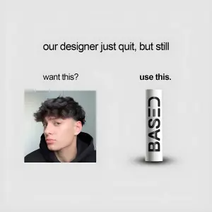
Digital graphic with a plain, light grey background. Centered at the top,
simple black text reads "XXXXX". Below, the layout is split. On the left, small
text reads "XXXXX" above a low-quality selfie of a young man with messy hair
looking smugly at the camera. On the right, bold text reads "XXXXX" above a
simple 3D render of a white cylindrical bottle with black text reading "XXXXX".
Pro Tip
3. The Fake Eye Test
A mock medical eye-test card where the “diagnosis” is secretly the offer. The clinical format plus an absurd purple apple makes the joke, and the reward hides in the color key.
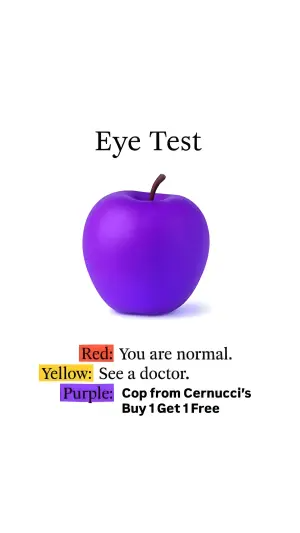
Digital graphic on a solid white background. At the top, a clean, serif
headline reads "XXXXX". Below is a 3D render of a shiny, bright purple apple.
Below the apple is a three-line color key. The first line features a red
highlight box reading "XXXXX" followed by black text "XXXXX". The second line
features a yellow highlight box reading "XXXXX" followed by text "XXXXX". The
third line features a purple highlight box reading "XXXXX" followed by bold text
"XXXXX".
Pro Tip
4. The Fake Call Screen
The visual language of a late-night infomercial or an incoming call - big red and green hang-up and answer buttons. It mimics a decision UI while looking cheap on purpose.
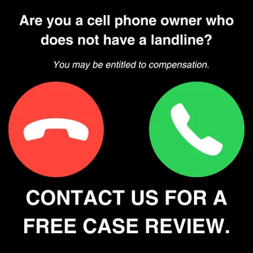
Digital graphic on a solid black background. At the top, bold white text reads
"XXXXX". Below that, smaller italicized white text reads "XXXXX". In the center
are two large, glossy 3D icons: a red circle containing a white "hang up" phone
receiver symbol, and a green circle containing a white "answer" phone receiver
symbol. Below the icons, massive, bold white text reads "XXXXX".
Pro Tip
Note how close this sits to Button Select ads - two tappable choices - except here the UI is played for laughs rather than for a tailored outcome.
5. The MS Paint Calculator
A full old-school MS Paint interface - grey border, menu bar, tool palette - with hand-drawn doodles and a typed calculation. The nostalgic ugliness makes a dry topic (calorie math) feel human and native.
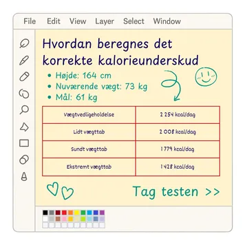
Digital graphic mimicking an old-school MS Paint computer program interface.
The UI features a classic grey border, a top menu bar (File, Edit, etc.), a
left-side tool palette, and a bottom color palette. The main drawing area has a
light yellow background. The content inside looks hand-drawn or typed with a
basic font: A blue headline reads "XXXXX". Below is a green bulleted list
reading "XXXXX", "XXXXX", and "XXXXX". A red grid table displays numbers.
Hand-drawn green arrows, hearts, and a smiley face decorate the margins. At the
bottom right, green text reads "XXXXX".
Pro Tip
6. The Windows XP Paint Quiz
An MS Paint window floating over the iconic Windows XP wallpaper, with a handwritten quiz question and product renders. Pure nostalgia-bait ugliness.
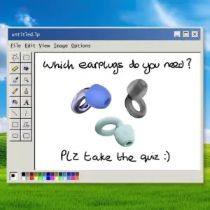
Digital graphic mimicking an old MS Paint window floating over a classic
"Windows XP" bliss green rolling hills wallpaper. The Paint window shows a white
canvas. At the top of the canvas, messy, handwritten black text reads "XXXXX".
In the center are 3D renders of three different colored loop earplugs (blue,
grey, mint). At the bottom of the canvas, more handwritten text reads "XXXXX".
Pro Tip
7. The Facebook-Mom Testimonial
A chaotic bright-yellow Facebook-post background with an over-enthusiastic review in giant purple text, emojis everywhere, and a cartoon avatar with a megaphone. The “Facebook Mom” aesthetic is the joke.

Digital graphic featuring an overwhelmingly chaotic, bright yellow background
covered in geometric shapes and squiggles (classic Facebook post background
style). In the center, massive, bold purple text reads a highly enthusiastic
multi-sentence review: "XXXXX", "XXXXX", "XXXXX". Scattered throughout the text
are flexing arm, fire, and heart emojis. Emerging from the bottom left corner is
a 3D cartoon avatar of a woman with curly red hair, holding a large blue
megaphone and shouting excitedly.
Pro Tip
8. The Pop-Culture Meme
A classic top-text / bottom-text meme using a shock image to dramatize a pain point. Maximum native-meme energy - it looks like it came straight off a feed.

Digital graphic in the classic meme format on a white background. At the top, a
bold serif headline reads "XXXXX". In the center is a cropped, dramatic
pop-culture-style image dramatizing a pain point. Below the image, clean black
text reads "XXXXX".
Pro Tip
Note
How to Build Your Own Funny & Ugly Ad
The recipe:
1. Pick the ugly device. MS Paint UI, a chaotic Facebook background, a low-quality selfie, an absurd chart, a meme. The device is the pattern break.
2. Write the joke around a real pain point. The humor is the hook, but the pain underneath has to be genuine - that’s what makes the product the punchline’s solution.
3. Commit to the bit. Half-ugly reads as a mistake; fully-ugly reads as intentional and funny. Go all the way. The messy text leans on the handwritten text and AI text rules.
4. Keep it legible and on-brand. Ugly, not unreadable - and only if your brand can carry “we don’t take ourselves seriously.” Luxury can’t.
How to Test a Funny & Ugly Ad
Two levers move performance most:
The ugliness ceiling. This is the biggest one. Every ugly ad has a threshold where ugly tips into unreadable or off-putting. Test a chaotic version against a toned-down one to find where the humor peaks before it breaks.
The humor style. Shock vs. subtle, aggressive meme vs. gentle relatable one, taboo vs. safe. The type of funny changes who laughs and who converts - and it interacts with how much your audience trusts the brand to joke.
- Use
- A device that reads as native internet culture, not as design.
- Avoid
- Half-ugly creative that just looks like a mistake.
- Use
- A genuine pain point sitting under the joke.
- Avoid
- Humor with nothing to sell underneath it.
- Use
- Ugly but legible - the message survives the chaos.
- Avoid
- Chaos so dense the offer can’t be read.
- Use
- Challenger brands that can afford to be silly.
- Avoid
- Luxury or high-trust categories where flippancy costs credibility.
Conclusion: Look Like a Friend, Not a Brand
Four to lock in:
1. Polish is invisible now. Hyper-produced ads get tuned out automatically. The Anti-Ad shatters that pattern by looking like native content, not marketing.
2. Ugly builds rapport. Deliberately bad design signals “we don’t take ourselves too seriously” - which makes a brand feel human. That rapport is the real conversion.
3. The joke hides a real pain. The absurdity stops the scroll; the genuine problem underneath makes the product the punchline’s answer. No real pain, no sale.
4. Commit, but stay legible and on-brand. Half-ugly reads as a mistake. Fully-ugly reads as a joke. And only pull it off if your brand can afford to be silly.
The rule of thumb for the archetype: a polished ad announces itself and gets ignored; an ugly one looks like a friend’s post and gets read. The ugliness isn’t a flaw - it’s the disguise, and the disguise is what beats ad-blindness.
So the move: take a polished ad that’s getting tuned out and rebuild it as an MS Paint meme or a chaotic Facebook-Mom post around the same pain point. My bet is it stops the scroll - because it stopped looking like an ad and started looking like the internet.
This is one spoke in the static ad archetype library. Its closest neighbors are Button Select ads and AirDrop ads - both borrow a UI, this one borrows a shitpost.
Steal my ad concept & hook library - new breakdowns every week
Get instant access →What’s the ugliest version of your best-performing ad - and would your brand survive running it?