


I used to think a before-after ad was the lazy option. Slap two photos side by side, call it proof, move on. I ran a batch like that for a skincare offer and watched every one flatline.
Then I actually studied the winners. The gap between the two photos wasn’t the point. What the reader did with that gap was.
Here’s what I mean: before anyone reads a word of your copy, their brain has already clocked the “before” state and the “after” state - and quietly cast themselves as the before. That recognition is the entire engine.
This is the definitive breakdown of before and after ads: the psychology, 26 real teardowns grouped by format, and every copy-paste recreate prompt. It’s the most-linked piece in the ad archetype library for a reason. Let’s pull it apart.
What Is a Before-After Ad?
Before-after ad: An ad that shows two states of the same subject - a painful “before” and a desirable “after” - side by side or split-screen, so the transformation reads as visual proof before any claim is made. The product, timeframe, or stat sits between them as the bridge that explains how the change happened.
It’s the oldest move in direct response because it works on contrast, which the brain processes faster than language.
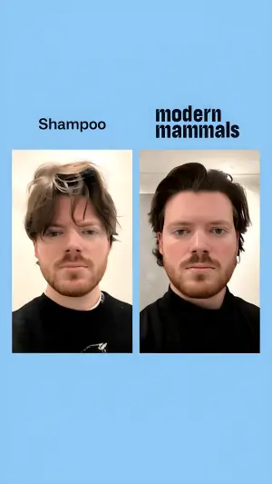
Here’s the first one - a plain hair split on a flat blue background:
Why It Works
The mechanism has a name I use with my team. I call it the Before Mirror.
The Before Mirror: In a split-screen transformation, the “before” panel is a mirror the target sees themselves in. Their brain detects the contrast instantly - before conscious reading - recognizes its own current frustration in the “before,” and reads the “after” as an attainable version of them. The gap between the two states is the proof. No claim required.
The Before Mirror has three parts, in this order:
1. The Division. The line that splits the two states (the split-screen, the “VS” badge, the colour shift from grey to bright). This is what the eye catches in peripheral vision, before anyone decides to stop.
2. The After. The eye gravitates to the resolved, aesthetic, successful state to learn what the reward is.
3. The Catalyst. Then it hunts for the bridge: the product, the timeframe (“Day 30”), or the stat (“97% saw…”). This is where you place what you’re selling.
The Aha moment is the half-second where the viewer recognizes their own frustration in the before and realizes the after is available to them.
Note
The Teardowns
Twenty-six examples, five sub-formats. Every recreate prompt keeps the XXXXX placeholders - drop in your own copy.
Every one of these depends on clean labels (“Before,” “Day 30,” “97%”) that AI generators love to mangle - see getting text right in AI images. For the photo-real transformations, grounding elements is what stops them looking like stock composites.
Sub-format 1: The Literal Split
Real human, before photo vs after photo. The default and the highest-trust - but also the one Meta scrutinizes hardest (see the compliance flag below). Match the labels to the emotion: chronological for clinical trust, identity-based (“Old You / New You”) for desire.
1. The styled-hair split. Same person, messy vs neat, on a flat digital background.
Digital graphic on a solid light blue background. A vertical split-screen shows two photos of the same person facing the camera. On the left, the person has messy, unstyled hair, with text above reading "XXXXX". On the right, the person has neat, styled hair, with text above reading "XXXXX".Side note
2. The macro skin humor. Extreme close-up, hairy vs smooth, with casual/funny copy carrying it.
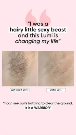
Digital graphic on a light pink background. At the top, large pink quotation marks sit above bold text reading "XXXXX". In the center, a side-by-side macro photo comparison of skin, showing a hairy patch on the left and smooth skin on the right. Below each photo are white pill-shaped labels reading "XXXXX" and "XXXXX". At the bottom, another text quote reads "XXXXX".Side note
3. The identity split. Black-and-white exhausted vs full-colour energetic, with a two-column benefit list.
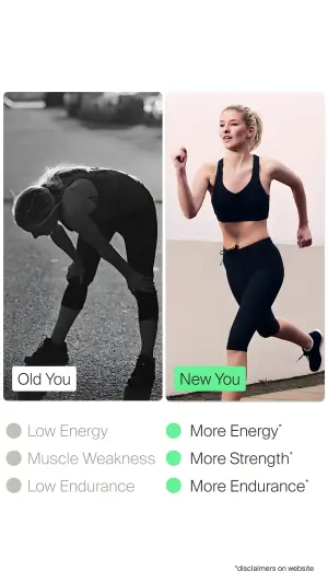
Split-screen vertical graphic. The left half is a black-and-white photo of a person looking exhausted and bent over, with a white label reading "XXXXX". The right half is a bright, full-color photo of a person running energetically, with a bright green label reading "XXXXX". Below the photos is a two-column list. The left column has grey circles and grey text reading "XXXXX". The right column has green circles and dark text reading "XXXXX". Small disclaimer text at the bottom right.Side note
4. The clinical skin split. Close-up bumps vs clear, product tucked in the corner as the bridge.
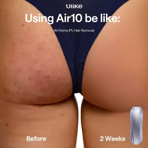
Close-up product demonstration photography of skin. The image is split subtly down the middle. The left side shows skin with red bumps and blemishes, labeled "XXXXX" at the bottom. The right side shows clear, smooth skin, labeled "XXXXX" at the bottom. At the top, bold white text reads "XXXXX" and smaller text "XXXXX". In the bottom right corner, a sleek silver hair removal device is overlaid.Side note
5. The hairline zoom. Split hairline with guide-circles and a percentage badge doing double duty as proof and catalyst.
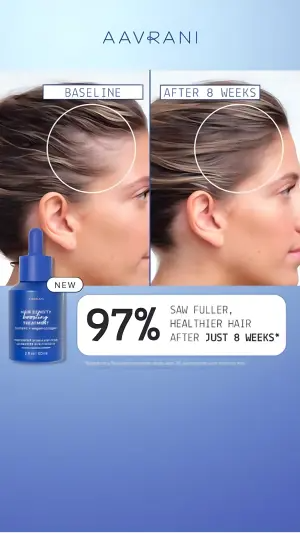
Digital graphic featuring a vertical split-screen photo comparison of a person's hairline. The left photo is labeled "XXXXX" with a thin white circle highlighting the temple area. The right photo is labeled "XXXXX" with a white circle highlighting thicker hair in the same area. The bottom third of the graphic is a solid blue background. A blue dropper bottle product sits on the left with a "XXXXX" badge. To the right is a white rounded box containing massive bold text "XXXXX" and smaller text "XXXXX".Side note
6. The acne-man split. Frowning before, smiling after, brand banner underneath.

Vertical split-screen photography graphic. On the left, a young man with severe facial acne looking at the camera, labeled with a white pill-shaped banner reading "XXXXX". On the right, the same young man with clear, glowing skin, labeled with a white banner reading "XXXXX" with small sparkle emojis. The bottom is a solid purple banner. On the left side of the banner, a logo reads "XXXXX". On the right side, a dark pill-shaped button reads "XXXXX".Side note
7. The risk-reversal face. Beauty profile before/after with a guarantee banner as the hook.
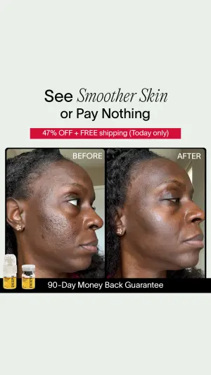
Vertical digital graphic on a light beige background. At the top, a bold headline reads "XXXXX" and "XXXXX". Below it is a bright red rectangular banner reading "XXXXX". The center features a side-by-side macro photo comparison of a woman's face profile. The left photo is labeled "XXXXX" showing textured skin. The right photo is labeled "XXXXX" showing smooth, glowing skin. In the bottom left corner, two small cosmetic serum bottles are labeled "XXXXX". A solid black banner at the very bottom reads "XXXXX".Side note
8. The emotional lifestyle split. Not a body - a situation. Stressed-awake vs peaceful-sleep, surreal exaggeration on the before.

Vertical split-screen photography graphic. The left side is labeled "XXXXX" showing a stressed woman lying awake in bed in the dark, surrounded by multiple disembodied hands holding smartphones up to her face. Several overlapping iOS notification bubbles float over her, containing anxious text like "XXXXX" and "XXXXX". The right side is labeled "XXXXX" showing the same woman sleeping peacefully in bed. Only two notification bubbles float here, reading "XXXXX". In the bottom right corner, a white logo reads "XXXXX".Side note
Sub-format 2: The Proof Object
The transformation is shown on a thing, not a person - usually gross → clean. Zero body imagery, so it sidesteps most personal-health scrutiny while still triggering a visceral reaction.
9. The dirty hairbrush. Tangled vs clean brush as the visual metaphor for hair loss.
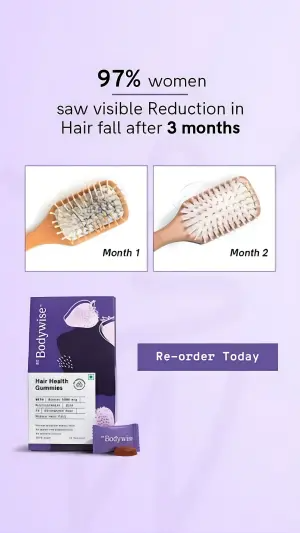
Digital graphic on a soft purple background. At the top, bold text reads "XXXXX" and "XXXXX". Below are two side-by-side square photos of wooden hairbrushes. The left brush is full of tangled hair, labeled "XXXXX". The right brush is clean, labeled "XXXXX". At the bottom left, a purple product box and a single gummy. At the bottom right, a purple button reading "XXXXX".Side note
10. The coated tongue. Circular tongue photos, gross vs clean, split by a “VS” badge.
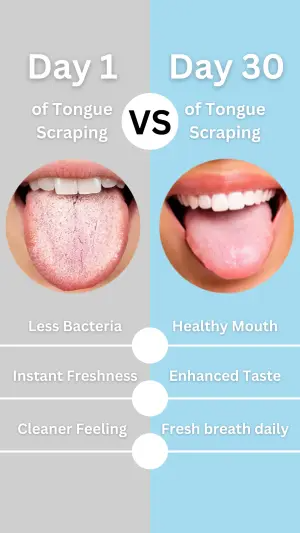
Vertical split-screen graphic. The left half has a grey background, labeled "XXXXX" at the top. Below is a circular close-up photo of an unhealthy, coated tongue. Below the photo, grey text reads "XXXXX", "XXXXX", and "XXXXX". The right half has a light blue background, labeled "XXXXX". Below is a circular close-up photo of a clean, pink tongue. Below the photo, white text reads "XXXXX", "XXXXX", and "XXXXX". A black and white "VS" badge sits on the top center dividing line. Three white dots connect the text lists down the center line.Side note
11. The dog teeth. Macro plaque vs clean, powder-tub product as catalyst.
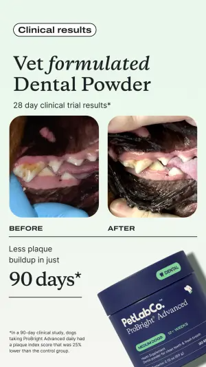
Vertical digital graphic on a very light mint green background. At the top left, a white pill-shaped badge reads "XXXXX". Below it, a large, elegant serif headline reads "XXXXX", followed by small subtext "XXXXX". In the center are two side-by-side close-up macro photos of a dog's teeth and gums. The left photo is labeled "XXXXX" showing severe plaque. The right photo is labeled "XXXXX" showing clean teeth. Below the photos on the left, text reads "XXXXX" with a large, bold, underlined number reading "XXXXX". In the bottom right, a 3D render of a dark blue powder tub is labeled "XXXXX".Side note
Sub-format 3: The Metaphor
A policy-safe stand-in - a 3D character, a cartoon, a puzzle, abstract UI - represents the before/after instead of a human. This is the format that dodges both ad-policy landmines and ad fatigue, because the visual is novel.
12. The strawberry character. Sad wrinkled fruit vs happy glowing fruit.
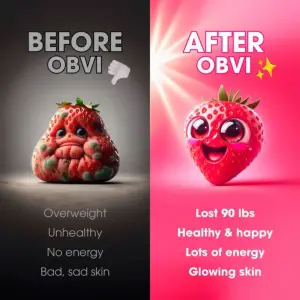
Split-screen digital graphic. The left half has a dark grey gradient background featuring a 3D render of a sad, wrinkled, unhealthy-looking strawberry. Above it, text reads "XXXXX" with a thumbs-down emoji. Below it, a list of grey text reads "XXXXX". The right half has a vibrant bright pink background featuring a 3D render of a happy, glowing, cute strawberry character. Above it, text reads "XXXXX" with sparkle emojis. Below it, a list of bold white text reads "XXXXX".Side note
13. The jigsaw puzzle. Chaos of loose pieces vs a perfectly assembled picture.
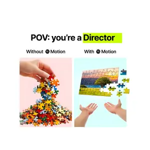
Digital graphic on a white background. At the top, bold text reads "XXXXX" with the last word highlighted in bright green. Below is a side-by-side comparison. The left side is labeled "XXXXX" above an image of a hand dropping a chaotic, falling pile of unconnected jigsaw puzzle pieces on a pink background. The right side is labeled "XXXXX" above an image of two hands floating beneath a perfectly assembled, floating jigsaw puzzle (showing a landscape) on a light blue background.Side note
14. The abstract UI bars. Messy overlapping task bars vs a neat green stack - work “before/after.”
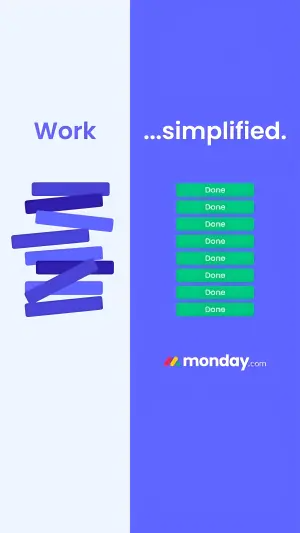
Vertical split-screen digital graphic. The left half has a very light blue background. Bold purple text reads "XXXXX". Below the text is a chaotic, messy stack of overlapping dark purple and blue digital UI task bars. The right half has a vibrant purple background. White text reads "XXXXX". Below the text is a perfectly neat, vertical stack of green UI task bars, each reading "XXXXX". At the bottom right, a logo reads "XXXXX".Side note
15. The donut-scale. Surreal 3D metaphor (donut shaped like a scale) with red-vs-green symptom buttons.
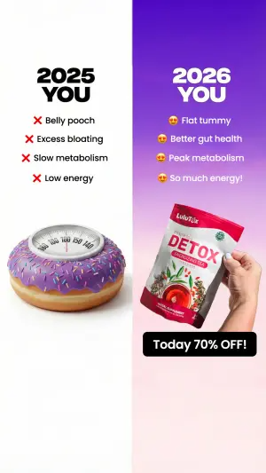
Vertical split-screen digital graphic. The left half has a solid white background. Top black text reads "XXXXX". Below is a vertical list featuring red 'X' emojis and text reading "XXXXX". Below the list is a 3D surreal image of a pink frosted donut with sprinkles shaped like a bathroom weight scale. The right half has a vibrant purple-to-pink gradient background. Top white text reads "XXXXX". Below is a vertical list featuring heart-eyes emojis and text reading "XXXXX". Below the list, a hand holds a red and white supplement pouch labeled "XXXXX". At the bottom, a black pill-shaped banner reads "XXXXX".Side note
16. The cartoon avatar. 2D illustrated woman, sad/tired vs happy/confident, red vs green pill buttons.
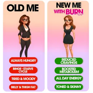
Vertical split-screen graphic. The left side features a light orange-to-pink gradient background. Massive top text reads "XXXXX". Below is a 2D cartoon illustration of a sad, tired, slightly overweight woman wearing dark clothing. Below her is a vertical stack of red pill-shaped buttons containing white text: "XXXXX", "XXXXX", "XXXXX", and "XXXXX". The right side features the same gradient background. Top text reads "XXXXX" and a pink logo "XXXXX". Below is a 2D cartoon illustration of the same woman looking happy, confident, and slim in a fitted black dress. Below her is a vertical stack of green pill-shaped buttons containing white text: "XXXXX".Side note
Sub-format 4: The Data Contrast
No transformation photo at all. The before/after is expressed as numbers, icons, columns, or a toggle. Best for retargeting and B2B, where a buyer trusts a metric over a face.
17. The progress timeline. Multi-panel grid documenting change over labelled steps, plus a testimonial panel.
Four-panel grid graphic. The first three panels show the back of a person's head documenting hair growth progress, with white rounded label boxes reading "XXXXX" in each. The bottom right panel is a solid dark grey square containing white quote text reading "XXXXX" and "XXXXX".Side note
18. The icon chart. Stopwatch icons (1 vs 8 stacked) as a data metaphor for duration.
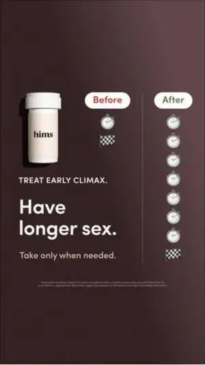
Digital infographic on a solid dark brown background. On the left side, a white pill bottle with the logo "XXXXX". To the right of the bottle, a visual chart is split into two columns. The left column is labeled "XXXXX" in a white pill shape, showing a single stopwatch icon above a checkered flag icon. The right column is labeled "XXXXX" in a white pill shape, showing a vertical stack of eight stopwatch icons above a checkered flag icon. In the bottom left, bold white text reads "XXXXX" and "XXXXX". Small disclaimer text at the bottom.Side note
19. The symptom→benefit chart. Product plus a “from → to” arrow table mapping pains to results.
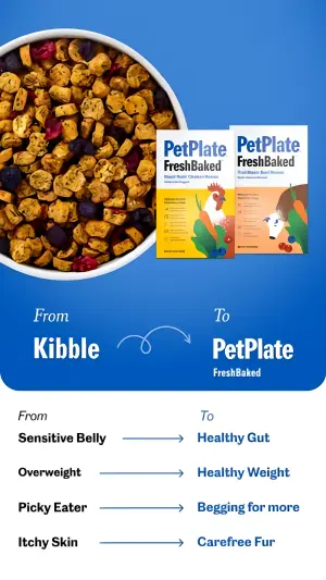
Digital graphic split horizontally. The top half features a vibrant blue background. On the left is a top-down view of a white bowl filled with baked dog food pieces and blueberries. On the right are two illustrated product boxes reading "XXXXX". Below the images, white text reads "XXXXX" next to a curving arrow pointing to "XXXXX". The bottom half has a white background containing a four-row chart. The left column is labeled "XXXXX" and lists symptoms in black text: "XXXXX", "XXXXX", "XXXXX", "XXXXX". Blue arrows point to the right column labeled "XXXXX", which lists benefits in blue text: "XXXXX", "XXXXX", "XXXXX", "XXXXX".Side note
Note
XXXXX - don’t render a competitor’s or a real third party’s brand into your creative. That’s a trademark exposure you don’t need.20. The debt columns. A big highlighted dollar figure over red-problem vs blue-solution columns with a hand-drawn arrow.
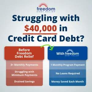
Digital infographic on a soft light grey background. At the top center, a logo reads "XXXXX". Below it, a massive, bold navy blue headline reads "XXXXX", with the specific dollar amount highlighted by a thick, hand-drawn red underline marker. Below the headline are two comparison columns. The left column has a dark red header reading "XXXXX" above three light red boxes containing white text "XXXXX". A hand-drawn green curved arrow points from the red column to the right column. The right column has a navy blue header reading "XXXXX" above three light blue boxes containing white text "XXXXX".Side note
21. The toggle switch. Off→On UI toggles as the transformation, one clinical claim, product photo below.
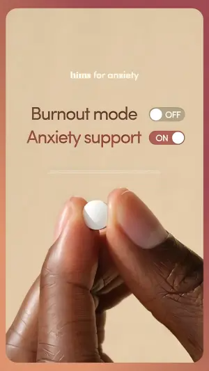
Digital graphic on a warm, smooth beige background. At the top center, a white logo reads "XXXXX". Below this, two lines of text mimic digital UI toggle switches. The top line reads "XXXXX" in dark brown text next to a grey "OFF" toggle switch. The bottom line reads "XXXXX" in dark brown text next to a maroon "ON" toggle switch. The bottom half of the image is a close-up photography shot of two dark-skinned fingers holding a small, round white pill.Side note
Sub-format 5: The Native Mockup
The before/after is wrapped in a platform UI or an analog scrapbook so it reads as an organic post, not a paid ad. High native-feel - but the platform mockups carry an IP flag (below).
22. The scrapbook Polaroid. Notebook paper, taped Polaroids, handwritten arrows and a star review.
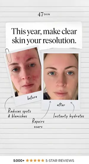
Digital graphic on a background mimicking lined notebook paper. At the top, a logo reads "XXXXX". Below, a piece of ripped white paper is taped to the background, containing bold black text "XXXXX". Below this, two Polaroid-style photos are attached with a drawn paperclip. The left photo shows a woman with red, inflamed skin, labeled "before" in handwritten text. The right photo shows the same woman with clear skin, labeled "after". Hand-drawn arrows point from the photos to handwritten text notes: "XXXXX", "XXXXX", and "XXXXX". At the bottom, a review banner reads "XXXXX" with 5 gold stars.Side note
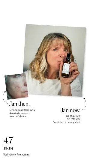
23. The magazine inset. Editorial-style collage, big lifestyle hero photo with a small “before” tucked behind it and hand-drawn arrows.
Digital collage on a white background. The main visual is a large, slightly tilted lifestyle photo of a confident, older woman holding up a dark glass serum bottle with a white label reading "XXXXX". Tucked behind the bottom-left corner of this main photo is a smaller, cropped photo of the same woman's face showing red, irritated skin. A thin hand-drawn arrow points from the small photo to a text block reading "XXXXX" and subtext "XXXXX". Another hand-drawn arrow points from the right side of the main photo to a text block reading "XXXXX" and subtext "XXXXX". At the bottom left, a logo reads "XXXXX" above the text "XXXXX".Side note
24. The Twitter/X post. Transformation dropped inside a fake tweet with reply/like/share icons.

Digital graphic mimicking a Twitter/X post on a white background. The profile header shows a small sunset photo and the name "XXXXX". Below the header, text reads "XXXXX" next to "XXXXX". Below the text is a side-by-side photo comparison of a woman's lower face. The left photo shows textured, bumpy skin. The right photo shows smooth, clear skin. Below the photos are the standard reply, repost, like, and share icons with numbers.Side note
25. The Instagram post. Transformation inside a fake IG story with a link sticker and caption paragraphs.
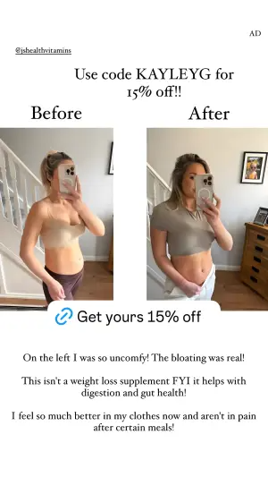
Digital graphic mimicking an Instagram story or post on a white background. At the top left, a small tagged handle reads "XXXXX". Large elegant text reads "XXXXX" and "XXXXX". Below is a side-by-side mirror selfie comparison. The left "Before" photo shows a woman in athletic wear with a bloated stomach. The right "After" photo shows the same woman looking visibly slimmer and less bloated. Overlapping the bottom of the photos is a white pill-shaped button with a blue link icon reading "XXXXX". Below the photos are three paragraphs of text: "XXXXX", "XXXXX", and "XXXXX".Side note
Note
26. The elimination triptych. Three options, two crossed out, one green check - the before-after costume on a Them-vs-Us body.
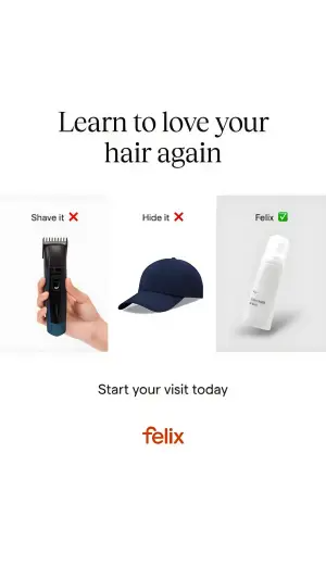
Minimalist product comparison graphic. A horizontal triptych layout on a clean white background. In the left panel, show a hand holding a black electric hair clipper below the text "XXXXX" and a red X emoji. In the middle panel, show a plain dark blue baseball cap below the text "XXXXX" and a red X emoji. In the right panel, place a blank white cosmetic tube standing on a subtle gray pedestal background, with the text "XXXXX" and a green checkmark emoji above it. Across the very top of the image, write a large elegant serif headline reading "XXXXX". At the bottom center, place a logo reading "XXXXX".Side note
Summary Table
| Sub-format | What carries the proof | Policy exposure | Best for |
|---|---|---|---|
| Literal Split | Two real photos of the same person | Highest (health/appearance) | Skincare, hair, fitness services |
| Proof Object | A thing, gross → clean | Low (no body) | Oral care, hair, pet, hygiene |
| Metaphor | A character, cartoon, puzzle, UI | Lowest (policy-safe) | Weight, mood, B2B, sensitive offers |
| Data Contrast | Numbers, icons, columns, toggle | Low (claims still apply) | Retargeting, B2B, finance |
| Native Mockup | Platform UI or scrapbook framing | Trademark / trade-dress | Native-feel, top-funnel, UGC-style |
Literal Split
What carries the proof
Two real photos of the same personPolicy exposure
Highest (health/appearance)Best for
Skincare, hair, fitness servicesProof Object
What carries the proof
A thing, gross → cleanPolicy exposure
Low (no body)Best for
Oral care, hair, pet, hygieneMetaphor
What carries the proof
A character, cartoon, puzzle, UIPolicy exposure
Lowest (policy-safe)Best for
Weight, mood, B2B, sensitive offersData Contrast
What carries the proof
Numbers, icons, columns, togglePolicy exposure
Low (claims still apply)Best for
Retargeting, B2B, financeNative Mockup
What carries the proof
Platform UI or scrapbook framingPolicy exposure
Trademark / trade-dressBest for
Native-feel, top-funnel, UGC-style
How to Build Your Own
Step #1: Pick the after first. The reward state is what the eye lands on. Nail the most desirable, believable “after,” then build the “before” to contrast it.
Step #2: Make the before a mirror, not a monster. It should look like the viewer’s real current state - relatable, not exaggerated to the point of “that’s not me.” The moment they don’t recognize themselves, the Before Mirror breaks.
Step #3: Place the catalyst on the bridge. Put the product, timeframe, or stat between the two states or on the dividing line - that’s where the eye goes hunting for the “how.”
Step #4: Choose the sub-format by your risk profile. Selling a body outcome on a young account? Metaphor or Proof Object, not Literal Split. Selling a service or a B2B result? Data Contrast.
Step #5: Label with time or identity, never with shame. “Day 30,” “Old You / New You” - yes. Anything that names the viewer’s flaw - no (and see the flag below).
How to Test It
Two levers decide these ads. Test in this order.
Lever 1 - The proof vehicle. Photo vs object vs metaphor vs data. This is the biggest swing: same offer, radically different believability and policy risk. Find which vehicle your audience trusts before you optimize anything else.
Lever 2 - The label framing. Same visuals, swap the labels: chronological (“Before / Day 30”) vs identity (“Old You / New You”) vs metric (“97% saw…”). The visual is the constant; the framing is what you’re really buying.
Don’t test the vehicle and the framing at once. You’ll get a winner and no idea why.
Note
- Use
- A “before” that looks like your customer this morning.
- Avoid
- A caricature nobody recognizes themselves in.
- Use
- The catalyst (product, day count, stat) on the dividing line.
- Avoid
- A transformation with no visible “how.”
- Use
- Copy that agitates the problem or the product.
- Avoid
- Copy that names the viewer’s body or flaw.
Conclusion: The Gap Is the Proof
Five to lock in:
1. Before-after wins on the Before Mirror. The viewer casts themselves as the “before,” and the visible gap to the “after” becomes a personal promise - no claim needed.
2. Five vehicles carry the proof. Literal Split, Proof Object, Metaphor, Data Contrast, Native Mockup. Pick by trust and by policy risk.
3. The after is the anchor. Build the before to mirror your actual viewer, not a caricature.
4. Metaphor and Proof Object are your escape hatches when the Literal Split gets rejected.
5. Enforcement is claims-based now. The image rarely kills the ad, the copy does. Agitate the problem, never the body.
The rule of thumb for the archetype: if the “before” doesn’t look like your customer this morning, it’s not a mirror - it’s a stock photo, and it won’t sell.
This is one spoke in the static ad archetype library. Its closest neighbors are text-only ads and founder ads - different proof vehicles for the same trust problem.
Steal my ad concept & hook library - new breakdowns every week
Get instant access →Which vehicle would you test first for your offer - the photo, the object, or the metaphor?