


I spent three years assuming a static ad needed a thing in it. A product. A face. A photo I’d sweated over in Figma at midnight.
Then a text-only ad - literally four words on a blue square - outperformed a shoot I’d spent an afternoon compositing. Same account, same audience, same week.
That stung. But it also rewired how I think about the feed.
This is the full breakdown of text-only ads: why a plain block of copy stops the thumb, the five formats I keep stealing, and the exact recreate prompts. Let’s pull it apart.
What Is a Text-Only Ad?
Text-only ad: A static creative with no photo, product shot, or model - just typed copy on a solid or gradient background. The message is the visual. The whole design job is contrast, hierarchy, and one idea big enough to read at a glance.
The archetype is defined by the treatment, not the content. A claim, a question, a stat stack, a checklist - any of them qualifies, as long as there’s nothing to look at except the words.
Here’s the first one, and it’s about as minimal as it gets:
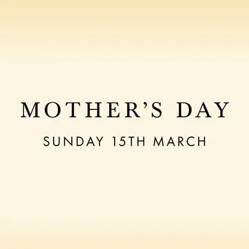
No product. No model holding a gift. Just a date and a serif font doing all the work.
Why It Works
The feed is a firehose of motion - reels, jump cuts, hyper-edited lifestyle shots, all screaming for attention. Your brain is decoding images at full tilt. Then it hits a flat rectangle with nothing to process.
That’s the mechanism. I call it the Blank Wall.
The Blank Wall: In a feed built for motion, a still block of pure text is a wall the scrolling thumb slams into. There’s no image to decode, so the only action left is to read - and the eye reads before the guard goes up. The interrupt isn’t loud. It’s empty.
The Blank Wall has three parts, every time:
1. The Contrast. A stark split between background and text (white on blue, black on cream). This is what catches the eye in peripheral vision, before anyone’s decided to stop.
2. The Hook. The biggest, boldest line. The question, the claim, the comparison. It has to be legible at thumbnail size and demand to be finished.
3. The Subtext. The numbers, the mad-lib, the checklist that backs the hook up once you’ve committed to reading.
The Aha moment is the half-second where the reader realizes the copy is aimed directly at a pain point they have - with zero product imagery in the way to trigger their ad-radar. It reads like an organic quote post. It sells like an ad.
Note
The Teardowns
Five examples, three sub-formats. Every recreate prompt keeps the XXXXX placeholders - swap in your own copy.
Sub-format 1: The Pure Block
Nothing but a claim or a title on a solid color. The hardest to get right, because there’s no layout to hide behind. If the line isn’t strong, the ad is dead.
Example 1 - The occasion (Mother’s Day). Elegant serif, cream-to-gold gradient. This one sells taste. The restraint is the message: a screaming discount graphic says “cheap,” a quiet serif says “gift worth giving.”
Digital graphic featuring a smooth, elegant cream-to-light-gold vertical gradient background. In the exact center, large, elegant serif text reading "XXXXX". Below it, smaller, clean sans-serif text reading "XXXXX". No other elements, images, or distractions.Side note
Example 2 - The viral title (shower door). A bold white claim on classic Facebook-blue, four stacked lines. This one mimics a shared blog headline or a “how-to” post. It doesn’t look like an ad because it looks like content someone reposted.
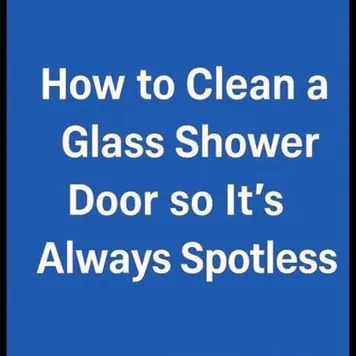
Digital graphic featuring a solid, vibrant blue background. In the exact center, large, bold, white sans-serif text reads "XXXXX" perfectly centered across four stacked lines. No other images or logos.Side note
Sub-format 2: The Structured Stack
Text arranged into a mini-layout so the eye has a path. Color-highlighted words or stat lines create rhythm without adding a single image.
Example 3 - The mad-libs. Dark background, an italic-green “Finally,” then a sentence built out of colorful rounded buttons acting as highlighted words. It reads like a UI, which makes it feel interactive and current. The buttons carry the value props so no line feels like ad copy.
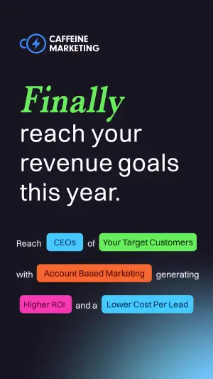
Digital graphic on a dark, almost black background with a subtle blue glow at the bottom. At the top left, a logo and text reading "XXXXX". Below, a large bold headline reads "XXXXX", with the first word italicized and in bright green. Below the headline is a sentence constructed with colorful rounded rectangular buttons acting as highlighted words. The text reads "XXXXX" followed by a blue button "XXXXX", then "XXXXX", a green button "XXXXX", then "XXXXX", an orange button "XXXXX", then "XXXXX", a pink button "XXXXX", then "XXXXX", and a light blue button "XXXXX".Side note
Example 4 - The data stack. Pink-to-purple gradient, a claim headline, then three stat lines with arrows, then a question, then a CTA line. It’s a proof card with no chart - the numbers are the visual.
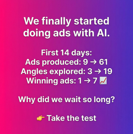
Digital graphic on a vibrant, smooth pink-to-purple diagonal gradient background. Centered white text throughout. The top headline reads "XXXXX". Below is a data summary section reading "XXXXX" followed by three lines of stats: "XXXXX", "XXXXX", and "XXXXX" ending with a small rising chart emoji. Below the stats, a question reads "XXXXX". At the bottom, a pointing finger emoji next to bold text reading "XXXXX".Side note
Note
Sub-format 3: The Analog Note
Fakes a hand-drawn, organic post - a note someone scribbled, not a brand produced. Marker circles and underlines do the emphasis a photo normally would.
Example 5 - The handwritten checklist. Off-white background, casual handwriting, a checklist with a red-marker circle and a blue-marker box. The analog markup is the trick: it reads as a personal note, not a paid placement.
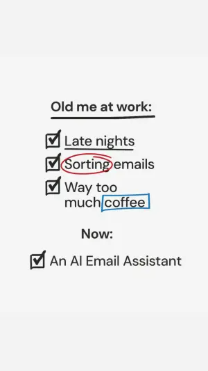
Digital graphic on a solid off-white background. The text is styled like a casual, handwritten note. At the top, text reads "XXXXX" with a thick black underline. Below is a vertical checklist of three items, each starting with a drawn black square with a checkmark. The first item reads "XXXXX" with a black underline. The second reads "XXXXX", with the first word circled in red marker. The third reads "XXXXX", with the last word enclosed in a blue marker box. Below this, standalone text reads "XXXXX". Underneath, a single checkmark box with text reading "XXXXX".Side note
Pro Tip
Summary Table
| Sub-format | Example | Hook mechanism | Best for |
|---|---|---|---|
| Pure Block | Mother’s Day serif | Restraint signals taste | Gifting, premium, occasion |
| Pure Block | Shower-door blue | Mimics a shared how-to post | Broad, educational, top-funnel |
| Structured Stack | Mad-libs buttons | UI feel = interactive, current | SaaS, B2B, feature-led |
| Structured Stack | Data card | Numbers as the visual | Proof, results, retargeting |
| Analog Note | Handwritten checklist | Reads as organic, not paid | Relatable pain, before/after |
Pure Block
Example
Mother’s Day serifHook mechanism
Restraint signals tasteBest for
Gifting, premium, occasionPure Block
Example
Shower-door blueHook mechanism
Mimics a shared how-to postBest for
Broad, educational, top-funnelStructured Stack
Example
Mad-libs buttonsHook mechanism
UI feel = interactive, currentBest for
SaaS, B2B, feature-ledStructured Stack
Example
Data cardHook mechanism
Numbers as the visualBest for
Proof, results, retargetingAnalog Note
Example
Handwritten checklistHook mechanism
Reads as organic, not paidBest for
Relatable pain, before/after
How to Build Your Own
Step #1: Write the hook first, design never. One line. A claim, a question, or a before→after. If it can’t stop you in your own feed, no font saves it.
Step #2: Pick your contrast pair. Background + text color that separates hard at thumbnail size. White on deep blue, black on cream, white on a gradient. Squint at it - if the hook survives blurred, it works.
Step #3: Choose the sub-format to match the message. Selling taste → Pure Block, serif. Selling proof → Data Stack. Selling relatability → Analog Note. Match the visual register to the emotion.
Step #4: Add exactly one layer of subtext. Stats, a mad-lib, a checklist. One. The second you add a photo or a third layer, you’ve left the archetype and lost the Blank Wall.
Step #5: Kill every decoration. No stock icon, no drop shadow, no product tucked in the corner. Emptiness is the feature. Protect it.
How to Test It
Two levers move these ads. Test them in this order.
Lever 1 - The background. The single biggest CPM/scroll-stop variable. Run your “safe” background (Facebook-blue, clean gradient) against an alarming one (hazard-red, stark black). Same copy, different wall. This tells you whether you’re winning on message or on interrupt.
Lever 2 - The hook angle. Same layout, swap the framing. Educational (“How to…”) vs. curiosity-gap (“The strange reason…”) vs. agitator (“Stop wasting your budget”). The layout is the constant; the angle is what you’re actually buying.
Don’t test font and background and angle at once. You’ll learn nothing and blame the creative.
- Use
- One idea, big enough to read at thumbnail size.
- Avoid
- Three competing lines fighting for the same eye.
- Use
- Hard contrast between background and type.
- Avoid
- Low-contrast pastel type that dies in the feed.
- Use
- Claims you can substantiate on request.
- Avoid
- Naked performance numbers with no receipt.
Conclusion: Emptiness Is the Feature
Five to lock in:
1. Text-only ads win by emptiness, not decoration. The Blank Wall stops the thumb because there’s nothing to decode but your words.
2. Three sub-formats cover almost everything. Pure Block (a claim on a color), Structured Stack (mad-libs or data), Analog Note (fake-handwritten).
3. The hook does 90% of the work. Design is just contrast + hierarchy + one subtext layer.
4. Lowest IP risk, highest claim risk. If a number’s on the creative, document it.
5. Test the background first, the angle second - and never both at once.
The rule of thumb for the archetype: if you added an image and the ad got worse, you were fighting the Blank Wall. Take the image back out.
This is one spoke in the static ad archetype library. Its closest neighbors are Funny & Ugly ads, Button Select ads and Brand Manifesto ads - all interrupts, different levers.
Steal my ad concept & hook library - new breakdowns every week
Get instant access →What’s the one line your best product could sell on - with nothing else on the canvas?