


I’ll admit it: the first time one of these beat a polished product ad in my account, I was annoyed. It was uglier. It was just a fake news headline with a product photo under it. And it printed.
Here’s what I’d missed. Nobody trusts a brand bragging about itself. But wrap the exact same claim in a masthead and a journalist’s byline, and the brain files it under “news” instead of “ad.”
That’s the whole trick. And it’s the most legally dangerous archetype in this library - so read the flag before you touch it.
This is the full breakdown: the psychology, 6 real teardowns grouped by the authority they borrow, the copy-paste recreate prompts, and the exact line between clever and illegal. It links up to the static ad archetype library. Let’s pull it apart.
What Is an Editorial-Style Ad?
An editorial-style ad is a paid creative built to look like a news article, magazine feature, or review from a trusted publication - masthead, headline, byline, article typography - so the viewer reads it as objective coverage rather than a sales pitch. The product sits inside the layout as if a journalist chose to feature it.
It’s the static-image cousin of the advertorial. And it works because of one bias.
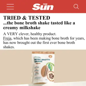
Here’s the first - a tabloid “Tried & Tested” verdict:
Why It Works
The mechanism is stolen credibility. I call it the Borrowed Halo.
The Borrowed Halo: Consumers are skeptical of brands but implicitly trust editorial institutions - papers, magazines, news anchors. Dress a paid claim in a publication’s visual language and it inherits that institution’s halo. The brain categorizes it as verified reporting or a prestigious endorsement, bypassing the “ad blocker” reflex before the claim is even read.
The Borrowed Halo has three parts, in this order:
1. The Authority Anchor - the recognizable masthead or an urgent red “Breaking News” banner. Caught first, in peripheral vision, and it establishes instant credibility.
2. The Editorial Headline - text that reads like an article title, not sales copy (“Shoppers rave over…”, “DJs expose secret…”). It opens a curiosity gap that demands reading.
3. The Subject - the eye finally lands on the product photo, now framed as the thing the “article” is about.
The Aha moment is the viewer stopping because they think they’re reading a legitimate news update or a vetted review from a magazine they respect - which instantly elevates the brand’s perceived value.
Side note
The Legal Flag - Read This First
This is the one archetype where the compliance note goes above the teardowns, not below.
Note
It’s worth being specific about why, because “illegal” covers three separate exposures:
Trademark infringement. A masthead is a registered mark. Rendering it into your ad without a licence is unauthorized use - full stop.
False endorsement / passing off. Implying a publication reviewed or endorsed your product when it didn’t is a false-advertising and unfair-competition problem (in Germany, straight into UWG territory; UK ASA/CAP and US FTC endorsement rules bite the same way).
Platform policy. Meta prohibits ads that use third-party trademarks without authorization and ads that impersonate a news entity. This gets accounts restricted, not just ads rejected - and that lands hardest on young accounts.
The XXXXX placeholders in every prompt below are where a publication name goes. The compliant move is to fill them with your own invented outlet - the genre of editorial (masthead layout, “Tried & Tested” framing, article typography, curiosity-gap headline) is free to borrow; a specific real outlet’s identity is not. If you genuinely were featured, you can say so - but only with real proof, the outlet’s usage terms, and a visible disclosure. This is general guidance, not legal advice; get a lawyer’s read before you run one with any real name on it.
With that locked in - the formats.
The Teardowns
Six examples, three sub-formats grouped by the kind of authority they borrow. Every recreate prompt keeps the XXXXX placeholders (your invented outlet + your copy).
Every one of these is a typography exercise before it’s anything else - mastheads, headlines, bylines, nav tabs, all text the generator has to render cleanly. See getting text right in AI images, and grounding elements for the product-in-context shot that sells the “real article” illusion.
Sub-format 1: The Tabloid Verdict
Mass-market paper energy (red masthead, “shoppers rave,” “Tried & Tested”). Borrows relatable authority - the paper your target already reads on the bus. Curiosity-gap headlines, everyday product framing.
1. The “Tried & Tested” review. Clean mobile-article mimicry, a taste-focused verdict headline, product render below.
Digital graphic mimicking a mobile news article on a white background. At the top, a solid red header with a white hamburger menu icon, a magnifying glass icon, and a logo reading "XXXXX". Below the header, a bold black headline reading "XXXXX" and "XXXXX", followed by paragraph text "XXXXX". The bottom half of the image features a 3D render of a standing pouch of bone broth shake with a white label, brown accents, and a cacao pod illustration, sitting on a light beige surface.Pro Tip
2. The “shoppers rave” hybrid. Deeper mimicry - a full fake news site with nav tabs, byline, and a hyperlink, plus a UGC split-screen up top. The most convincing and the most policy-sensitive (it’s imitating a real site’s chrome).
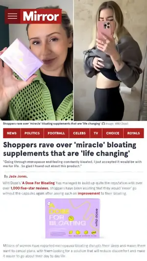
Digital graphic mimicking a mobile news article. The top half features a split-screen video/photo layout: on the left, a person holds a light purple supplement box; on the right, the same person lifts their shirt to show their stomach profile. Overlaid on the top left is a dark red header with a white logo reading "XXXXX". The bottom half mimics a news website with red navigation tabs reading "XXXXX". Below is a bold black headline "XXXXX", a subheadline "XXXXX", a byline "XXXXX", and a paragraph of text with a red hyperlink "XXXXX". A product photo of the purple box sits below the text.Pro Tip
Sub-format 2: The Prestige Endorsement
Aspirational glossy or business title. Borrows status authority - “a publication you look up to covered this.” Clinical or “best of” framing, cleaner typography, higher-perceived-value products.
3. The business-mag clinical angle. Prestige masthead, serif headline with a highlighter on the key ingredient claim, clean product photo.
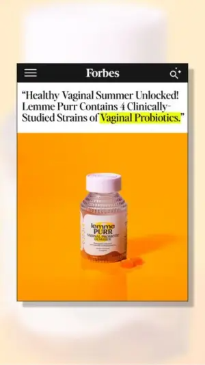
Digital graphic mimicking a mobile article from a business magazine. The background is a blurry, soft peach color. In the center, a vertical white card with a drop shadow. The top of the card is a black header with a white logo reading "XXXXX". Below the header, a bold serif headline reads "XXXXX", with the final two words highlighted in bright yellow marker. Below the text is a square, vibrant orange photo featuring a clear bottle of gummy vitamins with a white cap, sitting next to two loose gummies.Pro Tip
4. The glossy trend hook. Fashion/beauty masthead, vertical split (action photo + editorial column), a viral price-drop hook.
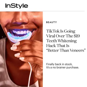
Digital graphic mimicking a magazine article layout. At the top left, a black logo reads "XXXXX" on a white background. Below the header, the layout splits vertically. The left side is a close-up photo of a person smiling while using a glowing blue LED teeth whitening mouthpiece. The right side is white with small text reading "XXXXX", a large serif headline reading "XXXXX", and a subheadline reading "XXXXX".Pro Tip
5. The “best of” listicle. Minimalist editorial, category label + roundup headline, single studio product shot - reads as a magazine’s curated pick.
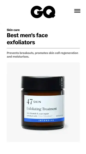
Digital graphic mimicking a clean, minimalist mobile article layout on a white background. At the top center, a large black logo reads "XXXXX" next to a hamburger menu icon. Below, small bold text reads "XXXXX", followed by a large, bold sans-serif headline reading "XXXXX". Under the headline, regular paragraph text reads "XXXXX". The bottom half features a simple, studio-lit photo of a dark brown glass cosmetic jar with a black lid and a white and blue label reading "XXXXX".Pro Tip
Sub-format 3: The “As Seen On” Wall
Instead of faking one full article, this stacks multiple publication logos into a trust bar - the credibility comes from the pile, not a single story. Highest legal exposure of the three, because every logo in the wall is a separate mark you’d need to clear.
6. The multi-logo feature. Framed article, headline quote, a triptych of people using the product, and a black “As seen on” banner of logos at the base.
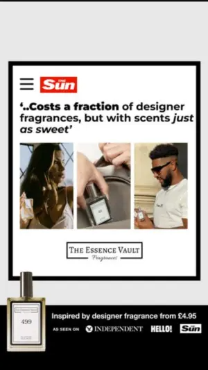
Digital graphic mimicking a framed news article on a light grey background. Inside a thick black border, the top features a red logo header reading "XXXXX". Below, a bold italicized headline quote reads "XXXXX". Under the headline is a triptych photo collage of three different people using and holding perfume bottles. Below the photos, a logo box reads "XXXXX". In the bottom left corner, overlapping the black border, is a glass perfume bottle. The bottom section is a solid black banner with white text "XXXXX" and "As seen on" logos including "XXXXX", "XXXXX", "XXXXX".Pro Tip
Summary Table
| Sub-format | Authority borrowed | Headline style | Best for |
|---|---|---|---|
| Tabloid Verdict | Relatable mass-market paper | Curiosity gap, “shoppers rave” | Broad, everyday, impulse products |
| Prestige Endorsement | Aspirational / business status | Clinical or “best of” roundup | Premium, higher-consideration products |
| “As Seen On” Wall | A stack of logos, combined | Quote-led | Trust-building, unknown challenger brands |
Tabloid Verdict
Authority borrowed
Relatable mass-market paperHeadline style
Curiosity gap, “shoppers rave”Best for
Broad, everyday, impulse productsPrestige Endorsement
Authority borrowed
Aspirational / business statusHeadline style
Clinical or “best of” roundupBest for
Premium, higher-consideration products“As Seen On” Wall
Authority borrowed
A stack of logos, combinedHeadline style
Quote-ledBest for
Trust-building, unknown challenger brands
How to Build Your Own
Step #1: Invent your outlet first. Name it, design a plausible masthead, keep it yours. Do this before you write a word of copy - it removes the temptation to reach for a real logo later.
Step #2: Write the headline as a journalist, not a marketer. It should read like a story a reporter chose to cover. Curiosity gap, third-person, no CTA. “DJs expose secret…” not “Buy now and save 20%.”
Step #3: Match the outlet to the product’s price tier. Everyday product → tabloid verdict. Premium product → prestige endorsement. Mismatch and the halo curdles into “this feels fake.”
Step #4: Add the article furniture. Byline, timestamp, nav tabs, a hyperlink in blue/red, a category label. These small signals are what tip “graphic” into “real page.”
Step #5: Ground the product photo. The one part that must look real, not rendered - a studio or in-context shot, not a floating cutout, or the whole illusion collapses.
How to Test It
Two levers move these ads. Test in this order.
Lever 1 - The outlet’s authority type. Relatable (tabloid) vs aspirational (glossy/business). This is the biggest swing: the same claim lands completely differently depending on which halo you borrow. Find your audience’s trusted register before optimizing anything else.
Lever 2 - The headline angle. Same layout, swap the framing: taste/benefit vs results/authority vs viral/trend. The masthead is the constant; the headline is what you’re actually buying.
Don’t test the outlet and the headline at once - you’ll get a winner and no idea which half won.
- Use
- An invented outlet with a masthead you own.
- Avoid
- A real publication’s logo you never partnered with.
- Use
- A headline a reporter would plausibly write.
- Avoid
- Sales copy in an article’s clothing.
- Use
- An outlet whose status matches the price tier.
- Avoid
- A luxury masthead over a $9 impulse product.
Conclusion: Borrow the Genre, Never the Name
Five to lock in:
1. Editorial-style ads win on the Borrowed Halo. A masthead and a byline make the brain file a paid claim as verified news.
2. Three vehicles by authority type. Tabloid Verdict (relatable), Prestige Endorsement (aspirational), “As Seen On” Wall (stacked logos).
3. The headline must read like journalism - curiosity gap, third-person, no sell.
4. Match the outlet’s status to the product’s price tier or the halo breaks.
5. The line is bright: borrow the genre, never a real outlet’s identity. No real mastheads, no fake endorsements, no “as seen on” logos you didn’t earn. It’s a trademark, false-endorsement, and platform-policy violation all at once.
The rule of thumb for the archetype: if you’d be nervous seeing your ad next to the real publication’s legal team, you’ve crossed the line. Invent your own outlet and sleep fine.
This is one spoke in the static ad archetype library. Its closest neighbors are social mockup ads and before-after ads - different credibility sources for the same trust problem.
Steal my ad concept & hook library - new breakdowns every week
Get instant access →Which halo would you borrow first for your offer - the relatable paper, or the glossy you look up to?