


I trust a stranger’s one-line review more than a brand’s entire landing page. So do you. So does everyone you’re trying to sell to.
That’s not a flaw in human judgment - it’s the whole engine of this archetype. Nobody believes a company describing its own product. Everybody believes the person who already bought it and lived to tell.
I’ve run testimonial statics that were nothing but five stars and a sentence, and they’ve quietly outperformed creatives I spent hours on.
This is the full breakdown: the psychology, 19 real teardowns grouped by format, the copy-paste recreate prompts, and the FTC line that will cost you $51,744 a pop if you cross it. It links up to the static ad archetype library. Let’s pull it apart.
What Is a Testimonial Ad?
A testimonial ad is a creative built around a customer’s review, rating, or quote - five stars, a verified badge, a Trustpilot card, a heartfelt sentence - so the pitch reads as a peer recommendation instead of a sales message. The product photo is there to give context to the praise, not to carry the ad.
It shifts the entire dynamic from “brand talking” to “customer vouching,” which lowers the perceived risk of buying.
Here’s the first - a review fused with a transformation photo:

Why It Works
The mechanism is risk offloaded onto people like you. I call it the Peer Verdict.
The Peer Verdict: Consumers distrust brands but are highly susceptible to other consumers. A star rating, a verified-purchase badge, or a quote from someone who sounds like the viewer transfers the risk of buying onto strangers who went first - and the closer the reviewer matches the viewer, the stronger the pull. The verdict has already been rendered; the viewer just has to agree with it.
The Peer Verdict has three parts, in this order:
1. The Proof Signal - the universal trust symbols, caught first: green or gold stars, the platform logo, a verified badge. Scannable shorthand for “this already worked for others.”
2. The Quote - the actual review text. The best ones name a specific pain that got solved, not “great product.”
3. The Subject - the product or lifestyle photo, giving context to what earned the praise.
The Aha moment is the viewer reading a review written by someone who sounds exactly like them - validating their specific anxiety and proving the product delivers in the real world.
Side note
The Compliance Flag - Read This First
Note
XXXXX is where you paste real review text, not invented copy; (2) don’t render a real review platform’s branding (Trustpilot’s logo and green stars especially) around reviews that didn’t come from that platform - that’s the trademark problem from editorial-style ads all over again. This is general guidance, not legal advice.The Teardowns
Nineteen examples, five sub-formats. Every recreate prompt keeps the XXXXX placeholders - fill them with real reviews.
These are typography-heavy: stars, names, badges, quotes, dates. See getting text right in AI images, grounding elements for lifestyle product shots that read real, and UI cards and buttons for the review boxes and badges.
Sub-format 1: The Hero Quote
One testimonial carries the whole ad, usually beside a photo or product. Highest emotional depth - the format for when you have one killer review that names the exact pain.
1. The review + transformation. A rating paired with a before/after photo. The stars are the mechanism; the photos are the support.
Digital graphic on a soft beige gradient background. At the top, bold text reads "XXXXX" and "XXXXX". Below that, text reads "XXXXX" next to five gold stars and the word "XXXXX". In the center, a split-screen photo layout with rounded corners. The left photo shows a woman sleeping peacefully in bed with a white tape strip across her mouth. The right photo shows the same woman looking energetic, wearing athletic gear and a race bib, standing outside at a marathon event. At the bottom center, a logo reads "XXXXX".Pro Tip
2. The “saved my life” quote. A single dramatic quote over a clean product shot, with a rating icon matched to the niche.
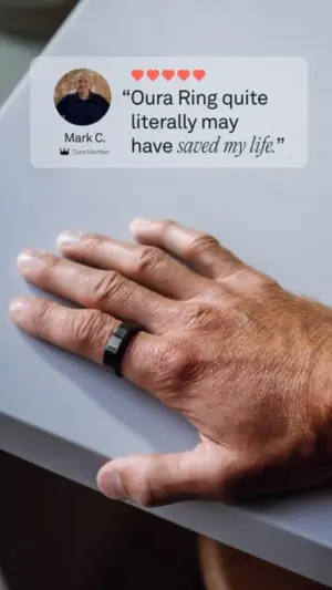
Close-up photography of a man's hand resting on a light grey table, wearing a sleek, matte black smart ring on his index finger. Overlaid in the top left corner is a translucent, frosted-glass style UI box. Inside the box, a small profile photo of a man next to the text "XXXXX" and a small crown icon. Above that, five red hearts. Next to the profile, bold text reads a quote: "XXXXX".Pro Tip
3. The speech-bubble quote. A review in a speech bubble pointing at the product, with a negative-framing headline as the hook.
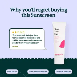
Digital graphic. The top half is a solid light blue background with a large, dark green serif headline reading "XXXXX". Below the headline on the right is a white tube of sunscreen with a pink abstract shape and text reading "XXXXX". On the left, pointing toward the tube, is a white speech bubble with a dark green border. Inside the bubble are five gold stars and a paragraph quote reading "XXXXX" signed "XXXXX". The bottom edge of the blue background is a jagged, zig-zag line separating it from a dark green bottom section containing three pill-shaped text boxes reading "XXXXX", "XXXXX", and "XXXXX".Pro Tip
4. The B2B reaction face. An exaggerated human reaction plus a review card and a logo/rating trust banner - testimonial for software.

High-quality photography of a man in a grey suit looking directly at the camera with a shocked, amazed expression, mouth open. Background is a blurred hallway with warm lighting and wall sconces. Overlaid at the top is a white rounded rectangular card mimicking a customer review with 5 black stars and text reading "XXXXX" with a yellow highlight over the first sentence, followed by paragraph text "XXXXX". At the bottom center, a white rounded UI banner contains two brand logos, gold stars, text reading "XXXXX", and a blue rectangular button reading "XXXXX".Pro Tip
5. The website + review split. A phone mockup of the site beside a long, detailed narrative review, with an arrow guiding the eye.

Digital graphic on a solid light pistachio green background. At the top left, bold black text reads "XXXXX" and "XXXXX", with a thin black hand-drawn arrow pointing to the right. On the left side, a digital mockup of a black smartphone displaying a mobile website interface with a green color scheme, a photo of a man with crossed arms, and text reading "XXXXX". On the right side, a tall white card mimics a review template, featuring five orange stars, a bold headline "XXXXX", and a long paragraph of text reading "XXXXX".Pro Tip
6. The clean paragraph quote. A large text-quote over a floating product, signed off with a Trustpilot rating footer.
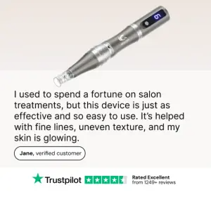
Digital graphic on a soft beige and white split background. At the top, a silver, cylindrical electronic skincare tool floats diagonally on a beige background. Below, on a white background, large black text reads a paragraph quote: "XXXXX". Under the quote is a white pill-shaped badge with a black border reading "XXXXX". At the bottom center, a horizontal layout features a green Trustpilot logo, five green stars, and text reading "XXXXX" and "XXXXX".Pro Tip
7. The poetic one-liner. A short, elegant quote tucked behind a minimalist product - the format for premium, low-word aesthetics.
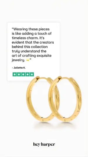
Minimalist product photography on a solid white background. In the center, a pair of textured gold hoop earrings cast soft shadows. Overlapping behind the left earring is a white square review card featuring a black text quote "XXXXX", followed by "- XXXXX" and five green square star icons. At the bottom center, a black logo reads "XXXXX".Pro Tip
Sub-format 2: The Platform Card
Mimics a specific review platform’s card (Trustpilot above all) to borrow that platform’s credibility on top of the reviewer’s. Powerful - but the platform’s branding is a trademark, so this only works with real reviews from that platform.
8. The Trustpilot card + highlight. A faithful review-card layout with a highlighted payoff line and a value-framed lead-in.
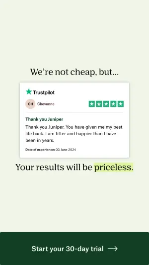
Digital graphic on a pale green background. At the top, elegant serif text reads "XXXXX". In the center, a white rectangular card mimics a Trustpilot review. It features the green Trustpilot logo, five green stars, a profile icon for "XXXXX", a bold review title "XXXXX", and a paragraph review reading "XXXXX". Below the card, text reads "XXXXX", with the final word highlighted in bright green marker. At the bottom, a solid dark green banner contains white text "XXXXX" and a right-pointing arrow.Pro Tip
9. The card + product pointer. A review card with a line pointing to the product - but watch the star color.
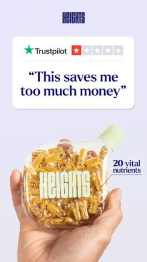
Digital graphic on a solid light purple background. At the top, a dark blue logo reads "XXXXX". Below is a white, rounded rectangular card mimicking a Trustpilot review. It features the green logo, five red stars, and a large, bold blue text quote reading "XXXXX". Below the review card, a hand holds up a unique, clear, flat flask-shaped bottle filled with bright yellow capsule supplements. A thin blue line points to the bottle with text reading "XXXXX".Pro Tip
Sub-format 3: The Volume Stack
Many reviews at once - the quantity is the proof. Floating clusters, grids, cascades. Best when no single review is a knockout but the volume is overwhelming.
10. The floating cluster. Review UI boxes orbiting a lifestyle product shot.
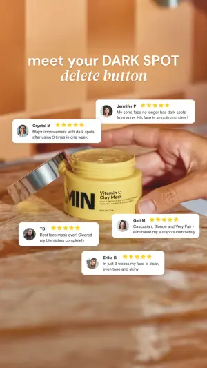
Warm lifestyle photography of a person's hands opening a bright yellow jar of cosmetic clay mask on a textured wooden table. The background features warm orange tiles. At the top, bold white text reads "XXXXX" and "XXXXX". Floating around the product jar are four white, rounded rectangular UI boxes. Each box mimics a customer review, containing a small profile photo, a name, five gold stars, and a short text review like "XXXXX".Pro Tip
11. The overlapping snippet stack. A vertical stack of short review boxes overlapping the model.
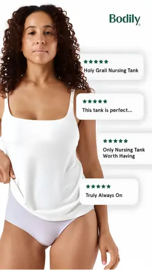
Studio lifestyle photography of a woman wearing a white nursing tank top and light purple underwear on a white background. At the top right, a dark green logo reads "XXXXX". Floating vertically down the right side of the image, slightly overlapping the woman, is a stack of four white, rounded rectangular UI boxes. Each box contains five dark green stars and short, bold text snippets like "XXXXX", "XXXXX", "XXXXX", and "XXXXX".Pro Tip
12. The cascading platform stack. Six Trustpilot-style cards cascading - volume + platform credibility combined.
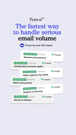
Digital graphic on a solid light periwinkle background. At the top, a logo reads "XXXXX". Below, a bold, multi-line serif headline reads "XXXXX" and "XXXXX". Underneath is a blue pill-shaped badge with a white icon and text "XXXXX". The bottom half features a cascading, overlapping stack of six white rounded rectangular cards mimicking Trustpilot reviews. Each card contains five green stars, a date, the green Trustpilot logo, and short bold text snippets like "XXXXX", "XXXXX", and "XXXXX".Pro Tip
13. The speech-bubble trio. Three review bubbles pointing at a hero product render.
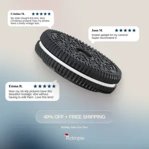
Product photography on a soft light blue and grey gradient background. In the center, a 3D rendering of a camera lens designed to look exactly like a classic black-and-white sandwich cookie. Surrounding the lens are three white speech bubbles with small pointer tails directing at the product. Each bubble contains a name "XXXXX", five blue stars, and a paragraph review reading "XXXXX". Below the product, a translucent frosted-glass style button reads "XXXXX". At the bottom center, small italicized text reads "XXXXX" above a logo reading "XXXXX".Pro Tip
14. The review grid. A 2×3 grid of verified reviews with the product overlapping the center.
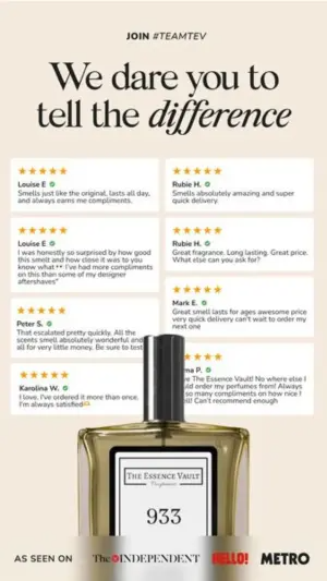
Digital graphic on a solid light beige background. At the top, small black text reads "XXXXX" above a large, bold serif headline reading "XXXXX", with the final word italicized. Below is a 2x3 grid of white rectangular review cards. Each card contains five gold stars, a name in bold "XXXXX" with a green checkmark, and a text review "XXXXX". Overlapping the bottom center of the review grid is a glass perfume bottle with a black cap and white label reading "XXXXX". At the very bottom, a black banner contains white text "XXXXX" and media logos.Pro Tip
Sub-format 4: The Value Fusion
A testimonial welded to price math or volume metrics. The review supplies trust; the numbers supply the deal. Best at the bottom of the funnel, on retargeting.
15. The review + receipt math. A rating stacked onto an itemized price breakdown.
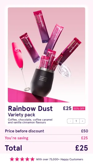
Digital graphic on a light pink background. The top half is a vibrant, surreal product photo on a pink background. A black tumbler cup sits on a reflective pink surface. Erupting upwards out of the cup are several purple and pink flavor packets, and a bright pink electric whisk. Below the image, bold purple text reads "XXXXX" and "XXXXX". To the right, text reads "XXXXX" with a pink "XXXXX" badge. Below is a grey price summary: "XXXXX", then pink text "XXXXX". A thick line separates a large purple total reading "XXXXX". At the bottom, five pink stars and text reading "XXXXX".Pro Tip
16. The quote + volume metric. A review quote sitting alongside a hard scale number (“300M+ sold”).
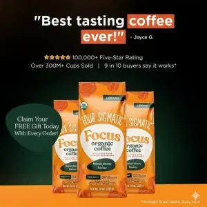
Product photography on a dark green to bright orange gradient background. In the center, three orange bags of ground coffee standing upright. Above the bags, bold white and orange text reads a quote "XXXXX" with an orange highlight box, signed "XXXXX". Below the quote, a row of five gold stars and white text reading "XXXXX" and "XXXXX". On the left side, a dark green circular sticker overlaps the bags, containing white text "XXXXX".Pro Tip
17. The rating + offer bundle. Stars and a headline over a product triptych with an offer-driven CTA.
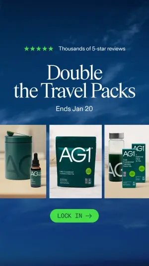
Digital graphic on a dark blue background featuring a subtle image of cloudy skies. At the top, five bright green stars and white text reading "XXXXX". Below, a large, bold serif headline in white reads "XXXXX", followed by smaller text "XXXXX". In the center, a horizontal row of three square product photos featuring dark green packaging, pouches, and bottles with the logo "XXXXX" on light studio backgrounds. At the bottom center, a bright green rounded button contains black text reading "XXXXX" with a right-pointing arrow.Pro Tip
Sub-format 5: The Contrarian Star
An ironic or negative rating used as a pattern-interrupt hook - a “1-star because it’s too good” joke. High curiosity, real risk of confusing casual scrollers.
18. The ironic 1-star (product). A single red star and a “bad” review that’s actually a backhanded compliment.
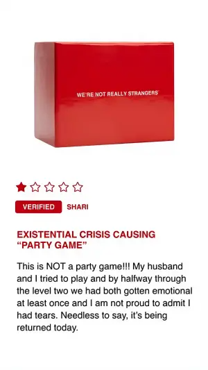
Digital graphic on a solid white background. The top half features a simple product shot of a glossy, bright red rectangular box with small white text reading "XXXXX". Below the box, on the left, is a row of five stars where only the first star is colored in dark red. Below the stars are two small red badges reading "XXXXX" and "XXXXX". Below this is a bold, dark red headline reading "XXXXX". Underneath is a paragraph of black text reading a review: "XXXXX".Pro Tip
19. The ironic 1-star (Trustpilot). The same joke inside a Trustpilot banner, with a reaching-hand action element.

High-quality product photography on a solid bright cyan background. A colorful stack of six different stylized cereal boxes labeled "XXXXX" sits in the center next to two small white bowls filled with cereal. A human hand reaches into the frame from the left to grab the top box. Floating above the boxes is a white rounded rectangular UI banner containing black text reading "XXXXX", the green Trustpilot logo, and a row of stars where only the first star is colored red and the rest are grey. At the bottom center, a black pill-shaped button reads "XXXXX".Pro Tip
Summary Table
| Sub-format | What carries the proof | Best for |
|---|---|---|
| Hero Quote | One review, deep and specific | One killer testimonial that names the pain |
| Platform Card | A named platform's credibility (Trustpilot) | Real platform reviews, trust-building |
| Volume Stack | Sheer quantity of reviews | Many good reviews, no single knockout |
| Value Fusion | Review + price/volume math | Bottom-funnel, retargeting, offers |
| Contrarian Star | An ironic bad rating as a hook | Pattern interrupt, curiosity clicks |
Hero Quote
What carries the proof
One review, deep and specificBest for
One killer testimonial that names the painPlatform Card
What carries the proof
A named platform's credibility (Trustpilot)Best for
Real platform reviews, trust-buildingVolume Stack
What carries the proof
Sheer quantity of reviewsBest for
Many good reviews, no single knockoutValue Fusion
What carries the proof
Review + price/volume mathBest for
Bottom-funnel, retargeting, offersContrarian Star
What carries the proof
An ironic bad rating as a hookBest for
Pattern interrupt, curiosity clicks
How to Build Your Own
Step #1: Mine your real reviews for the pain-named ones. The best testimonial isn’t the most glowing - it’s the one that names the exact anxiety your buyer has. Pull those first.
Step #2: Lead with the Proof Signal. Stars, badge, or platform logo goes where the eye lands first. It’s the scannable promise that makes someone read the quote.
Step #3: Match the reviewer to the viewer. A review “sounds like me” or it doesn’t. Pick the customer whose language mirrors your target’s - that’s the whole Aha.
Step #4: Pick the sub-format by what you have. One deep review → Hero Quote. A pile of short ones → Volume Stack. A great review and a great deal → Value Fusion.
Step #5: Keep it real. Every star, name, and badge maps to a genuine customer. This isn’t just ethics - it’s the $51,744 rule.
How to Test It
Two levers move these ads. Test in this order.
Lever 1 - The review content. The single biggest variable. Emotional vs functional, poetic vs blunt, dramatic vs realistic. Same layout, swap the quote - you’re testing which voice your audience trusts, and it’s rarely the one you’d guess.
Lever 2 - Volume vs depth. One detailed review vs a stack of short ones. Some audiences want a story; some want to see forty people can’t be wrong. The layout is the constant; the quantity is what you’re buying.
Don’t swap the content and the layout at once - you’ll get a winner with no idea which lever moved it.
- Use
- A real review that names a specific pain.
- Avoid
- An invented quote, star count, or verified badge.
- Use
- A reviewer who sounds like your buyer.
- Avoid
- A polished quote nobody would actually write.
- Use
- Platform branding only for reviews from that platform.
- Avoid
- Trustpilot green stars around off-platform reviews.
Conclusion: The Verdict Is Already In
Five to lock in:
1. Testimonial ads win on the Peer Verdict. A peer’s judgment de-risks the purchase, and the closer the reviewer sounds to the viewer, the harder it hits.
2. Five vehicles: Hero Quote, Platform Card, Volume Stack, Value Fusion, Contrarian Star. Pick by what your review pile actually contains.
3. Lead with the Proof Signal, then the pain-named quote, then the product.
4. The review content is your highest-impact test - voice beats layout.
5. Every review must be real. Fabricated testimonials, fake stars, and unauthorized Trustpilot branding are an FTC violation at up to $51,744 each.
The rule of thumb for the archetype: if you can’t point to the real customer behind a review, it doesn’t go in the ad. No exceptions - the math on getting caught is brutal.
This is one spoke in the static ad archetype library. Its closest neighbors are before-after ads and editorial-style ads - different proof sources for the same trust problem.
Steal my ad concept & hook library - new breakdowns every week
Get instant access →Which lever would you pull first - one deep review, or forty short ones?