


I resisted comparison ads for a long time because they felt cheap. Putting your product next to someone else’s and slapping red X’s on theirs - it seemed beneath a “real” brand.
Then I ran one for a client, half-expecting it to flop, and it became the control I couldn’t beat for two months.
Here’s why I was wrong: people aren’t choosing your product in a vacuum. They’re already using something. A comparison ad doesn’t introduce a choice - it reveals they’re on the losing side of one they’ve already made, and shows them the exit.
This is the full breakdown of us-vs-them comparison ads: the psychology, 9 real teardowns, the copy-paste recreate prompts, and the comparative-advertising law that decides whether you can name a competitor at all. It links up to the ad archetype library. Let’s pull it apart.
What Is a Comparison Ad?
It’s an ad that places your product directly next to an inferior or pricier alternative - split down the middle, with a dividing line, contrasting colors, or a “VS” badge - so the viewer instantly reads a clear winner and loser. Your product is “Us”; the alternative is “Them.”
The alternative can be a named competitor, a generic “other brands,” an inferior material, or the old way of doing things.
Here’s the first - two products flanking a VS badge:
Why It Works
The mechanism is a rigged-feeling binary you’re invited to cross. I call it the Side Switch.
The Side Switch: By placing your product next to an inferior alternative, you create a clear winner and loser. The brain loves binary choices - they take less energy to process - so it anchors to the competitor’s flaws (“Them”) and reads your brand (“Us”) as the obvious no-brainer upgrade. The viewer realizes they’re currently standing on the losing side of the line, and switching across it feels easy and overdue.
The Side Switch has three parts, in exactly this order:
1. The Dividing Line - the eye immediately registers the split (a literal line, contrasting backgrounds, or a “VS” badge). The binary is set before a word is read.
2. The Negative Anchor - the eye scans the “Them” side to collect the pain points: red X’s, dull colors, messy visuals, a higher price.
3. The Superior Solution - the eye moves to “Us” and takes in the positive reinforcements: green checks, bright colors, clean aesthetics, a better price.
The Aha moment is the viewer realizing they’re currently settling for the inferior “Them” experience - and that they can easily cross the dividing line to the superior “Us.”
Side note
The Teardowns
Nine examples, four sub-formats grouped by comparison structure. Every recreate prompt keeps the XXXXX placeholders.
These live and die on clean labels, checks, and X’s - see getting text right in AI images, grounding elements for the product shots, and icons and badges for the VS badge and check/X marks.
Sub-format 1: The VS Badge
Two products flanking a “VS” badge (or a “wins every time” banner), each with an opposing list. The most explicit, highest-contrast version - best when your product is visually more appealing than the alternative.
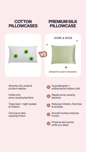
1. The gross-vs-clean split. A visually “dirty” competitor product against your clean one, VS badge between, opposing lists.
Vertical split-screen digital graphic on a soft pink background. Left side features a white pillow covered in green bacteria graphics, labeled "XXXXX". Below it, a list of negative text points. Right side features a smooth green silk pillow labeled "XXXXX" and "XXXXX". Below it, a list of positive text points marked with red checkmarks. A red "VS" badge connects the two sides in the middle.Pro Tip
2. The shared-feature column. Two products with a central shared feature list, red X’s down one side, green checks down the other.
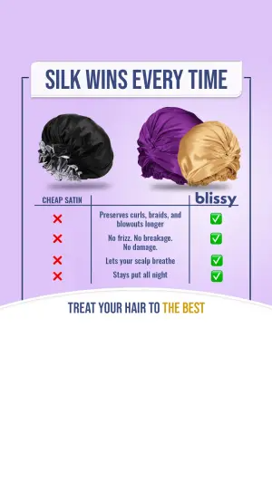
Vertical digital graphic. Top banner reads "XXXXX". Center shows a visual comparison. On the left, a black satin hair bonnet labeled "XXXXX" with a column of red 'X' marks below. On the right, a purple and a gold silk bonnet labeled "XXXXX" with a column of green checkmarks below. A central column lists features like "XXXXX" and "XXXXX". Bottom banner reads "XXXXX".Pro Tip
Sub-format 2: The Us/Them Columns
Explicit “US” / “THEM” column headers. The cleanest, most template-able version - reads instantly, works for any category, and the generic “Them” sidesteps most legal risk (more on that below).
3. The split-object visual. One product visually cut in half - your side vs theirs - with checks vs dashes.
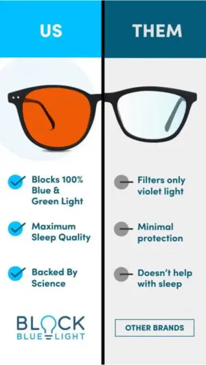
Vertical split-screen graphic comparing two halves of a pair of glasses. The left half is on a light blue background, labeled "XXXXX", featuring an orange-tinted lens. Below are blue checkmarks and positive text, ending with a logo "XXXXX". The right half is on a light grey background, labeled "XXXXX", featuring a clear lens. Below are grey minus signs and negative text, ending with "XXXXX".Pro Tip
4. The question-hook columns. A question headline, then Us/Them columns where the check/X polarity does the arguing.
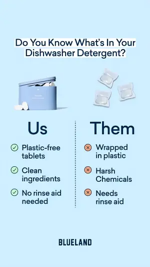
Digital graphic on a light blue background. Top headline reads "XXXXX". Left side is labeled "XXXXX" showing a blue tin container of white dishwasher tablets, followed by three green checkmarks and positive text like "XXXXX". Right side is labeled "XXXXX" showing three plastic-wrapped detergent pods, followed by three red 'X' marks and negative text like "XXXXX". Bottom center logo reads "XXXXX".Pro Tip
5. The tree-line columns. Vertical connector lines linking each point down to the product, blank/greyed competitor vs vibrant you.
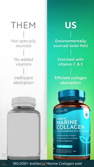
Vertical split-screen graphic. Left side features a white background labeled "XXXXX". Below is a vertical tree-line connecting negative grey text points like "XXXXX", ending at a blank, greyed-out 3D supplement bottle. Right side features a bright green to blue gradient background labeled "XXXXX". Below is a vertical tree-line connecting positive white text points like "XXXXX", ending at a vibrant blue and brown 3D supplement bottle labeled "XXXXX". Bottom banner reads "XXXXX".Pro Tip
Sub-format 3: The Price Play
A feature table or price-question split that concedes feature parity and wins purely on price. The boldest version - and the one most likely to name a real competitor, because the whole point is “same thing, cheaper.”
6. The feature-parity table. A spec table where both products tie on checkmarks, then a price row swings it.
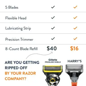
Digital comparison chart graphic. A table lists features like "XXXXX" and "XXXXX" on the left, with checkmarks indicating both competing products possess them. Below the features, a price comparison row highlights "XXXXX" versus "XXXXX". Below the price, an arrow points from text reading "XXXXX" to images of two razor heads: a yellow/black one labeled "XXXXX" and an orange/grey one labeled "XXXXX".Pro Tip
7. The price-question split. A rhetorical price question, competitor at their price vs you at yours.
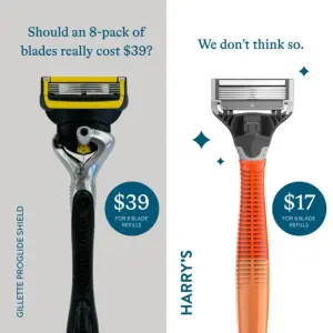
Vertical split-screen graphic. Left side has a grey background, text "XXXXX", an image of a yellow and black razor handle, and a blue circle reading "XXXXX". Right side has a white background, text "XXXXX", an image of an orange and grey razor handle with sparkle graphics, and a blue circle reading "XXXXX". Side labels read "XXXXX" and "XXXXX".Pro Tip
Sub-format 4: The Demo Split
The difference shown in use - a model wearing it, a product in action - often with Problem/Solution labels. The most native and least “chart-like,” best for apparel and anything where the difference is visible on a person.
8. The old-way demo. The tedious old method vs your streamlined one, shown as products in use.

Digital graphic on a dark purple gradient background. Top headline reads "XXXXX". Left side shows a small yellow cup overflowing with various supplement pills, labeled "XXXXX", with three red 'X' bullet points below. Right side shows a hand holding a purple scoop filled with powder, labeled "XXXXX", with three green checkmark bullet points below.Pro Tip
9. The worn split. The same model in the competitor’s product vs yours, with Problem/Solution copy underneath.
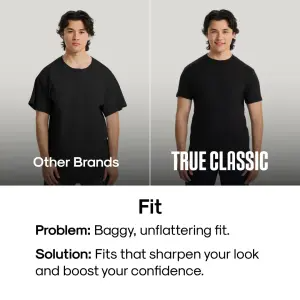
Split-screen photography graphic. Left side shows a man looking neutral in a poorly fitting, baggy black t-shirt, labeled "XXXXX". Right side shows the same man smiling in a well-fitting, tailored black t-shirt, labeled "XXXXX". Below the photos is a white banner reading a bold header "XXXXX", followed by "XXXXX" text and "XXXXX" text.Pro Tip
Summary Table
| Sub-format | Structure | Enemy usually is | Best for |
|---|---|---|---|
| VS Badge | Two products, "VS" between | Generic material / old product | Visually superior products |
| Us/Them Columns | Labeled US/THEM halves | Generic "other brands" | Any category, template-able |
| Price Play | Parity table, wins on price | Often a named competitor | Cheaper challenger brands |
| Demo Split | Difference shown in use | The old way / other brands | Apparel, visible-difference products |
VS Badge
Structure
Two products, "VS" betweenEnemy usually is
Generic material / old productBest for
Visually superior productsUs/Them Columns
Structure
Labeled US/THEM halvesEnemy usually is
Generic "other brands"Best for
Any category, template-ablePrice Play
Structure
Parity table, wins on priceEnemy usually is
Often a named competitorBest for
Cheaper challenger brandsDemo Split
Structure
Difference shown in useEnemy usually is
The old way / other brandsBest for
Apparel, visible-difference products
How to Build Your Own
Step #1: Decide who “Them” is - and how safe that is. Generic “other brands,” an inferior material, or the old way is the low-risk default. A named competitor is powerful but legally loaded (see the flag). Choose deliberately.
Step #2: Make the dividing line unmissable. A VS badge, a hard color split, “US/THEM” headers. If the binary isn’t obvious in the thumbnail, the whole mechanism fails.
Step #3: Anchor the negatives honestly. Red X’s, greyed-out visuals, higher price - but every negative you put on “Them” must be true and provable. This is where comparison ads get brands sued.
Step #4: Reward the eye on your side. Green checks, bright color, clean layout, the better price. The “Us” side should feel like relief after the “Them” side.
Step #5: Give it a switching line. “Silk wins every time,” “We don’t think so,” “Treat your hair to the best.” Name the crossing so the viewer knows what to do.
How to Test It
Two levers move these ads. Test in this order.
Lever 1 - The enemy. Named competitor vs generic “other brands” vs inferior material vs the old way. This is the biggest swing: it changes the identity shift, the legal risk, and how polarizing the ad feels. Find the boldest version you can legally and credibly run.
Lever 2 - The winning axis. What “Us” wins on: price vs performance vs values vs convenience. Hold the layout, swap the axis. This tells you which difference your audience actually cares about crossing the line for.
Don’t change the enemy and the axis at once - you’ll win and learn nothing.
- Use
- An unmissable dividing line, a deliberately chosen enemy, and three or four provable negatives against three or four rewarding positives.
- Avoid
- Unprovable red X’s, a named competitor without legal sign-off, and denigrating hooks that turn a comparison into an attack.
Side note
XXXXX is your brand and your provable claims. General guidance, not legal advice - get a DACH-qualified read before naming anyone.Conclusion: Pick the Enemy You Can Defend
Five to lock in:
1. Comparison ads win on the Side Switch. A binary split anchors the viewer to the competitor’s flaws and makes crossing to “Us” feel like an obvious, overdue upgrade.
2. Four structures: VS Badge, Us/Them Columns, Price Play, Demo Split. Pick by category and how visible the difference is.
3. Choose your enemy deliberately - generic is safe, named is powerful and legally loaded.
4. Anchor the negatives honestly; every X on “Them” is a provable claim, not a vibe.
5. In DACH, naming a competitor triggers UWG §6 - objective, non-denigrating, substantiated, or don’t name them.
The rule of thumb for the archetype: if you’d struggle to defend a red X in front of the competitor’s lawyer, take it off the board - and if you can’t, make “Them” generic.
This is one spoke in the static ad archetype library. Its closest neighbors are Feature Callout ads, Brand Manifesto ads and Before-After ads.
Steal my ad concept & hook library - new breakdowns every week
Get instant access →Who is your “Them” - and can you prove every X you’d put on them?