


For years I wrote ads like essays. A great headline, then a paragraph of body copy carrying every reason to buy, expecting people to read it. They didn’t. Nobody reads the paragraph.
The fix wasn’t better copy. It was stealing a format from IKEA instruction sheets and biology textbooks: put the product in the middle and label it. Draw a little arrow. Let the picture do the arguing.
The moment I started annotating products instead of describing them, my thumb-stop rate on cold traffic jumped - because a labeled diagram doesn’t read like an ad. It reads like information.
This is the full breakdown of feature-callout and problem-solution ads: the psychology, 12 real teardowns grouped by format, and a copy-paste recreate prompt for every one. It links up to the static ad archetype library. Let’s pull it apart.
What Is a Feature-Callout / Problem-Solution Ad?
Feature-callout ad: An ad that lays out its own argument visually - either by splitting the frame into the buyer’s problem versus your solution, or by surrounding a hero product with labeled callouts (arrows, bubbles, icons) that name each feature or benefit. The buyer absorbs four or five selling points in one glance, without reading a single line of body copy.
The two variants share one job: doing the buyer’s homework for them.
Why It Works
The mechanism is pre-empted doubt, disguised as a diagram. I call it the Objection Map.
The Objection Map: Every buyer arrives with a silent list of doubts - does it actually work, is it comfortable, will it last, what’s wrong with it? This ad plots those doubts as labeled points around the product (or as a problem column beside the solution) and answers each one on the spot. Because the layout reads as a neutral diagram rather than sales copy, the brain files the answers as facts. The viewer reaches “this is for me” feeling like they concluded it themselves.
The Objection Map has three parts, in this order:
1. The Hero + Frame. The product centered, plus a headline that frames what we’re looking at (a named problem, a category claim like “not any X,” or a benefit promise). This orients the eye.
2. The Callouts. The labels radiating out, each answering one objection. This is the load-bearing layer: four or five reasons, scannable in a second.
3. The Anchor. The offer, price, or CTA at the bottom that converts the absorbed logic into an action.
The Aha moment is the viewer realizing - without reading a paragraph - that every “but does it…” has already been answered, so the purchase feels de-risked and obvious.
Note
The Teardowns
Twelve examples, four sub-formats. Every recreate prompt below is written from the creative itself - XXXXX marks your copy.
These are annotation-heavy, so text rendering is the whole game: see getting text right in AI images for clean labels, grounding elements for a hero product that reads real, and badges and buttons for the offer pills and CTA.
Sub-format 1: The Problem/Solution Split
The frame is divided - the buyer’s pains on one side, your product on the other. The most direct version of the archetype, and the best top-of-funnel opener because it leads with the problem, not the product.
1. The two-column split. Icon-led pains in one column, the product hero in a contrasting color block opposite.
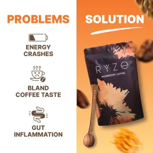
Square digital graphic split vertically into two columns. The left column has a white background with a bold header reading "XXXXX". Below the header are three rows, each with a small orange line-icon (a draining battery, a sad coffee cup, an irritated stomach) next to bold black text: "XXXXX", "XXXXX", and "XXXXX". The right column has a solid orange background with a white header reading "XXXXX" underlined by a white brushstroke. Below it, a product pouch floats at an angle with a wooden spoon, surrounded by scattered coffee beans.Side note
Sub-format 2: The Radial Map
The hero product floats center-frame and features or benefits radiate outward on curved lines, dotted spokes, or a ring. The premium look - it feels like a product-design keynote slide. Best for a single hero SKU where the product is the beauty shot.
2. The category-claim hero. A “not any X” headline over a floating product ringed by three feature spokes and a financing line.
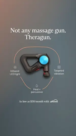
Digital graphic on a dark grey gradient background. At the top center, a white serif headline reads "XXXXX" and "XXXXX" on two lines. In the center, a percussive massage device floats at an angle. A thin curved orange line loops beneath and around it, connecting three feature callouts, each with a small line-icon and a label: "XXXXX", "XXXXX", and "XXXXX". At the bottom center, small white text reads "XXXXX" next to a payment-provider logo.Side note
3. The benefit spokes (supplement). Product floating on a bold solid color, dotted lines dropping to three asterisked benefits with a disclaimer.
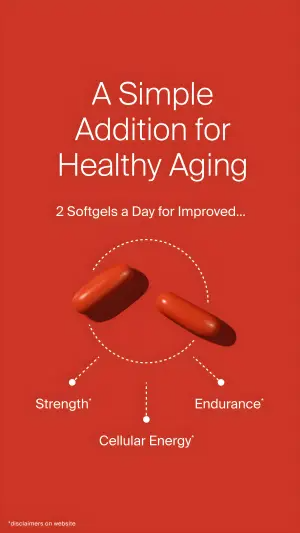
Vertical digital graphic on a solid deep red background. At the top center, a large white serif headline reads "XXXXX" across three lines, followed by smaller white text "XXXXX". In the center, two softgel capsules float. Below them, three dotted lines radiate downward to three benefit labels in white: "XXXXX", "XXXXX", and "XXXXX", each with a small asterisk. In the bottom left corner, tiny white text reads "XXXXX".Side note
4. The named-enemy hero. A prescription-drug comparison headline over floating product, four corner callouts with a study-backed footnote.
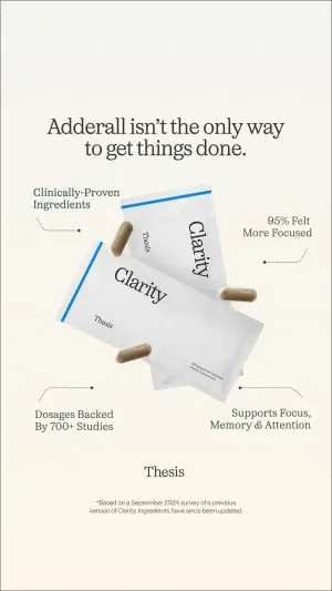
Vertical digital graphic on a clean off-white background. At the top center, a bold dark serif headline reads "XXXXX" across two lines. In the center, two product sachets and two capsules float at angles, casting soft shadows. Four thin dotted lines connect to four callouts in small dark text positioned around the product: "XXXXX", "XXXXX", "XXXXX", and "XXXXX". Below the product, a centered logo reads "XXXXX". At the very bottom, tiny grey disclaimer text reads "XXXXX".Side note
5. The benefit ring + ingredient map. Product bottle centered inside an oval ring of benefit callouts, with ingredient-to-benefit notes on the label itself.
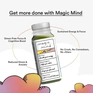
Square digital graphic on a white background with soft pink-orange heart shapes in the bottom corners. At the top center, a bold underlined headline reads "XXXXX". In the center, a small product bottle stands upright. A faint oval ring loops around it, connecting four benefit callouts in dark text positioned around the bottle: "XXXXX", "XXXXX", "XXXXX", and "XXXXX". On the product label, small handwritten-style notes map each ingredient to a benefit: "XXXXX", "XXXXX", "XXXXX", "XXXXX".Side note
Sub-format 3: The Pointer Callout
Clean or hand-drawn arrows connect labels to specific parts of the product or model. The most versatile and the most native-feeling - it looks like someone marked up a photo. Works on models, flat-lays, and in-hand shots alike.
6. The lifestyle model markup. A model wearing the product, arrows pointing to fabric qualities, plus a center hook pill and an offer.
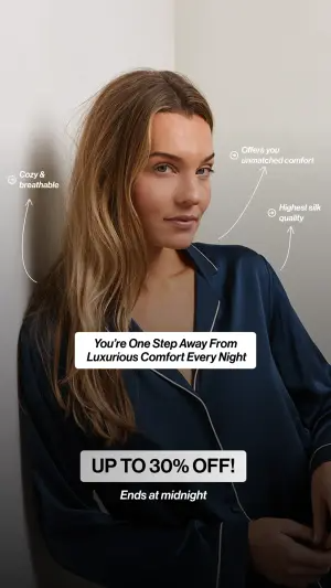
Vertical lifestyle photograph of a woman leaning against a white corner wall, wearing a navy silk pyjama shirt. Three feature callouts in small text with thin hand-drawn arrows point to her outfit: "XXXXX", "XXXXX", and "XXXXX", each with a small circular icon. Across the center, a black rounded pill contains white italic text reading "XXXXX". Near the bottom, a light rounded box contains bold black text "XXXXX", and below it italic text reads "XXXXX".Side note
7. The in-hand product bubbles. A hand holding the product, rounded label bubbles with pointer lines to each part.
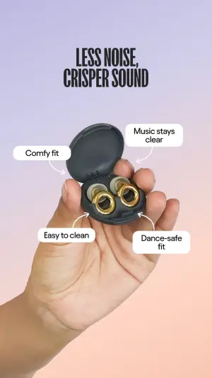
Vertical digital graphic on a purple-to-peach gradient background. At the top, a bold black sans-serif headline reads "XXXXX" and "XXXXX" on two lines. In the center, a hand holds an open product case containing earbuds. Four white rounded rectangular callout labels with thin pointer lines surround the product: "XXXXX", "XXXXX", "XXXXX", and "XXXXX".Side note
8. The offer-led markup. A strikethrough-price headline, product hero, curved arrows to features, and an offer badge.
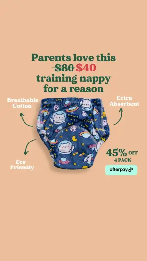
Vertical digital graphic on a warm peach background. At the top center, bold serif text reads "XXXXX", with a strikethrough price "XXXXX" beside a red price "XXXXX", continuing "XXXXX". In the center, the product floats. Three feature callouts with thin curved hand-drawn arrows point to it: "XXXXX", "XXXXX", and "XXXXX". On the right, an offer badge reads "XXXXX". Below it, a payment-provider logo.Side note
9. The restock stack. A big “back in stock” headline over stacked product, arrows to durability and fit claims, price bar at the base.
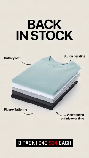
Vertical digital graphic on a soft cream background. At the top center, a massive bold black headline reads "XXXXX" and "XXXXX" on two lines. In the center, a neat stack of three folded t-shirts in different colors. Four feature callouts with thin curved arrows point to the stack: "XXXXX", "XXXXX", "XXXXX", and "XXXXX". At the bottom, a black banner contains white and red text reading "XXXXX".Side note
Sub-format 4: The Icon & List Callout
Features rendered as icon-badges or a stacked pill-list. The most technical, clinical feel - it reads like a spec sheet, which suits functional, health, or performance products where credibility beats vibe.
10. The icon-badge map. A worn product with circular icon-badges naming each engineered feature.
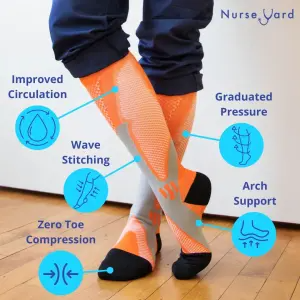
Vertical photograph of a person's lower legs wearing brightly colored compression socks, standing on a wooden floor. At the top right, a logo reads "XXXXX". Five feature callouts surround the legs, each with a circular blue line-icon and a blue label: "XXXXX", "XXXXX", "XXXXX", "XXXXX", and "XXXXX".Side note
11. The stacked pill list. Callouts as a vertical column of pills, each pointing at the product in use.
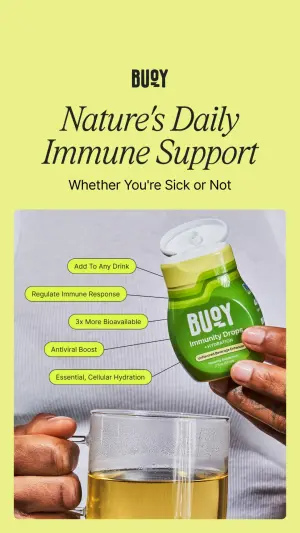
Vertical digital graphic on a bright yellow-green background. At the top left, a logo reads "XXXXX". Below, an elegant serif headline reads "XXXXX" and smaller text "XXXXX". In the lower half, a photo shows a hand squeezing a small dropper bottle into a glass of liquid. Five green rounded pill-shaped callout labels stack vertically down the left side, each with a thin pointer line to the bottle: "XXXXX", "XXXXX", "XXXXX", "XXXXX", and "XXXXX".Side note
12. The provocative-hook markup. A pattern-interrupt headline over a body shot, two callouts naming the outcome, and a CTA box.
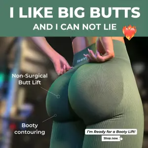
Square digital graphic with a colored border. At the top, a bold white headline on a colored banner reads "XXXXX" and "XXXXX" with a small emoji. The center is a photograph of a person using the product, a hand adjusting it. Two white callout labels with thin pointer lines point to the result: "XXXXX" and "XXXXX". In the bottom right, a small white box contains bold text "XXXXX" and a "Shop now" button.Side note
Summary Table
| Sub-format | Callout style | Feel | Best for |
|---|---|---|---|
| Problem/Solution Split | Two columns, pains vs product | Direct, punchy | Cold traffic, problem-aware buyers |
| Radial Map | Spokes/ring around a floating hero | Premium, keynote | Single hero SKU, beauty-shot products |
| Pointer Callout | Arrows/lines to product parts | Native, marked-up | Apparel, wearables, in-hand products |
| Icon & List | Icon-badges or pill stack | Technical, spec-sheet | Health, performance, functional gear |
Problem/Solution Split
Callout style
Two columns, pains vs productFeel
Direct, punchyBest for
Cold traffic, problem-aware buyersRadial Map
Callout style
Spokes/ring around a floating heroFeel
Premium, keynoteBest for
Single hero SKU, beauty-shot productsPointer Callout
Callout style
Arrows/lines to product partsFeel
Native, marked-upBest for
Apparel, wearables, in-hand productsIcon & List
Callout style
Icon-badges or pill stackFeel
Technical, spec-sheetBest for
Health, performance, functional gear
How to Build Your Own
Step #1: List the objections first, not the features. Write down the five doubts a skeptic has before buying. Those become your callouts - an answered objection outsells a bragged feature.
Step #2: Pick the hero shot the callouts can hang on. Floating render for a radial map, in-hand for pointers, worn for icon badges. The product image is the spine.
Step #3: Cap it at four or five callouts. Past that, the glance breaks and it stops reading as a clean diagram. Kill your weakest label.
Step #4: Make each label answer, don’t boast. “Won’t shrink or fade” beats “premium cotton.” Name the doubt and close it.
Step #5: Anchor the bottom. Offer, price, or CTA. The map builds the logic; the anchor converts it.
How to Test It
Two levers move these ads. Test in this order.
Lever 1 - The frame/hook. Problem-led (“energy crashes…”) vs category claim (“not any X”) vs benefit promise vs provocative pattern-interrupt. This sets who stops. Same callouts, different frame - the biggest swing in who you attract.
Lever 2 - The callout set. Which objections you answer, and how many. Swap the labels, hold the layout. Test five vs three; test feature-phrased vs benefit-phrased labels. This is where you learn which doubt actually blocks the sale.
Don’t change the frame and the callouts at once - you’ll get a winner and no idea which half won.
- Use
- Four or five labels that each close a doubt.
- Avoid
- Nine labels that turn the glance into homework.
- Use
- A hero shot the arrows can actually point at.
- Avoid
- A busy lifestyle scene with no clear anchor points.
- Use
- Structure-function claims with the disclaimer attached.
- Avoid
- Disease claims and unsubstantiated body promises.
Note
XXXXX is your brand - don’t render a competitor’s logo, and only show a payment provider if you actually offer it. General guidance, not legal advice.Conclusion: Answer the Doubt, Don’t Brag the Spec
Five to lock in:
1. These ads win on the Objection Map. They plot the buyer’s doubts and answer each one, disguised as a neutral diagram.
2. Four vehicles cover it: Problem/Solution Split, Radial Map, Pointer Callout, Icon & List. Pick by product type and how technical the buyer is.
3. Build from objections, not features. An answered doubt outsells a bragged spec.
4. Cap callouts at four or five, or the glance breaks and it stops reading as information.
5. Every callout is a claim. On health and cosmetic products, keep them substantiated and disclaimed - the label is where the legal risk lives.
The rule of thumb for the archetype: if a callout brags instead of answering a doubt, cut it. The map only works when every label closes a question the buyer was already asking.
This is one spoke in the static ad archetype library. Its closest neighbors are Before-After ads, Product Grid ads and Text-Only ads.
Steal my ad concept & hook library - new breakdowns every week
Get instant access →Which objection is quietly killing your best product - and is it on the creative yet?