


Here’s a mistake I made for years: I sold the feature and assumed the benefit was obvious. “400 thread count.” “Graduated compression.” “Contains Lion’s Mane.” Then I’d wonder why nobody cared.
Nobody buys a feature. They buy what the feature does for them - and if you make them do that translation in their head, they won’t. They’ll scroll.
The ads that fixed this for me don’t just list specs. They draw a line from the spec to the payoff, so the skeptic’s analytical brain gets the “why it works” it needs before the emotional brain says yes.
This is the full breakdown of feature-to-benefit ads: the psychology, 5 real teardowns, and a copy-paste recreate prompt for each. It links up to the ad archetype library. Let’s pull it apart.
What Is a Feature-to-Benefit Ad?
It’s an ad that pairs a concrete feature - an ingredient, a technology, a fabric, a software integration - directly with the specific benefit it produces, usually with a visible connector (an arrow, a line, a toggle, a “→”). It shows the working, not just the claim. The buyer sees not only what the product does but why it works.
It’s the logical justification that lets someone make an emotional purchase.
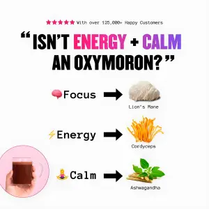
Here’s the purest version - an ingredient mapped to each benefit:
Why It Works
The mechanism is the visible connection between spec and payoff. I call it the Payoff Bridge.
The Payoff Bridge: Consumers are skeptical of broad claims (“the best supplement,” “the best software”). This ad breaks down exactly why a product works - pairing each feature with the specific benefit it delivers - so the analytical brain gets its logical justification. The connector (the arrow, the line, the toggle) is the bridge from “what it is” to “what it does for me,” and once the buyer walks across it, the claim reads as proven rather than boasted.
The Payoff Bridge has three parts, in exactly this order:
1. The Anchor - the eye starts here: the central product, the striking lifestyle image, or the bold question/claim at the top.
2. The Connectors - the visual cues (arrows, lines, bullets, toggles, plus signs) that break the subject into distinct parts and pair each feature with its outcome.
3. The Payoff - the eye lands on the specific, punchy benefit statements or data points.
The Aha moment is the viewer connecting one tangible feature - an ingredient, an integration, a fabric technology - directly to the specific benefit they’ve been wanting.
Side note
The Teardowns
Five examples, three sub-formats grouped by the connector they use. Every recreate prompt keeps the XXXXX placeholders.
These are text-and-connector heavy - see getting text right in AI images for clean labels and arrows, grounding elements for the ingredient cutouts and product-in-use shots, and pill buttons for the feature-stack format.
Sub-format 1: The Equation Rows
The most literal bridge: a benefit on one side, the feature that delivers it on the other, an arrow between. This is the archetype in its purest form - each row is a small proof.
1. The ingredient equation. Benefit + emoji → arrow → a photo of the exact ingredient responsible, stacked in rows under a curiosity hook.
Digital infographic on a white background. At the top, five pink stars and text reading "XXXXX". Below, a massive, bold black quote reads "XXXXX", with specific words colored in pink and purple. The center features a three-row diagram. Row one: a brain emoji and text "XXXXX", a black right-pointing arrow, and a cutout photo of a Lion's Mane mushroom. Row two: a lightning emoji and text "XXXXX", a black arrow, and a cutout photo of Cordyceps mushrooms. Row three: a meditating emoji and text "XXXXX", a black arrow, and a cutout photo of Ashwagandha roots. In the bottom left corner, a circular pink inset shows a hand holding a glass mug of brown liquid.Pro Tip
Sub-format 2: The Translated List
A vertical stack where each item is a feature already translated into its payoff - an emoji-led list, or gradient pills naming what the product replaces or eliminates. The list is the bridge; every line lands as a benefit, not a spec.
2. The emoji feature list. A split-screen: the translated feature list on a solid panel, the lifestyle payoff shot beside it.
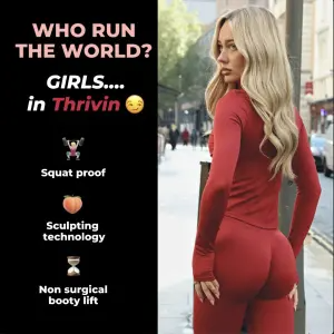
Vertical split-screen graphic. The left side has a black background. At the top, bold pink and white text reads "XXXXX" with a smirking emoji. Below is a vertical list of three features, each with an emoji above white text: a weightlifter emoji above "XXXXX", a peach emoji above "XXXXX", and an hourglass emoji above "XXXXX". The right side is a lifestyle photograph of a blonde woman looking over her shoulder, wearing a tight, red long-sleeve athletic top and matching leggings, walking down a city street.Pro Tip
3. The elimination stack. Gradient pills naming what the product replaces - each pill translates the tool into “you no longer need X.”
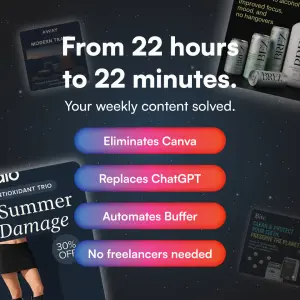
Digital graphic on a dark, starry night sky background. Several blurred, floating mobile ad mockups hover in the background. In the center, a large, bold white headline reads "XXXXX" followed by subtext "XXXXX". Below this is a vertical stack of four glowing, colorful (blue to red gradient) pill-shaped buttons containing white text: "XXXXX", "XXXXX", "XXXXX", and "XXXXX".Pro Tip
Sub-format 3: The Axis & Pointer
Benefits mapped along a line, timeline, or pointed at the product with thin leads. The closest to a callout layout - which is exactly why the pairing logic has to carry it, not the pointers.
4. The axis map. A vertical axis of dots beside the product, each dot naming a benefit the single mechanism unlocks - “when everything works together.”
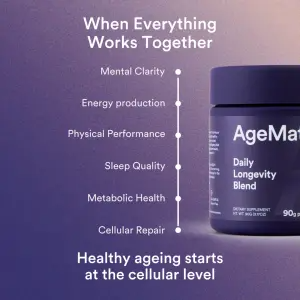
Digital graphic on a smooth, dark purple-to-light purple gradient background. On the right side, a partial 3D render of a dark blue supplement tub with white text. On the left side, a vertical white line with six small dots acts as a pointer system (like a timeline or axis) aligned next to the bottle. Next to each dot is white text reading a specific benefit: "XXXXX", "XXXXX", "XXXXX", "XXXXX", "XXXXX", and "XXXXX". At the top center, white text reads "XXXXX". At the bottom center, white text reads "XXXXX".Pro Tip
5. The demo pointer. A product-in-use lifestyle shot with two thin leads translating what the device does into skin outcomes.

Studio lifestyle photography of a woman sitting cross-legged on a bed with white linens. She is looking directly at the camera, holding a bright cyan-blue light therapy mask in her lap, which is emitting a bright red glow onto her white tank top. At the top, a thin white logo reads "XXXXX" above a bold, elegant headline reading "XXXXX", with the first two words highlighted in cyan block color. Thin white lines point from the mask to text on the left reading "XXXXX" and text on the right reading "XXXXX".Pro Tip
Summary Table
| Sub-format | The connector | What it proves | Best for |
|---|---|---|---|
| Equation Rows | Arrows, benefit → ingredient | Each benefit has a named cause | Supplements, ingredient-led products |
| Translated List | Emoji list / elimination pills | Every spec already reads as a payoff | Apparel, SaaS, feature-rich products |
| Axis & Pointer | Timeline/axis or thin leads | One mechanism unlocks many outcomes | Devices, holistic health, single-hero SKUs |
Equation Rows
The connector
Arrows, benefit → ingredientWhat it proves
Each benefit has a named causeBest for
Supplements, ingredient-led productsTranslated List
The connector
Emoji list / elimination pillsWhat it proves
Every spec already reads as a payoffBest for
Apparel, SaaS, feature-rich productsAxis & Pointer
The connector
Timeline/axis or thin leadsWhat it proves
One mechanism unlocks many outcomesBest for
Devices, holistic health, single-hero SKUs
How to Build Your Own
Step #1: Write the feature and the payoff as a pair. Never ship one without the other. “Merino wool” is a spec; “merino wool → never smells” is a bridge. Pair every line.
Step #2: Pick your connector. Arrow for a literal equation, a list for translated features, an axis for one-mechanism-many-benefits. The connector is what makes it read as logic, not a claim.
Step #3: Lead with the Anchor that fits your buyer’s skepticism. A bold question for the curious, a striking product for the visual, a data metric for the analytical.
Step #4: Make the payoff specific. “Improves focus” is weak. “22 hours to 22 minutes” is a bridge you can feel. Numbers and concrete outcomes beat adjectives.
Step #5: Keep the chain short. Three or four feature→benefit pairs. This is a chain of reasoning, not a spec dump - one weak link and the whole logic feels padded.
How to Test It
Two levers move these ads. Test in this order.
Lever 1 - The Anchor/hook. Curiosity question (“isn’t energy + calm an oxymoron?”) vs direct benefit vs data metric vs named enemy. This decides who stops and in what mindset. Same bridges, different anchor - biggest swing in who you attract.
Lever 2 - The payoff phrasing. Same features, reframe the benefit: emotional vs functional, holistic vs single-pain, raw metric vs outcome. The connector is the constant; what’s on the payoff side is what you’re really testing.
Don’t change the anchor and the payoffs at once - you’ll win and learn nothing.
- Use
- Three or four tight feature→benefit pairs with a visible connector, and payoffs written as concrete outcomes or numbers.
- Avoid
- Unpaired specs, eight rows of padding, and vague payoffs (“better wellness”) that the connector can’t make believable.
Side note
XXXXX is your brand. General guidance, not legal advice - verify before spend.Conclusion: No Payoff, No Bridge
Five to lock in:
1. These ads win on the Payoff Bridge. Pairing each feature with its benefit gives the analytical brain the “why it works” it needs to justify an emotional yes.
2. Three connectors: Equation Rows (arrows), Translated List (emoji/pills), Axis & Pointer (leads). The connector is what turns a claim into logic.
3. Never ship a feature without its payoff - an unpaired spec is invisible.
4. Keep the chain to three or four pairs, and make each payoff specific and concrete.
5. The bridge makes claims look proven, so on health, cosmetic and comparative payoffs, every pairing must be substantiated.
The rule of thumb for the archetype: if you can’t finish the sentence “…which means you get ___,” the feature doesn’t belong in the ad. No payoff, no bridge.
This is one spoke in the static ad archetype library. Its closest neighbors are Feature Callout ads, Brand Manifesto ads and Before-After ads.
Steal my ad concept & hook library - new breakdowns every week
Get instant access →Which of your features is still sitting on the creative without its payoff attached?