


I used to bury the offer. Nice product shot, tasteful headline, and the discount tucked in a corner like I was embarrassed by it. Those ads were polite. They also didn’t sell.
Then I flipped it: made the number the biggest thing on the canvas. A giant “-30%,” a “$100,” a “FREE.” Same product, same audience - and suddenly people who were on the fence couldn’t scroll past.
The number wasn’t decoration. It was the whole pitch. It rewired the buyer’s internal question from “do I actually need this?” to “I can’t pass this up.”
This is the full breakdown of special-offer ads: the psychology, 7 real teardowns, the copy-paste recreate prompts, and the price-law line that matters for anyone running in the EU. It links up to the ad archetype library. Let’s pull it apart.
What Is a Special Offer Ad?
It’s an ad built around a deal - a discount, a bundle, a BOGO, a big-value coupon - where the offer itself is the largest element on the canvas. The product is there to justify what the discount applies to; the number is the hook.
It works on three of the oldest levers in the brain: scarcity, urgency, and anchoring.
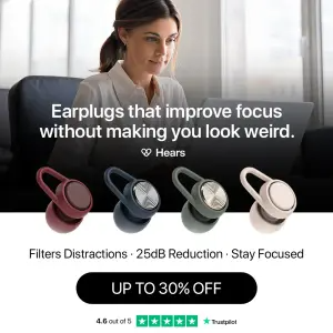
Here’s the first - a discount led by the number, product and trust badge underneath:
Why It Works
The mechanism is a big number that reframes the decision. I call it the Anchor Hit.
The Anchor Hit: A well-designed offer bypasses logical deliberation and triggers a dopamine hit - the brain loves a “hack” or a “win.” By anchoring a high original price, or a closing window, or a painful stat, the ad reframes the internal monologue from “do I need this?” to “I can’t afford to pass this up.” The number does the work; the product just tells you what the win applies to.
The Anchor Hit has three parts, in exactly this order:
1. The Number - the eye goes straight to the largest element, which is almost always the math: 50%, $100, FREE. This is the hook.
2. The Vehicle - the eye jumps to the product to justify what the massive discount applies to.
3. The Urgency Trigger - finally, the eye catches the scarcity element (“ends at midnight,” “almost sold out,” “new users only”) that forces immediate action.
The Aha moment is the buyer realizing the barrier to entry - price or risk - has been temporarily lowered, making a product they were passively interested in suddenly irresistible.
Side note
The Teardowns
Seven examples, four sub-formats grouped by how the number is framed. Every recreate prompt keeps the XXXXX placeholders.
The number is the entire ad, so text rendering is non-negotiable - see getting text right in AI images. For the offer buttons use CTA buttons, and for the product hero, grounding elements.
Sub-format 1: The Discount Anchor
A percentage is the hero. The cleanest, most direct offer - best when the discount is genuinely strong and the product is already desirable.
1. The clean % + trust badge. Lifestyle photo, product colors, a big offer pill, and a rating badge to de-risk the click.
Digital graphic split horizontally. The top half is a lifestyle photo of a woman working focused at a laptop. The bottom half is a solid white background. Overlapping the middle are four 3D renders of earplugs in different colors (burgundy, navy, grey, beige). Above the earplugs, bold white text over the photo reads "XXXXX" with a small logo "XXXXX". Below the earplugs, small text reads "XXXXX". Below that, a massive black pill-shaped button reads "XXXXX". At the very bottom, a green Trustpilot 4.6 rating badge.Pro Tip
2. The loud number. A high-energy, clashing-color layout where the discount screams off a sunburst.
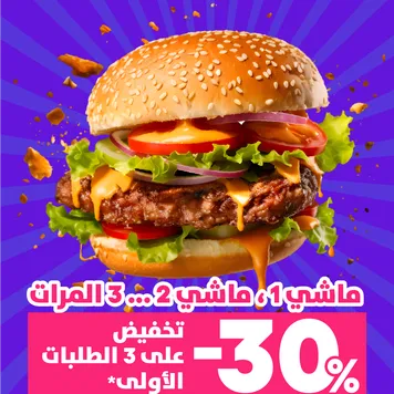
High-contrast food photography on a vibrant purple background with lighter purple radiating sunburst lines. In the center, a massive, highly appetizing hamburger with melting cheese, tomatoes, and lettuce, with small crumb particles floating dynamically around it. Below the burger, white Arabic text is overlaid. At the bottom, a bright pink rectangular banner contains massive white text reading "XXXXX" alongside more white Arabic text.Pro Tip
Sub-format 2: The Free Math
The deal is shown as a giveaway or an equation - FREE, or buy-X-get-Y. The word “FREE” is one of the strongest anchors in advertising, so it gets to be the biggest thing on the canvas.
3. The visual equation. The deal literally drawn as math: two products + one = $0.
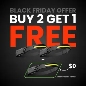
Digital graphic on a dark grey background with a subtle vignette. At the top, grey text reads "XXXXX". Below it, massive white and bright red text reads "XXXXX". The center features a visual math equation: two black LED headlamps sit above a white "+" sign. Below the plus sign, a third headlamp is highlighted by a bright green glowing outline, with a hand-drawn arrow pointing to the text "XXXXX" and "XXXXX".Pro Tip
4. The scarcity-led BOGO. A “buy one get one” offer fronted by a sold-out urgency hook and a trust badge.

Minimalist product photography on a stark white background. Top dark green text reads "XXXXX" followed by a 5-star Trustpilot badge. In the center, a pair of thick, black rectangular sunglasses. A thin, elegant hand-drawn line points to the lens with cursive text reading "XXXXX". Below the sunglasses, bold dark green text reads "XXXXX" with smaller text "XXXXX".Pro Tip
Sub-format 3: The Value Bundle
A big dollar figure or a buy-more structure is the anchor - designed to raise average order value, not just convert. Best mid-funnel and for first-order acquisition.
5. The dollar anchor + exclusivity. A huge “$100” coupon bundle gated to new users, over an abundance flat-lay.
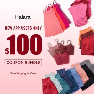
Digital graphic on a soft pink-to-white gradient background. The left side features dark red text reading "XXXXX" above a massive "$100" and "XXXXX". A small asterisk notes "XXXXX" and the logo "XXXXX" sits at the top left. The right side features an organized flat-lay collage of numerous colorful athletic garments, including tank tops, tennis skirts, and shorts in various shades of pink, red, and blue.Pro Tip
6. The upsell structure. A “2nd item 50%” offer that forces a bundle, dressed in luxury moody aesthetics to protect perceived value.
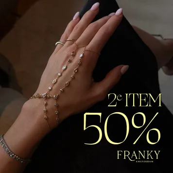
Moody, aesthetic close-up photography of a woman's hand resting on a black dress, wearing delicate gold and diamond hand-chain jewelry. The background is dark and warm. On the right side, elegant, thin yellow serif text reads "XXXXX" with a massive "XXXXX" below it. At the bottom right, the logo reads "XXXXX".Pro Tip
Sub-format 4: The Stat Anchor
The big number isn’t a discount at all - it’s a pain-stat or a value figure, framed with loss aversion. The B2B and high-consideration play, where a discount would cheapen the product.
7. The pain-stat + reclaim CTA. A giant statistic as the anchor, framed as time the buyer is losing.
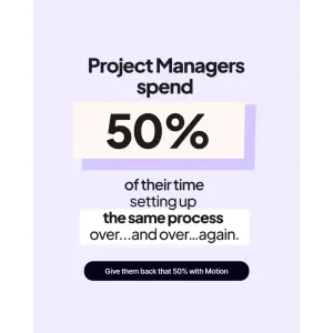
Digital graphic on a pale lavender background. Large dark text reads "XXXXX". Below this, a large beige rectangular highlight block contains the massive number "XXXXX". Underneath, text continues "XXXXX", followed by a white highlight block reading "XXXXX". At the bottom, a dark navy pill-shaped button reads "XXXXX".Pro Tip
Summary Table
| Sub-format | The anchor | The trigger | Best for |
|---|---|---|---|
| Discount Anchor | A % off, hero-sized | Deadline / trust badge | Desirable products, strong margins |
| Free Math | FREE / BOGO as equation | Event or scarcity | Impulse, gifting, volume moves |
| Value Bundle | Big $ or buy-more | Exclusivity / first-order | Raising AOV, acquisition |
| Stat Anchor | A pain-stat, not a discount | Loss aversion | B2B, premium, high-consideration |
Discount Anchor
The anchor
A % off, hero-sizedThe trigger
Deadline / trust badgeBest for
Desirable products, strong marginsFree Math
The anchor
FREE / BOGO as equationThe trigger
Event or scarcityBest for
Impulse, gifting, volume movesValue Bundle
The anchor
Big $ or buy-moreThe trigger
Exclusivity / first-orderBest for
Raising AOV, acquisitionStat Anchor
The anchor
A pain-stat, not a discountThe trigger
Loss aversionBest for
B2B, premium, high-consideration
How to Build Your Own
Step #1: Make the number the biggest thing on the canvas. Not the logo, not the product - the math. If a squinting stranger can’t read the offer from the thumbnail, rebuild it.
Step #2: Pick the frame that fits your margin. Strong margin → straight discount. Want higher AOV → bundle or 2nd-item. Premium product → a stat anchor, not a price cut.
Step #3: Add the vehicle to justify it. The product shot answers “off what?” Keep it clean and secondary to the number.
Step #4: Add one urgency trigger. A deadline, a scarcity line, an exclusivity gate. One. Stacking three fake-looking triggers kills trust faster than it builds urgency.
Step #5: Make every claim true. The anchor price, the “up to,” the “almost sold out.” This is where offer ads get brands fined (see below).
How to Test It
Two levers move these ads. Test in this order.
Lever 1 - The offer structure. Percentage vs dollar vs BOGO vs bundle vs stat. Same product, different math - this is the biggest swing, because it changes who buys and how much they spend, not just the click rate.
Lever 2 - The urgency trigger. Scarcity (“almost sold out”) vs exclusivity (“new users only”) vs deadline (“ends midnight”) vs event (“Black Friday”). Hold the offer, swap the trigger. This tells you what actually makes your audience move now.
Don’t change the offer and the trigger at once - you’ll win and learn nothing.
- Use
- One hero number, one clean vehicle, one true urgency trigger - readable at thumbnail size.
- Avoid
- Buried offers, three stacked urgency claims, and invented “was” prices or fake countdowns.
Side note
XXXXX is your brand and your real numbers. General guidance, not legal advice - verify against current EU/DE rules before spend.Conclusion: The Number Is the Pitch
Five to lock in:
1. Special-offer ads win on the Anchor Hit. A hero-sized number reframes the purchase from “do I need this?” to “I can’t pass this up.”
2. Four frames: Discount Anchor, Free Math, Value Bundle, Stat Anchor. Pick by your margin and your goal (convert vs raise AOV vs B2B).
3. Number, vehicle, trigger - the hook, the justification, the reason to act now, in that order.
4. This is the amplifier archetype. It bolts onto other formats, but only counts when the number is the hero.
5. Every number is a regulated claim. Real anchor prices, real scarcity, real ratings - especially under EU/DE price law.
The rule of thumb for the archetype: if a stranger squinting at the thumbnail can’t read the deal, the number isn’t big enough - and if the “was” price isn’t real, don’t run it at all.
This is one spoke in the static ad archetype library. Its closest neighbors are Product Grid ads, Testimonial ads and Feature-to-Benefit ads.
Steal my ad concept & hook library - new breakdowns every week
Get instant access →Which of your offers is still hiding in the corner of the creative?